Willkommen bei den Top‑Schriften – hier treffen Beliebtheit und Qualität aufeinander. Das sind die in diesem Jahr am häufigsten heruntergeladenen und genutzten Fonts. Wenn Sie sichere Optionen für Logo, Web oder Social suchen, starten Sie hier.
Jeder Top‑Font überzeugt durch Balance, Lesbarkeit und Vielseitigkeit. Sie finden moderne Sans‑Serifs, elegante Scripts, Vintage‑Serifs und minimalistische Displays.
-
( Fonts by NanaNissa - Personal-use only. For commercial use please contact owner. )
A whimsical and elegant script font with decorative swashes.
 Herunterladen 45 Downloads@WebFont
 -
( Fonts by Nirmana Visual - Sigit Dwipa - Personal-use only. For commercial use please contact owner. )
A cursive script font with elegant, flowing lines and moderate contrast.
![Gilas Frei Schriftart Herunterladen]() Herunterladen 45 Downloads@WebFont
Herunterladen 45 Downloads@WebFont -
( Fonts by NanaNissa - Personal-use only. For commercial use please contact owner. )
A flowing, elegant script font with smooth, cursive strokes.
![Delara Frei Schriftart Herunterladen]() Herunterladen 45 Downloads@WebFont
Herunterladen 45 Downloads@WebFont -
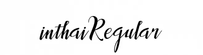
( Fonts by Best Font Studio - Rifan Asri - Personal-use only. For commercial use please contact owner. )
An elegant, flowing script font with graceful curves and ornate uppercase letters.
![inthai-Regular Frei Schriftart Herunterladen]() Herunterladen 45 Downloads@WebFont
Herunterladen 45 Downloads@WebFont -
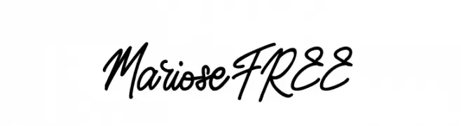
( Fonts by Vunira Design - Personal-use only. For commercial use please contact owner. )
A dynamic and fluid script font with elegant, flowing letterforms and expressive swashes.
![MarioseFREE Frei Schriftart Herunterladen]() Herunterladen 45 Downloads@WebFont
Herunterladen 45 Downloads@WebFont -
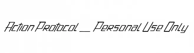
( Fonts by dcoxy - Greg Medina - Personal-use only. For commercial use please contact owner. )
A modern, angular font with a dynamic slant and sharp lines.
![Action Protocol_PersonalUseOnly Frei Schriftart Herunterladen]() Herunterladen 45 Downloads@WebFont
Herunterladen 45 Downloads@WebFont -
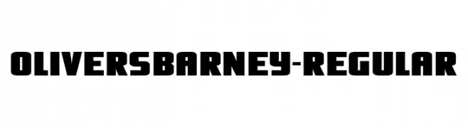
( Fonts by Typodermic Fonts - Raymond Larabie - Personal-use only. For commercial use please contact owner. )
A bold, blocky font with a strong, geometric style.
![OliversBarney-Regular Frei Schriftart Herunterladen]() Herunterladen 45 Downloads@WebFont
Herunterladen 45 Downloads@WebFont -
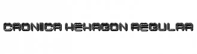
( Fonts by Vladimir Nikolic - www.creativefabrica.com/designer/vladimirnikolic/ - Personal-use only. For commercial use please contact owner. )
A bold, geometric font with a hexagonal pattern, offering a modern and futuristic style.
![Cronica Hexagon Regular Frei Schriftart Herunterladen]() Herunterladen 45 Downloads@WebFont
Herunterladen 45 Downloads@WebFont -
( Fonts by Creatype Studio - Rian Rahardi - Personal-use only. For commercial use please contact owner. )
A bold, hand-drawn font with an energetic and playful style.
![Jattayu Regular Frei Schriftart Herunterladen]() Herunterladen 45 Downloads@WebFont
Herunterladen 45 Downloads@WebFont -
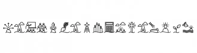
( Fonts by Kaiky Fernandez - Personal-use only. For commercial use please contact owner. )
Monoline religious and community icon set with a minimal, decorative style.
![Liturgica Semibold Frei Schriftart Herunterladen]() Herunterladen 45 Downloads@WebFont
Herunterladen 45 Downloads@WebFont -
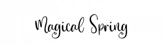
( Fonts by sronstudio - Yusron Billah - Personal-use only. For commercial use please contact owner. )
A whimsical, cursive font with elegant loops and swirls.
![Magical Spring Frei Schriftart Herunterladen]() Herunterladen 45 Downloads@WebFont
Herunterladen 45 Downloads@WebFont -
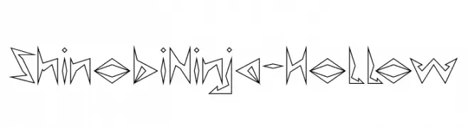
( Fonts by weknow - Wino S Kadir - Personal-use only. For commercial use please contact owner. )
A bold, angular font with a futuristic and edgy style.
![Shinobi Ninja-Hollow Frei Schriftart Herunterladen]() Herunterladen 45 Downloads@WebFont
Herunterladen 45 Downloads@WebFont -
( Fonts by Khurasan - Syaf Rizal - Personal-use only. For commercial use please contact owner. )
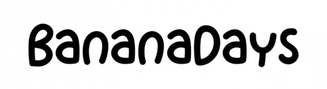
A playful, rounded, and handwritten-style font with smooth curves.
![Banana Days Frei Schriftart Herunterladen]() Herunterladen 45 Downloads@WebFont
Herunterladen 45 Downloads@WebFont -
( Fonts by Zetafonts - Personal-use only. For commercial use please contact owner. )
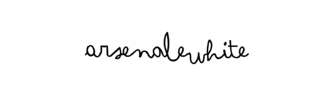
A playful, handwritten cursive font with fluid, connected strokes.
![Arsenale White Frei Schriftart Herunterladen]() Herunterladen 45 Downloads@WebFont
Herunterladen 45 Downloads@WebFont -
( Fonts by Puri Creative - Personal-use only. For commercial use please contact owner. )
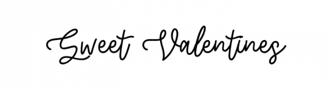
A charming and fluid script font with elegant, flowing curves and smooth connections.
![Sweet Valentines Frei Schriftart Herunterladen]() Herunterladen 45 Downloads@WebFont
Herunterladen 45 Downloads@WebFont -
( Fonts by The Docallisme - Amry Al Mursalaat - Personal-use only. For commercial use please contact owner. )
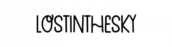
A playful, handwritten font with a casual and friendly style.
![Lost In The Sky Frei Schriftart Herunterladen]() Herunterladen 45 Downloads@WebFont
Herunterladen 45 Downloads@WebFont -
( Fonts by ijem - Ferdiansyah Ferdiansyah - Personal-use only. For commercial use please contact owner. )
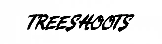
A bold, handwritten font with dynamic strokes and expressive style.
![TREESHOOTS Frei Schriftart Herunterladen]() Herunterladen 45 Downloads@WebFont
Herunterladen 45 Downloads@WebFont -
( Fonts by Khurasan - Syaf Rizal - Personal-use only. For commercial use please contact owner. )
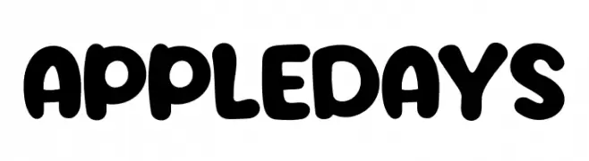
A playful, bold font with rounded, thick letterforms and a whimsical style.
![Apple Days Frei Schriftart Herunterladen]() Herunterladen 45 Downloads@WebFont
Herunterladen 45 Downloads@WebFont -
( Fonts by AukimVisuel - Audry Kitoko Makelele - Personal-use only. For commercial use please contact owner. )
A bold, italicized brush font with expanded, expressive strokes.
![Kumba Brush Expanded Italic Frei Schriftart Herunterladen]() Herunterladen 45 Downloads@WebFont
Herunterladen 45 Downloads@WebFont -
( Fonts by Creatype Studio - Rian Rahardi - Personal-use only. For commercial use please contact owner. )
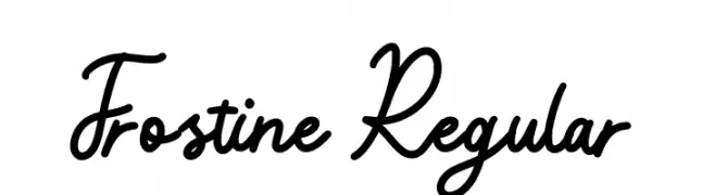
A flowing, cursive script font with elegant loops and smooth connections.
![Frostine Regular Frei Schriftart Herunterladen]() Herunterladen 45 Downloads@WebFont
Herunterladen 45 Downloads@WebFont -
( Fonts by Maulana Creative - Gilang Maulana - Personal-use only. For commercial use please contact owner. )
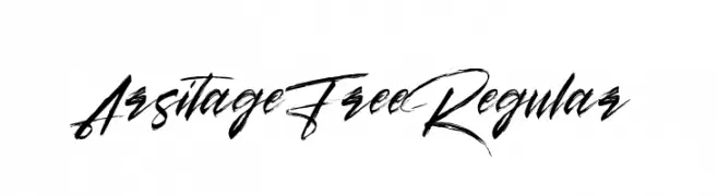
A dynamic and expressive script font with fluid, sweeping strokes.
![Arsitage Free Regular Frei Schriftart Herunterladen]() Herunterladen 45 Downloads@WebFont
Herunterladen 45 Downloads@WebFont -
( Fonts by Vladimir Nikolic - Personal-use only. For commercial use please contact owner. )
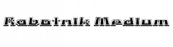
A bold, geometric font with a retro 3D video game aesthetic.
![Rabotnik Medium Frei Schriftart Herunterladen]() Herunterladen 45 Downloads@WebFont
Herunterladen 45 Downloads@WebFont -
( Fonts by Tokokoo Studio )
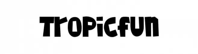
Bold, playful display font with irregular shapes and high contrast.
![Tropicfun Frei Schriftart Herunterladen]() Herunterladen 45 Downloads@WebFont
Herunterladen 45 Downloads@WebFont -
( Fonts by Inermedia Studio - Personal-use only. For commercial use please contact owner. )
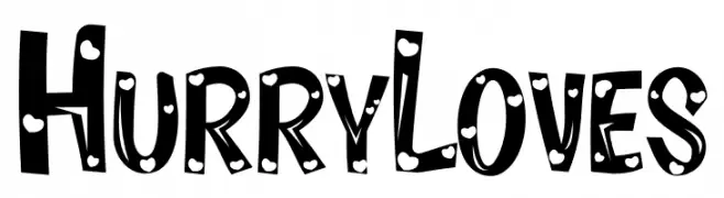
A playful, bold font with polka dot patterns and cartoonish style.
![Hurry Loves Frei Schriftart Herunterladen]() Herunterladen 45 Downloads@WebFont
Herunterladen 45 Downloads@WebFont -
( Fonts by UkiyoMoji Fonts - Haley Wakamatsu - Personal-use only. For commercial use please contact owner. )
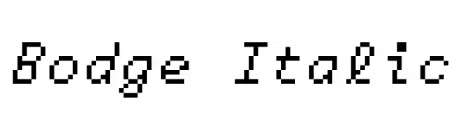
A pixelated, monospaced italic font with a retro digital aesthetic.
![Bodge Italic Frei Schriftart Herunterladen]() Herunterladen 45 Downloads@WebFont
Herunterladen 45 Downloads@WebFont -
( Fonts by Dominik Krotscheck - Personal-use only. For commercial use please contact owner. )
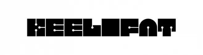
A bold, geometric font with futuristic and symmetrical design elements.
![Keel Fat Frei Schriftart Herunterladen]() Herunterladen 45 Downloads@WebFont
Herunterladen 45 Downloads@WebFont -
( Fonts by Thirtypath - Personal-use only. For commercial use please contact owner. )
An elegant script font with flowing, cursive strokes and decorative flourishes.
![Mandymores Frei Schriftart Herunterladen]() Herunterladen 45 Downloads@WebFont
Herunterladen 45 Downloads@WebFont -
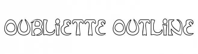
( Fonts by Daniel Zadorozny - www.iconian.com - Personal-use only. For commercial use please contact owner. )
An artistic outline font with bold, decorative characters.
![Oubliette Outline Frei Schriftart Herunterladen]() Herunterladen 45 Downloads@WebFont
Herunterladen 45 Downloads@WebFont -
( Fonts by Md Shohail Bhuian - Personal-use only. For commercial use please contact owner. )
A playful, handwritten font with a modern and friendly style.
![Sweet Summer Frei Schriftart Herunterladen]() Herunterladen 45 Downloads@WebFont
Herunterladen 45 Downloads@WebFont -
( Fonts by StringLabs - stringlabscreative.com - Personal-use only. For commercial use please contact owner. )
A dynamic and elegant script font with fluid strokes.
![Astayfattony Frei Schriftart Herunterladen]() Herunterladen 45 Downloads@WebFont
Herunterladen 45 Downloads@WebFont -
( Fonts by Mans Greback - www.mansgreback.com - Personal-use only. For commercial use please contact owner. )
A playful, casual handwritten font with smooth, rounded curves.
![Sugar Cream Frei Schriftart Herunterladen]() Herunterladen 45 Downloads@WebFont
Herunterladen 45 Downloads@WebFont -
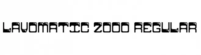
( Fonts by Damien Gosset )
A futuristic, geometric font with bold shapes and cut-out elements.
![Lavomatic 2000 Regular Frei Schriftart Herunterladen]() Herunterladen 45 Downloads@WebFont
Herunterladen 45 Downloads@WebFont -
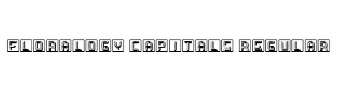
( Fonts by Vladimir Nikolic )
A decorative font with bold, framed letters featuring intricate line patterns.
![Floralogy Capitals Regular Frei Schriftart Herunterladen]() Herunterladen 45 Downloads@WebFont
Herunterladen 45 Downloads@WebFont -
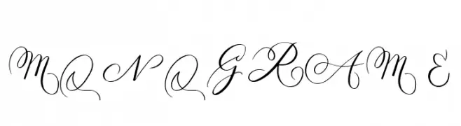
( Fonts by AminMario - Amin Mario - Personal-use only. For commercial use please contact owner. )
An elegant script font with intricate swirls and flourishes, perfect for luxurious designs.
![MONOGRAM E Frei Schriftart Herunterladen]() Herunterladen 45 Downloads@WebFont
Herunterladen 45 Downloads@WebFont -
( Fonts by AukimVisuel - Audry Kitoko Makelele - Personal-use only. For commercial use please contact owner. )
A bold, italicized font with a modern, geometric style.
![Kumba College Italic Frei Schriftart Herunterladen]() Herunterladen 45 Downloads@WebFont
Herunterladen 45 Downloads@WebFont


Welche Schriften sind gerade am populärsten?
Poppins, Roboto, Montserrat, Open Sans und Lato sind wegen ihrer klaren Formen und breiten Einsetzbarkeit sehr gefragt – von Markenauftritt über Landingpages bis hin zu Postern.
Welche Fonts eignen sich für Logos?
Geometrische Sans‑Serifs (z. B. Poppins, Familien im Gotham‑Stil) sind ein häufiger Griff für sauberes, skalierbares Branding. Für eine persönlichere Note bleiben Scripts und Handschrift‑Stile beliebt. Kombinieren Sie einen prägnanten Headline‑Font mit einer neutralen Brotschrift für Wiedererkennung und Harmonie.
Wie oft wird die Top‑Liste aktualisiert?
Regelmäßig – basierend auf realen Downloads und Interaktionen. Schauen Sie öfter vorbei, um aufstrebende Favoriten früh zu entdecken.
💡 Tipp: Seite bookmarken – Trends wechseln schnell, und heutige Top‑Schriften inspirieren morgen vielleicht das Rebranding.