Willkommen bei den Top‑Schriften – hier treffen Beliebtheit und Qualität aufeinander. Das sind die in diesem Jahr am häufigsten heruntergeladenen und genutzten Fonts. Wenn Sie sichere Optionen für Logo, Web oder Social suchen, starten Sie hier.
Jeder Top‑Font überzeugt durch Balance, Lesbarkeit und Vielseitigkeit. Sie finden moderne Sans‑Serifs, elegante Scripts, Vintage‑Serifs und minimalistische Displays.
-
( Fonts by Iconian Fonts - Daniel Zadorozny - Personal-use only. For commercial use please contact owner. )
A futuristic, italicized font with sharp edges and a dynamic, modern style.
 Herunterladen 46 Downloads@WebFont
 -
( Fonts by Daniel Zadorozny - www.iconian.com - Personal-use only. For commercial use please contact owner. )
A playful 3D font with bold, rounded characters and a whimsical style.
![Charmling 3D Frei Schriftart Herunterladen]() Herunterladen 46 Downloads@WebFont
Herunterladen 46 Downloads@WebFont -
( Fonts by Dikas Studio - Andika Setiawan - Personal-use only. For commercial use please contact owner. )
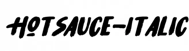
A bold, brush script font with a dynamic, hand-painted style.
![HotSauce-Italic Frei Schriftart Herunterladen]() Herunterladen 46 Downloads@WebFont
Herunterladen 46 Downloads@WebFont -
( Fonts by HansCo - Burhan Afif - Personal-use only. For commercial use please contact owner. )
A bold, playful handwritten font with smooth curves and a lively appearance.
![Kayla Story Frei Schriftart Herunterladen]() Herunterladen 46 Downloads@WebFont
Herunterladen 46 Downloads@WebFont -
( Fonts by MJB Letters - Muhammad Mujibulloh - Personal-use only. For commercial use please contact owner. )
A flowing, elegant script font with smooth, rounded edges and consistent stroke width.
![Kastella Frei Schriftart Herunterladen]() Herunterladen 46 Downloads@WebFont
Herunterladen 46 Downloads@WebFont -
( Fonts by Vladimir Nikolic - www.creativefabrica.com/designer/vladimirnikolic/ - Personal-use only. For commercial use please contact owner. )
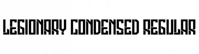
A bold, geometric, and condensed font with a futuristic and industrial style.
![Legionary Condensed Regular Frei Schriftart Herunterladen]() Herunterladen 46 Downloads@WebFont
Herunterladen 46 Downloads@WebFont -
( Fonts by Iconian Fonts - Daniel Zadorozny - Personal-use only. For commercial use please contact owner. )
Bold, semi-italic stencil font with angular strokes and cut-out sections.
![Free Shipping Semi-Italic Frei Schriftart Herunterladen]() Herunterladen 46 Downloads@WebFont
Herunterladen 46 Downloads@WebFont -
( Fonts by Thirtypath - Personal-use only. For commercial use please contact owner. )
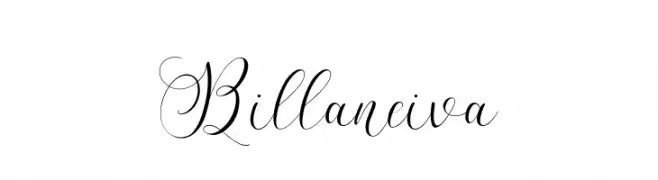
An elegant script font with flowing lines and intricate swashes.
![Billaneiva Frei Schriftart Herunterladen]() Herunterladen 46 Downloads@WebFont
Herunterladen 46 Downloads@WebFont -
( Fonts by Letterena Studios - letterena.com - Personal-use only. For commercial use please contact owner. )
An elegant script font with ornate, flowing letterforms.
![Laylarita Frei Schriftart Herunterladen]() Herunterladen 46 Downloads@WebFont
Herunterladen 46 Downloads@WebFont -
( Fonts by Nirmana Visual - Sigit Dwipa - Personal-use only. For commercial use please contact owner. )
A bold, brushstroke-style font with dynamic and artistic flair.
![ArtistikDemoVersioRegular Frei Schriftart Herunterladen]() Herunterladen 46 Downloads@WebFont
Herunterladen 46 Downloads@WebFont -
( Fonts by ReyreyBlue - Reyrey Blue - Personal-use only. For commercial use please contact owner. )
An elegant script font with flowing, cursive letterforms and decorative flourishes.
![Paisleigh Frei Schriftart Herunterladen]() Herunterladen 46 Downloads@WebFont
Herunterladen 46 Downloads@WebFont -
( Fonts by Typodermic Fonts - Raymond Larabie - Personal-use only. For commercial use please contact owner. )
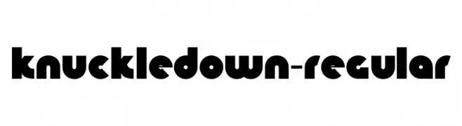
A bold, geometric font with circular shapes and a modern, playful style.
![KnuckleDown-Regular Frei Schriftart Herunterladen]() Herunterladen 46 Downloads@WebFont
Herunterladen 46 Downloads@WebFont -
( Fonts by Woodcutter Manero - www.woodcutter.es - Personal-use only. For commercial use please contact owner. )
Chunky, textured display font with playful, hand-drawn style.
![Cirujano Liberal Frei Schriftart Herunterladen]() Herunterladen 46 Downloads@WebFont
Herunterladen 46 Downloads@WebFont -
( Fonts by Vladimir Nikolic - www.creativefabrica.com/designer/vladimirnikolic/ - Personal-use only. For commercial use please contact owner. )
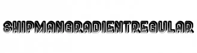
A bold, decorative font with a gradient effect for a 3D look.
![Shipman Gradient Regular Frei Schriftart Herunterladen]() Herunterladen 46 Downloads@WebFont
Herunterladen 46 Downloads@WebFont -
( Fonts by Nirmana Visual - Sigit Dwipa - Personal-use only. For commercial use please contact owner. )
A bold, artistic font with a hand-drawn, dynamic style.
![Artistik Demo Versio Frei Schriftart Herunterladen]() Herunterladen 46 Downloads@WebFont
Herunterladen 46 Downloads@WebFont -
( Fonts by Vunira Design - Personal-use only. For commercial use please contact owner. )
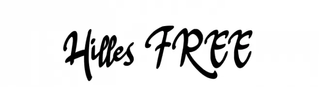
A bold, flowing script font with elegant, interconnected characters.
![Hilles FREE Frei Schriftart Herunterladen]() Herunterladen 46 Downloads@WebFont
Herunterladen 46 Downloads@WebFont -
( Fonts by Vladimir Nikolic - www.creativefabrica.com/designer/vladimirnikolic/ - Personal-use only. For commercial use please contact owner. )
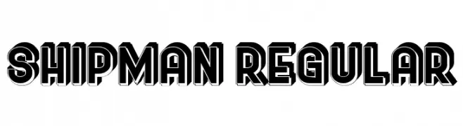
Bold, decorative font with a 3D shadow effect.
![Shipman Regular Frei Schriftart Herunterladen]() Herunterladen 46 Downloads@WebFont
Herunterladen 46 Downloads@WebFont -
( Fonts by Glendi Prasetyo - Personal-use only. For commercial use please contact owner. )
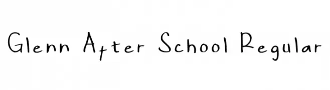
A playful, handwritten font with a casual and friendly style.
![Glenn After School Regular Frei Schriftart Herunterladen]() Herunterladen 46 Downloads@WebFont
Herunterladen 46 Downloads@WebFont -
( Fonts by Stefani Letter - Stefani Tri Rosa - Personal-use only. For commercial use please contact owner. )
A playful and elegant script font with flowing, cursive letterforms.
![Allofera Frei Schriftart Herunterladen]() Herunterladen 46 Downloads@WebFont
Herunterladen 46 Downloads@WebFont -
( Fonts by weknow - Wino S Kadir - Personal-use only. For commercial use please contact owner. )
A bold, flame-inspired font with high contrast and dynamic curves.
![ETERNAL FLAME-Inverse Frei Schriftart Herunterladen]() Herunterladen 46 Downloads@WebFont
Herunterladen 46 Downloads@WebFont -
( Fonts by Nur Solikh - Personal-use only. For commercial use please contact owner. )
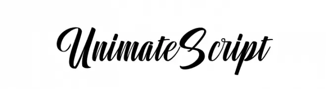
A bold and elegant script font with flowing, cursive letterforms.
![Unimate Script Frei Schriftart Herunterladen]() Herunterladen 46 Downloads@WebFont
Herunterladen 46 Downloads@WebFont -
( Fonts by Rayn Media - Rayan - Personal-use only. For commercial use please contact owner. )
A dynamic, cursive script font with medium contrast and elegant flow.
![Blackside Frei Schriftart Herunterladen]() Herunterladen 46 Downloads@WebFont
Herunterladen 46 Downloads@WebFont -
( Fonts by Woodcutter Manero - www.woodcutter.es - Personal-use only. For commercial use please contact owner. )
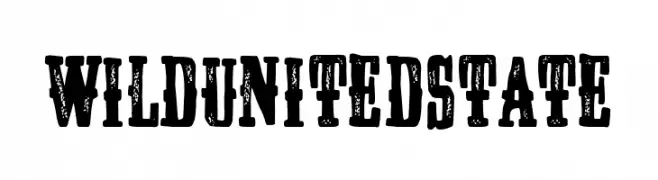
Distressed, bold slab serif with a rugged, vintage look.
![Wild United State Frei Schriftart Herunterladen]() Herunterladen 46 Downloads@WebFont
Herunterladen 46 Downloads@WebFont -
( Fonts by Edric Studio - Personal-use only. For commercial use please contact owner. )
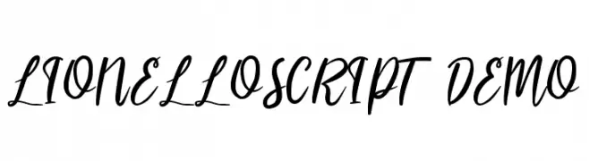
A flowing, elegant script font with medium contrast and a modern calligraphic style.
![LIONELLOSCRIPT DEMO Frei Schriftart Herunterladen]() Herunterladen 46 Downloads@WebFont
Herunterladen 46 Downloads@WebFont -
( Fonts by OCSstudio - Oki Candra Setiawan - Personal-use only. For commercial use please contact owner. )
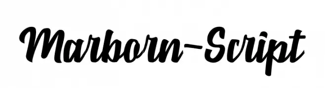
A bold, flowing script font with elegant curves and medium contrast.
![Marborn-Script Frei Schriftart Herunterladen]() Herunterladen 46 Downloads@WebFont
Herunterladen 46 Downloads@WebFont -
( Fonts by Sungi Creative - Ivan Pranata - Personal-use only. For commercial use please contact owner. )
A delicate, elegant script font with a handwritten style.
![Askania Frei Schriftart Herunterladen]() Herunterladen 46 Downloads@WebFont
Herunterladen 46 Downloads@WebFont -
( Fonts by Lunas Type )
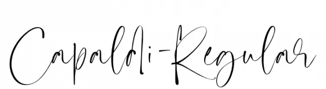
A dynamic and flowing handwritten font with elegant, interconnected strokes.
![Capaldi-Regular Frei Schriftart Herunterladen]() Herunterladen 46 Downloads@WebFont
Herunterladen 46 Downloads@WebFont -
( Fonts by Woodcutter Manero - www.woodcutter.es - Personal-use only. For commercial use please contact owner. )
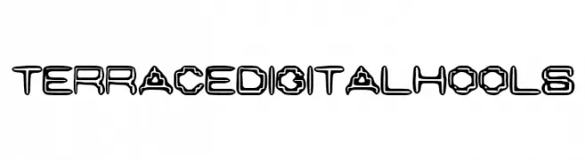
Outlined, geometric display font with a digital, futuristic look.
![Terrace Digital Hools Frei Schriftart Herunterladen]() Herunterladen 46 Downloads@WebFont
Herunterladen 46 Downloads@WebFont -
( Fonts by Vladimir Nikolic - www.creativefabrica.com/designer/vladimirnikolic/ - Personal-use only. For commercial use please contact owner. )
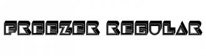
A bold, geometric font with a three-dimensional effect and sharp angles.
![Freezer Regular Frei Schriftart Herunterladen]() Herunterladen 46 Downloads@WebFont
Herunterladen 46 Downloads@WebFont -
( Fonts by Graphue - Personal-use only. For commercial use please contact owner. )
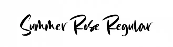
A bold, expressive handwritten font with fluid strokes and dynamic style.
![Summer Rose Regular Frei Schriftart Herunterladen]() Herunterladen 46 Downloads@WebFont
Herunterladen 46 Downloads@WebFont -
( Fonts by Iconian Fonts - Daniel Zadorozny - Personal-use only. For commercial use please contact owner. )
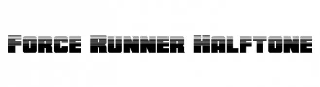
A bold, futuristic font with a halftone effect and dynamic, block-like forms.
![Force Runner Halftone Frei Schriftart Herunterladen]() Herunterladen 46 Downloads@WebFont
Herunterladen 46 Downloads@WebFont -
( Fonts by NanaNissa - Personal-use only. For commercial use please contact owner. )
A graceful and elegant cursive font with flowing, intricate details.
![Ainsley Frei Schriftart Herunterladen]() Herunterladen 46 Downloads@WebFont
Herunterladen 46 Downloads@WebFont -
( Fonts by Rayn Media - Rayan - Personal-use only. For commercial use please contact owner. )
A fluid, elegant script font with a modern yet classic handwritten style.
![Syaquilla Frei Schriftart Herunterladen]() Herunterladen 46 Downloads@WebFont
Herunterladen 46 Downloads@WebFont -
( Fonts by Sungi Creative - Ivan Pranata - Personal-use only. For commercial use please contact owner. )
A playful, hand-drawn font with a whimsical and friendly style.
![Parisio Frei Schriftart Herunterladen]() Herunterladen 46 Downloads@WebFont
Herunterladen 46 Downloads@WebFont -
( Fonts by Typodermic Fonts - Raymond Larabie - Personal-use only. For commercial use please contact owner. )
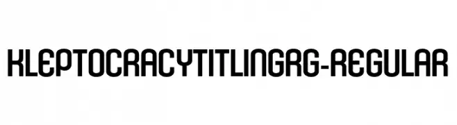
A bold, modern, and geometric font with a condensed structure.
![KleptocracyTitlingRg-Regular Frei Schriftart Herunterladen]() Herunterladen 46 Downloads@WebFont
Herunterladen 46 Downloads@WebFont


Welche Schriften sind gerade am populärsten?
Poppins, Roboto, Montserrat, Open Sans und Lato sind wegen ihrer klaren Formen und breiten Einsetzbarkeit sehr gefragt – von Markenauftritt über Landingpages bis hin zu Postern.
Welche Fonts eignen sich für Logos?
Geometrische Sans‑Serifs (z. B. Poppins, Familien im Gotham‑Stil) sind ein häufiger Griff für sauberes, skalierbares Branding. Für eine persönlichere Note bleiben Scripts und Handschrift‑Stile beliebt. Kombinieren Sie einen prägnanten Headline‑Font mit einer neutralen Brotschrift für Wiedererkennung und Harmonie.
Wie oft wird die Top‑Liste aktualisiert?
Regelmäßig – basierend auf realen Downloads und Interaktionen. Schauen Sie öfter vorbei, um aufstrebende Favoriten früh zu entdecken.
💡 Tipp: Seite bookmarken – Trends wechseln schnell, und heutige Top‑Schriften inspirieren morgen vielleicht das Rebranding.