Willkommen bei den Top‑Schriften – hier treffen Beliebtheit und Qualität aufeinander. Das sind die in diesem Jahr am häufigsten heruntergeladenen und genutzten Fonts. Wenn Sie sichere Optionen für Logo, Web oder Social suchen, starten Sie hier.
Jeder Top‑Font überzeugt durch Balance, Lesbarkeit und Vielseitigkeit. Sie finden moderne Sans‑Serifs, elegante Scripts, Vintage‑Serifs und minimalistische Displays.
-
( Fonts by K_IN Studio - Personal-use only. For commercial use please contact owner. )
A playful and whimsical font with rounded, flowing letterforms.
 Herunterladen 46 Downloads@WebFont
 -
( Fonts by JibbaJabba Fonts - Jibba Jabba - Personal-use only. For commercial use please contact owner. )
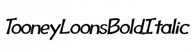
A bold, italicized font with playful and dynamic letterforms.
![Tooney Loons Bold Italic Frei Schriftart Herunterladen]() Herunterladen 46 Downloads@WebFont
Herunterladen 46 Downloads@WebFont -
( Fonts by Typodermic Fonts - Raymond Larabie - Personal-use only. For commercial use please contact owner. )
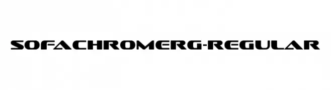
A bold, futuristic font with sharp, angular edges and a geometric structure.
![SofachromeRg-Regular Frei Schriftart Herunterladen]() Herunterladen 46 Downloads@WebFont
Herunterladen 46 Downloads@WebFont -
( Fonts by Mans Greback - www.mansgreback.com - Personal-use only. For commercial use please contact owner. )
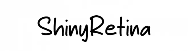
A playful, casual handwritten font with smooth, rounded strokes.
![Shiny Retina Frei Schriftart Herunterladen]() Herunterladen 46 Downloads@WebFont
Herunterladen 46 Downloads@WebFont -
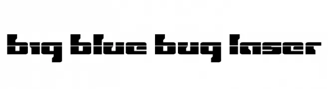
( Fonts by Daniel Zadorozny - www.iconian.com - Personal-use only. For commercial use please contact owner. )
A bold, geometric font with a futuristic and industrial design.
![Big Blue Bug Laser Frei Schriftart Herunterladen]() Herunterladen 46 Downloads@WebFont
Herunterladen 46 Downloads@WebFont -
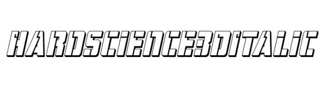
( Fonts by Iconian Fonts - Daniel Zadorozny - Personal-use only. For commercial use please contact owner. )
A bold, 3D italic font with a futuristic and dynamic style.
![Hard Science 3D Italic Frei Schriftart Herunterladen]() Herunterladen 46 Downloads@WebFont
Herunterladen 46 Downloads@WebFont -
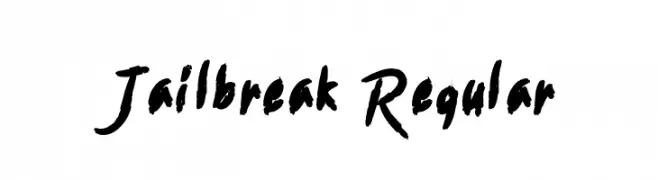
( Fonts by Heypen Type - Personal-use only. For commercial use please contact owner. )
A bold, brush-style font with high contrast and dynamic, hand-drawn aesthetics.
![Jailbreak-Regular Frei Schriftart Herunterladen]() Herunterladen 46 Downloads@WebFont
Herunterladen 46 Downloads@WebFont -
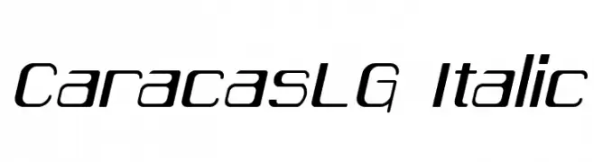
( Fonts by Jorge Algarin - Personal-use only. For commercial use please contact owner. )
A modern, italicized font with a sleek and dynamic design.
![CaracasLG Italic Frei Schriftart Herunterladen]() Herunterladen 46 Downloads@WebFont
Herunterladen 46 Downloads@WebFont -
( Fonts by Letterhend Studio - Hendry Juanda - Personal-use only. For commercial use please contact owner. )
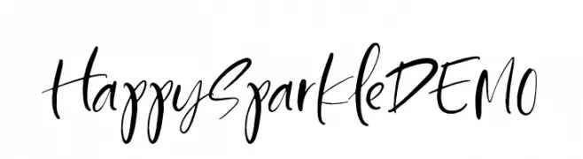
A lively, handwritten font with fluid strokes and a playful, casual style.
![HappySparkleDEMO Frei Schriftart Herunterladen]() Herunterladen 46 Downloads@WebFont
Herunterladen 46 Downloads@WebFont -
( Fonts by Mans Greback - Personal-use only. For commercial use please contact owner. )
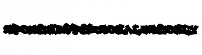
A bold, graffiti-inspired font with a dynamic, urban aesthetic.
![Spoken BG PERSONAL USE ONLY Frei Schriftart Herunterladen]() Herunterladen 46 Downloads@WebFont
Herunterladen 46 Downloads@WebFont -
( Fonts by Iconian Fonts - Daniel Zadorozny - Personal-use only. For commercial use please contact owner. )
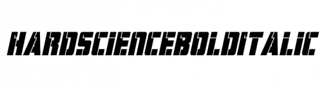
A bold, italicized, futuristic font with sharp angles and a dynamic design.
![Hard Science Bold Italic Frei Schriftart Herunterladen]() Herunterladen 46 Downloads@WebFont
Herunterladen 46 Downloads@WebFont -
( Fonts by ONG Type )
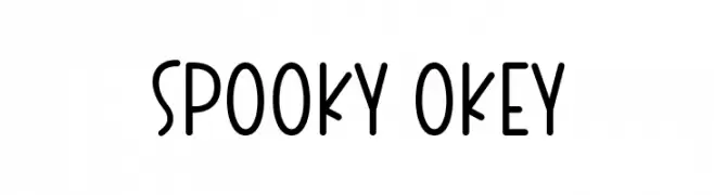
Tall, quirky sans-serif with playful, spooky character.
![Spooky Okey Frei Schriftart Herunterladen]() Herunterladen 46 Downloads@WebFont
Herunterladen 46 Downloads@WebFont -
( Fonts by Graphix Line Studio - Personal-use only. For commercial use please contact owner. )
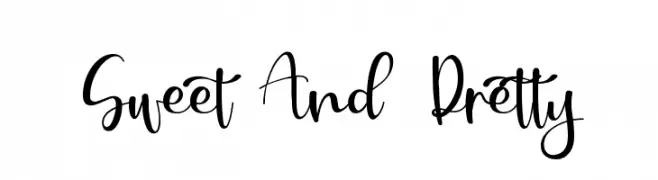
A playful, cursive script font with a whimsical and elegant style.
![Sweet And Pretty Frei Schriftart Herunterladen]() Herunterladen 46 Downloads@WebFont
Herunterladen 46 Downloads@WebFont -
( Fonts by Hanoded - David Kerkhoff - Personal-use only. For commercial use please contact owner. )
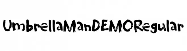
A bold, brush-stroke style font with artistic flair and playful umbrella motifs.
![Umbrella Man DEMO Regular Frei Schriftart Herunterladen]() Herunterladen 46 Downloads@WebFont
Herunterladen 46 Downloads@WebFont -
( Fonts by ToniStudio - Fatoni Nurman - Personal-use only. For commercial use please contact owner. )
A playful, childlike font with whimsical curves and angles.
![childspon Frei Schriftart Herunterladen]() Herunterladen 46 Downloads@WebFont
Herunterladen 46 Downloads@WebFont -
( Fonts by Yoga Letter - Isroni Yoga Prasetya - Personal-use only. For commercial use please contact owner. )
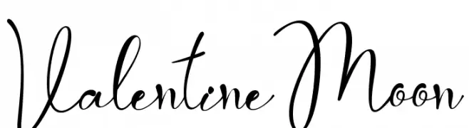
A whimsical and elegant script font with flowing, interconnected letters.
![Valentine Moon Frei Schriftart Herunterladen]() Herunterladen 46 Downloads@WebFont
Herunterladen 46 Downloads@WebFont -
( Fonts by sronstudio - Yusron Billah - Personal-use only. For commercial use please contact owner. )
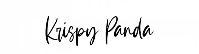
A playful, handwritten font with dynamic, cursive strokes.
![Krispy Panda Frei Schriftart Herunterladen]() Herunterladen 46 Downloads@WebFont
Herunterladen 46 Downloads@WebFont -
( Fonts by Mans Greback - www.mansgreback.com - Personal-use only. For commercial use please contact owner. )
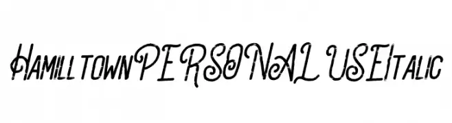
A bold, italic handwritten font with a vintage, distressed texture.
![Hamilltown PERSONAL USE Italic Frei Schriftart Herunterladen]() Herunterladen 46 Downloads@WebFont
Herunterladen 46 Downloads@WebFont -
( Fonts by Brittney Murphy Design )
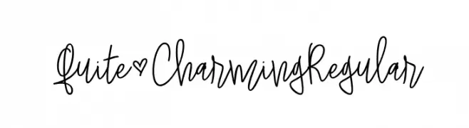
Casual handwritten script with tall, narrow forms.
![Quite*Charming Regular Frei Schriftart Herunterladen]() Herunterladen 46 Downloads@WebFont
Herunterladen 46 Downloads@WebFont -
( Fonts by Motokiwo - Anton Cahyono - Personal-use only. For commercial use please contact owner. )
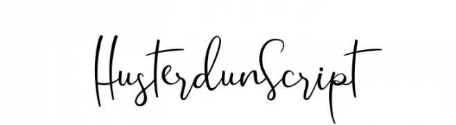
A lively and elegant script font with flowing, dynamic curves.
![HusterdunScript Frei Schriftart Herunterladen]() Herunterladen 46 Downloads@WebFont
Herunterladen 46 Downloads@WebFont -
( Fonts by Perspectype Studio - Personal-use only. For commercial use please contact owner. )
A fluid, elegant script font with dynamic, connected strokes.
![hand script Frei Schriftart Herunterladen]() Herunterladen 46 Downloads@WebFont
Herunterladen 46 Downloads@WebFont -
( Fonts by Sabrcreative - Personal-use only. For commercial use please contact owner. )
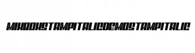
A bold, italicized font with a distressed, stamp-like texture.
![Mixbox Stamp Italic Demo Stamp Italic Frei Schriftart Herunterladen]() Herunterladen 46 Downloads@WebFont
Herunterladen 46 Downloads@WebFont -
( Fonts by Letterara - Thomas Aradea - Personal-use only. For commercial use please contact owner. )
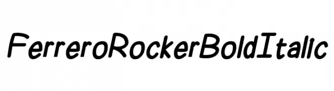
A bold, italic font with smooth, rounded characters and a dynamic slant.
![Ferrero Rocker Bold Italic Frei Schriftart Herunterladen]() Herunterladen 46 Downloads@WebFont
Herunterladen 46 Downloads@WebFont -
( Fonts by Vladimir Nikolic - www.creativefabrica.com/designer/vladimirnikolic/ - Personal-use only. For commercial use please contact owner. )
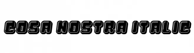
A bold, italicized font with a three-dimensional, decorative style.
![Cosa Nostra Italic Frei Schriftart Herunterladen]() Herunterladen 46 Downloads@WebFont
Herunterladen 46 Downloads@WebFont -
( Fonts by Mans Greback - Personal-use only. For commercial use please contact owner. )
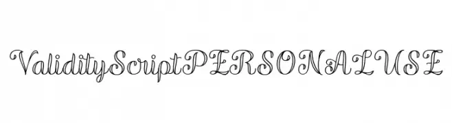
An elegant script font with flowing, decorative loops and smooth strokes.
![ValidityScriptPERSONALUSE Frei Schriftart Herunterladen]() Herunterladen 46 Downloads@WebFont
Herunterladen 46 Downloads@WebFont -
( Fonts by Nuryanto Dwi - Personal-use only. For commercial use please contact owner. )
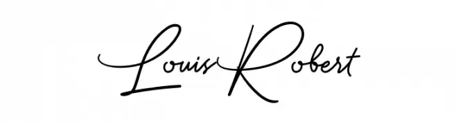
A cursive, handwritten font with elegant and flowing lines.
![Louis Robert Frei Schriftart Herunterladen]() Herunterladen 46 Downloads@WebFont
Herunterladen 46 Downloads@WebFont -
( Fonts by ToniStudio - Fatoni Nurman - Personal-use only. For commercial use please contact owner. )
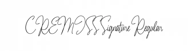
A modern, elegant script font with a fluid, handwritten style.
![CREMISS Signature Regular Frei Schriftart Herunterladen]() Herunterladen 46 Downloads@WebFont
Herunterladen 46 Downloads@WebFont -
( Fonts by Andrey Font Design - Personal-use only. For commercial use please contact owner. )
A graceful script font with flowing, cursive strokes and elegant loops.
![Rathya Frei Schriftart Herunterladen]() Herunterladen 46 Downloads@WebFont
Herunterladen 46 Downloads@WebFont -
( Fonts by Sidkia Nurisa Firda )
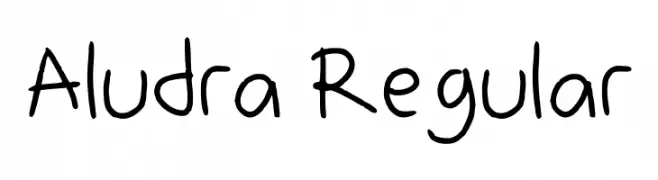
A playful handwritten sans-serif font with rounded, even strokes.
![Aludra Regular Frei Schriftart Herunterladen]() Herunterladen 46 Downloads@WebFont
Herunterladen 46 Downloads@WebFont -
( Fonts by Garisman Studio - Risman Ginarwan - Personal-use only. For commercial use please contact owner. )
A bold, dynamic script font with sweeping curves and high contrast.
![Wardness Frei Schriftart Herunterladen]() Herunterladen 46 Downloads@WebFont
Herunterladen 46 Downloads@WebFont -
( Fonts by K_IN Studio - Personal-use only. For commercial use please contact owner. )
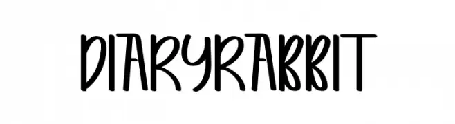
A playful, handwritten font with tall, narrow letters and a modern aesthetic.
![DIARY RABBIT Frei Schriftart Herunterladen]() Herunterladen 46 Downloads@WebFont
Herunterladen 46 Downloads@WebFont -
( Fonts by Nirmana Visual - Sigit Dwipa - Personal-use only. For commercial use please contact owner. )
A cursive script font with elegant, flowing lines and moderate contrast.
![Gilas Frei Schriftart Herunterladen]() Herunterladen 46 Downloads@WebFont
Herunterladen 46 Downloads@WebFont -
( Fonts by MJB Letters - Muhammad Mujibulloh - Personal-use only. For commercial use please contact owner. )
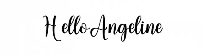
An elegant, flowing script font with a handwritten appearance.
![Hello Angeline Frei Schriftart Herunterladen]() Herunterladen 46 Downloads@WebFont
Herunterladen 46 Downloads@WebFont -
( Fonts by D&K Project - Degi Kurniawan - Personal-use only. For commercial use please contact owner. )
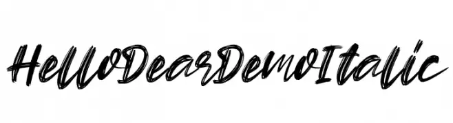
A bold, brush-style italic font with dynamic strokes and a handwritten feel.
![Hello Dear Demo Italic Frei Schriftart Herunterladen]() Herunterladen 46 Downloads@WebFont
Herunterladen 46 Downloads@WebFont -
( Fonts by MJType )
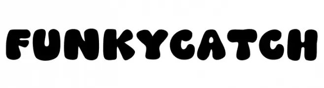
Bold, rounded, and playful display font with a bubbly look.
![Funky Catch Frei Schriftart Herunterladen]() Herunterladen 46 Downloads@WebFont
Herunterladen 46 Downloads@WebFont


Welche Schriften sind gerade am populärsten?
Poppins, Roboto, Montserrat, Open Sans und Lato sind wegen ihrer klaren Formen und breiten Einsetzbarkeit sehr gefragt – von Markenauftritt über Landingpages bis hin zu Postern.
Welche Fonts eignen sich für Logos?
Geometrische Sans‑Serifs (z. B. Poppins, Familien im Gotham‑Stil) sind ein häufiger Griff für sauberes, skalierbares Branding. Für eine persönlichere Note bleiben Scripts und Handschrift‑Stile beliebt. Kombinieren Sie einen prägnanten Headline‑Font mit einer neutralen Brotschrift für Wiedererkennung und Harmonie.
Wie oft wird die Top‑Liste aktualisiert?
Regelmäßig – basierend auf realen Downloads und Interaktionen. Schauen Sie öfter vorbei, um aufstrebende Favoriten früh zu entdecken.
💡 Tipp: Seite bookmarken – Trends wechseln schnell, und heutige Top‑Schriften inspirieren morgen vielleicht das Rebranding.