Willkommen bei den Top‑Schriften – hier treffen Beliebtheit und Qualität aufeinander. Das sind die in diesem Jahr am häufigsten heruntergeladenen und genutzten Fonts. Wenn Sie sichere Optionen für Logo, Web oder Social suchen, starten Sie hier.
Jeder Top‑Font überzeugt durch Balance, Lesbarkeit und Vielseitigkeit. Sie finden moderne Sans‑Serifs, elegante Scripts, Vintage‑Serifs und minimalistische Displays.
-
( Fonts by Albert Kalingga )
A lively handwritten script with a casual, cursive style.
 Herunterladen 46 Downloads@WebFont
 -
( Fonts by Weape Studio )
![Kapuas Frei Schriftart Herunterladen]() Herunterladen 46 Downloads@WebFont
Herunterladen 46 Downloads@WebFont -
( Fonts by Bluestype Studio - Jefri Dwi Alfatah - Personal-use only. For commercial use please contact owner. )
A playful, casual handwritten font with fluid strokes and a whimsical feel.
![The Submit Frei Schriftart Herunterladen]() Herunterladen 46 Downloads@WebFont
Herunterladen 46 Downloads@WebFont -
( Fonts by Iconian Fonts - Daniel Zadorozny - Personal-use only. For commercial use please contact owner. )
A bold, blocky font with a vintage, dramatic style.
![Movie Monster Spaced Frei Schriftart Herunterladen]() Herunterladen 46 Downloads@WebFont
Herunterladen 46 Downloads@WebFont -
( Fonts by Kong Font - Personal-use only. For commercial use please contact owner. )
A bold, playful cursive font with rounded strokes and a lively, dynamic style.
![Candywell Frei Schriftart Herunterladen]() Herunterladen 46 Downloads@WebFont
Herunterladen 46 Downloads@WebFont -
( Fonts by Rantautype - Yudi Pratama Chandra - Personal-use only. For commercial use please contact owner. )
A lively, handwritten font with expressive strokes and a playful yet sophisticated style.
![Bandetta Frei Schriftart Herunterladen]() Herunterladen 46 Downloads@WebFont
Herunterladen 46 Downloads@WebFont -
( Fonts by Balpirick - Personal-use only. For commercial use please contact owner. )
A lively and elegant script font with flowing, cursive letterforms.
![Violetail Frei Schriftart Herunterladen]() Herunterladen 46 Downloads@WebFont
Herunterladen 46 Downloads@WebFont -
( Fonts by Design a Lot - Bogdan Casota - Personal-use only. For commercial use please contact owner. )
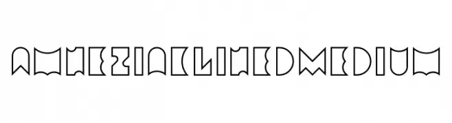
A bold, geometric font with sharp angles and a modern, futuristic style.
![Amneziak Lined Medium Frei Schriftart Herunterladen]() Herunterladen 46 Downloads@WebFont
Herunterladen 46 Downloads@WebFont -
( Fonts by Muhammad Iqbal Faizin - Personal-use only. For commercial use please contact owner. )
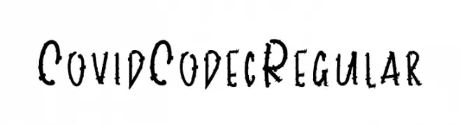
A rugged, hand-drawn font with a distressed and energetic style.
![CovidCodecRegular Frei Schriftart Herunterladen]() Herunterladen 46 Downloads@WebFont
Herunterladen 46 Downloads@WebFont -
( Fonts by Perspectype Studio - Personal-use only. For commercial use please contact owner. )
A bold, playful handwritten font with dynamic curves and loops.
![Hopelove Frei Schriftart Herunterladen]() Herunterladen 46 Downloads@WebFont
Herunterladen 46 Downloads@WebFont -
( Fonts by Pollem Studio - Muhammad Nur - Personal-use only. For commercial use please contact owner. )
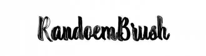
A bold, expressive brush-style font with dynamic strokes and artistic flair.
![Randoem Brush Frei Schriftart Herunterladen]() Herunterladen 46 Downloads@WebFont
Herunterladen 46 Downloads@WebFont -
( Fonts by Rometheme Studio - Yahdi Kumala - Personal-use only. For commercial use please contact owner. )
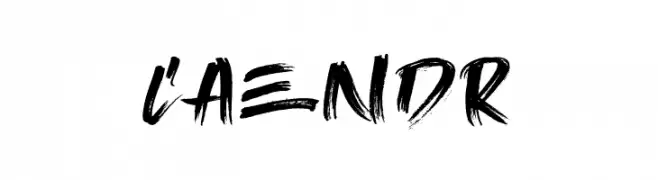
A bold, dynamic brush script font with expressive strokes and artistic flair.
![Caendr Frei Schriftart Herunterladen]() Herunterladen 46 Downloads@WebFont
Herunterladen 46 Downloads@WebFont -
( Fonts by Garisman Studio - Risman Ginarwan - Personal-use only. For commercial use please contact owner. )
A bold, blocky font with sharp, angular edges and dynamic character shapes.
![Blocky Frei Schriftart Herunterladen]() Herunterladen 46 Downloads@WebFont
Herunterladen 46 Downloads@WebFont -
( Fonts by dcoxy - Greg Medina - Personal-use only. For commercial use please contact owner. )
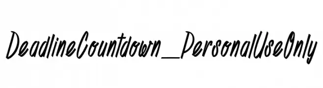
A dynamic, slanted script font with an energetic, handwritten style.
![Deadline Countdown_PersonalUseOnly Frei Schriftart Herunterladen]() Herunterladen 46 Downloads@WebFont
Herunterladen 46 Downloads@WebFont -
( Fonts by Kong Font - fontkong.com - Personal-use only. For commercial use please contact owner. )
A sophisticated, italic script font with elegant, flowing strokes.
![Two Queen Italic Frei Schriftart Herunterladen]() Herunterladen 46 Downloads@WebFont
Herunterladen 46 Downloads@WebFont -
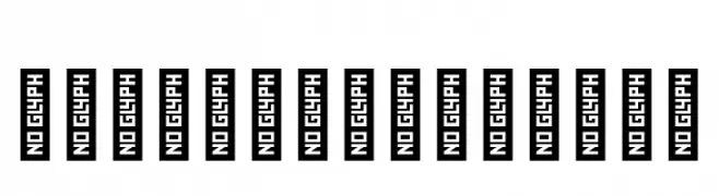
( Fonts by Namela Type )
No valid font is displayed; only placeholder glyphs are present.
![Wakel DEMO Arabic Frei Schriftart Herunterladen]() Herunterladen 46 Downloads@WebFont
Herunterladen 46 Downloads@WebFont -
( Fonts by Analogous Studio - Muhammad Ilham - Personal-use only. For commercial use please contact owner. )
A graceful, flowing script font with elegant curves and a handwritten style.
![magdalena script Frei Schriftart Herunterladen]() Herunterladen 46 Downloads@WebFont
Herunterladen 46 Downloads@WebFont -
( Fonts by Johandika Syahputra Lubis - Personal-use only. For commercial use please contact owner. )
A modern, italic sans-serif font with medium contrast and normal spacing.
![BrandingPro-Italic Frei Schriftart Herunterladen]() Herunterladen 46 Downloads@WebFont
Herunterladen 46 Downloads@WebFont -
( Fonts by Kong Font - Personal-use only. For commercial use please contact owner. )
A modern, italicized font with bold strokes and a sleek, condensed design.
![Archimate Italic Frei Schriftart Herunterladen]() Herunterladen 46 Downloads@WebFont
Herunterladen 46 Downloads@WebFont -
( Fonts by Perspectype Studio - Personal-use only. For commercial use please contact owner. )
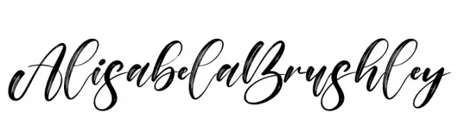
A bold, expressive script font with a lively, handwritten style.
![Alisabela Brushley Frei Schriftart Herunterladen]() Herunterladen 46 Downloads@WebFont
Herunterladen 46 Downloads@WebFont -
( Fonts by Vladimir Nikolic - Personal-use only. For commercial use please contact owner. )
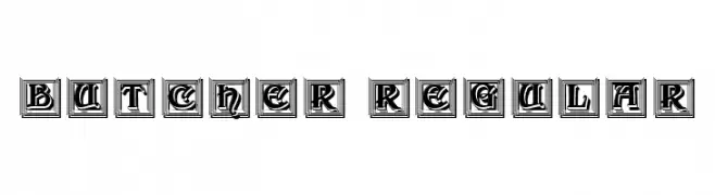
A bold, decorative font with a three-dimensional, boxed style.
![Butcher Regular Frei Schriftart Herunterladen]() Herunterladen 46 Downloads@WebFont
Herunterladen 46 Downloads@WebFont -
( Fonts by Khurasan - Syaf Rizal - Personal-use only. For commercial use please contact owner. )
A bold, brush-style font with dynamic, expressive strokes.
![Marqez Frei Schriftart Herunterladen]() Herunterladen 46 Downloads@WebFont
Herunterladen 46 Downloads@WebFont -
( Fonts by Alpaprana - Personal-use only. For commercial use please contact owner. )
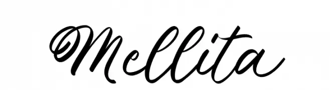
An elegant and flowing script font with ornate uppercase and smooth lowercase letters.
![Mellita Frei Schriftart Herunterladen]() Herunterladen 46 Downloads@WebFont
Herunterladen 46 Downloads@WebFont -
( Fonts by BBA Key - Personal-use only. For commercial use please contact owner. )
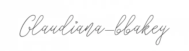
A graceful and elegant script font with flowing, cursive strokes.
![Glaudiana-bbakey Frei Schriftart Herunterladen]() Herunterladen 46 Downloads@WebFont
Herunterladen 46 Downloads@WebFont -
( Fonts by Nanda Muhammad Rifai - Personal-use only. For commercial use please contact owner. )
A bold, geometric font with rounded edges and a modern style.
![smart kid Frei Schriftart Herunterladen]() Herunterladen 46 Downloads@WebFont
Herunterladen 46 Downloads@WebFont -
( Fonts by Woodcutter Manero - www.woodcutter.es - Personal-use only. For commercial use please contact owner. )
Bold, dripping display font with a horror vibe.
![Revenge Team Frei Schriftart Herunterladen]() Herunterladen 46 Downloads@WebFont
Herunterladen 46 Downloads@WebFont -
( Fonts by Pollux of Geminorum - Addy Sukma Bharata - Personal-use only. For commercial use please contact owner. )
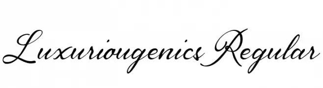
An elegant script font with flowing, cursive letterforms and intricate details.
![Luxuriougenics Regular Frei Schriftart Herunterladen]() Herunterladen 46 Downloads@WebFont
Herunterladen 46 Downloads@WebFont -
( Fonts by Tiny Hand Letter - Nasruni Fajarita - Personal-use only. For commercial use please contact owner. )
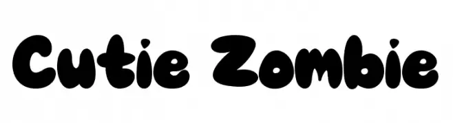
A playful, bold font with rounded, bubbly characters.
![Cutie Zombie Frei Schriftart Herunterladen]() Herunterladen 46 Downloads@WebFont
Herunterladen 46 Downloads@WebFont -
( Fonts by Vladimir Nikolic - Personal-use only. For commercial use please contact owner. )
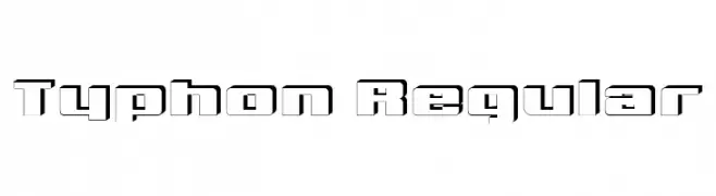
A bold, geometric font with a modern outline style.
![Typhon Regular Frei Schriftart Herunterladen]() Herunterladen 46 Downloads@WebFont
Herunterladen 46 Downloads@WebFont -
( Fonts by weknow - Wino S Kadir - Personal-use only. For commercial use please contact owner. )
A bold, italic font with a modern and dynamic style.
![pandaman Italic Frei Schriftart Herunterladen]() Herunterladen 46 Downloads@WebFont
Herunterladen 46 Downloads@WebFont -
( Fonts by Jadatype - Jada Akbal - Personal-use only. For commercial use please contact owner. )
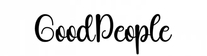
A playful, whimsical script font with a hand-drawn appearance.
![Good People Frei Schriftart Herunterladen]() Herunterladen 46 Downloads@WebFont
Herunterladen 46 Downloads@WebFont -
( Fonts by Letterafa Studio )
![Sweet Romantic Frei Schriftart Herunterladen]() Herunterladen 46 Downloads@WebFont
Herunterladen 46 Downloads@WebFont -
( Fonts by Iconian Fonts - Daniel Zadorozny - Personal-use only. For commercial use please contact owner. )
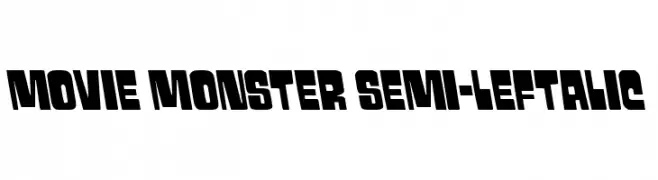
A bold, dynamic font with thick, blocky letters and a slightly slanted orientation.
![Movie Monster Semi-Leftalic Frei Schriftart Herunterladen]() Herunterladen 46 Downloads@WebFont
Herunterladen 46 Downloads@WebFont -
( Fonts by Pollux of Geminorum - Addy Sukma Bharata - Personal-use only. For commercial use please contact owner. )
A lively and dynamic script font with fluid, cursive strokes.
![BelieveDreams Regular Frei Schriftart Herunterladen]() Herunterladen 46 Downloads@WebFont
Herunterladen 46 Downloads@WebFont -
( Fonts by StringLabs - stringlabscreative.com - Personal-use only. For commercial use please contact owner. )
A bold, ornate blackletter font with a medieval, gothic style.
![Bahisy Regular Frei Schriftart Herunterladen]() Herunterladen 46 Downloads@WebFont
Herunterladen 46 Downloads@WebFont


Welche Schriften sind gerade am populärsten?
Poppins, Roboto, Montserrat, Open Sans und Lato sind wegen ihrer klaren Formen und breiten Einsetzbarkeit sehr gefragt – von Markenauftritt über Landingpages bis hin zu Postern.
Welche Fonts eignen sich für Logos?
Geometrische Sans‑Serifs (z. B. Poppins, Familien im Gotham‑Stil) sind ein häufiger Griff für sauberes, skalierbares Branding. Für eine persönlichere Note bleiben Scripts und Handschrift‑Stile beliebt. Kombinieren Sie einen prägnanten Headline‑Font mit einer neutralen Brotschrift für Wiedererkennung und Harmonie.
Wie oft wird die Top‑Liste aktualisiert?
Regelmäßig – basierend auf realen Downloads und Interaktionen. Schauen Sie öfter vorbei, um aufstrebende Favoriten früh zu entdecken.
💡 Tipp: Seite bookmarken – Trends wechseln schnell, und heutige Top‑Schriften inspirieren morgen vielleicht das Rebranding.