Willkommen bei den Top‑Schriften – hier treffen Beliebtheit und Qualität aufeinander. Das sind die in diesem Jahr am häufigsten heruntergeladenen und genutzten Fonts. Wenn Sie sichere Optionen für Logo, Web oder Social suchen, starten Sie hier.
Jeder Top‑Font überzeugt durch Balance, Lesbarkeit und Vielseitigkeit. Sie finden moderne Sans‑Serifs, elegante Scripts, Vintage‑Serifs und minimalistische Displays.
-
 Herunterladen 348 Downloads@WebFont
 -
( fredcre.free.fr )
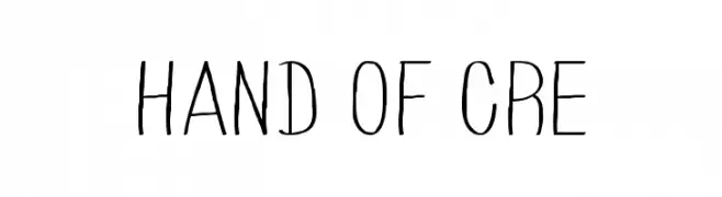
A playful, handwritten font with tall, narrow letters and a casual style.
![HAND OF CRE Frei Schriftart Herunterladen]() Herunterladen 348 Downloads@WebFont
Herunterladen 348 Downloads@WebFont -
( Fonts by dartcanada.tripod.com - Darren Rigby )
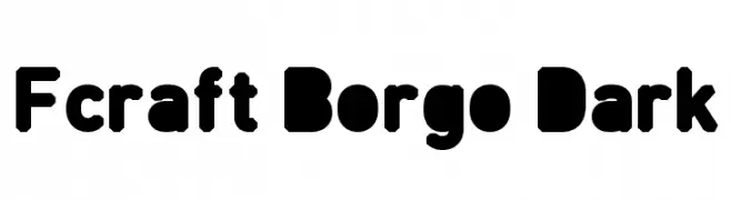
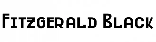
A bold, geometric font with consistent line weights and a modern aesthetic.
![Fitzgerald Black Frei Schriftart Herunterladen]() Herunterladen 348 Downloads@WebFont
Herunterladen 348 Downloads@WebFont -
( Fonts by Daniel Zadorozny - www.iconian.com - Personal-use only. For commercial use please contact owner. )
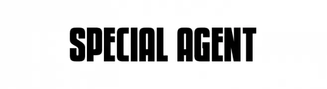
A bold, blocky typeface perfect for impactful headlines.
![Special Agent Frei Schriftart Herunterladen]() Herunterladen 348 Downloads@WebFont
Herunterladen 348 Downloads@WebFont -
![Atomium Frei Schriftart Herunterladen]() Herunterladen 348 Downloads@WebFont
Herunterladen 348 Downloads@WebFont -
-
( Fonts by Kong Font )
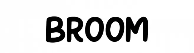
A playful, bold font with rounded edges and thick strokes, perfect for creative projects.
![Broom Frei Schriftart Herunterladen]() Herunterladen 348 Downloads@WebFont
Herunterladen 348 Downloads@WebFont -
( Fonts by www.typodermicfonts.com - Ray Larabie )
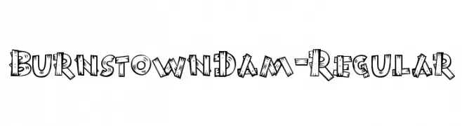
A playful, hand-drawn font with a bold, cartoonish style and woodgrain texture.
![BurnstownDam-Regular Frei Schriftart Herunterladen]() Herunterladen 348 Downloads@WebFont
Herunterladen 348 Downloads@WebFont -
( ideas-art.blogspot.com/ )
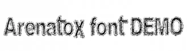
A bold, distressed font with a rugged, hand-drawn appearance.
![Arenatox font DEMO Frei Schriftart Herunterladen]() Herunterladen 348 Downloads@WebFont
Herunterladen 348 Downloads@WebFont -
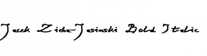
![Jacek Zieba-Jasinski Bold Italic Frei Schriftart Herunterladen]() Herunterladen 348 Downloads@WebFont
Herunterladen 348 Downloads@WebFont -
( Fonts by Marty Bee - www.martybee.com )
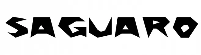
A bold, angular font with sharp, jagged edges and a dynamic, energetic style.
![Saguaro Frei Schriftart Herunterladen]() Herunterladen 348 Downloads@WebFont
Herunterladen 348 Downloads@WebFont

Welche Schriften sind gerade am populärsten?
Poppins, Roboto, Montserrat, Open Sans und Lato sind wegen ihrer klaren Formen und breiten Einsetzbarkeit sehr gefragt – von Markenauftritt über Landingpages bis hin zu Postern.
Welche Fonts eignen sich für Logos?
Geometrische Sans‑Serifs (z. B. Poppins, Familien im Gotham‑Stil) sind ein häufiger Griff für sauberes, skalierbares Branding. Für eine persönlichere Note bleiben Scripts und Handschrift‑Stile beliebt. Kombinieren Sie einen prägnanten Headline‑Font mit einer neutralen Brotschrift für Wiedererkennung und Harmonie.
Wie oft wird die Top‑Liste aktualisiert?
Regelmäßig – basierend auf realen Downloads und Interaktionen. Schauen Sie öfter vorbei, um aufstrebende Favoriten früh zu entdecken.
💡 Tipp: Seite bookmarken – Trends wechseln schnell, und heutige Top‑Schriften inspirieren morgen vielleicht das Rebranding.