Willkommen bei den Top‑Schriften – hier treffen Beliebtheit und Qualität aufeinander. Das sind die in diesem Jahr am häufigsten heruntergeladenen und genutzten Fonts. Wenn Sie sichere Optionen für Logo, Web oder Social suchen, starten Sie hier.
Jeder Top‑Font überzeugt durch Balance, Lesbarkeit und Vielseitigkeit. Sie finden moderne Sans‑Serifs, elegante Scripts, Vintage‑Serifs und minimalistische Displays.
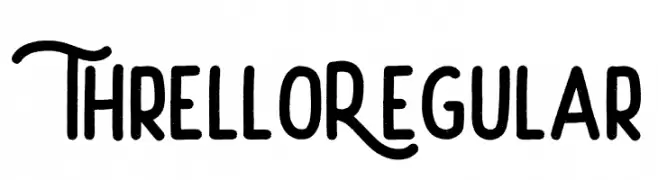
-
( Fonts by Creatype Studio - Rian Rahardi - Personal-use only. For commercial use please contact owner. )
A playful, handwritten font with whimsical loops and curls.
 Herunterladen 45 Downloads@WebFont
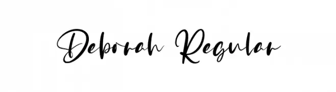
 -
( Fonts by Vz Type - Personal-use only. For commercial use please contact owner. )
A flowing, cursive font with elegant and interconnected characters.
![Deborah Regular Frei Schriftart Herunterladen]() Herunterladen 45 Downloads@WebFont
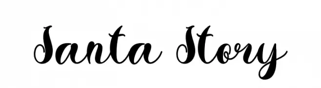
Herunterladen 45 Downloads@WebFont -
( Fonts by Yoga Letter - Isroni Yoga Prasetya - Personal-use only. For commercial use please contact owner. )
A whimsical and playful script font with decorative swashes.
![Santa Story Frei Schriftart Herunterladen]() Herunterladen 45 Downloads@WebFont
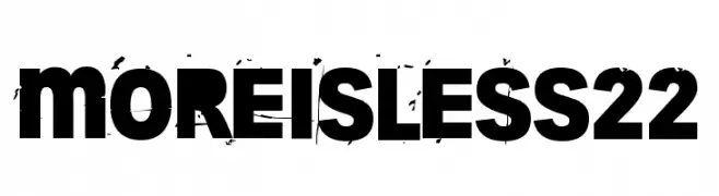
Herunterladen 45 Downloads@WebFont -
( Fonts by junkohanhero - Personal-use only. For commercial use please contact owner. )
A bold, distressed font with a grunge aesthetic and tight character spacing.
![More is less 22 Frei Schriftart Herunterladen]() Herunterladen 45 Downloads@WebFont
Herunterladen 45 Downloads@WebFont -
( Fonts by Pandan Wangi - Personal-use only. For commercial use please contact owner. )
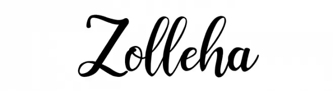
A flowing, cursive font with elegant loops and swashes.
![Zolleha Frei Schriftart Herunterladen]() Herunterladen 45 Downloads@WebFont
Herunterladen 45 Downloads@WebFont -
( Fonts by StringLabs - stringlabscreative.com - Personal-use only. For commercial use please contact owner. )
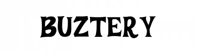
A bold, playful font with a hand-drawn, whimsical style.
![BUZTERY Frei Schriftart Herunterladen]() Herunterladen 45 Downloads@WebFont
Herunterladen 45 Downloads@WebFont -
( Fonts by Bexxtype - Personal-use only. For commercial use please contact owner. )
An elegant script font with flowing, cursive strokes and artistic flair.
![Mettadilla Frei Schriftart Herunterladen]() Herunterladen 45 Downloads@WebFont
Herunterladen 45 Downloads@WebFont -
( Fonts by StringLabs - stringlabscreative.com - Personal-use only. For commercial use please contact owner. )
A flowing, cursive handwritten font with elegant and expressive characters.
![Vatteny Rose Frei Schriftart Herunterladen]() Herunterladen 45 Downloads@WebFont
Herunterladen 45 Downloads@WebFont -
( Fonts by Vultype - Candra Hamdani - Personal-use only. For commercial use please contact owner. )
A dynamic script font with elegant, flowing curves and connected letterforms.
![Hargael Frei Schriftart Herunterladen]() Herunterladen 45 Downloads@WebFont
Herunterladen 45 Downloads@WebFont -
( Fonts by Miss Tiina Fonts - MTF - Miss Tiina - Personal-use only. For commercial use please contact owner. )
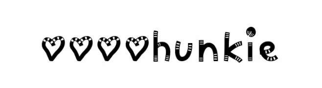
A playful, decorative font with striped and dotted characters, perfect for creative projects.
![MTF Chunkie Frei Schriftart Herunterladen]() Herunterladen 45 Downloads@WebFont
Herunterladen 45 Downloads@WebFont -
( Fonts by Edric Studio - Personal-use only. For commercial use please contact owner. )
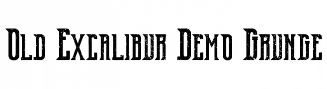
A bold, distressed font with a vintage grunge aesthetic and sharp serifs.
![Old Excalibur Demo Grunge Frei Schriftart Herunterladen]() Herunterladen 45 Downloads@WebFont
Herunterladen 45 Downloads@WebFont -
( Fonts by Dav studio - Dimas Aji Virgiawan - Personal-use only. For commercial use please contact owner. )
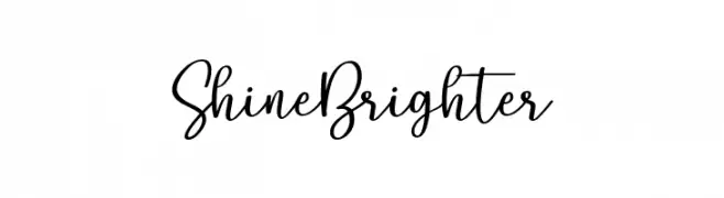
A playful and elegant handwritten font with fluid, connected letterforms.
![Shine Brighter Frei Schriftart Herunterladen]() Herunterladen 45 Downloads@WebFont
Herunterladen 45 Downloads@WebFont -
( Fonts by Kat`s Fun Fonts - Personal-use only. For commercial use please contact owner. )
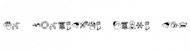
A festive decorative dingbat set with Christmas icons.
![KR Christmas Dings Two Frei Schriftart Herunterladen]() Herunterladen 45 Downloads@WebFont
Herunterladen 45 Downloads@WebFont -
( Fonts by Prioritype Co - Prio Nurokhim Aji - Personal-use only. For commercial use please contact owner. )
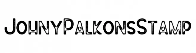
A bold, distressed font with a vintage stamp effect.
![Johny Palkons Stamp Frei Schriftart Herunterladen]() Herunterladen 45 Downloads@WebFont
Herunterladen 45 Downloads@WebFont -
( Fonts by aulia - Personal-use only. For commercial use please contact owner. )
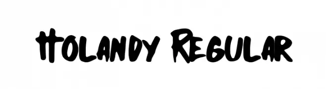
A bold, handwritten-style font with a playful and dynamic character.
![Holandy Regular Frei Schriftart Herunterladen]() Herunterladen 45 Downloads@WebFont
Herunterladen 45 Downloads@WebFont -
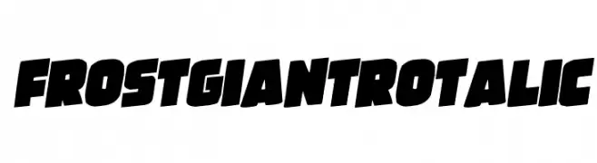
( Fonts by Iconian Fonts - Daniel Zadorozny - Personal-use only. For commercial use please contact owner. )
A bold, italicized font with thick, angular strokes and high contrast.
![Frost Giant Rotalic Frei Schriftart Herunterladen]() Herunterladen 45 Downloads@WebFont
Herunterladen 45 Downloads@WebFont -
( Fonts by NimaType - Andres Moreno - Personal-use only. For commercial use please contact owner. )
A modern, rounded sans-serif font with consistent stroke width and balanced character spacing.
![TimeBurner Frei Schriftart Herunterladen]() Herunterladen 45 Downloads@WebFont
Herunterladen 45 Downloads@WebFont -
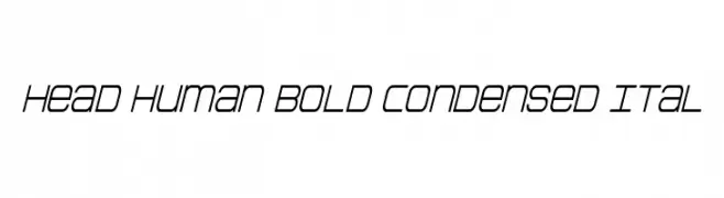
( Fonts by Daniel Zadorozny - www.iconian.com - Personal-use only. For commercial use please contact owner. )
A bold, condensed, and slightly italicized modern font with tight spacing.
![Head Human Bold Condensed Ital Frei Schriftart Herunterladen]() Herunterladen 45 Downloads@WebFont
Herunterladen 45 Downloads@WebFont -
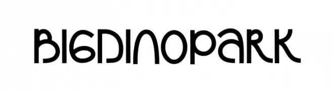
( Fonts by Alpaprana - Personal-use only. For commercial use please contact owner. )
A playful, bold font with rounded, whimsical characters.
![Bigdino Park Frei Schriftart Herunterladen]() Herunterladen 45 Downloads@WebFont
Herunterladen 45 Downloads@WebFont -
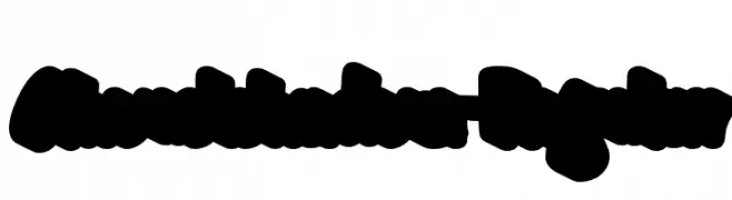
( Fonts by 38.lineart - Muhammad Ridha Agusni - Personal-use only. For commercial use please contact owner. )
A bold, playful font with a shadow effect and a graffiti-like style.
![Ghoustshadow-Regular Frei Schriftart Herunterladen]() Herunterladen 45 Downloads@WebFont
Herunterladen 45 Downloads@WebFont -
( Fonts by Creakokun Studio - Personal-use only. For commercial use please contact owner. )
A bold, expressive handwritten font with a flowing cursive style.
![Manohara Willona Frei Schriftart Herunterladen]() Herunterladen 45 Downloads@WebFont
Herunterladen 45 Downloads@WebFont -
( Fonts by Tegaki Script - Personal-use only. For commercial use please contact owner. )
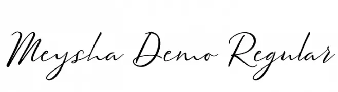
A graceful script font with flowing, cursive strokes and elegant character design.
![Meysha Demo Regular Frei Schriftart Herunterladen]() Herunterladen 45 Downloads@WebFont
Herunterladen 45 Downloads@WebFont -
( Fonts by dcoxy - Greg Medina - Personal-use only. For commercial use please contact owner. )
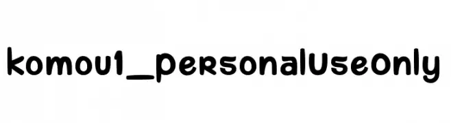
A playful, rounded font with a bold and friendly appearance.
![komou 1_PersonalUseOnly Frei Schriftart Herunterladen]() Herunterladen 45 Downloads@WebFont
Herunterladen 45 Downloads@WebFont -
( Fonts by Gassstype - Anang Fibriyanto - www.gassstype.com - Personal-use only. For commercial use please contact owner. )
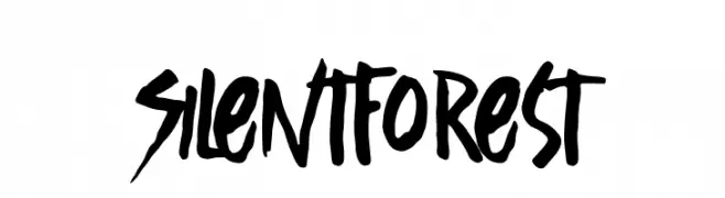
A bold, hand-drawn font with an expressive and dynamic style.
![Silent Forest Frei Schriftart Herunterladen]() Herunterladen 45 Downloads@WebFont
Herunterladen 45 Downloads@WebFont -
( Fonts by Vladimir Nikolic - Personal-use only. For commercial use please contact owner. )
A playful, icy font with bold, rounded letters and a frosty theme.
![Iceberg Regular Frei Schriftart Herunterladen]() Herunterladen 45 Downloads@WebFont
Herunterladen 45 Downloads@WebFont -
( Fonts by Mans Greback - www.mansgreback.com - Personal-use only. For commercial use please contact owner. )
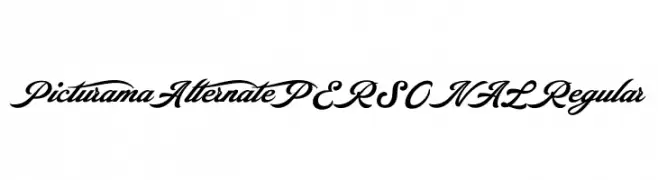
A bold, elegant script font with flowing curves and ornate details.
![Picturama Alternate PERSONAL Regular Frei Schriftart Herunterladen]() Herunterladen 45 Downloads@WebFont
Herunterladen 45 Downloads@WebFont -
( Fonts by AltaTech - Personal-use only. For commercial use please contact owner. )
A bold, futuristic font with geometric, three-dimensional outlines.
![Used Servers Bold Frei Schriftart Herunterladen]() Herunterladen 45 Downloads@WebFont
Herunterladen 45 Downloads@WebFont -
( Fonts by Digi Temply - Personal-use only. For commercial use please contact owner. )
A modern, geometric font with clean lines and a minimalist style.
![Eva Regular Frei Schriftart Herunterladen]() Herunterladen 45 Downloads@WebFont
Herunterladen 45 Downloads@WebFont -
( Fonts by Iconian Fonts - Daniel Zadorozny - Personal-use only. For commercial use please contact owner. )
A bold, futuristic font with sharp, angular edges and a geometric style.
![Shining Herald Laser Frei Schriftart Herunterladen]() Herunterladen 45 Downloads@WebFont
Herunterladen 45 Downloads@WebFont -
( Fonts by Niki Studio - Achmad Solikhin - Personal-use only. For commercial use please contact owner. )
A playful and artistic handwritten font with dynamic strokes and whimsical character.
![Genstay Frei Schriftart Herunterladen]() Herunterladen 45 Downloads@WebFont
Herunterladen 45 Downloads@WebFont -
( Fonts by Alpaprana Studio - Personal-use only. For commercial use please contact owner. )
A casual handwritten font with smooth, flowing strokes.
![Clatterson Frei Schriftart Herunterladen]() Herunterladen 45 Downloads@WebFont
Herunterladen 45 Downloads@WebFont -
( Fonts by Aqeela Studio - Muhammad Nasir - Personal-use only. For commercial use please contact owner. )
An elegant, flowing script font with intricate loops and swirls.
![Gabrina-Regular Frei Schriftart Herunterladen]() Herunterladen 45 Downloads@WebFont
Herunterladen 45 Downloads@WebFont -
( Fonts by Dirt2.com - SickCapital - Andrew Hart - Personal-use only. For commercial use please contact owner. )
A playful, hand-drawn font with thin, irregular strokes and a whimsical style.
![Boldenstein THIN Frei Schriftart Herunterladen]() Herunterladen 45 Downloads@WebFont
Herunterladen 45 Downloads@WebFont -
( Fonts by LetterFreshStudio - Rizki Andika - Personal-use only. For commercial use please contact owner. )
A classic, elegant script font with flowing cursive letters and ornate details.
![AngeltaScript Frei Schriftart Herunterladen]() Herunterladen 45 Downloads@WebFont
Herunterladen 45 Downloads@WebFont -
( Fonts by StringLabs - stringlabscreative.com - Personal-use only. For commercial use please contact owner. )
An elegant script font with flowing, cursive-like characters and intricate flourishes.
![Bitley Anthem Frei Schriftart Herunterladen]() Herunterladen 45 Downloads@WebFont
Herunterladen 45 Downloads@WebFont


Welche Schriften sind gerade am populärsten?
Poppins, Roboto, Montserrat, Open Sans und Lato sind wegen ihrer klaren Formen und breiten Einsetzbarkeit sehr gefragt – von Markenauftritt über Landingpages bis hin zu Postern.
Welche Fonts eignen sich für Logos?
Geometrische Sans‑Serifs (z. B. Poppins, Familien im Gotham‑Stil) sind ein häufiger Griff für sauberes, skalierbares Branding. Für eine persönlichere Note bleiben Scripts und Handschrift‑Stile beliebt. Kombinieren Sie einen prägnanten Headline‑Font mit einer neutralen Brotschrift für Wiedererkennung und Harmonie.
Wie oft wird die Top‑Liste aktualisiert?
Regelmäßig – basierend auf realen Downloads und Interaktionen. Schauen Sie öfter vorbei, um aufstrebende Favoriten früh zu entdecken.
💡 Tipp: Seite bookmarken – Trends wechseln schnell, und heutige Top‑Schriften inspirieren morgen vielleicht das Rebranding.