Willkommen bei den Top‑Schriften – hier treffen Beliebtheit und Qualität aufeinander. Das sind die in diesem Jahr am häufigsten heruntergeladenen und genutzten Fonts. Wenn Sie sichere Optionen für Logo, Web oder Social suchen, starten Sie hier.
Jeder Top‑Font überzeugt durch Balance, Lesbarkeit und Vielseitigkeit. Sie finden moderne Sans‑Serifs, elegante Scripts, Vintage‑Serifs und minimalistische Displays.
-
( Fonts by Trim Studio - Deri Kurnia - Personal-use only. For commercial use please contact owner. )
A lively, expressive handwritten font with dynamic strokes and a playful bounce.
 Herunterladen 46 Downloads@WebFont
 -
( Fonts by Mans Greback - www.mansgreback.com - Personal-use only. For commercial use please contact owner. )
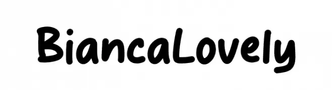
A playful, handwritten-style font with bold, rounded strokes.
![Bianca Lovely Frei Schriftart Herunterladen]() Herunterladen 46 Downloads@WebFont
Herunterladen 46 Downloads@WebFont -
( Fonts by Perspectype Studio - Personal-use only. For commercial use please contact owner. )
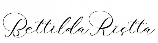
An elegant script font with flowing, cursive style and intricate flourishes.
![Bettilda Ristta Frei Schriftart Herunterladen]() Herunterladen 46 Downloads@WebFont
Herunterladen 46 Downloads@WebFont -
( Fonts by Sakadang Keos - Personal-use only. For commercial use please contact owner. )
A bold, decorative font with playful serifs and dynamic strokes.
![Kuramo DEMO Frei Schriftart Herunterladen]() Herunterladen 46 Downloads@WebFont
Herunterladen 46 Downloads@WebFont -
( Fonts by Thor Christopher Arisland - Personal-use only. For commercial use please contact owner. )
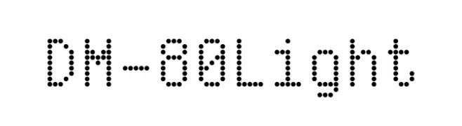
A dotted, geometric font with a digital, retro aesthetic.
![DM-80 Light Frei Schriftart Herunterladen]() Herunterladen 46 Downloads@WebFont
Herunterladen 46 Downloads@WebFont -
( Fonts by Vladimir Nikolic - www.creativefabrica.com/designer/vladimirnikolic/ - Personal-use only. For commercial use please contact owner. )
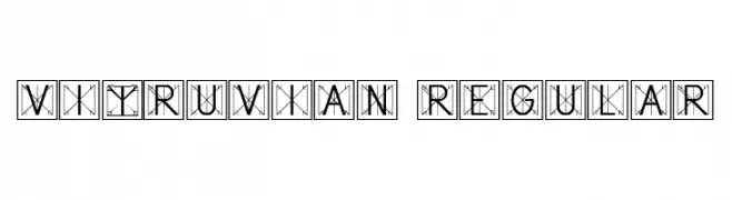
A decorative, geometric serif font inspired by classical architecture.
![Vitruvian Regular Frei Schriftart Herunterladen]() Herunterladen 46 Downloads@WebFont
Herunterladen 46 Downloads@WebFont -
( Fonts by Maulana Creative - Gilang Maulana - Personal-use only. For commercial use please contact owner. )
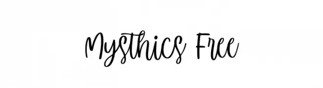
A playful and flowing handwritten font with smooth curves and charming variability.
![Mysthics Free Frei Schriftart Herunterladen]() Herunterladen 46 Downloads@WebFont
Herunterladen 46 Downloads@WebFont -
( Fonts by MrtheNoronha - Daniel Noronha - Personal-use only. For commercial use please contact owner. )
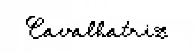
A pixelated cursive font blending digital and handwritten styles.
![Cavalhatriz Frei Schriftart Herunterladen]() Herunterladen 46 Downloads@WebFont
Herunterladen 46 Downloads@WebFont -
( Fonts by Vladimir Nikolic - www.creativefabrica.com/designer/vladimirnikolic/ - Personal-use only. For commercial use please contact owner. )
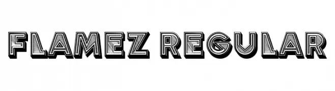
A bold, decorative font with a three-dimensional effect and intricate patterns.
![Flamez Regular Frei Schriftart Herunterladen]() Herunterladen 46 Downloads@WebFont
Herunterladen 46 Downloads@WebFont -
( Fonts by CalligraphyFonts - Personal-use only. For commercial use please contact owner. )
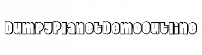
A bold, playful outline font with a modern yet retro aesthetic.
![Dumpy Planet Demo Outline Frei Schriftart Herunterladen]() Herunterladen 46 Downloads@WebFont
Herunterladen 46 Downloads@WebFont -
( Fonts by Letterena Studios - letterena.com - Personal-use only. For commercial use please contact owner. )
A bold, italic script font with a dynamic and flowing style.
![Tatan Deer Italic Frei Schriftart Herunterladen]() Herunterladen 46 Downloads@WebFont
Herunterladen 46 Downloads@WebFont -
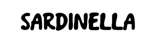
( Fonts by Origin Type )
Bold, rounded, playful sans-serif font with thick strokes.
![Sardinella Frei Schriftart Herunterladen]() Herunterladen 46 Downloads@WebFont
Herunterladen 46 Downloads@WebFont -
( Fonts by GFR Creative - Personal-use only. For commercial use please contact owner. )
A bold, dynamic script font with flowing, cursive letterforms.
![Regal Love Frei Schriftart Herunterladen]() Herunterladen 46 Downloads@WebFont
Herunterladen 46 Downloads@WebFont -
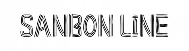
( Fonts by Goma Shin - Personal-use only. For commercial use please contact owner. )
A bold, multi-line decorative font with a modern and geometric style.
![Sanbon Line Frei Schriftart Herunterladen]() Herunterladen 46 Downloads@WebFont
Herunterladen 46 Downloads@WebFont -
( Fonts by Kateeng Ciu - Personal-use only. For commercial use please contact owner. )
A playful, casual handwritten font with smooth curves and a friendly feel.
![First Stroke Frei Schriftart Herunterladen]() Herunterladen 46 Downloads@WebFont
Herunterladen 46 Downloads@WebFont -
( Fonts by Letterena Studios - letterena.com - Personal-use only. For commercial use please contact owner. )
A sophisticated script font with flowing, interconnected letters and elegant curves.
![Kallinda Frei Schriftart Herunterladen]() Herunterladen 46 Downloads@WebFont
Herunterladen 46 Downloads@WebFont -
( Fonts by Nocturnal Workspace - Farhan Tirta - Personal-use only. For commercial use please contact owner. )
A bold and robust serif font with strong, pronounced strokes.
![Evereast Serif Frei Schriftart Herunterladen]() Herunterladen 46 Downloads@WebFont
Herunterladen 46 Downloads@WebFont -
( Fonts by Supersemar Letter - Arief Tri Sulistiyono - Personal-use only. For commercial use please contact owner. )
An elegant and flowing script font with artistic loops and swirls.
![Mayapada Frei Schriftart Herunterladen]() Herunterladen 46 Downloads@WebFont
Herunterladen 46 Downloads@WebFont -
( Fonts by Zulfikar Ali - Personal-use only. For commercial use please contact owner. )
A bold, italicized font with a strong, elegant presence.
![BataviaGlamoreBOLDITALIC-BoldIt Frei Schriftart Herunterladen]() Herunterladen 46 Downloads@WebFont
Herunterladen 46 Downloads@WebFont -
( Fonts by weknow - Wino S Kadir - Personal-use only. For commercial use please contact owner. )
A modern, hollow, geometric font with clean lines and rounded edges.
![TECHNIQUE-Hollow Frei Schriftart Herunterladen]() Herunterladen 46 Downloads@WebFont
Herunterladen 46 Downloads@WebFont -
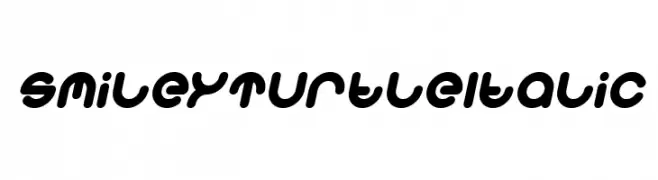
( Fonts by weknow - Wino S Kadir - Personal-use only. For commercial use please contact owner. )
A playful, bold, and rounded italic font with a whimsical style.
![Smiley Turtle Italic Frei Schriftart Herunterladen]() Herunterladen 46 Downloads@WebFont
Herunterladen 46 Downloads@WebFont -
( Fonts by Masanis Studio - Naufal Anis - Personal-use only. For commercial use please contact owner. )
A dynamic, brush-style handwritten font with expressive strokes.
![SailRoyals Frei Schriftart Herunterladen]() Herunterladen 46 Downloads@WebFont
Herunterladen 46 Downloads@WebFont -
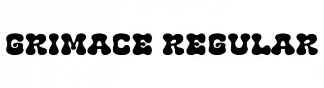
( Fonts by Font Bundles )
Bold, playful font with rounded shapes.
![Grimace Regular Frei Schriftart Herunterladen]() Herunterladen 46 Downloads@WebFont
Herunterladen 46 Downloads@WebFont -
( Fonts by Letterena Studios - letterena.com - Personal-use only. For commercial use please contact owner. )
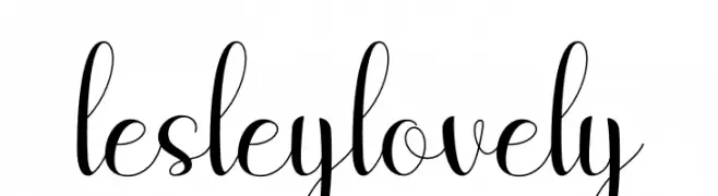
A graceful script font with elegant loops and swirls, perfect for romantic and luxurious designs.
![lesley lovely Frei Schriftart Herunterladen]() Herunterladen 46 Downloads@WebFont
Herunterladen 46 Downloads@WebFont -
( Fonts by Zetafonts - Personal-use only. For commercial use please contact owner. )
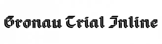
A bold, inline blackletter-inspired font with a modern geometric twist.
![Gronau Trial Inline Frei Schriftart Herunterladen]() Herunterladen 46 Downloads@WebFont
Herunterladen 46 Downloads@WebFont -
( Fonts by Edric Studio - Personal-use only. For commercial use please contact owner. )
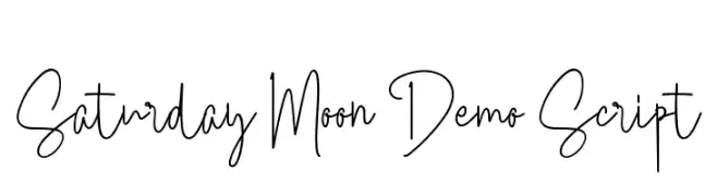
A playful, handwritten script font with a casual and friendly style.
![Saturday Moon Demo Script Frei Schriftart Herunterladen]() Herunterladen 46 Downloads@WebFont
Herunterladen 46 Downloads@WebFont -
( Fonts by Iconian Fonts - Daniel Zadorozny - Personal-use only. For commercial use please contact owner. )
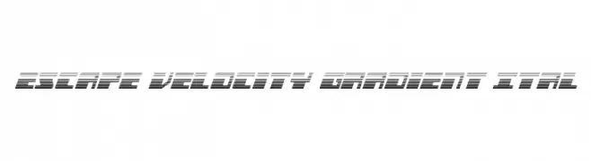
A futuristic, gradient-striped font with an italic slant, perfect for dynamic designs.
![Escape Velocity Gradient Ital Frei Schriftart Herunterladen]() Herunterladen 46 Downloads@WebFont
Herunterladen 46 Downloads@WebFont -
( Fonts by Sealoung - Saiful Anwar - Personal-use only. For commercial use please contact owner. )
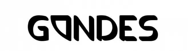
A playful, bold font with rounded edges and a hand-drawn feel.
![GONDES Frei Schriftart Herunterladen]() Herunterladen 46 Downloads@WebFont
Herunterladen 46 Downloads@WebFont -
( Fonts by VPcreativeshop - Vladimir Fedotov - Personal-use only. For commercial use please contact owner. )
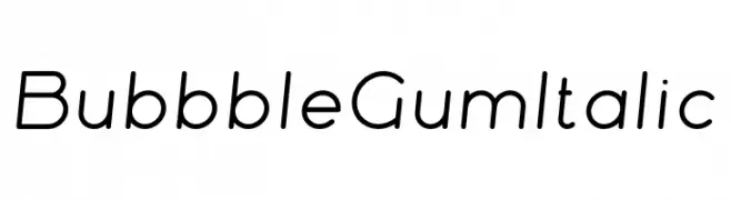
A playful, rounded, and slightly italic font with a modern and friendly style.
![Bubbble Gum Italic Frei Schriftart Herunterladen]() Herunterladen 46 Downloads@WebFont
Herunterladen 46 Downloads@WebFont -
( Fonts by da_only_aan - Personal-use only. For commercial use please contact owner. )
A modern, geometric font with a double-line style and sharp angles.
![Racheto Frei Schriftart Herunterladen]() Herunterladen 46 Downloads@WebFont
Herunterladen 46 Downloads@WebFont -
( Fonts by Iconian Fonts - Daniel Zadorozny - Personal-use only. For commercial use please contact owner. )
A bold, geometric outline font with a futuristic and digital style.
![Wildcard Outline Frei Schriftart Herunterladen]() Herunterladen 46 Downloads@WebFont
Herunterladen 46 Downloads@WebFont -
( Fonts by Masanis Studio - Naufal Anis - Personal-use only. For commercial use please contact owner. )
A modern, handwritten script font with elegant, flowing letters.
![The Fashionist Personal Use Frei Schriftart Herunterladen]() Herunterladen 46 Downloads@WebFont
Herunterladen 46 Downloads@WebFont -
( Fonts by Pizzadude - Jakob Fischer - Personal-use only. For commercial use please contact owner. )
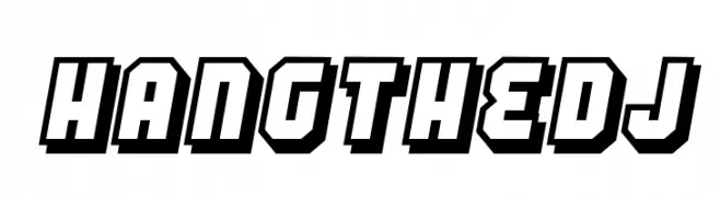
A bold, three-dimensional font with a retro, geometric style.
![Hang the DJ Frei Schriftart Herunterladen]() Herunterladen 46 Downloads@WebFont
Herunterladen 46 Downloads@WebFont -
( Fonts by Creatype Studio - Rian Rahardi - Personal-use only. For commercial use please contact owner. )
A bold, brush script font with dynamic and expressive strokes.
![Sunquish Regular Frei Schriftart Herunterladen]() Herunterladen 46 Downloads@WebFont
Herunterladen 46 Downloads@WebFont -
( Fonts by Creatype Studio - Rian Rahardi - Personal-use only. For commercial use please contact owner. )
A flowing, cursive script font with elegant loops and swashes.
![Layttona Regular Frei Schriftart Herunterladen]() Herunterladen 46 Downloads@WebFont
Herunterladen 46 Downloads@WebFont


Welche Schriften sind gerade am populärsten?
Poppins, Roboto, Montserrat, Open Sans und Lato sind wegen ihrer klaren Formen und breiten Einsetzbarkeit sehr gefragt – von Markenauftritt über Landingpages bis hin zu Postern.
Welche Fonts eignen sich für Logos?
Geometrische Sans‑Serifs (z. B. Poppins, Familien im Gotham‑Stil) sind ein häufiger Griff für sauberes, skalierbares Branding. Für eine persönlichere Note bleiben Scripts und Handschrift‑Stile beliebt. Kombinieren Sie einen prägnanten Headline‑Font mit einer neutralen Brotschrift für Wiedererkennung und Harmonie.
Wie oft wird die Top‑Liste aktualisiert?
Regelmäßig – basierend auf realen Downloads und Interaktionen. Schauen Sie öfter vorbei, um aufstrebende Favoriten früh zu entdecken.
💡 Tipp: Seite bookmarken – Trends wechseln schnell, und heutige Top‑Schriften inspirieren morgen vielleicht das Rebranding.