Willkommen bei den Top‑Schriften – hier treffen Beliebtheit und Qualität aufeinander. Das sind die in diesem Jahr am häufigsten heruntergeladenen und genutzten Fonts. Wenn Sie sichere Optionen für Logo, Web oder Social suchen, starten Sie hier.
Jeder Top‑Font überzeugt durch Balance, Lesbarkeit und Vielseitigkeit. Sie finden moderne Sans‑Serifs, elegante Scripts, Vintage‑Serifs und minimalistische Displays.
-
( Fonts by Darrell Flood - Personal-use only. For commercial use please contact owner. )
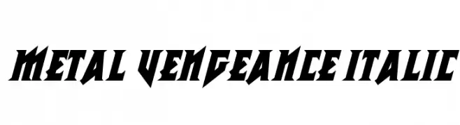
A bold, angular, italic font with a dynamic and aggressive style.
 Herunterladen 43 Downloads@WebFont
 -
( Fonts by Lerima - Leandro Ribeiro - Personal-use only. For commercial use please contact owner. )
A sleek, modern font with elongated, narrow characters and a minimalist design.
![Dustria Frei Schriftart Herunterladen]() Herunterladen 43 Downloads@WebFont
Herunterladen 43 Downloads@WebFont -
( Fonts by Sarif Letter - Personal-use only. For commercial use please contact owner. )
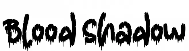
A bold, dripping font perfect for horror-themed designs.
![Blood Shadow Frei Schriftart Herunterladen]() Herunterladen 43 Downloads@WebFont
Herunterladen 43 Downloads@WebFont -
( Fonts by The Docallisme - Amry Al Mursalaat - Personal-use only. For commercial use please contact owner. )
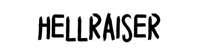
A bold, brush-style font with expressive, hand-painted strokes.
![HELL RAISER Frei Schriftart Herunterladen]() Herunterladen 43 Downloads@WebFont
Herunterladen 43 Downloads@WebFont -
( Fonts by weknow - Wino S Kadir - Personal-use only. For commercial use please contact owner. )
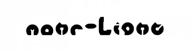
A bold, geometric font with a modern, edgy style and minimal contrast.
![mohr-Light Frei Schriftart Herunterladen]() Herunterladen 43 Downloads@WebFont
Herunterladen 43 Downloads@WebFont -
( Fonts by Aphriell Art - Personal-use only. For commercial use please contact owner. )
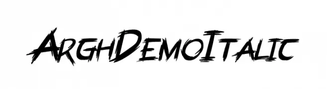
A bold, jagged, and italicized font with a graffiti-like, hand-drawn style.
![ArghDemo Italic Frei Schriftart Herunterladen]() Herunterladen 43 Downloads@WebFont
Herunterladen 43 Downloads@WebFont -
( Fonts by Creative Lab - Creative LAB - Personal-use only. For commercial use please contact owner. )
An elegant script font with flowing curves and decorative flourishes.
![HillahScript Frei Schriftart Herunterladen]() Herunterladen 43 Downloads@WebFont
Herunterladen 43 Downloads@WebFont -
( Fonts by Eghtin Studio - Personal-use only. For commercial use please contact owner. )
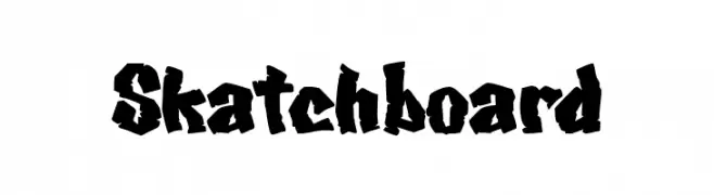
A bold, jagged font with a hand-drawn, graffiti-like style.
![Skatchboard Frei Schriftart Herunterladen]() Herunterladen 43 Downloads@WebFont
Herunterladen 43 Downloads@WebFont -
( Fonts by Rudi Winarko - Personal-use only. For commercial use please contact owner. )
An elegant, decorative font with intricate swirls and flourishes.
![Ayuningtyas Frei Schriftart Herunterladen]() Herunterladen 43 Downloads@WebFont
Herunterladen 43 Downloads@WebFont -
( Fonts by weknow - Wino S Kadir - Personal-use only. For commercial use please contact owner. )
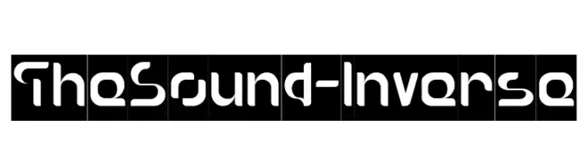
A bold, geometric font with a futuristic and modern design.
![The Sound-Inverse Frei Schriftart Herunterladen]() Herunterladen 43 Downloads@WebFont
Herunterladen 43 Downloads@WebFont -
( Fonts by Nowak.tv - Bartek Nowak - Personal-use only. For commercial use please contact owner. )
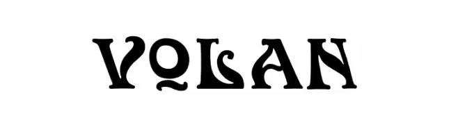
A bold, decorative font with medieval-inspired, artistic flourishes.
![Volan Frei Schriftart Herunterladen]() Herunterladen 43 Downloads@WebFont
Herunterladen 43 Downloads@WebFont -
( Fonts by Lionel Pailloncy - Personal-use only. For commercial use please contact owner. )
A fluid and dynamic handwritten font with smooth, flowing strokes.
![Escribi Frei Schriftart Herunterladen]() Herunterladen 43 Downloads@WebFont
Herunterladen 43 Downloads@WebFont -
( Fonts by Craft Supply Co. )
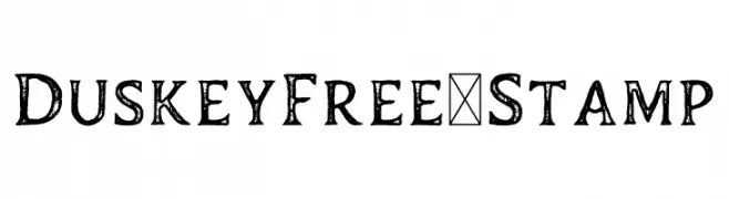
A distressed, vintage-style font with a textured, handcrafted appearance.
![DuskeyFree-Stamp Frei Schriftart Herunterladen]() Herunterladen 43 Downloads@WebFont
Herunterladen 43 Downloads@WebFont -
( Fonts by Aphriell Art - Personal-use only. For commercial use please contact owner. )
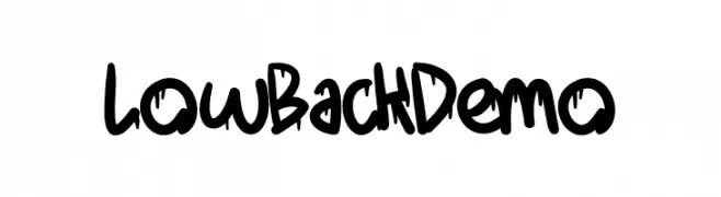
A bold, graffiti-inspired font with a playful, urban style.
![LowBack Demo Frei Schriftart Herunterladen]() Herunterladen 43 Downloads@WebFont
Herunterladen 43 Downloads@WebFont -
( Fonts by Don Marciano - Personal-use only. For commercial use please contact owner. )
A bold, angular font with a shadow effect, combining Gothic influences with modern design.
![Edge Shadow Frei Schriftart Herunterladen]() Herunterladen 43 Downloads@WebFont
Herunterladen 43 Downloads@WebFont -
( Fonts by Arjuna Ortega - Personal-use only. For commercial use please contact owner. )
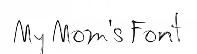
A playful, handwritten font with decorative, flowing strokes.
![My Mom's Font Frei Schriftart Herunterladen]() Herunterladen 43 Downloads@WebFont
Herunterladen 43 Downloads@WebFont -
( Fonts by Mans Greback - www.mansgreback.com - Personal-use only. For commercial use please contact owner. )
A bold, geometric sans-serif font with a modern and clean aesthetic.
![Hatsch Sans PERSONAL USE ONLY Regular Frei Schriftart Herunterladen]() Herunterladen 43 Downloads@WebFont
Herunterladen 43 Downloads@WebFont -
( Fonts by Woodcutter - woodcutter Manero - Personal-use only. For commercial use please contact owner. )
A bold, decorative font with a tattoo-inspired style and strong outlines.
![Tattooed and Proud Frei Schriftart Herunterladen]() Herunterladen 43 Downloads@WebFont
Herunterladen 43 Downloads@WebFont -
( Fonts by Corpus Delicti Fonts - Samuel Marin - Personal-use only. For commercial use please contact owner. )
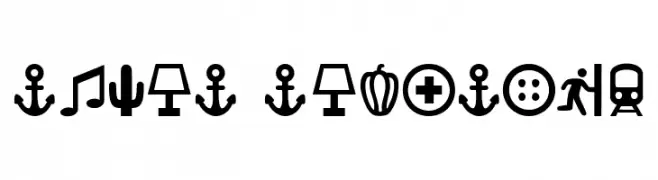
A bold iconographic font composed of clear, playful pictograms.
![Ancla Alphabet Frei Schriftart Herunterladen]() Herunterladen 43 Downloads@WebFont
Herunterladen 43 Downloads@WebFont -
( Fonts by Stefani Letter - Stefani Tri Rosa - Personal-use only. For commercial use please contact owner. )
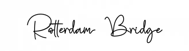
A stylish, handwritten font with elegant, flowing lines and a modern touch.
![Rotterdam Bridge Frei Schriftart Herunterladen]() Herunterladen 43 Downloads@WebFont
Herunterladen 43 Downloads@WebFont -
( Fonts by Vladimir Nikolic - Personal-use only. For commercial use please contact owner. )
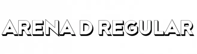
A bold, 3D font with geometric shapes and shadow effects for a modern look.
![Arena 3D Regular Frei Schriftart Herunterladen]() Herunterladen 43 Downloads@WebFont
Herunterladen 43 Downloads@WebFont -
( Fonts by Thirtypath - Personal-use only. For commercial use please contact owner. )
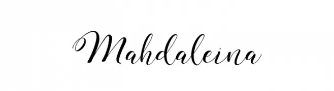
An elegant script font with intricate swirls and flowing design.
![Mahdaleina Frei Schriftart Herunterladen]() Herunterladen 43 Downloads@WebFont
Herunterladen 43 Downloads@WebFont -
( Fonts by Cosmic Hog - Personal-use only. For commercial use please contact owner. )
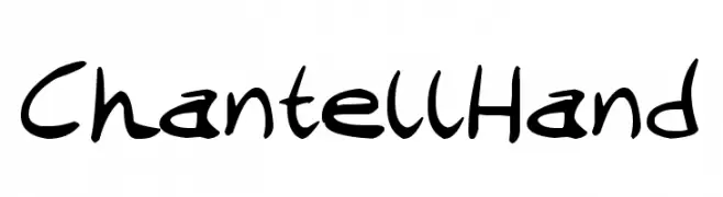
A playful and casual handwritten font with fluid, dynamic strokes.
![Chantell Hand Frei Schriftart Herunterladen]() Herunterladen 43 Downloads@WebFont
Herunterladen 43 Downloads@WebFont -
( Fonts by Mathew Woodhams - Personal-use only. For commercial use please contact owner. )
A futuristic, pixelated font with a digital and geometric style.
![Binero Regular Frei Schriftart Herunterladen]() Herunterladen 43 Downloads@WebFont
Herunterladen 43 Downloads@WebFont -
( Fonts by Perspectype Studio - Personal-use only. For commercial use please contact owner. )
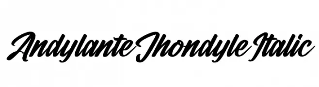
A bold, italic script font with dynamic and flowing letterforms.
![Andylante Jhondyle Italic Frei Schriftart Herunterladen]() Herunterladen 43 Downloads@WebFont
Herunterladen 43 Downloads@WebFont -
( Fonts by Vladimir Nikolic - Personal-use only. For commercial use please contact owner. )
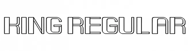
A modern, geometric outline font with a futuristic and technical style.
![King Regular Frei Schriftart Herunterladen]() Herunterladen 43 Downloads@WebFont
Herunterladen 43 Downloads@WebFont -
( Fonts by Mr Letters - Personal-use only. For commercial use please contact owner. )
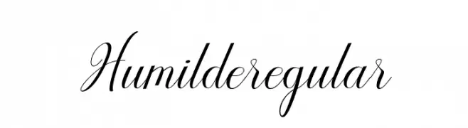
A graceful script font with flowing, ornate characters and elegant flourishes.
![Humilderegular Frei Schriftart Herunterladen]() Herunterladen 43 Downloads@WebFont
Herunterladen 43 Downloads@WebFont -
( Fonts by Aisyah - Nur Aisyah Amalia - Personal-use only. For commercial use please contact owner. )
A lively, expressive handwritten font with fluid strokes and dynamic style.
![Tsanafia Frei Schriftart Herunterladen]() Herunterladen 43 Downloads@WebFont
Herunterladen 43 Downloads@WebFont -
( Fonts by Kassymkulov Design - Personal-use only. For commercial use please contact owner. )
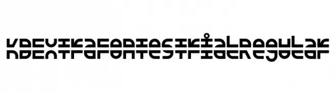
A futuristic, geometric font with bold, blocky letterforms.
![KD Extra Fontestrial Regular Frei Schriftart Herunterladen]() Herunterladen 43 Downloads@WebFont
Herunterladen 43 Downloads@WebFont -
( Fonts by Letterena Studios - letterena.com - Personal-use only. For commercial use please contact owner. )
A bold, expressive handwritten script with fluid, connected letters.
![Halymah Frei Schriftart Herunterladen]() Herunterladen 43 Downloads@WebFont
Herunterladen 43 Downloads@WebFont -
( Fonts by sronstudio - Yusron Billah - Personal-use only. For commercial use please contact owner. )
A playful, hand-drawn font with tall, narrow letters and a whimsical style.
![Delight Cookies Frei Schriftart Herunterladen]() Herunterladen 43 Downloads@WebFont
Herunterladen 43 Downloads@WebFont -
( Fonts by D&K Project - Degi Kurniawan - Personal-use only. For commercial use please contact owner. )
A bold, brush-style font with dynamic, hand-painted strokes.
![Holyrock Frei Schriftart Herunterladen]() Herunterladen 43 Downloads@WebFont
Herunterladen 43 Downloads@WebFont -
( Fonts by Inermedia Studio - Personal-use only. For commercial use please contact owner. )
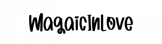
A playful, handwritten font with bold, rounded strokes and a whimsical style.
![Magaic In Love Frei Schriftart Herunterladen]() Herunterladen 43 Downloads@WebFont
Herunterladen 43 Downloads@WebFont -
( Fonts by Jipatype - Anupap Jaichumnan - Personal-use only. For commercial use please contact owner. )
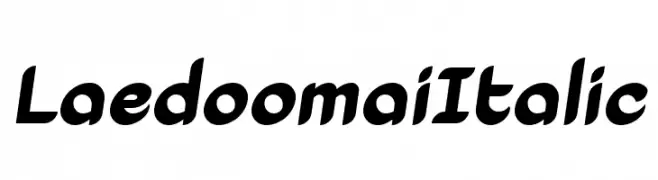
A dynamic italic font with smooth curves and a modern aesthetic.
![Laedoomai Italic Frei Schriftart Herunterladen]() Herunterladen 43 Downloads@WebFont
Herunterladen 43 Downloads@WebFont -
( Fonts by Nur Solikh - Personal-use only. For commercial use please contact owner. )
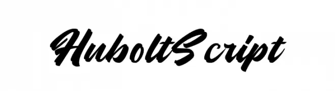
A bold, dynamic script font with flowing, cursive letterforms.
![Hubolt Script Frei Schriftart Herunterladen]() Herunterladen 43 Downloads@WebFont
Herunterladen 43 Downloads@WebFont


Welche Schriften sind gerade am populärsten?
Poppins, Roboto, Montserrat, Open Sans und Lato sind wegen ihrer klaren Formen und breiten Einsetzbarkeit sehr gefragt – von Markenauftritt über Landingpages bis hin zu Postern.
Welche Fonts eignen sich für Logos?
Geometrische Sans‑Serifs (z. B. Poppins, Familien im Gotham‑Stil) sind ein häufiger Griff für sauberes, skalierbares Branding. Für eine persönlichere Note bleiben Scripts und Handschrift‑Stile beliebt. Kombinieren Sie einen prägnanten Headline‑Font mit einer neutralen Brotschrift für Wiedererkennung und Harmonie.
Wie oft wird die Top‑Liste aktualisiert?
Regelmäßig – basierend auf realen Downloads und Interaktionen. Schauen Sie öfter vorbei, um aufstrebende Favoriten früh zu entdecken.
💡 Tipp: Seite bookmarken – Trends wechseln schnell, und heutige Top‑Schriften inspirieren morgen vielleicht das Rebranding.