Willkommen bei den Top‑Schriften – hier treffen Beliebtheit und Qualität aufeinander. Das sind die in diesem Jahr am häufigsten heruntergeladenen und genutzten Fonts. Wenn Sie sichere Optionen für Logo, Web oder Social suchen, starten Sie hier.
Jeder Top‑Font überzeugt durch Balance, Lesbarkeit und Vielseitigkeit. Sie finden moderne Sans‑Serifs, elegante Scripts, Vintage‑Serifs und minimalistische Displays.
-
( Fonts by Dav studio - Dimas Aji Virgiawan - Personal-use only. For commercial use please contact owner. )
A dynamic, expressive handwritten font with fluid strokes and elegant slant.
 Herunterladen 44 Downloads@WebFont
 -
( Fonts by weknow - Wino S Kadir - Personal-use only. For commercial use please contact owner. )
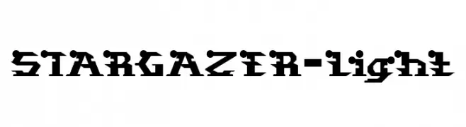
A bold, geometric font with a futuristic and industrial style.
![STARGAZER-Light Frei Schriftart Herunterladen]() Herunterladen 44 Downloads@WebFont
Herunterladen 44 Downloads@WebFont -
( Fonts by Iconian Fonts - Daniel Zadorozny - Personal-use only. For commercial use please contact owner. )
A bold, 3D italic font with a futuristic and dynamic style.
![Classic Cobra 3D Italic Frei Schriftart Herunterladen]() Herunterladen 44 Downloads@WebFont
Herunterladen 44 Downloads@WebFont -
( Fonts by Vladimir Nikolic - Personal-use only. For commercial use please contact owner. )
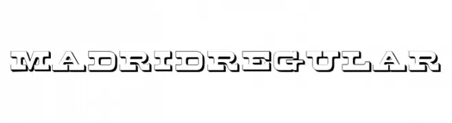
A bold, decorative font with a three-dimensional shadow effect.
![Madrid Regular Frei Schriftart Herunterladen]() Herunterladen 44 Downloads@WebFont
Herunterladen 44 Downloads@WebFont -
( Fonts by TypeType Foundry )
A bold, angular, and geometric font with a dynamic slant.
![TT Octosquares Trl Cmd XBd It Frei Schriftart Herunterladen]() Herunterladen 44 Downloads@WebFont
Herunterladen 44 Downloads@WebFont -
( Fonts by Creatype Studio - Rian Rahardi - Personal-use only. For commercial use please contact owner. )
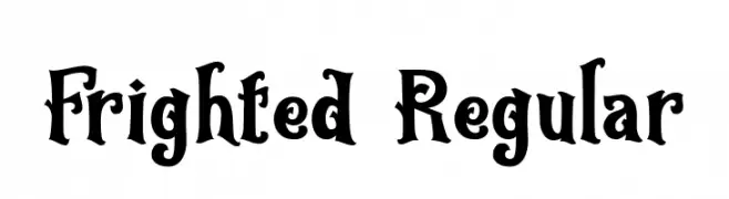
A bold, decorative font with a spooky and whimsical style.
![Frighted Regular Frei Schriftart Herunterladen]() Herunterladen 44 Downloads@WebFont
Herunterladen 44 Downloads@WebFont -
( Fonts by Iconian Fonts - Daniel Zadorozny - Personal-use only. For commercial use please contact owner. )
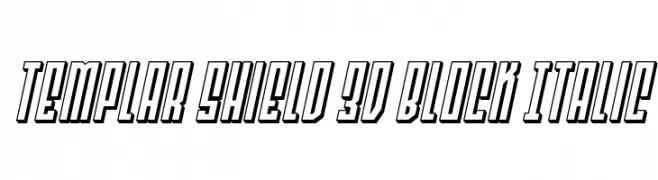
A bold, 3D block italic font with outlined characters and a dynamic style.
![Templar Shield 3D Block Italic Frei Schriftart Herunterladen]() Herunterladen 44 Downloads@WebFont
Herunterladen 44 Downloads@WebFont -
( Fonts by SSI.Scraps - Syukur Setiyadi - Personal-use only. For commercial use please contact owner. )
A playful, handwritten font with exaggerated curves and a whimsical style.
![Bugs_Bony Frei Schriftart Herunterladen]() Herunterladen 44 Downloads@WebFont
Herunterladen 44 Downloads@WebFont -
( Fonts by Yoga Letter - Isroni Yoga Prasetya - Personal-use only. For commercial use please contact owner. )
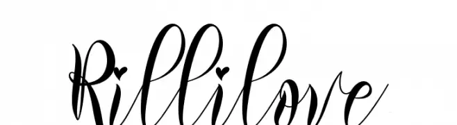
A flowing, cursive font with elegant, sweeping strokes and artistic flair.
![Rillilove Frei Schriftart Herunterladen]() Herunterladen 44 Downloads@WebFont
Herunterladen 44 Downloads@WebFont -
( Fonts by Woodcutter Manero - www.woodcutter.es - Personal-use only. For commercial use please contact owner. )
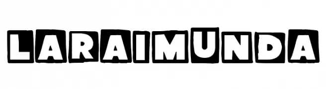
Bold, playful display font with hand-drawn blocky style.
![La Raimunda Frei Schriftart Herunterladen]() Herunterladen 44 Downloads@WebFont
Herunterladen 44 Downloads@WebFont -
( Fonts by Iconian Fonts - Daniel Zadorozny - Personal-use only. For commercial use please contact owner. )
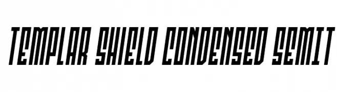
A bold, condensed, and slanted font with a modern and dynamic style.
![Templar Shield Condensed SemIt Frei Schriftart Herunterladen]() Herunterladen 44 Downloads@WebFont
Herunterladen 44 Downloads@WebFont -
( Fonts by Letterhend Studio - Hendry Juanda - Personal-use only. For commercial use please contact owner. )
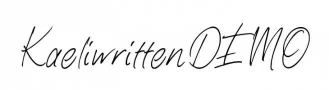
A fluid, elegant handwritten font with a casual yet sophisticated style.
![KaeliwrittenDEMO Frei Schriftart Herunterladen]() Herunterladen 44 Downloads@WebFont
Herunterladen 44 Downloads@WebFont -
( Fonts by sronstudio - Yusron Billah - Personal-use only. For commercial use please contact owner. )
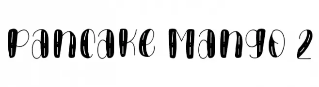
A playful, bold, and whimsical font with rounded, hand-drawn letterforms.
![Pancake Mango 2 Frei Schriftart Herunterladen]() Herunterladen 44 Downloads@WebFont
Herunterladen 44 Downloads@WebFont -
( Fonts by AlifRyanZulfikar - Personal-use only. For commercial use please contact owner. )
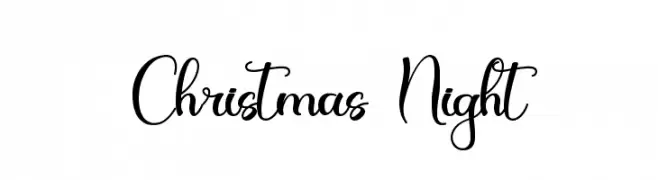
A festive, elegant script font with flowing, calligraphic style.
![Christmas Night Frei Schriftart Herunterladen]() Herunterladen 44 Downloads@WebFont
Herunterladen 44 Downloads@WebFont -
( Fonts by Bytenesia Studio - Personal-use only. For commercial use please contact owner. )
A modern, playful font with elongated, narrow characters.
![Highdream-Semibold Frei Schriftart Herunterladen]() Herunterladen 44 Downloads@WebFont
Herunterladen 44 Downloads@WebFont -
( Fonts by Perspectype Studio - Personal-use only. For commercial use please contact owner. )
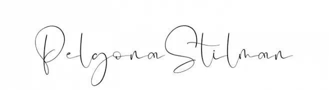
A graceful, cursive script font with delicate, flowing strokes.
![Pelgona Stilman Frei Schriftart Herunterladen]() Herunterladen 44 Downloads@WebFont
Herunterladen 44 Downloads@WebFont -
( Fonts by Antipixel - Julia MartÃnez Diana - Personal-use only. For commercial use please contact owner. )
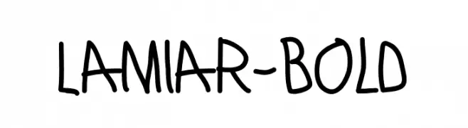
A bold, playful handwritten font with a casual and friendly style.
![Lamiar-Bold Frei Schriftart Herunterladen]() Herunterladen 44 Downloads@WebFont
Herunterladen 44 Downloads@WebFont -
( Fonts by Woodcutter Manero - www.woodcutter.es - Personal-use only. For commercial use please contact owner. )
Bold Western-style display font with ornamental slab serifs.
![Canadian Western Frei Schriftart Herunterladen]() Herunterladen 44 Downloads@WebFont
Herunterladen 44 Downloads@WebFont -
( Fonts by Alpaprana - Personal-use only. For commercial use please contact owner. )
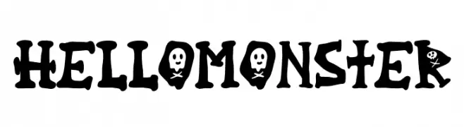
A playful, spooky font with monster-like characteristics and skull motifs.
![Hello Monster Frei Schriftart Herunterladen]() Herunterladen 44 Downloads@WebFont
Herunterladen 44 Downloads@WebFont -
( Fonts by Justin Penner - Personal-use only. For commercial use please contact owner. )
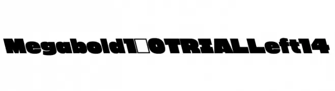
A bold, impactful font with a strong, authoritative presence.
![Megabold 1.0 TRIAL Left 14 Frei Schriftart Herunterladen]() Herunterladen 44 Downloads@WebFont
Herunterladen 44 Downloads@WebFont -
( Fonts by keithzo )
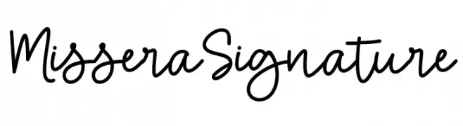
Casual handwritten script with smooth, rounded strokes.
![Missera Signature Frei Schriftart Herunterladen]() Herunterladen 44 Downloads@WebFont
Herunterladen 44 Downloads@WebFont -
( Fonts by Edric Studio - Personal-use only. For commercial use please contact owner. )
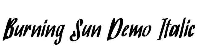
A bold, italicized handwritten font with a dynamic and expressive style.
![Burning Sun Demo Italic Frei Schriftart Herunterladen]() Herunterladen 44 Downloads@WebFont
Herunterladen 44 Downloads@WebFont -
( Fonts by Arterfak Project - Ahmad Ramzi Fahruddin - Personal-use only. For commercial use please contact owner. )
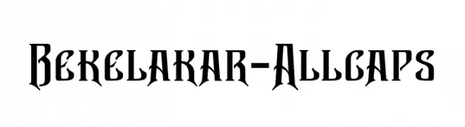
A bold, gothic-inspired font with sharp serifs and a dramatic presence.
![Bekelakar-Allcaps Frei Schriftart Herunterladen]() Herunterladen 44 Downloads@WebFont
Herunterladen 44 Downloads@WebFont -
( Fonts by Dav studio - Dimas Aji Virgiawan - Personal-use only. For commercial use please contact owner. )
A playful and elegant handwritten font with fluid, dynamic strokes.
![Rastyin Frei Schriftart Herunterladen]() Herunterladen 44 Downloads@WebFont
Herunterladen 44 Downloads@WebFont -
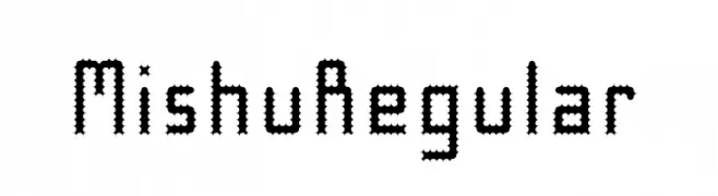
( Fonts by Mishu Baba - Personal-use only. For commercial use please contact owner. )
A decorative font with a jagged, zigzag pattern, ideal for artistic projects.
![Mishu Regular Frei Schriftart Herunterladen]() Herunterladen 44 Downloads@WebFont
Herunterladen 44 Downloads@WebFont -
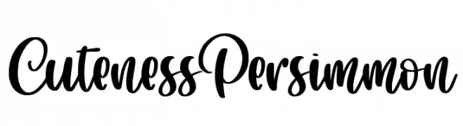
( Fonts by Abo Daniel Studio - Panggah Laksono - Personal-use only. For commercial use please contact owner. )
A playful and whimsical script font with bold, flowing letterforms.
![Cuteness Persimmon Frei Schriftart Herunterladen]() Herunterladen 44 Downloads@WebFont
Herunterladen 44 Downloads@WebFont -
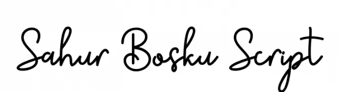
( Fonts by CBRTEXT Studio - Muhammad Khoirul Amal - Personal-use only. For commercial use please contact owner. )
A playful and elegant script font with a handwritten style.
![Sahur Bosku Script Frei Schriftart Herunterladen]() Herunterladen 44 Downloads@WebFont
Herunterladen 44 Downloads@WebFont -
( Fonts by Yoga Letter - Isroni Yoga Prasetya - Personal-use only. For commercial use please contact owner. )
A sophisticated script font with elegant loops and swirls.
![Emillisa Frei Schriftart Herunterladen]() Herunterladen 44 Downloads@WebFont
Herunterladen 44 Downloads@WebFont -
( Fonts by Bexxtype - Personal-use only. For commercial use please contact owner. )
An elegant script font with intricate swirls and decorative flourishes.
![Sabena Frei Schriftart Herunterladen]() Herunterladen 44 Downloads@WebFont
Herunterladen 44 Downloads@WebFont -
( Fonts by M-Dfonts - Martin Steiner - Personal-use only. For commercial use please contact owner. )
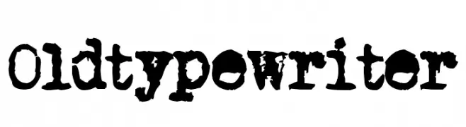
A vintage, distressed typewriter-style font with a rugged, nostalgic appeal.
![Old typewriter Frei Schriftart Herunterladen]() Herunterladen 44 Downloads@WebFont
Herunterladen 44 Downloads@WebFont -
( Fonts by Woodcutter Manero - www.woodcutter.es - Personal-use only. For commercial use please contact owner. )
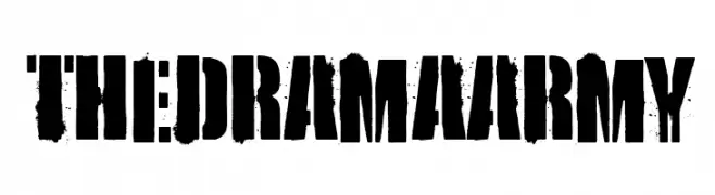
Distressed, bold stencil font with a grungy, military-inspired look.
![the Drama Army Frei Schriftart Herunterladen]() Herunterladen 44 Downloads@WebFont
Herunterladen 44 Downloads@WebFont -
( Fonts by Daniel Zadorozny - www.iconian.com - Personal-use only. For commercial use please contact owner. )
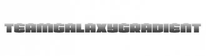
A bold, futuristic font with a gradient line effect, offering a dynamic and modern look.
![Team Galaxy Gradient Frei Schriftart Herunterladen]() Herunterladen 44 Downloads@WebFont
Herunterladen 44 Downloads@WebFont -
( Fonts by Alpaprana - Personal-use only. For commercial use please contact owner. )
A bold, angular font with geometric shapes and sharp edges.
![HASTER Frei Schriftart Herunterladen]() Herunterladen 44 Downloads@WebFont
Herunterladen 44 Downloads@WebFont -
( Fonts by Kong Font - Personal-use only. For commercial use please contact owner. )
A dynamic script font with elegant swashes and fluid strokes.
![Kenthir Swash Frei Schriftart Herunterladen]() Herunterladen 44 Downloads@WebFont
Herunterladen 44 Downloads@WebFont -
( Fonts by SSI.Scraps - Syukur Setiyadi - Personal-use only. For commercial use please contact owner. )
A dynamic and expressive script font with elegant, flowing strokes.
![The Creative Frei Schriftart Herunterladen]() Herunterladen 44 Downloads@WebFont
Herunterladen 44 Downloads@WebFont


Welche Schriften sind gerade am populärsten?
Poppins, Roboto, Montserrat, Open Sans und Lato sind wegen ihrer klaren Formen und breiten Einsetzbarkeit sehr gefragt – von Markenauftritt über Landingpages bis hin zu Postern.
Welche Fonts eignen sich für Logos?
Geometrische Sans‑Serifs (z. B. Poppins, Familien im Gotham‑Stil) sind ein häufiger Griff für sauberes, skalierbares Branding. Für eine persönlichere Note bleiben Scripts und Handschrift‑Stile beliebt. Kombinieren Sie einen prägnanten Headline‑Font mit einer neutralen Brotschrift für Wiedererkennung und Harmonie.
Wie oft wird die Top‑Liste aktualisiert?
Regelmäßig – basierend auf realen Downloads und Interaktionen. Schauen Sie öfter vorbei, um aufstrebende Favoriten früh zu entdecken.
💡 Tipp: Seite bookmarken – Trends wechseln schnell, und heutige Top‑Schriften inspirieren morgen vielleicht das Rebranding.