Willkommen bei den Top‑Schriften – hier treffen Beliebtheit und Qualität aufeinander. Das sind die in diesem Jahr am häufigsten heruntergeladenen und genutzten Fonts. Wenn Sie sichere Optionen für Logo, Web oder Social suchen, starten Sie hier.
Jeder Top‑Font überzeugt durch Balance, Lesbarkeit und Vielseitigkeit. Sie finden moderne Sans‑Serifs, elegante Scripts, Vintage‑Serifs und minimalistische Displays.
-
( Fonts by Bido Std - Personal-use only. For commercial use please contact owner. )
A bold, expressive handwritten font with dynamic curves and playful swashes.
 Herunterladen 44 Downloads@WebFont
 -
( Fonts by Green Adventure Studio - Ardi Parwito - Personal-use only. For commercial use please contact owner. )
A flowing, cursive font with elegant, interconnected strokes.
![Hellena Italic Frei Schriftart Herunterladen]() Herunterladen 44 Downloads@WebFont
Herunterladen 44 Downloads@WebFont -
( Fonts by Supersemar Letter - Arief Tri Sulistiyono - Personal-use only. For commercial use please contact owner. )
A playful, handwritten font with bold, smooth strokes.
![Bravocado Frei Schriftart Herunterladen]() Herunterladen 44 Downloads@WebFont
Herunterladen 44 Downloads@WebFont -
( Fonts by The Ocean Studio - Laire Banyu Sandi Pawenang - Personal-use only. For commercial use please contact owner. )
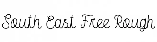
A playful, hand-drawn script font with a rustic and artistic style.
![South East Free Rough Frei Schriftart Herunterladen]() Herunterladen 44 Downloads@WebFont
Herunterladen 44 Downloads@WebFont -
( Fonts by Vladimir Nikolic - Personal-use only. For commercial use please contact owner. )
A bold, decorative font with intricate geometric patterns and a strong outline.
![Street Filled Regular Frei Schriftart Herunterladen]() Herunterladen 44 Downloads@WebFont
Herunterladen 44 Downloads@WebFont -
( Fonts by Mr Letters - Personal-use only. For commercial use please contact owner. )
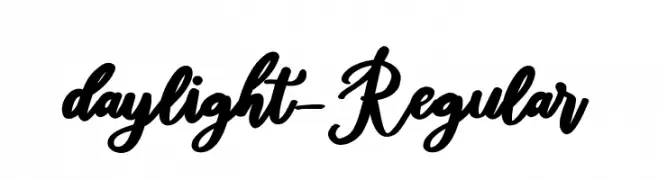
A bold, cursive font with a classic yet modern calligraphic style.
![daylight-Regular Frei Schriftart Herunterladen]() Herunterladen 44 Downloads@WebFont
Herunterladen 44 Downloads@WebFont -
( Fonts by Pizzadude - Jakob Fischer - Personal-use only. For commercial use please contact owner. )
A bold, textured font with a fragmented, confetti-like appearance.
![Malapropism Frei Schriftart Herunterladen]() Herunterladen 44 Downloads@WebFont
Herunterladen 44 Downloads@WebFont -
( Personal-use only. For commercial use please contact owner. )
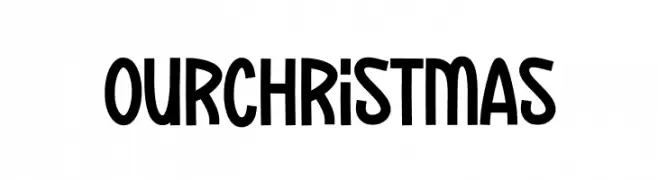
A playful, tall, and rounded sans-serif with a whimsical, festive feel.
![Our Christmas Frei Schriftart Herunterladen]() Herunterladen 44 Downloads@WebFont
Herunterladen 44 Downloads@WebFont -
( Fonts by Kong Font - https://fontkong.com/ - Personal-use only. For commercial use please contact owner. )
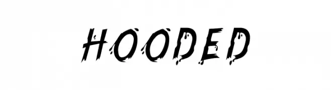
A bold, edgy font with a distressed, grunge-like appearance.
![Hooded Frei Schriftart Herunterladen]() Herunterladen 44 Downloads@WebFont
Herunterladen 44 Downloads@WebFont -
( Fonts by Craft Supply Co - Personal-use only. For commercial use please contact owner. )
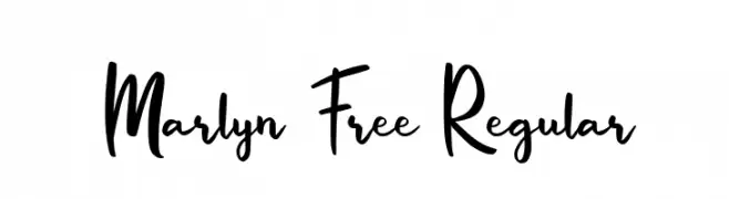
A lively handwritten font with dynamic strokes and playful curves.
![Marlyn Free Regular Frei Schriftart Herunterladen]() Herunterladen 44 Downloads@WebFont
Herunterladen 44 Downloads@WebFont -
( Fonts by HighUpNorth LLC - Personal-use only. For commercial use please contact owner. )
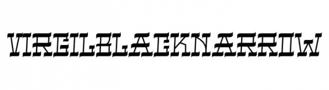
A bold, narrow font with blackletter influences and sharp angles.
![VIRGIL BLACK NARROW Frei Schriftart Herunterladen]() Herunterladen 44 Downloads@WebFont
Herunterladen 44 Downloads@WebFont -
( Fonts by Youthlabs Studio - Personal-use only. For commercial use please contact owner. )
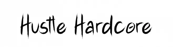
A bold, brush-style font with dynamic, hand-drawn strokes.
![Hustle Hardcore Frei Schriftart Herunterladen]() Herunterladen 44 Downloads@WebFont
Herunterladen 44 Downloads@WebFont -
( Fonts by Creativework69 Studio - Daddi Daryawan - Personal-use only. For commercial use please contact owner. )
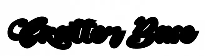
A bold, decorative font with flowing, interconnected strokes and a playful style.
![Skatter Base Frei Schriftart Herunterladen]() Herunterladen 44 Downloads@WebFont
Herunterladen 44 Downloads@WebFont -
( Fonts by Mengulirpena - Deny Dwi Kurniawan - Personal-use only. For commercial use please contact owner. )
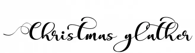
A festive, elegant script font with intricate swirls and loops.
![Christmas glather Frei Schriftart Herunterladen]() Herunterladen 44 Downloads@WebFont
Herunterladen 44 Downloads@WebFont -
( Fonts by Vunira Design - Personal-use only. For commercial use please contact owner. )
A bold, modern font with geometric elements and strong visual impact.
![Bagela FREE Frei Schriftart Herunterladen]() Herunterladen 44 Downloads@WebFont
Herunterladen 44 Downloads@WebFont -
( Fonts by Mans Greback - www.mansgreback.com - Personal-use only. For commercial use please contact owner. )
A bold, geometric font with a modern, industrial aesthetic.
![Wheeler Regular Frei Schriftart Herunterladen]() Herunterladen 44 Downloads@WebFont
Herunterladen 44 Downloads@WebFont -
( Fonts by NanaNissa - Personal-use only. For commercial use please contact owner. )
An elegant script font with intricate loops and high contrast, perfect for formal and decorative uses.
![Kimberline Frei Schriftart Herunterladen]() Herunterladen 44 Downloads@WebFont
Herunterladen 44 Downloads@WebFont -
( Fonts by Sifak Muf - Personal-use only. For commercial use please contact owner. )
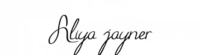
A cursive, handwritten font with elegant, flowing lines.
![Aliya jayner Frei Schriftart Herunterladen]() Herunterladen 44 Downloads@WebFont
Herunterladen 44 Downloads@WebFont -
( Fonts by Vunira Design - Personal-use only. For commercial use please contact owner. )
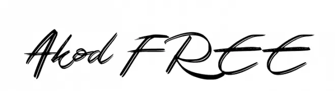
A bold, expressive script font with a dynamic, handwritten style.
![Akod FREE Frei Schriftart Herunterladen]() Herunterladen 44 Downloads@WebFont
Herunterladen 44 Downloads@WebFont -
( Fonts by wep )
Expressive, bold script with a handwritten brush style.
![Halmas Frei Schriftart Herunterladen]() Herunterladen 44 Downloads@WebFont
Herunterladen 44 Downloads@WebFont -
( Fonts by Daniel Zadorozny - www.iconian.com - Personal-use only. For commercial use please contact owner. )
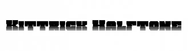
A bold, geometric font with a halftone pattern and layered appearance.
![Kittrick Halftone Frei Schriftart Herunterladen]() Herunterladen 44 Downloads@WebFont
Herunterladen 44 Downloads@WebFont -
( Fonts by Iconian Fonts - Daniel Zadorozny - Personal-use only. For commercial use please contact owner. )
A bold, condensed font with a geometric and impactful style.
![Sacred Czars Condensed Frei Schriftart Herunterladen]() Herunterladen 44 Downloads@WebFont
Herunterladen 44 Downloads@WebFont -
( Fonts by Kong Font - Personal-use only. For commercial use please contact owner. )
An elegant script font with flowing, cursive letterforms and sophisticated flair.
![WasteLowlife Frei Schriftart Herunterladen]() Herunterladen 44 Downloads@WebFont
Herunterladen 44 Downloads@WebFont -
( Fonts by Gigih Wiryana - Personal-use only. For commercial use please contact owner. )
A whimsical, playful handwritten font with thin, flowing strokes.
![Moon Light Frei Schriftart Herunterladen]() Herunterladen 44 Downloads@WebFont
Herunterladen 44 Downloads@WebFont -
( Fonts by Dedi Mujiono - Personal-use only. For commercial use please contact owner. )
A bold, expressive script font with high contrast and flowing cursive style.
![Hello Love Frei Schriftart Herunterladen]() Herunterladen 44 Downloads@WebFont
Herunterladen 44 Downloads@WebFont -
( Fonts by Woodcutter )
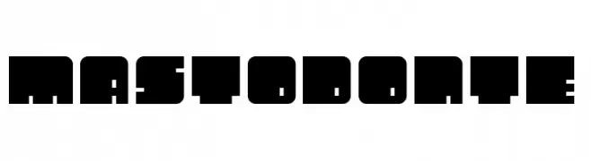
A bold, blocky font with a modern, industrial feel.
![Mastodonte Frei Schriftart Herunterladen]() Herunterladen 44 Downloads@WebFont
Herunterladen 44 Downloads@WebFont -
( Fonts by Erik Studio - Personal-use only. For commercial use please contact owner. )
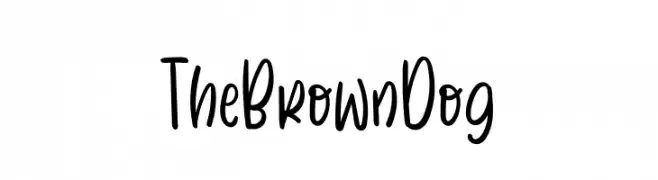
A playful, handwritten font with a casual and friendly style.
![The Brown Dog Frei Schriftart Herunterladen]() Herunterladen 44 Downloads@WebFont
Herunterladen 44 Downloads@WebFont -
( Fonts by Letterena Studios - letterena.com - Personal-use only. For commercial use please contact owner. )
A bold, expressive handwritten font with dynamic brush-like strokes.
![Padrox Frei Schriftart Herunterladen]() Herunterladen 44 Downloads@WebFont
Herunterladen 44 Downloads@WebFont -
( Fonts by Stefani Letter - Stefani Tri Rosa - Personal-use only. For commercial use please contact owner. )
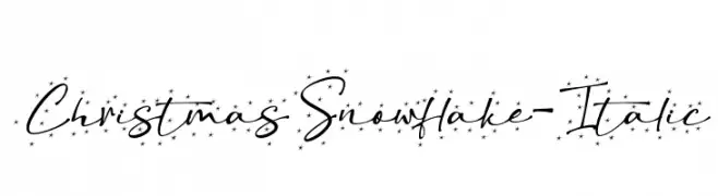
A playful, italic script font with snowflake accents, perfect for festive designs.
![ChristmasSnowflake-Italic Frei Schriftart Herunterladen]() Herunterladen 44 Downloads@WebFont
Herunterladen 44 Downloads@WebFont -
( Fonts by Mr Letters - Personal-use only. For commercial use please contact owner. )
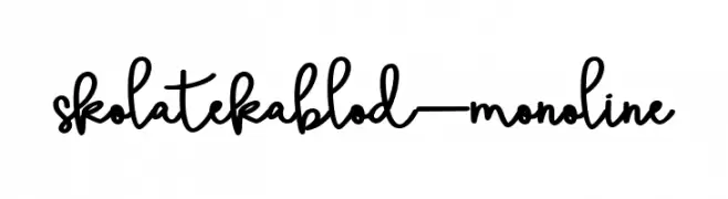
A playful, monoline handwritten font with fluid, connected letters.
![skolatekablod-monoline Frei Schriftart Herunterladen]() Herunterladen 44 Downloads@WebFont
Herunterladen 44 Downloads@WebFont -
( Fonts by alphArtype - Agung Rohmat - Personal-use only. For commercial use please contact owner. )
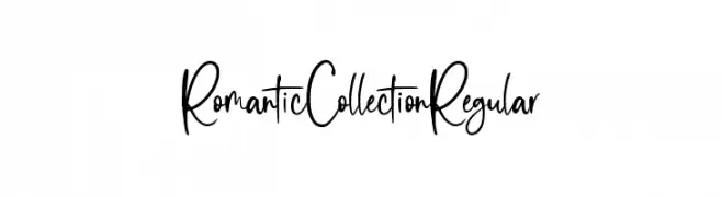
A playful and elegant handwritten font with flowing, interconnected letterforms.
![Romantic Collection Regular Frei Schriftart Herunterladen]() Herunterladen 44 Downloads@WebFont
Herunterladen 44 Downloads@WebFont -
( Fonts by Prioritype Co )
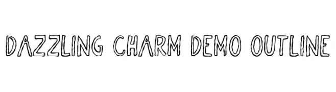
A playful, hand-drawn outline font with a whimsical and dynamic style.
![Dazzling Charm DEMO Outline Frei Schriftart Herunterladen]() Herunterladen 44 Downloads@WebFont
Herunterladen 44 Downloads@WebFont -
( Fonts by Vladimir Nikolic - www.creativefabrica.com/designer/vladimirnikolic/ - Personal-use only. For commercial use please contact owner. )
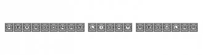
A decorative font with bold characters enclosed in hexagonal frames, featuring intricate line patterns.
![Hexagonas Light Regular Frei Schriftart Herunterladen]() Herunterladen 44 Downloads@WebFont
Herunterladen 44 Downloads@WebFont -
( Fonts by Hanzel Graphic - Personal-use only. For commercial use please contact owner. )
A bold, dynamic script font with a handwritten appearance.
![Brigan Frei Schriftart Herunterladen]() Herunterladen 44 Downloads@WebFont
Herunterladen 44 Downloads@WebFont -
( Fonts by Jetsmax Studio - Khairil Anwar - Personal-use only. For commercial use please contact owner. )
A bold, geometric font with a futuristic and edgy design.
![Hundred Wars Extrabold Frei Schriftart Herunterladen]() Herunterladen 44 Downloads@WebFont
Herunterladen 44 Downloads@WebFont


Welche Schriften sind gerade am populärsten?
Poppins, Roboto, Montserrat, Open Sans und Lato sind wegen ihrer klaren Formen und breiten Einsetzbarkeit sehr gefragt – von Markenauftritt über Landingpages bis hin zu Postern.
Welche Fonts eignen sich für Logos?
Geometrische Sans‑Serifs (z. B. Poppins, Familien im Gotham‑Stil) sind ein häufiger Griff für sauberes, skalierbares Branding. Für eine persönlichere Note bleiben Scripts und Handschrift‑Stile beliebt. Kombinieren Sie einen prägnanten Headline‑Font mit einer neutralen Brotschrift für Wiedererkennung und Harmonie.
Wie oft wird die Top‑Liste aktualisiert?
Regelmäßig – basierend auf realen Downloads und Interaktionen. Schauen Sie öfter vorbei, um aufstrebende Favoriten früh zu entdecken.
💡 Tipp: Seite bookmarken – Trends wechseln schnell, und heutige Top‑Schriften inspirieren morgen vielleicht das Rebranding.