Willkommen bei den Top‑Schriften – hier treffen Beliebtheit und Qualität aufeinander. Das sind die in diesem Jahr am häufigsten heruntergeladenen und genutzten Fonts. Wenn Sie sichere Optionen für Logo, Web oder Social suchen, starten Sie hier.
Jeder Top‑Font überzeugt durch Balance, Lesbarkeit und Vielseitigkeit. Sie finden moderne Sans‑Serifs, elegante Scripts, Vintage‑Serifs und minimalistische Displays.
-
 Herunterladen 340 Downloads@WebFont
 -
( Fonts by Neale Davidson - www.pixelsagas.com )
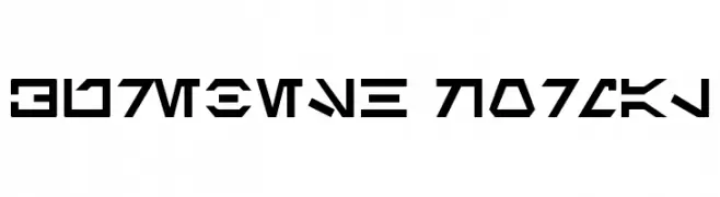
A geometric, angular font representing a fictional alien language.
![Aurebesh Normal Frei Schriftart Herunterladen]() Herunterladen 340 Downloads@WebFont
Herunterladen 340 Downloads@WebFont -
( Fonts by Hanoded )
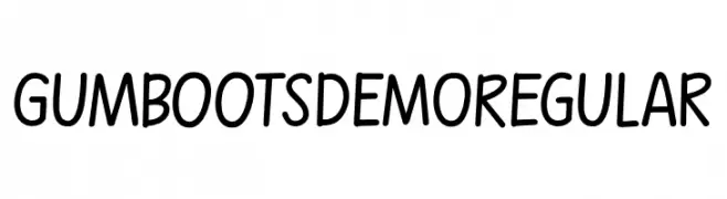
A playful, handwritten font with bold, rounded strokes and a whimsical style.
![Gumboots DEMO Regular Frei Schriftart Herunterladen]() Herunterladen 340 Downloads@WebFont
Herunterladen 340 Downloads@WebFont -
( Doel Creative - creativemarket.com/fajriyandi )
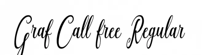
An elegant script font with flowing, ornate characters and intricate swashes.
![Graf Call free Regular Frei Schriftart Herunterladen]() Herunterladen 340 Downloads@WebFont
Herunterladen 340 Downloads@WebFont -
( Fonts by junkohanhero )
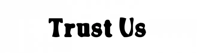
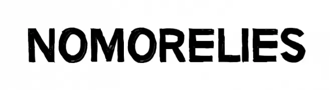
A bold, hand-drawn font with a rugged and textured appearance.
![No more lies Frei Schriftart Herunterladen]() Herunterladen 340 Downloads@WebFont
Herunterladen 340 Downloads@WebFont -
-
( Fernando Carvente - serifchocolate.com )
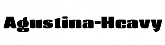
A bold, heavy font with a modern and impactful design.
![Agustina-Heavy Frei Schriftart Herunterladen]() Herunterladen 340 Downloads@WebFont
Herunterladen 340 Downloads@WebFont -
( Fonts by Alex Tomlinson - Skyhaven Fonts - shfonts.com )
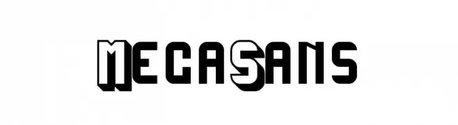
A bold, geometric font with a 3D shadow effect, ideal for retro and modern designs.
![MegaSans Frei Schriftart Herunterladen]() Herunterladen 340 Downloads@WebFont
Herunterladen 340 Downloads@WebFont -
( Fonts by Thomas Ledin - tomledin.com )
A bold, playful font with thick, rounded strokes and a whimsical, hand-drawn feel.
![Tom-Bombadill Frei Schriftart Herunterladen]() Herunterladen 340 Downloads@WebFont
Herunterladen 340 Downloads@WebFont -
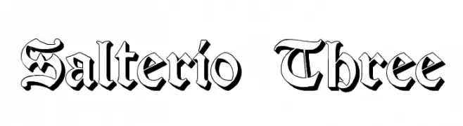
![Salterio Three Frei Schriftart Herunterladen]() Herunterladen 340 Downloads@WebFont
Herunterladen 340 Downloads@WebFont -
( Fonts by Monofonts )
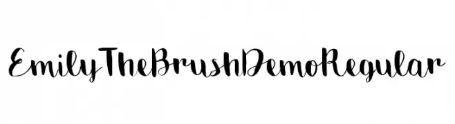
A playful brush script font with dynamic strokes and artistic flair.
![Emily The Brush Demo Regular Frei Schriftart Herunterladen]() Herunterladen 340 Downloads@WebFont
Herunterladen 340 Downloads@WebFont

Welche Schriften sind gerade am populärsten?
Poppins, Roboto, Montserrat, Open Sans und Lato sind wegen ihrer klaren Formen und breiten Einsetzbarkeit sehr gefragt – von Markenauftritt über Landingpages bis hin zu Postern.
Welche Fonts eignen sich für Logos?
Geometrische Sans‑Serifs (z. B. Poppins, Familien im Gotham‑Stil) sind ein häufiger Griff für sauberes, skalierbares Branding. Für eine persönlichere Note bleiben Scripts und Handschrift‑Stile beliebt. Kombinieren Sie einen prägnanten Headline‑Font mit einer neutralen Brotschrift für Wiedererkennung und Harmonie.
Wie oft wird die Top‑Liste aktualisiert?
Regelmäßig – basierend auf realen Downloads und Interaktionen. Schauen Sie öfter vorbei, um aufstrebende Favoriten früh zu entdecken.
💡 Tipp: Seite bookmarken – Trends wechseln schnell, und heutige Top‑Schriften inspirieren morgen vielleicht das Rebranding.