Willkommen bei den Top‑Schriften – hier treffen Beliebtheit und Qualität aufeinander. Das sind die in diesem Jahr am häufigsten heruntergeladenen und genutzten Fonts. Wenn Sie sichere Optionen für Logo, Web oder Social suchen, starten Sie hier.
Jeder Top‑Font überzeugt durch Balance, Lesbarkeit und Vielseitigkeit. Sie finden moderne Sans‑Serifs, elegante Scripts, Vintage‑Serifs und minimalistische Displays.
-
Schriftart von Fontscafe. For commercial use please contact the owner.
 Herunterladen 1287 Downloads@WebFont
 -
![Human building Frei Schriftart Herunterladen]() Herunterladen 1287 Downloads@WebFont
Herunterladen 1287 Downloads@WebFont -
![Josschrift Bold Frei Schriftart Herunterladen]() Herunterladen 1287 Downloads@WebFont
Herunterladen 1287 Downloads@WebFont -
( Fonts by Gyom Seguin - last-soundtrack.daportfolio.com )
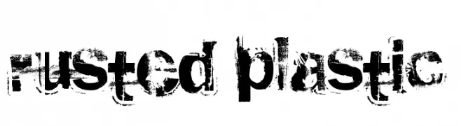
A distressed, grunge-style font with a textured, weathered appearance.
![rusted plastic Frei Schriftart Herunterladen]() Herunterladen 1287 Downloads@WebFont
Herunterladen 1287 Downloads@WebFont -
( Fonts by Apostrophic Lab )
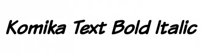
A playful, bold, and italic font with a dynamic and friendly style.
![Komika Text Bold Italic Frei Schriftart Herunterladen]() Herunterladen 1287 Downloads@WebFont
Herunterladen 1287 Downloads@WebFont -
( Fonts by Apostrophic Lab )
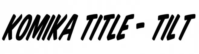
A bold, slanted font with a playful and dynamic style.
![Komika Title - Tilt Frei Schriftart Herunterladen]() Herunterladen 1287 Downloads@WebFont
Herunterladen 1287 Downloads@WebFont -
![Fight This Frei Schriftart Herunterladen]() Herunterladen 1287 Downloads@WebFont
Herunterladen 1287 Downloads@WebFont -
( Fonts by Alit Design )
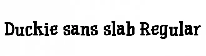
A bold, playful slab serif font with rounded characters.
![Duckie sans slab Regular Frei Schriftart Herunterladen]() Herunterladen 1286 Downloads@WebFont
Herunterladen 1286 Downloads@WebFont -
( Fonts by Ospiro Enterprises - Personal-use only. For commercial use please contact owner. )
A modern, light sans-serif font with a clean and minimalist design.
![Gontserrat Light Frei Schriftart Herunterladen]() Herunterladen 1286 Downloads@WebFont
Herunterladen 1286 Downloads@WebFont -
( Fonts by Vladimir Nikolic - www.creativefabrica.com/designer/vladimirnikolic/ - Personal-use only. For commercial use please contact owner. )
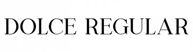
A classic serif font with elegant strokes and moderate contrast.
![Dolce Regular Frei Schriftart Herunterladen]() Herunterladen 1286 Downloads@WebFont
Herunterladen 1286 Downloads@WebFont -
( 21326 - 21326.info/ )
A bold, classic serif typeface with strong lines and a slightly condensed appearance.
![Neuton SC Bold Frei Schriftart Herunterladen]() Herunterladen 1286 Downloads@WebFont
Herunterladen 1286 Downloads@WebFont -
( Deepak Dogra - www.creativefabrica.com/designer/deepak-dogra/ )
A modern, bold sans-serif font with geometric structure and excellent readability.
![Renogare Regular Frei Schriftart Herunterladen]() Herunterladen 1286 Downloads@WebFont
Herunterladen 1286 Downloads@WebFont -
![Zabritzkyes Personal Use Frei Schriftart Herunterladen]() Herunterladen 1286 Downloads@WebFont
Herunterladen 1286 Downloads@WebFont -
( Fonts by Octotype - www.foundmyfont.com - Personal-use only. For commercial use please contact owner. )
An elegant, cursive script font with ornate, flowing characters.
![Goldfinger Kingdom Frei Schriftart Herunterladen]() Herunterladen 1286 Downloads@WebFont
Herunterladen 1286 Downloads@WebFont -
( Fonts by Castcraft Software - OPTI Fonts Archive - opti.netii.net - Personal-use only. For commercial use please contact owner. )
A modern, geometric sans-serif typeface with a clean and professional look.
![OPTISallyMae-Medium Frei Schriftart Herunterladen]() Herunterladen 1286 Downloads@WebFont
Herunterladen 1286 Downloads@WebFont -
( Fonts by Tom Oetken - Ash Pikachu Font )
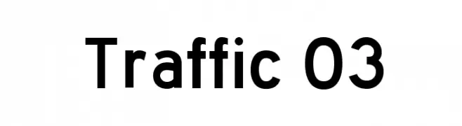
A bold, modern sans-serif font with excellent readability and geometric influence.
![Traffic 03 Frei Schriftart Herunterladen]() Herunterladen 1286 Downloads@WebFont
Herunterladen 1286 Downloads@WebFont -
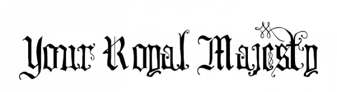
( Fonts by Sharkshock Productions----www.sharkshock.com. Personal-use only. For commercial use please contact owner. )
A regal, medieval-inspired font with intricate flourishes and decorative elements.
![Your Royal Majesty Frei Schriftart Herunterladen]() Herunterladen 1286 Downloads@WebFont
Herunterladen 1286 Downloads@WebFont -
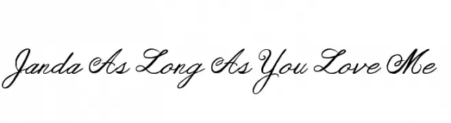
( Fonts by www.kimberlygeswein.com - Kimberly Geswein )
An elegant, cursive font with a sophisticated, handwritten style.
![Janda As Long As You Love Me Frei Schriftart Herunterladen]() Herunterladen 1286 Downloads@WebFont
Herunterladen 1286 Downloads@WebFont -
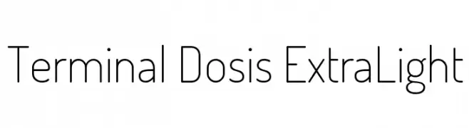
( Copyright (c) 2011, Edgar Tolentino and Pablo Impallari (www.impallari.com|impallari@gmail.com) )
A clean, geometric font with rounded edges and a minimalist design.
![Terminal Dosis ExtraLight Frei Schriftart Herunterladen]() Herunterladen 1286 Downloads@WebFont
Herunterladen 1286 Downloads@WebFont -
( Fonts by www.gust.org.pl )
A classic serif font with strong, authoritative characters and sharp serifs.
![LMRomanDemi10-Regular Frei Schriftart Herunterladen]() Herunterladen 1286 Downloads@WebFont
Herunterladen 1286 Downloads@WebFont -
( Fonts by Manfred Klein. Free for private and charity use. Free for commercial with donation to organizations )
A bold, modern font with characters in white on black circles.
![FolksCircleNegative Frei Schriftart Herunterladen]() Herunterladen 1286 Downloads@WebFont
Herunterladen 1286 Downloads@WebFont -
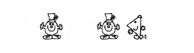
![Mr Men Frei Schriftart Herunterladen]() Herunterladen 1286 Downloads@WebFont
Herunterladen 1286 Downloads@WebFont -
( Fonts by Dieter Steffmann )
An ornate blackletter font with intricate detailing and a classic, formal style.
![Colchester Black Frei Schriftart Herunterladen]() Herunterladen 1286 Downloads@WebFont
Herunterladen 1286 Downloads@WebFont -
( Caveras - Cliff Modes - caveras.net )
A bold, geometric font with a pixelated, digital aesthetic.
![Jamboree Frei Schriftart Herunterladen]() Herunterladen 1285 Downloads@WebFont
Herunterladen 1285 Downloads@WebFont -
( Fonts by Situjuh Nazara - 7ntypes.com - Personal-use only. For commercial use please contact owner. )
A fluid and elegant script font with a handwritten appearance.
![Bintar Italic Frei Schriftart Herunterladen]() Herunterladen 1285 Downloads@WebFont
Herunterladen 1285 Downloads@WebFont -
( Copyright (c) 2010-2012, Alejandro Inler (alejandroinler@gmail.com), with Reserved Font Name 'Elsie' )
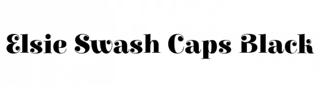
A bold, decorative serif font with elegant swash elements.
![Elsie Swash Caps Black Frei Schriftart Herunterladen]() Herunterladen 1285 Downloads@WebFont
Herunterladen 1285 Downloads@WebFont -
( Fonts by www.gliphmaker.com. Personal-use only. For commercial use please contact owner. )
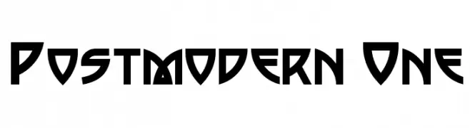
A bold, geometric font with a futuristic and edgy style.
![Postmodern One Frei Schriftart Herunterladen]() Herunterladen 1285 Downloads@WebFont
Herunterladen 1285 Downloads@WebFont -
( Copyright (c) 2012, LatinoType (luciano@latinotype.com), with Reserved Font Names 'Chela' )
A bold, playful font with rounded edges and thick strokes.
![Chela One Frei Schriftart Herunterladen]() Herunterladen 1285 Downloads@WebFont
Herunterladen 1285 Downloads@WebFont -
( Fonts by www.gust.org.pl )
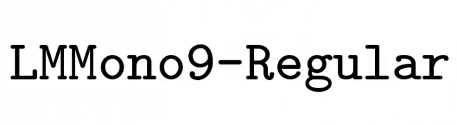
A monospaced font with uniform character width and a modern classic style.
![LMMono9-Regular Frei Schriftart Herunterladen]() Herunterladen 1285 Downloads@WebFont
Herunterladen 1285 Downloads@WebFont -
![Linux Libertine Italic Frei Schriftart Herunterladen]() Herunterladen 1285 Downloads@WebFont
Herunterladen 1285 Downloads@WebFont -
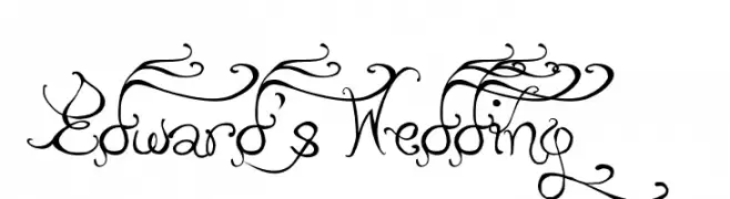
( Fonts by Albertine Nerevan - albertinenerevan.blogspot.com )
An ornate and decorative script font with elaborate swirls and flourishes.
![Edward's Wedding Frei Schriftart Herunterladen]() Herunterladen 1285 Downloads@WebFont
Herunterladen 1285 Downloads@WebFont -
( Fonts by Rodrigo German - RASDESIGN )
A bold, edgy font inspired by urban street art and skate culture.
![[skateboarding] Frei Schriftart Herunterladen]() Herunterladen 1285 Downloads@WebFont
Herunterladen 1285 Downloads@WebFont -
![Bas Relief Frei Schriftart Herunterladen]() Herunterladen 1285 Downloads
Herunterladen 1285 Downloads -
( Fonts by Masato Shimojima - Personal-use only. For commercial use please contact owner. )
A bold, decorative font with playful, high-contrast letterforms.
![Candy Bold Frei Schriftart Herunterladen]() Herunterladen 1285 Downloads@WebFont
Herunterladen 1285 Downloads@WebFont -
( Fonts by TypeOff )
A bold, modern sans-serif font with a strong and impactful presence.
![Martel Sans Heavy Frei Schriftart Herunterladen]() Herunterladen 1284 Downloads@WebFont
Herunterladen 1284 Downloads@WebFont


![[skateboarding] Frei Schriftart Herunterladen](https://d144mzi0q5mijx.cloudfront.net/img/0/S/skateboarding.webp)


Welche Schriften sind gerade am populärsten?
Poppins, Roboto, Montserrat, Open Sans und Lato sind wegen ihrer klaren Formen und breiten Einsetzbarkeit sehr gefragt – von Markenauftritt über Landingpages bis hin zu Postern.
Welche Fonts eignen sich für Logos?
Geometrische Sans‑Serifs (z. B. Poppins, Familien im Gotham‑Stil) sind ein häufiger Griff für sauberes, skalierbares Branding. Für eine persönlichere Note bleiben Scripts und Handschrift‑Stile beliebt. Kombinieren Sie einen prägnanten Headline‑Font mit einer neutralen Brotschrift für Wiedererkennung und Harmonie.
Wie oft wird die Top‑Liste aktualisiert?
Regelmäßig – basierend auf realen Downloads und Interaktionen. Schauen Sie öfter vorbei, um aufstrebende Favoriten früh zu entdecken.
💡 Tipp: Seite bookmarken – Trends wechseln schnell, und heutige Top‑Schriften inspirieren morgen vielleicht das Rebranding.