Willkommen bei den Top‑Schriften – hier treffen Beliebtheit und Qualität aufeinander. Das sind die in diesem Jahr am häufigsten heruntergeladenen und genutzten Fonts. Wenn Sie sichere Optionen für Logo, Web oder Social suchen, starten Sie hier.
Jeder Top‑Font überzeugt durch Balance, Lesbarkeit und Vielseitigkeit. Sie finden moderne Sans‑Serifs, elegante Scripts, Vintage‑Serifs und minimalistische Displays.
-
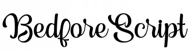
( Fonts by Lettersams - Samsul Kamal - Personal-use only. For commercial use please contact owner. )
A playful and elegant script font with flowing, interconnected letters.
 Herunterladen 43 Downloads@WebFont
 -
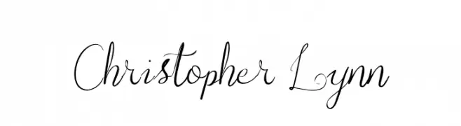
( Fonts by UI Creative - Personal-use only. For commercial use please contact owner. )
An elegant script font with flowing, cursive strokes and graceful loops.
![Christopher Lynn Frei Schriftart Herunterladen]() Herunterladen 43 Downloads@WebFont
Herunterladen 43 Downloads@WebFont -
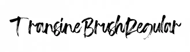
( Fonts by Vz Type - Personal-use only. For commercial use please contact owner. )
A bold, expressive brush-style font with dynamic strokes and a textured appearance.
![Transine Brush Regular Frei Schriftart Herunterladen]() Herunterladen 43 Downloads@WebFont
Herunterladen 43 Downloads@WebFont -
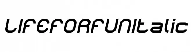
( Fonts by weknow - Wino S Kadir - Personal-use only. For commercial use please contact owner. )
A modern, italic font with rounded characters and a sleek, dynamic design.
![LIFE FOR FUN Italic Frei Schriftart Herunterladen]() Herunterladen 43 Downloads@WebFont
Herunterladen 43 Downloads@WebFont -
( Fonts by weknow - Wino S Kadir - Personal-use only. For commercial use please contact owner. )
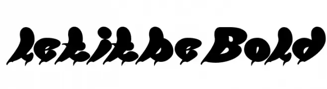
A bold, dynamic script font with exaggerated curves and sharp edges.
![let it be Bold Frei Schriftart Herunterladen]() Herunterladen 43 Downloads@WebFont
Herunterladen 43 Downloads@WebFont -
( Fonts by Runsell Studio - Personal-use only. For commercial use please contact owner. )
A bold, modern sans-serif font with geometric influences and high legibility.
![SchrambergSans Frei Schriftart Herunterladen]() Herunterladen 43 Downloads@WebFont
Herunterladen 43 Downloads@WebFont -
( Fonts by Mans Greback - www.mansgreback.com - Personal-use only. For commercial use please contact owner. )
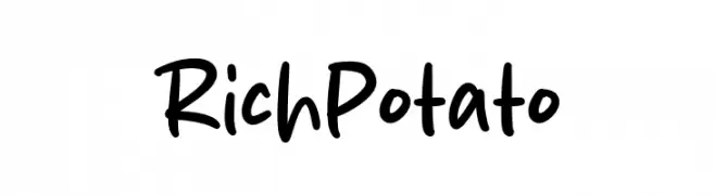
A playful, bold handwritten font with rounded strokes and a casual style.
![Rich Potato Frei Schriftart Herunterladen]() Herunterladen 43 Downloads@WebFont
Herunterladen 43 Downloads@WebFont -
( Fonts by Attype Studio - Fadli Ramadhan Iskandar - Personal-use only. For commercial use please contact owner. )
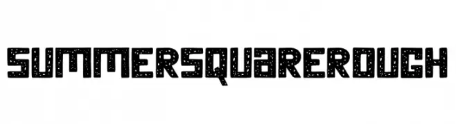
A bold, textured font with a hand-drawn, distressed appearance.
![SummerSquareRough Frei Schriftart Herunterladen]() Herunterladen 43 Downloads@WebFont
Herunterladen 43 Downloads@WebFont -
( Fonts by Letterena Studios - letterena.com - Personal-use only. For commercial use please contact owner. )
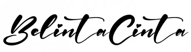
A dynamic, cursive script font with flowing, interconnected strokes.
![Belinta Cinta Frei Schriftart Herunterladen]() Herunterladen 43 Downloads@WebFont
Herunterladen 43 Downloads@WebFont -
( Fonts by Nur Solikh - Personal-use only. For commercial use please contact owner. )
A bold, geometric sans-serif font with strong, uniform strokes.
![Centie Sans Frei Schriftart Herunterladen]() Herunterladen 43 Downloads@WebFont
Herunterladen 43 Downloads@WebFont -
( Fonts by Risa Andarwati Wazirotun - Personal-use only. For commercial use please contact owner. )
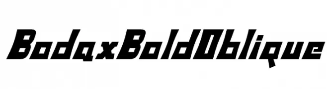
A bold, oblique font with angular, dynamic characters.
![BodaxBoldOblique Frei Schriftart Herunterladen]() Herunterladen 43 Downloads@WebFont
Herunterladen 43 Downloads@WebFont -
( Fonts by Attype Studio - Fadli Ramadhan Iskandar - Personal-use only. For commercial use please contact owner. )
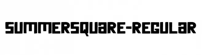
A bold, geometric font with a modern, assertive style.
![SummerSquare-Regular Frei Schriftart Herunterladen]() Herunterladen 43 Downloads@WebFont
Herunterladen 43 Downloads@WebFont -
( Fonts by Beautypes - Bhakti Al Akbar Pasaribu - Personal-use only. For commercial use please contact owner. )
A playful and elegant handwritten script font.
![HeyShanay Frei Schriftart Herunterladen]() Herunterladen 43 Downloads@WebFont
Herunterladen 43 Downloads@WebFont -
( Fonts by Graphics Bam - Benjamin Melville - Personal-use only. For commercial use please contact owner. )
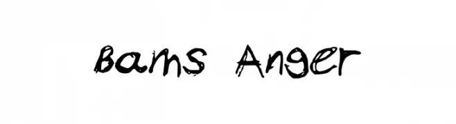
A bold, expressive font with brush-like strokes and dynamic, irregular characters.
![Bams Anger Frei Schriftart Herunterladen]() Herunterladen 43 Downloads@WebFont
Herunterladen 43 Downloads@WebFont -
( Fonts by Mega Type - M Akmal - Personal-use only. For commercial use please contact owner. )
A graceful and elegant script font with flowing, cursive letterforms.
![mobaster Frei Schriftart Herunterladen]() Herunterladen 43 Downloads@WebFont
Herunterladen 43 Downloads@WebFont -
( Fonts by Vladimir Nikolic - www.creativefabrica.com/designer/vladimirnikolic/ - Personal-use only. For commercial use please contact owner. )
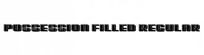
A bold, geometric font with a filled, outlined style, ideal for modern and impactful designs.
![Possession Filled Regular Frei Schriftart Herunterladen]() Herunterladen 43 Downloads@WebFont
Herunterladen 43 Downloads@WebFont -
( Fonts by EkoZero7 - Personal-use only. For commercial use please contact owner. )
A gothic Blackletter font with sharp, angular lines and decorative serifs.
![Marthapura Frei Schriftart Herunterladen]() Herunterladen 43 Downloads@WebFont
Herunterladen 43 Downloads@WebFont -
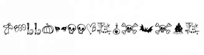
( Fonts by Jonathan S. Harris - Personal-use only. For commercial use please contact owner. )
A whimsical and playful Halloween-themed icon font.
![Halloween Spirits Frei Schriftart Herunterladen]() Herunterladen 43 Downloads@WebFont
Herunterladen 43 Downloads@WebFont -
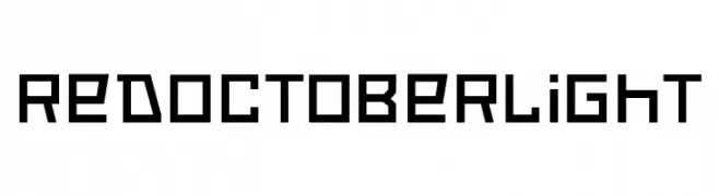
( Fonts by Neogrey Creative - Ivan Filipov - Personal-use only. For commercial use please contact owner. )
A bold, geometric font with a modern, industrial aesthetic.
![Red October Light Frei Schriftart Herunterladen]() Herunterladen 43 Downloads@WebFont
Herunterladen 43 Downloads@WebFont -
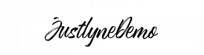
( Fonts by Runsell Studio - Personal-use only. For commercial use please contact owner. )
A dynamic and expressive handwritten font with fluid, cursive strokes.
![JustlyneDemo Frei Schriftart Herunterladen]() Herunterladen 43 Downloads@WebFont
Herunterladen 43 Downloads@WebFont -
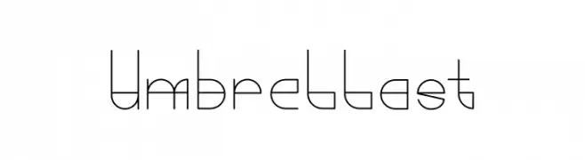
( Fonts by Typemacz Studio - Yusuf Sangdes - Personal-use only. For commercial use please contact owner. )
A modern, geometric font with thin lines and a minimalist aesthetic.
![Umbrellast Frei Schriftart Herunterladen]() Herunterladen 43 Downloads@WebFont
Herunterladen 43 Downloads@WebFont -
( Fonts by Beautypes - Bhakti Al Akbar Pasaribu - Personal-use only. For commercial use please contact owner. )
A lively and flowing script font with playful curves and elegant loops.
![TheBillow Frei Schriftart Herunterladen]() Herunterladen 43 Downloads@WebFont
Herunterladen 43 Downloads@WebFont -
( Fonts by Danu Setyaji Nugroho - Personal-use only. For commercial use please contact owner. )
An ornate and decorative serif font with intricate details and flourishes.
![stalber Frei Schriftart Herunterladen]() Herunterladen 43 Downloads@WebFont
Herunterladen 43 Downloads@WebFont -
( Fonts by Heinzel Std - Personal-use only. For commercial use please contact owner. )
An elegant, flowing script font with smooth, continuous strokes.
![Madore Frei Schriftart Herunterladen]() Herunterladen 43 Downloads@WebFont
Herunterladen 43 Downloads@WebFont -
( Fonts by zone108.main.jp - Personal-use only. For commercial use please contact owner. )
A bold, three-dimensional font with a shadow effect and uniform width.
![Kohryo Normal Frei Schriftart Herunterladen]() Herunterladen 43 Downloads@WebFont
Herunterladen 43 Downloads@WebFont -
( Fonts by Woodcutter Manero - www.woodcutter.es - Personal-use only. For commercial use please contact owner. )
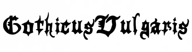
Ornate blackletter font with bold, angular forms and medieval character.
![Gothicus Vulgaris Frei Schriftart Herunterladen]() Herunterladen 43 Downloads@WebFont
Herunterladen 43 Downloads@WebFont -
( Fonts by ReivNick )
![Laylin Frei Schriftart Herunterladen]() Herunterladen 43 Downloads@WebFont
Herunterladen 43 Downloads@WebFont -
( Fonts by Kong Font - Personal-use only. For commercial use please contact owner. )
A playful and elegant script font with fluid, connected strokes.
![Billion Smile Frei Schriftart Herunterladen]() Herunterladen 43 Downloads@WebFont
Herunterladen 43 Downloads@WebFont -
( Fonts by Perspectype Studio - Personal-use only. For commercial use please contact owner. )
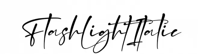
A dynamic and flowing script font with elegant, cursive letterforms.
![Flash Light Italic Frei Schriftart Herunterladen]() Herunterladen 43 Downloads@WebFont
Herunterladen 43 Downloads@WebFont -
( Fonts by Yoga Letter - Isroni Yoga Prasetya - Personal-use only. For commercial use please contact owner. )
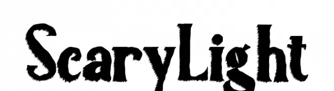
A jagged, horror-themed font with rough, textured characters.
![Scary Light Frei Schriftart Herunterladen]() Herunterladen 43 Downloads@WebFont
Herunterladen 43 Downloads@WebFont -
( Fonts by Neogrey Creative - Ivan Filipov - Personal-use only. For commercial use please contact owner. )
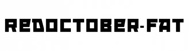
A bold, geometric font with a modern, industrial style.
![RedOctober-Fat Frei Schriftart Herunterladen]() Herunterladen 43 Downloads@WebFont
Herunterladen 43 Downloads@WebFont -
( Fonts by Woodcutter Manero - www.woodcutter.es - Personal-use only. For commercial use please contact owner. )
Bold, industrial stencil font with geometric shapes and separated strokes.
![Breaking Stencil News Frei Schriftart Herunterladen]() Herunterladen 43 Downloads@WebFont
Herunterladen 43 Downloads@WebFont -
( Fonts by Abo Daniel Studio - Panggah Laksono - Personal-use only. For commercial use please contact owner. )
A bold, hand-drawn font with a playful and artistic style.
![Soredona Frei Schriftart Herunterladen]() Herunterladen 43 Downloads@WebFont
Herunterladen 43 Downloads@WebFont -
( Fonts by Fontherapy - Siti Anisa - Personal-use only. For commercial use please contact owner. )
Elegant, flowing swashes with a calligraphic style.
![Remember Moment swash Frei Schriftart Herunterladen]() Herunterladen 43 Downloads@WebFont
Herunterladen 43 Downloads@WebFont -
( Fonts by weknow - Wino S Kadir - Personal-use only. For commercial use please contact owner. )
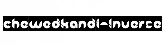
A bold, geometric font with circular and abstract shapes, ideal for modern designs.
![chewedkandi-Inverse Frei Schriftart Herunterladen]() Herunterladen 43 Downloads@WebFont
Herunterladen 43 Downloads@WebFont


Welche Schriften sind gerade am populärsten?
Poppins, Roboto, Montserrat, Open Sans und Lato sind wegen ihrer klaren Formen und breiten Einsetzbarkeit sehr gefragt – von Markenauftritt über Landingpages bis hin zu Postern.
Welche Fonts eignen sich für Logos?
Geometrische Sans‑Serifs (z. B. Poppins, Familien im Gotham‑Stil) sind ein häufiger Griff für sauberes, skalierbares Branding. Für eine persönlichere Note bleiben Scripts und Handschrift‑Stile beliebt. Kombinieren Sie einen prägnanten Headline‑Font mit einer neutralen Brotschrift für Wiedererkennung und Harmonie.
Wie oft wird die Top‑Liste aktualisiert?
Regelmäßig – basierend auf realen Downloads und Interaktionen. Schauen Sie öfter vorbei, um aufstrebende Favoriten früh zu entdecken.
💡 Tipp: Seite bookmarken – Trends wechseln schnell, und heutige Top‑Schriften inspirieren morgen vielleicht das Rebranding.