Willkommen bei den Top‑Schriften – hier treffen Beliebtheit und Qualität aufeinander. Das sind die in diesem Jahr am häufigsten heruntergeladenen und genutzten Fonts. Wenn Sie sichere Optionen für Logo, Web oder Social suchen, starten Sie hier.
Jeder Top‑Font überzeugt durch Balance, Lesbarkeit und Vielseitigkeit. Sie finden moderne Sans‑Serifs, elegante Scripts, Vintage‑Serifs und minimalistische Displays.
-
( Fonts by Colllab Studio - Personal-use only. For commercial use please contact owner. )
A charming and elegant handwritten script font with fluid, connected letterforms.
 Herunterladen 43 Downloads@WebFont
 -
( Fonts by Gigih Wiryana - Personal-use only. For commercial use please contact owner. )
A modern, elegant script font with flowing, cursive characters.
![Camella Beauty Script Frei Schriftart Herunterladen]() Herunterladen 43 Downloads@WebFont
Herunterladen 43 Downloads@WebFont -
( Fonts by weknow - Wino S Kadir - Personal-use only. For commercial use please contact owner. )
A bold, dynamic font with rounded strokes and a slight slant.
![Big Mountain-Inverse Frei Schriftart Herunterladen]() Herunterladen 43 Downloads@WebFont
Herunterladen 43 Downloads@WebFont -
( Fonts by Almarkhatype - Abdul Malik Wisnu - Personal-use only. For commercial use please contact owner. )
A bold, playful font with a hand-drawn, dynamic style.
![themoment Frei Schriftart Herunterladen]() Herunterladen 43 Downloads@WebFont
Herunterladen 43 Downloads@WebFont -
( Fonts by Creative Lab - Creative LAB - Personal-use only. For commercial use please contact owner. )
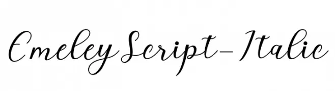
An elegant and flowing script font with sophisticated cursive letters.
![EmeleyScript-Italic Frei Schriftart Herunterladen]() Herunterladen 43 Downloads@WebFont
Herunterladen 43 Downloads@WebFont -
( Fonts by Typefactoryco )
![Winola Free Trial Frei Schriftart Herunterladen]() Herunterladen 43 Downloads@WebFont
Herunterladen 43 Downloads@WebFont -
( Fonts by Bytenesia Studio - Personal-use only. For commercial use please contact owner. )
A bold, playful font with rounded edges and a modern, energetic feel.
![Highdream-Bold Frei Schriftart Herunterladen]() Herunterladen 43 Downloads@WebFont
Herunterladen 43 Downloads@WebFont -
( Fonts by Pandan Wangi - Personal-use only. For commercial use please contact owner. )
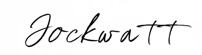
A fluid and elegant handwritten cursive font with dynamic strokes.
![Jockwatt Frei Schriftart Herunterladen]() Herunterladen 43 Downloads@WebFont
Herunterladen 43 Downloads@WebFont -
( Fonts by Jayde Garrow - Personal-use only. For commercial use please contact owner. )
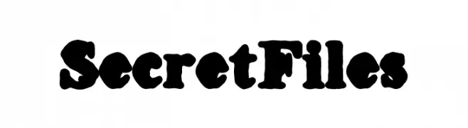
A bold, vintage-style decorative font with thick, irregular strokes.
![Secret Files Frei Schriftart Herunterladen]() Herunterladen 43 Downloads@WebFont
Herunterladen 43 Downloads@WebFont -
( Fonts by mightype - Personal-use only. For commercial use please contact owner. )
A cursive font with elegant, flowing strokes and decorative flourishes.
![kallita Frei Schriftart Herunterladen]() Herunterladen 43 Downloads@WebFont
Herunterladen 43 Downloads@WebFont -
( Fonts by Attype Studio - Fadli Ramadhan Iskandar - Personal-use only. For commercial use please contact owner. )
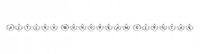
An elegant, decorative monogram font with ornate frames and classic serif style.
![Heleny Monogram Regular Frei Schriftart Herunterladen]() Herunterladen 43 Downloads@WebFont
Herunterladen 43 Downloads@WebFont -
( Fonts by Creatype Studio - Rian Rahardi - Personal-use only. For commercial use please contact owner. )
A tall, narrow handwritten font with a playful and elegant style.
![HaiAllison-Regular Frei Schriftart Herunterladen]() Herunterladen 43 Downloads@WebFont
Herunterladen 43 Downloads@WebFont -
( Fonts by Helotype - Yudi Setiawan - Personal-use only. For commercial use please contact owner. )
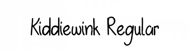
A playful, hand-drawn font with a whimsical and informal style.
![Kiddiewink Regular Frei Schriftart Herunterladen]() Herunterladen 43 Downloads@WebFont
Herunterladen 43 Downloads@WebFont -
( Fonts by UI Creative - Personal-use only. For commercial use please contact owner. )
A playful and whimsical handwritten font with flowing curves and dynamic strokes.
![Warangga Frei Schriftart Herunterladen]() Herunterladen 43 Downloads@WebFont
Herunterladen 43 Downloads@WebFont -
( Fonts by weknow - Wino S Kadir - Personal-use only. For commercial use please contact owner. )
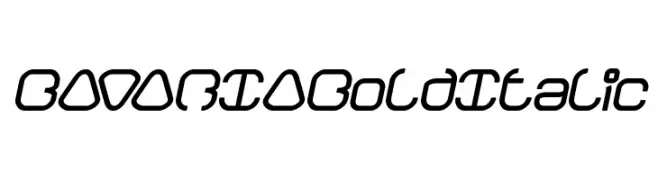
A bold, italic, and geometric font with a modern and futuristic style.
![BAVARIA Bold Italic Frei Schriftart Herunterladen]() Herunterladen 43 Downloads@WebFont
Herunterladen 43 Downloads@WebFont -
( Fonts by Creatype Studio - Rian Rahardi - Personal-use only. For commercial use please contact owner. )
A monoline, rounded script font with a casual, handwritten style.
![Rampage Monoline Rounded Frei Schriftart Herunterladen]() Herunterladen 43 Downloads@WebFont
Herunterladen 43 Downloads@WebFont -
( Fonts by Regalëy_21 - Personal-use only. For commercial use please contact owner. )
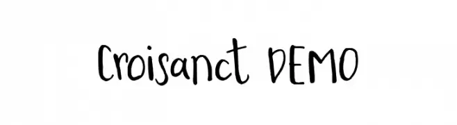
A playful, handwritten font with irregular strokes and a casual style.
![Croisanct DEMO Frei Schriftart Herunterladen]() Herunterladen 43 Downloads@WebFont
Herunterladen 43 Downloads@WebFont -
( Fonts by SSI.Scraps - Syukur Setiyadi - Personal-use only. For commercial use please contact owner. )
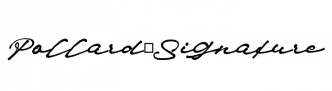
A classic, cursive script font with a handwritten, signature-like style.
![Pollard_Signature Frei Schriftart Herunterladen]() Herunterladen 43 Downloads@WebFont
Herunterladen 43 Downloads@WebFont -
( Fonts by arttotell - Personal-use only. For commercial use please contact owner. )
An elegant, flowing script font with intricate loops and swirls.
![Oystersvelt Frei Schriftart Herunterladen]() Herunterladen 43 Downloads@WebFont
Herunterladen 43 Downloads@WebFont -
( Fonts by Albertako - Albert Akho - Personal-use only. For commercial use please contact owner. )
A modern yet vintage-inspired font with elegant curves and geometric shapes.
![Respingo Frei Schriftart Herunterladen]() Herunterladen 43 Downloads@WebFont
Herunterladen 43 Downloads@WebFont -
( Fonts by Nils Cordes - Personal-use only. For commercial use please contact owner. )
A bold, playful font with a hand-drawn, casual style.
![Cardenio Modern Bold Frei Schriftart Herunterladen]() Herunterladen 43 Downloads@WebFont
Herunterladen 43 Downloads@WebFont -
( Fonts by Iconian Fonts - Daniel Zadorozny - Personal-use only. For commercial use please contact owner. )
A bold, angular font with a leftward slant and tight spacing.
![Templar Shield Leftalic Frei Schriftart Herunterladen]() Herunterladen 43 Downloads@WebFont
Herunterladen 43 Downloads@WebFont -
( Fonts by Miss Tiina Fonts - MTF - Miss Tiina - Personal-use only. For commercial use please contact owner. )
A whimsical, hand-drawn font with playful, curly elements and decorative uppercase letters.
![MTF Girlie Frei Schriftart Herunterladen]() Herunterladen 43 Downloads@WebFont
Herunterladen 43 Downloads@WebFont -
( Fonts by Woodcutter Manero - www.woodcutter.es - Personal-use only. For commercial use please contact owner. )
Bold, decorative slab serif with dotted fill and vintage flair.
![Serigraphy Frei Schriftart Herunterladen]() Herunterladen 43 Downloads@WebFont
Herunterladen 43 Downloads@WebFont -
( Fonts by Rangkai Aksara - Personal-use only. For commercial use please contact owner. )
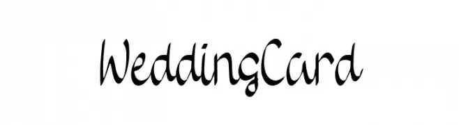
A cursive, elegant font with flowing lines and sophisticated flourishes.
![Wedding Card Frei Schriftart Herunterladen]() Herunterladen 43 Downloads@WebFont
Herunterladen 43 Downloads@WebFont -
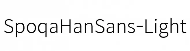
( Collection of Korean web fonts - Personal-use only. For commercial use please contact owner. )
A clean, modern sans-serif font with geometric letterforms and even stroke widths.
![SpoqaHanSans-Light Frei Schriftart Herunterladen]() Herunterladen 43 Downloads@WebFont
Herunterladen 43 Downloads@WebFont -
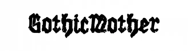
( Fonts by Woodcutter Manero - www.woodcutter.es - Personal-use only. For commercial use please contact owner. )
Distressed, bold blackletter font with a grungy, gothic style.
![Gothic Mother Frei Schriftart Herunterladen]() Herunterladen 43 Downloads@WebFont
Herunterladen 43 Downloads@WebFont -
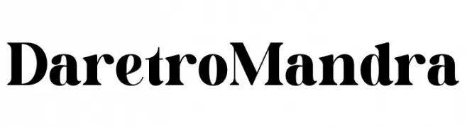
( Fonts by Letterena Studios - letterena.com - Personal-use only. For commercial use please contact owner. )
A bold, high-contrast serif font with dramatic strokes and classic elegance.
![Daretro Mandra Frei Schriftart Herunterladen]() Herunterladen 43 Downloads@WebFont
Herunterladen 43 Downloads@WebFont -
( Fonts by weknow - Wino S Kadir - Personal-use only. For commercial use please contact owner. )
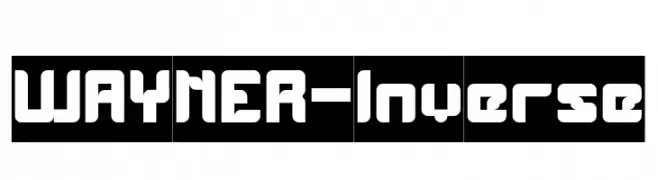
A bold, geometric font with a modern, futuristic style and rounded edges.
![WAYNER-Inverse Frei Schriftart Herunterladen]() Herunterladen 43 Downloads@WebFont
Herunterladen 43 Downloads@WebFont -
( Fonts by Typodermic Fonts - Raymond Larabie - Personal-use only. For commercial use please contact owner. )
A bold, geometric font with sharp angles and a futuristic look.
![RelishGargler-Regular Frei Schriftart Herunterladen]() Herunterladen 43 Downloads@WebFont
Herunterladen 43 Downloads@WebFont -
( Fonts by 1PrivateTime )
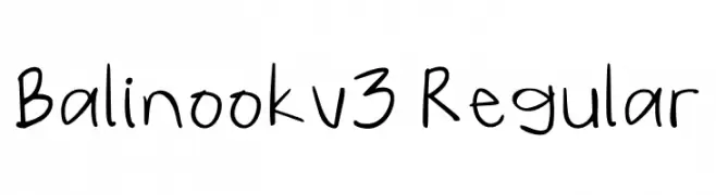
Casual handwritten sans-serif with playful, organic strokes.
![Balinook_v3 Regular Frei Schriftart Herunterladen]() Herunterladen 43 Downloads@WebFont
Herunterladen 43 Downloads@WebFont -
( Fonts by Vladimir Nikolic - www.creativefabrica.com/designer/vladimirnikolic/ - Personal-use only. For commercial use please contact owner. )
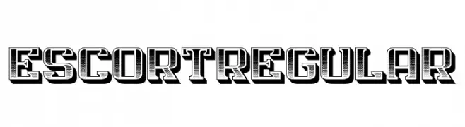
A bold, decorative font with a three-dimensional effect and intricate detailing.
![Escort Regular Frei Schriftart Herunterladen]() Herunterladen 43 Downloads@WebFont
Herunterladen 43 Downloads@WebFont -
( Fonts by Booga Letter - Fajar Wicaksono - Personal-use only. For commercial use please contact owner. )
A playful, hand-drawn font with bold, rounded characters and a whimsical style.
![Kiddos Club Frei Schriftart Herunterladen]() Herunterladen 43 Downloads@WebFont
Herunterladen 43 Downloads@WebFont -
( Fonts by Typefar - Farul Arjianto - Personal-use only. For commercial use please contact owner. )
A dynamic, brush-style font with an expressive, handwritten look.
![Purple Grande Frei Schriftart Herunterladen]() Herunterladen 43 Downloads@WebFont
Herunterladen 43 Downloads@WebFont -
( Fonts by Tegaki Script - Personal-use only. For commercial use please contact owner. )
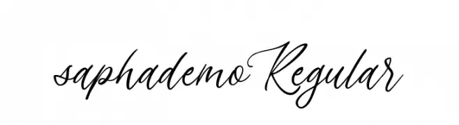
A cursive, handwritten font with elegant, flowing strokes.
![sapha demo Regular Frei Schriftart Herunterladen]() Herunterladen 43 Downloads@WebFont
Herunterladen 43 Downloads@WebFont


Welche Schriften sind gerade am populärsten?
Poppins, Roboto, Montserrat, Open Sans und Lato sind wegen ihrer klaren Formen und breiten Einsetzbarkeit sehr gefragt – von Markenauftritt über Landingpages bis hin zu Postern.
Welche Fonts eignen sich für Logos?
Geometrische Sans‑Serifs (z. B. Poppins, Familien im Gotham‑Stil) sind ein häufiger Griff für sauberes, skalierbares Branding. Für eine persönlichere Note bleiben Scripts und Handschrift‑Stile beliebt. Kombinieren Sie einen prägnanten Headline‑Font mit einer neutralen Brotschrift für Wiedererkennung und Harmonie.
Wie oft wird die Top‑Liste aktualisiert?
Regelmäßig – basierend auf realen Downloads und Interaktionen. Schauen Sie öfter vorbei, um aufstrebende Favoriten früh zu entdecken.
💡 Tipp: Seite bookmarken – Trends wechseln schnell, und heutige Top‑Schriften inspirieren morgen vielleicht das Rebranding.