Willkommen bei den Top‑Schriften – hier treffen Beliebtheit und Qualität aufeinander. Das sind die in diesem Jahr am häufigsten heruntergeladenen und genutzten Fonts. Wenn Sie sichere Optionen für Logo, Web oder Social suchen, starten Sie hier.
Jeder Top‑Font überzeugt durch Balance, Lesbarkeit und Vielseitigkeit. Sie finden moderne Sans‑Serifs, elegante Scripts, Vintage‑Serifs und minimalistische Displays.
-
( Personal-use only. For commercial use please contact owner. )
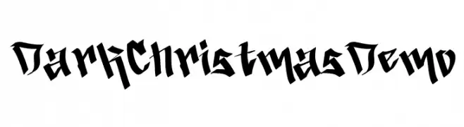
Sharp, gothic-inspired display font with bold, angular strokes.
 Herunterladen 41 Downloads@WebFont
 -
( Fonts by Vunira Design - Personal-use only. For commercial use please contact owner. )
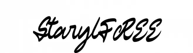
A bold, cursive script font with a fluid, handwritten style.
![StarylFREE Frei Schriftart Herunterladen]() Herunterladen 41 Downloads@WebFont
Herunterladen 41 Downloads@WebFont -
( Fonts by Kong Font - Personal-use only. For commercial use please contact owner. )
Ornate and decorative font with intricate embellishments.
![Delusion Ornament Frei Schriftart Herunterladen]() Herunterladen 41 Downloads@WebFont
Herunterladen 41 Downloads@WebFont -
( Fonts by weknow - Wino S Kadir - Personal-use only. For commercial use please contact owner. )
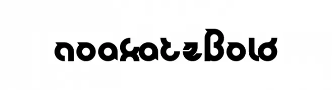
A bold, modern font with geometric and dynamic styling.
![noakatz Bold Frei Schriftart Herunterladen]() Herunterladen 41 Downloads@WebFont
Herunterladen 41 Downloads@WebFont -
( Fonts by weknow - Wino S Kadir - Personal-use only. For commercial use please contact owner. )
A bold, geometric hollow font with a modern and futuristic style.
![perfect-Hollow Frei Schriftart Herunterladen]() Herunterladen 41 Downloads@WebFont
Herunterladen 41 Downloads@WebFont -
( Fonts by BlackFridayFont FMF )
![Dogpixur Frei Schriftart Herunterladen]() Herunterladen 41 Downloads@WebFont
Herunterladen 41 Downloads@WebFont -
( Fonts by Integritype Studio - Personal-use only. For commercial use please contact owner. )
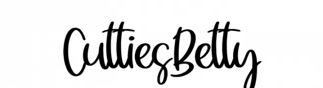
A playful handwritten font with smooth, flowing curves and a lively appearance.
![Cutties Betty Frei Schriftart Herunterladen]() Herunterladen 41 Downloads@WebFont
Herunterladen 41 Downloads@WebFont -
( Fonts by Dichi - Rizky Andyno Ramadhan - Personal-use only. For commercial use please contact owner. )
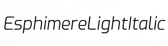
A sleek, modern, light italic font with medium contrast and condensed spacing.
![Esphimere Light Italic Frei Schriftart Herunterladen]() Herunterladen 41 Downloads@WebFont
Herunterladen 41 Downloads@WebFont -
( Fonts by deFharo - Fernando Haro - Personal-use only. For commercial use please contact owner. )
A bold, geometric font with sharp angles and a modern style.
![Gudariak Frei Schriftart Herunterladen]() Herunterladen 41 Downloads@WebFont
Herunterladen 41 Downloads@WebFont -
( Fonts by Perspectype Studio - Personal-use only. For commercial use please contact owner. )
A lively and expressive handwritten font with dynamic strokes and playful loops.
![Amigoste Frei Schriftart Herunterladen]() Herunterladen 41 Downloads@WebFont
Herunterladen 41 Downloads@WebFont -
( Fonts by Vladimir Nikolic - www.creativefabrica.com/designer/vladimirnikolic/ - Personal-use only. For commercial use please contact owner. )
A bold, geometric font with a three-dimensional shadow effect, ideal for display use.
![Excessive Regular Frei Schriftart Herunterladen]() Herunterladen 41 Downloads@WebFont
Herunterladen 41 Downloads@WebFont -
( Fonts by Ari Aditia Ikhsan - Personal-use only. For commercial use please contact owner. )
A bold, geometric font with an industrial and mechanical style.
![Serpadu Frei Schriftart Herunterladen]() Herunterladen 41 Downloads@WebFont
Herunterladen 41 Downloads@WebFont -
( Fonts by Iconian Fonts - Daniel Zadorozny - Personal-use only. For commercial use please contact owner. )
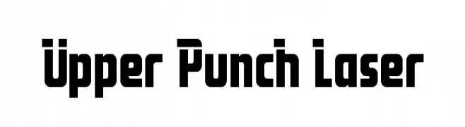
A bold, geometric font with strong, blocky characters and high contrast.
![Upper Punch Laser Frei Schriftart Herunterladen]() Herunterladen 41 Downloads@WebFont
Herunterladen 41 Downloads@WebFont -
( Fonts by Iconian Fonts - Daniel Zadorozny - Personal-use only. For commercial use please contact owner. )
A bold, geometric font with a futuristic and angular design.
![Star Guard Drop-Case Frei Schriftart Herunterladen]() Herunterladen 41 Downloads@WebFont
Herunterladen 41 Downloads@WebFont -
( Fonts by Runsell Studio - Personal-use only. For commercial use please contact owner. )
A flowing, cursive script font with elegant, sweeping strokes.
![HemisphersScript Frei Schriftart Herunterladen]() Herunterladen 41 Downloads@WebFont
Herunterladen 41 Downloads@WebFont -
( Fonts by Gus Fajar - Personal-use only. For commercial use please contact owner. )
A lively handwritten font with fluid, playful strokes.
![Buchero Regular Frei Schriftart Herunterladen]() Herunterladen 41 Downloads@WebFont
Herunterladen 41 Downloads@WebFont -
( Fonts by S.P.M.H - Slyzi Hadi - Personal-use only. For commercial use please contact owner. )
A modern, geometric font with clean lines and sharp angles.
![SeNSKYDEMO Frei Schriftart Herunterladen]() Herunterladen 41 Downloads@WebFont
Herunterladen 41 Downloads@WebFont -
( Fonts by weknow - Wino S Kadir - Personal-use only. For commercial use please contact owner. )
A bold, hollow, and geometric font with a modern, futuristic style.
![perfect-Hollow-Inverse Frei Schriftart Herunterladen]() Herunterladen 41 Downloads@WebFont
Herunterladen 41 Downloads@WebFont -
( Fonts by Beautypes - Bhakti Al Akbar Pasaribu - Personal-use only. For commercial use please contact owner. )
A playful and elegant cursive font with interconnected strokes.
![Bellasya Frei Schriftart Herunterladen]() Herunterladen 41 Downloads@WebFont
Herunterladen 41 Downloads@WebFont -
( Fonts by Khurasan - Syaf Rizal - Personal-use only. For commercial use please contact owner. )
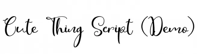
A playful, whimsical script font with a handwritten, cursive style.
![Cute Thing Script (Demo) Frei Schriftart Herunterladen]() Herunterladen 41 Downloads@WebFont
Herunterladen 41 Downloads@WebFont -
( Fonts by Lovoos - Personal-use only. For commercial use please contact owner. )
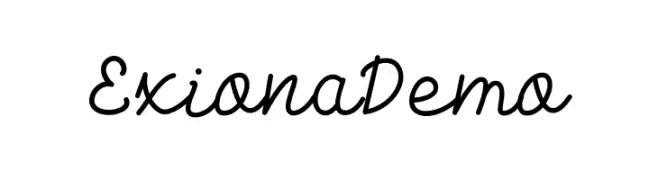
A charming and fluid script font with elegant cursive letters.
![Exiona Demo Frei Schriftart Herunterladen]() Herunterladen 41 Downloads@WebFont
Herunterladen 41 Downloads@WebFont -
( Fonts by Abo Daniel Studio - Panggah Laksono - Personal-use only. For commercial use please contact owner. )
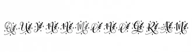
An ornate, floral-decorated font ideal for elegant and sophisticated designs.
![Quinn Monogram Frei Schriftart Herunterladen]() Herunterladen 41 Downloads@WebFont
Herunterladen 41 Downloads@WebFont -
( Fonts by FallenGraphic Studio - Vava Aryanto - Personal-use only. For commercial use please contact owner. )
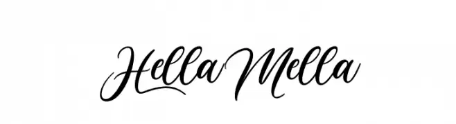
A graceful and elegant script font with flowing curves and artistic flair.
![Hella Mella Frei Schriftart Herunterladen]() Herunterladen 41 Downloads@WebFont
Herunterladen 41 Downloads@WebFont -
( Fonts by weknow - Wino S Kadir - Personal-use only. For commercial use please contact owner. )
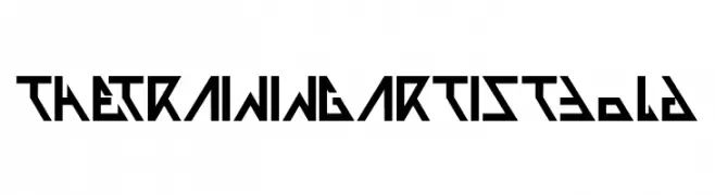
A bold, geometric font with sharp angles and a futuristic style.
![THE TRAINING ARTIST Bold Frei Schriftart Herunterladen]() Herunterladen 41 Downloads@WebFont
Herunterladen 41 Downloads@WebFont -
( Fonts by Digital Typeface Studio - Eva Barabasne Olasz - Personal-use only. For commercial use please contact owner. )
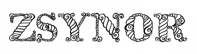
An ornate and decorative font with swirling, artistic patterns.
![Zsynor Frei Schriftart Herunterladen]() Herunterladen 41 Downloads@WebFont
Herunterladen 41 Downloads@WebFont -
( Fonts by GGBotNet - Personal-use only. For commercial use please contact owner. )
A pixelated, grid-based font with a retro digital aesthetic.
![DatCub Frei Schriftart Herunterladen]() Herunterladen 41 Downloads@WebFont
Herunterladen 41 Downloads@WebFont -
( Fonts by Ilham Nashrul Huda - ETC Supply - Personal-use only. For commercial use please contact owner. )
A smooth, flowing script font with an elegant handwritten style.
![Get Holland Frei Schriftart Herunterladen]() Herunterladen 41 Downloads@WebFont
Herunterladen 41 Downloads@WebFont -
( Fonts by Runsell Studio - Personal-use only. For commercial use please contact owner. )
A decorative, distressed font with a vintage, artistic style.
![Revalina Frei Schriftart Herunterladen]() Herunterladen 41 Downloads@WebFont
Herunterladen 41 Downloads@WebFont -
( Personal-use only. For commercial use please contact owner. )
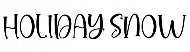
Playful handwritten script with tall, whimsical letters.
![HOLIDAY SNOW Frei Schriftart Herunterladen]() Herunterladen 41 Downloads@WebFont
Herunterladen 41 Downloads@WebFont -
( Fonts by Vladimir Nikolic - www.creativefabrica.com/designer/vladimirnikolic/ - Personal-use only. For commercial use please contact owner. )
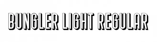
A bold, 3D font with a shadow effect and modern aesthetic.
![Bungler Light Regular Frei Schriftart Herunterladen]() Herunterladen 41 Downloads@WebFont
Herunterladen 41 Downloads@WebFont -
( Fonts by Perspectype Studio - Personal-use only. For commercial use please contact owner. )
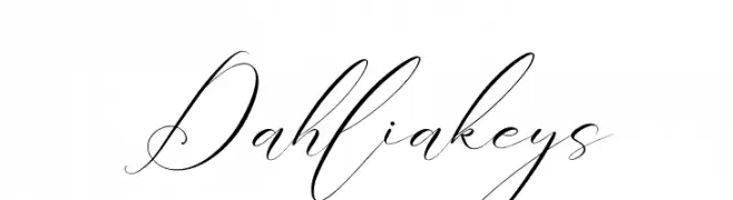
An elegant script font with flowing, cursive strokes and high contrast.
![Dahliakeys Frei Schriftart Herunterladen]() Herunterladen 41 Downloads@WebFont
Herunterladen 41 Downloads@WebFont -
( Fonts by Jamaluddin - Personal-use only. For commercial use please contact owner. )
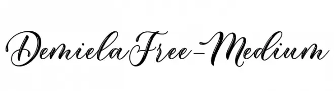
An elegant script font with flowing, cursive strokes and decorative flourishes.
![DemielaFree-Medium Frei Schriftart Herunterladen]() Herunterladen 41 Downloads@WebFont
Herunterladen 41 Downloads@WebFont -
( Fonts by Attype Studio - Fadli Ramadhan Iskandar - Personal-use only. For commercial use please contact owner. )
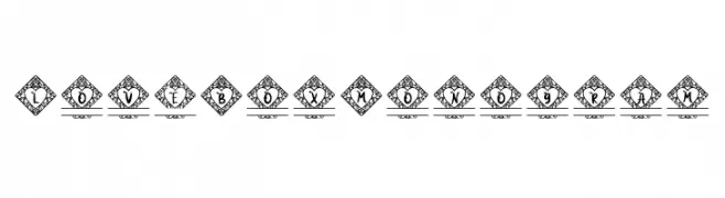
An ornate, decorative font with diamond-framed letters, ideal for monograms.
![Love Box Monogram Frei Schriftart Herunterladen]() Herunterladen 41 Downloads@WebFont
Herunterladen 41 Downloads@WebFont -
( Fonts by Md Shohail Bhuian - Personal-use only. For commercial use please contact owner. )
A playful, hand-drawn font with tall, narrow letters and a whimsical style.
![Inquisitive Frei Schriftart Herunterladen]() Herunterladen 41 Downloads@WebFont
Herunterladen 41 Downloads@WebFont -
( Fonts by P. Baudin )
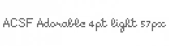
A cross-stitch styled font with a handcrafted, whimsical appearance.
![ACSF Adorable 4pt light 57px Frei Schriftart Herunterladen]() Herunterladen 41 Downloads@WebFont
Herunterladen 41 Downloads@WebFont


Welche Schriften sind gerade am populärsten?
Poppins, Roboto, Montserrat, Open Sans und Lato sind wegen ihrer klaren Formen und breiten Einsetzbarkeit sehr gefragt – von Markenauftritt über Landingpages bis hin zu Postern.
Welche Fonts eignen sich für Logos?
Geometrische Sans‑Serifs (z. B. Poppins, Familien im Gotham‑Stil) sind ein häufiger Griff für sauberes, skalierbares Branding. Für eine persönlichere Note bleiben Scripts und Handschrift‑Stile beliebt. Kombinieren Sie einen prägnanten Headline‑Font mit einer neutralen Brotschrift für Wiedererkennung und Harmonie.
Wie oft wird die Top‑Liste aktualisiert?
Regelmäßig – basierend auf realen Downloads und Interaktionen. Schauen Sie öfter vorbei, um aufstrebende Favoriten früh zu entdecken.
💡 Tipp: Seite bookmarken – Trends wechseln schnell, und heutige Top‑Schriften inspirieren morgen vielleicht das Rebranding.