Willkommen bei den Top‑Schriften – hier treffen Beliebtheit und Qualität aufeinander. Das sind die in diesem Jahr am häufigsten heruntergeladenen und genutzten Fonts. Wenn Sie sichere Optionen für Logo, Web oder Social suchen, starten Sie hier.
Jeder Top‑Font überzeugt durch Balance, Lesbarkeit und Vielseitigkeit. Sie finden moderne Sans‑Serifs, elegante Scripts, Vintage‑Serifs und minimalistische Displays.
-
 Herunterladen 331 Downloads@WebFont
 -
![wmeaster1 Frei Schriftart Herunterladen]() Herunterladen 331 Downloads@WebFont
Herunterladen 331 Downloads@WebFont -
![bhangra Frei Schriftart Herunterladen]() Herunterladen 331 Downloads@WebFont
Herunterladen 331 Downloads@WebFont -
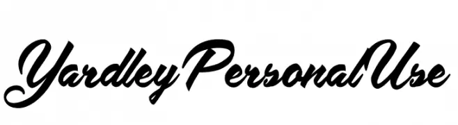
( Fonts by Billy Argel Fonts - www.billyargel.com - Personal-use only. For commercial use please contact owner. )
A cursive font with elegant, flowing curves and high contrast strokes.
![Yardley Personal Use Frei Schriftart Herunterladen]() Herunterladen 331 Downloads@WebFont
Herunterladen 331 Downloads@WebFont -
( Fonts by www.chequered.ink - Chequered Ink - Personal-use only. For commercial use please contact owner. )
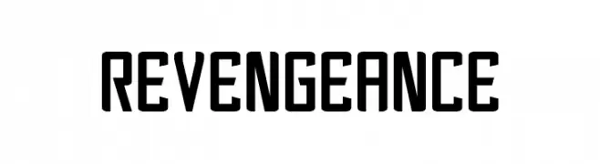
A bold, modern font with a geometric and condensed design.
![Revengeance Frei Schriftart Herunterladen]() Herunterladen 331 Downloads@WebFont
Herunterladen 331 Downloads@WebFont -
-
( Fonts by ShyFonts )
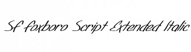
A flowing, cursive script font with an elegant, italicized style.
![SF Foxboro Script Extended Italic Frei Schriftart Herunterladen]() Herunterladen 331 Downloads@WebFont
Herunterladen 331 Downloads@WebFont -
( Fonts by Darko Bogdanov )
A playful, handwritten font with a casual and whimsical style.
![Darbog Frei Schriftart Herunterladen]() Herunterladen 331 Downloads@WebFont
Herunterladen 331 Downloads@WebFont -
( Fonts by 7NTypes )
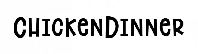
A playful, bold font with a hand-drawn, whimsical style.
![Chicken Dinner Frei Schriftart Herunterladen]() Herunterladen 331 Downloads@WebFont
Herunterladen 331 Downloads@WebFont -
( Fonts by HENRIavecunK - Henrik - Personal-use only. For commercial use please contact owner. )
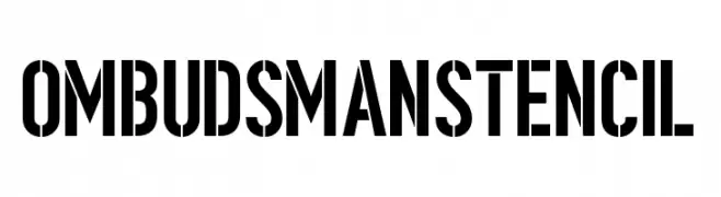
A bold, stencil-style font with high contrast and tight spacing.
![OmbudsmanStencil Frei Schriftart Herunterladen]() Herunterladen 331 Downloads@WebFont
Herunterladen 331 Downloads@WebFont -
( Fonts by Galdino Otten )
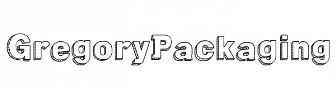
A bold, three-dimensional font with a playful shadow effect and textured interior.
![Gregory Packaging Frei Schriftart Herunterladen]() Herunterladen 331 Downloads@WebFont
Herunterladen 331 Downloads@WebFont

Welche Schriften sind gerade am populärsten?
Poppins, Roboto, Montserrat, Open Sans und Lato sind wegen ihrer klaren Formen und breiten Einsetzbarkeit sehr gefragt – von Markenauftritt über Landingpages bis hin zu Postern.
Welche Fonts eignen sich für Logos?
Geometrische Sans‑Serifs (z. B. Poppins, Familien im Gotham‑Stil) sind ein häufiger Griff für sauberes, skalierbares Branding. Für eine persönlichere Note bleiben Scripts und Handschrift‑Stile beliebt. Kombinieren Sie einen prägnanten Headline‑Font mit einer neutralen Brotschrift für Wiedererkennung und Harmonie.
Wie oft wird die Top‑Liste aktualisiert?
Regelmäßig – basierend auf realen Downloads und Interaktionen. Schauen Sie öfter vorbei, um aufstrebende Favoriten früh zu entdecken.
💡 Tipp: Seite bookmarken – Trends wechseln schnell, und heutige Top‑Schriften inspirieren morgen vielleicht das Rebranding.