Willkommen bei den Top‑Schriften – hier treffen Beliebtheit und Qualität aufeinander. Das sind die in diesem Jahr am häufigsten heruntergeladenen und genutzten Fonts. Wenn Sie sichere Optionen für Logo, Web oder Social suchen, starten Sie hier.
Jeder Top‑Font überzeugt durch Balance, Lesbarkeit und Vielseitigkeit. Sie finden moderne Sans‑Serifs, elegante Scripts, Vintage‑Serifs und minimalistische Displays.
-
 Herunterladen 10223 Downloads@WebFont
 -
Schriftart von alphadesigner. For commercial use please contact the owner.
![BulgariaModernaV3 Frei Schriftart Herunterladen]() Herunterladen 10220 Downloads@WebFont
Herunterladen 10220 Downloads@WebFont -
![FederationBold Frei Schriftart Herunterladen]() Herunterladen 10219 Downloads@WebFont
Herunterladen 10219 Downloads@WebFont -
Schriftart von HammerBro101. For commercial use please contact the owner.
![ITC Lubalin Graph Std Bold Frei Schriftart Herunterladen]() Herunterladen 10208 Downloads@WebFont
Herunterladen 10208 Downloads@WebFont -
( Copyright 2014 Jeju Special Self-Governing Province (jmg0987@korea.kr), with Reserved Font Name 'Jeju Hallasan, 'Jeju Gothic, 'Jeju Myeongjo'. )
A classic serif font with medium contrast and elegant strokes.
![JejuMyeongjo Frei Schriftart Herunterladen]() Herunterladen 10195 Downloads@WebFont
Herunterladen 10195 Downloads@WebFont -
-
![Movie Poster Frei Schriftart Herunterladen]() Herunterladen 10165 Downloads@WebFont
Herunterladen 10165 Downloads@WebFont -
![ClerestorySSK Frei Schriftart Herunterladen]() Herunterladen 10157 Downloads@WebFont
Herunterladen 10157 Downloads@WebFont -
![Gunplay Frei Schriftart Herunterladen]() Herunterladen 10157 Downloads@WebFont
Herunterladen 10157 Downloads@WebFont -
( Nils Merkel )
A bold, modern sans-serif font with clean lines and a structured appearance.
![HYPE Bold Frei Schriftart Herunterladen]() Herunterladen 10147 Downloads@WebFont
Herunterladen 10147 Downloads@WebFont -
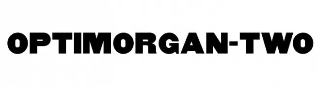
( Fonts by Castcraft Software - opti.netii.net - check the website before use )
A bold, heavy font with strong, uniform strokes and tight spacing.
![OPTIMorgan-Two Frei Schriftart Herunterladen]() Herunterladen 10137 Downloads@WebFont
Herunterladen 10137 Downloads@WebFont -
![Bullpen 3D Frei Schriftart Herunterladen]() Herunterladen 10137 Downloads@WebFont
Herunterladen 10137 Downloads@WebFont -
( Fonts by Diogene - Claude Pelletier )
A bold, modern sans-serif font with a clean and assertive style.
![Essai Frei Schriftart Herunterladen]() Herunterladen 10132 Downloads@WebFont
Herunterladen 10132 Downloads@WebFont -
![VI Hai Duong Frei Schriftart Herunterladen]() Herunterladen 10131 Downloads@WebFont
Herunterladen 10131 Downloads@WebFont -
( Copyright 2015 The Amatica Project Authors (hafontia@gmail.com) )
A playful, handwritten-style font with tall, narrow characters and a casual feel.
![Amatica SC Bold Frei Schriftart Herunterladen]() Herunterladen 10111 Downloads@WebFont
Herunterladen 10111 Downloads@WebFont -
![Bundy Yellow Solid Frei Schriftart Herunterladen]() Herunterladen 10100 Downloads@WebFont
Herunterladen 10100 Downloads@WebFont -
![Caterpillar Frei Schriftart Herunterladen]() Herunterladen 10099 Downloads@WebFont
Herunterladen 10099 Downloads@WebFont -
( Copyright 2010, 2012 Adobe Systems Incorporated (http://www.adobe.com/), with Reserved Font Name 'Source'. All Rights Reserved. Source is a trademark of Adobe Systems Incorporated in the United States and/or other countries. )
A modern, versatile sans-serif font with clean, rounded letterforms and balanced proportions.
![Source Sans Pro Frei Schriftart Herunterladen]() Herunterladen 10083 Downloads@WebFont
Herunterladen 10083 Downloads@WebFont -
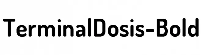
( Fonts by www.impallari.com )
A bold, rounded sans-serif font with a modern and friendly style.
![TerminalDosis-Bold Frei Schriftart Herunterladen]() Herunterladen 10081 Downloads@WebFont
Herunterladen 10081 Downloads@WebFont -
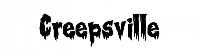
( Fonts by Tony O`Farrell )
A spooky, dripping font ideal for horror themes.
![Creepsville Frei Schriftart Herunterladen]() Herunterladen 10078 Downloads@WebFont
Herunterladen 10078 Downloads@WebFont -
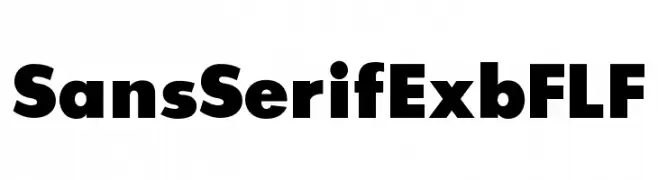
( Fonts by Casady & Greene )
A bold, geometric sans-serif font with clean lines and strong presence.
![SansSerifExbFLF Frei Schriftart Herunterladen]() Herunterladen 10076 Downloads@WebFont
Herunterladen 10076 Downloads@WebFont -
( Fonts by Daniel Zadorozny - www.iconian.com )
A bold, playful font with irregular, hand-drawn letterforms.
![#44 Font Frei Schriftart Herunterladen]() Herunterladen 10069 Downloads@WebFont
Herunterladen 10069 Downloads@WebFont -
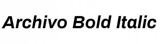
( Copyright 2016 The Archivo Project Authors (omnibus.type@gmail.com) )
A modern, bold, and italicized typeface with a clean and dynamic style.
![Archivo Bold Italic Frei Schriftart Herunterladen]() Herunterladen 10063 Downloads@WebFont
Herunterladen 10063 Downloads@WebFont -
![Neuropol Medium Frei Schriftart Herunterladen]() Herunterladen 10060 Downloads@WebFont
Herunterladen 10060 Downloads@WebFont -
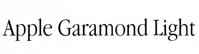
![Apple Garamond Light Frei Schriftart Herunterladen]() Herunterladen 10059 Downloads@WebFont
Herunterladen 10059 Downloads@WebFont -
![TheBraggest-Demo Frei Schriftart Herunterladen]() Herunterladen 10051 Downloads@WebFont
Herunterladen 10051 Downloads@WebFont -
( Copyright 2010, 2012 Adobe Systems Incorporated (http://www.adobe.com/), with Reserved Font Name 'Source'. All Rights Reserved. Source is a trademark of Adobe Systems Incorporated in the United States and/or other countries. )
A modern, monospaced font perfect for coding and technical documentation.
![Source Code Pro Frei Schriftart Herunterladen]() Herunterladen 10047 Downloads@WebFont
Herunterladen 10047 Downloads@WebFont -
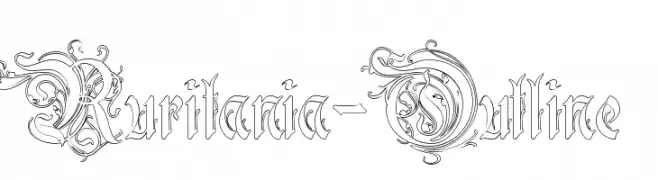
( Fonts by Paul Lloyd )
An ornate, decorative outline font with intricate flourishes and a medieval aesthetic.
![Ruritania-Outline Frei Schriftart Herunterladen]() Herunterladen 10047 Downloads@WebFont
Herunterladen 10047 Downloads@WebFont -
( Fonts by Alan Carr )
A playful, bold font with rounded, bubbly characters and a hand-drawn feel.
![Croissant Frei Schriftart Herunterladen]() Herunterladen 10041 Downloads@WebFont
Herunterladen 10041 Downloads@WebFont -
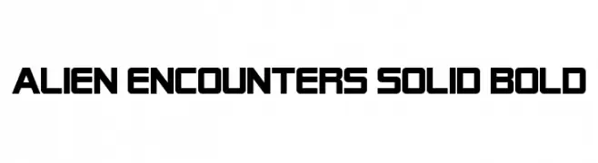
( Fonts by ShyFonts )
A bold, futuristic font with geometric, block-like characters.
![Alien Encounters Solid Bold Frei Schriftart Herunterladen]() Herunterladen 10041 Downloads@WebFont
Herunterladen 10041 Downloads@WebFont -
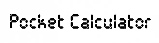
( Fonts by Blue Vinyl - Jess Latham - www.bvfonts.com )
A digital-style, geometric font inspired by classic calculator displays.
![Pocket Calculator Frei Schriftart Herunterladen]() Herunterladen 10039 Downloads@WebFont
Herunterladen 10039 Downloads@WebFont -
![NCAA Ohio State Buckeyes Frei Schriftart Herunterladen]() Herunterladen 10030 Downloads@WebFont
Herunterladen 10030 Downloads@WebFont -
![Milford Hollow Frei Schriftart Herunterladen]() Herunterladen 10029 Downloads@WebFont
Herunterladen 10029 Downloads@WebFont -
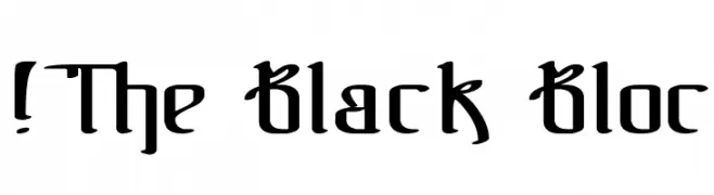
( Fonts by www.exclamachine.com )
A bold, blackletter-inspired font with sharp, angular lines and intricate detailing.
![!The Black Bloc Frei Schriftart Herunterladen]() Herunterladen 10028 Downloads@WebFont
Herunterladen 10028 Downloads@WebFont -
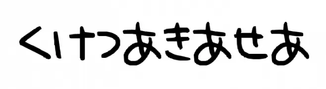
![hiragana Frei Schriftart Herunterladen]() Herunterladen 10028 Downloads@WebFont
Herunterladen 10028 Downloads@WebFont -
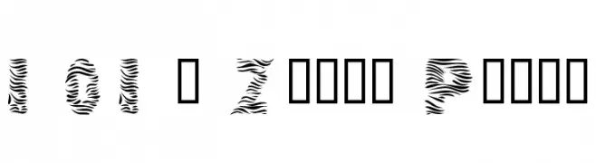
![101! Zebra Print Frei Schriftart Herunterladen]() Herunterladen 10018 Downloads@WebFont
Herunterladen 10018 Downloads@WebFont


Welche Schriften sind gerade am populärsten?
Poppins, Roboto, Montserrat, Open Sans und Lato sind wegen ihrer klaren Formen und breiten Einsetzbarkeit sehr gefragt – von Markenauftritt über Landingpages bis hin zu Postern.
Welche Fonts eignen sich für Logos?
Geometrische Sans‑Serifs (z. B. Poppins, Familien im Gotham‑Stil) sind ein häufiger Griff für sauberes, skalierbares Branding. Für eine persönlichere Note bleiben Scripts und Handschrift‑Stile beliebt. Kombinieren Sie einen prägnanten Headline‑Font mit einer neutralen Brotschrift für Wiedererkennung und Harmonie.
Wie oft wird die Top‑Liste aktualisiert?
Regelmäßig – basierend auf realen Downloads und Interaktionen. Schauen Sie öfter vorbei, um aufstrebende Favoriten früh zu entdecken.
💡 Tipp: Seite bookmarken – Trends wechseln schnell, und heutige Top‑Schriften inspirieren morgen vielleicht das Rebranding.