Willkommen bei den Top‑Schriften – hier treffen Beliebtheit und Qualität aufeinander. Das sind die in diesem Jahr am häufigsten heruntergeladenen und genutzten Fonts. Wenn Sie sichere Optionen für Logo, Web oder Social suchen, starten Sie hier.
Jeder Top‑Font überzeugt durch Balance, Lesbarkeit und Vielseitigkeit. Sie finden moderne Sans‑Serifs, elegante Scripts, Vintage‑Serifs und minimalistische Displays.
-
( Fonts by Debut Studio - Ari Fadli - Personal-use only. For commercial use please contact owner. )
An elegant swash font with flowing, artistic lines.
 Herunterladen 38 Downloads@WebFont
 -
( Fonts by Mans Greback - www.mansgreback.com - Personal-use only. For commercial use please contact owner. )
A thin, italic serif font with high contrast and elegant style.
![Golden State Serif PERSONAL Thin Italic Frei Schriftart Herunterladen]() Herunterladen 38 Downloads@WebFont
Herunterladen 38 Downloads@WebFont -
( Fonts by Giga Typography - GigaType - www.deviantart.com/wolves-fonts - Personal-use only. For commercial use please contact owner. )
Modern italic sans-serif font.
![GT Vice City Sans - Book Italic Frei Schriftart Herunterladen]() Herunterladen 38 Downloads@WebFont
Herunterladen 38 Downloads@WebFont -
( Fonts by Perspectype Studio - Personal-use only. For commercial use please contact owner. )
A dynamic, cursive script font with fluid connections and playful variations.
![Brilliant Castelo Italic Frei Schriftart Herunterladen]() Herunterladen 38 Downloads@WebFont
Herunterladen 38 Downloads@WebFont -
( Fonts by Mans Greback - www.mansgreback.com - Personal-use only. For commercial use please contact owner. )
A bold, italic serif font with a classic yet modern appeal.
![Golden State Serif PERSONAL Black Italic Frei Schriftart Herunterladen]() Herunterladen 38 Downloads@WebFont
Herunterladen 38 Downloads@WebFont -
( Fonts by Woodcutter Manero - www.woodcutter.es - Personal-use only. For commercial use please contact owner. )
A bold, distressed display font with a horror theme.
![Universal Monsters Frei Schriftart Herunterladen]() Herunterladen 38 Downloads@WebFont
Herunterladen 38 Downloads@WebFont -
( Fonts by Iconian Fonts - Daniel Zadorozny - Personal-use only. For commercial use please contact owner. )
A bold, futuristic font with sharp angles and a dynamic slant.
![Flight Corps Laser Italic Frei Schriftart Herunterladen]() Herunterladen 38 Downloads@WebFont
Herunterladen 38 Downloads@WebFont -
( Fonts by Graphix Line Studio - Personal-use only. For commercial use please contact owner. )
A lively, handwritten font with smooth curves and a dynamic, slanted style.
![Cat Lady Frei Schriftart Herunterladen]() Herunterladen 38 Downloads@WebFont
Herunterladen 38 Downloads@WebFont -
( Fonts by Kassymkulov Design - Personal-use only. For commercial use please contact owner. )
A playful, rounded typeface with a bold and whimsical style.
![KD Happi Regular Frei Schriftart Herunterladen]() Herunterladen 38 Downloads@WebFont
Herunterladen 38 Downloads@WebFont -
( Fonts by Typodermic Fonts - Raymond Larabie - Personal-use only. For commercial use please contact owner. )
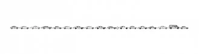
A decorative font with vintage car illustrations as characters.
![OilCrisisA-Regular Frei Schriftart Herunterladen]() Herunterladen 38 Downloads@WebFont
Herunterladen 38 Downloads@WebFont -
( Fonts by AVType - Personal-use only. For commercial use please contact owner. )
A charming handwritten script with fluid, graceful strokes and decorative flair.
![Chiesty Frei Schriftart Herunterladen]() Herunterladen 38 Downloads@WebFont
Herunterladen 38 Downloads@WebFont -
( Fonts by Perspectype Studio - Personal-use only. For commercial use please contact owner. )
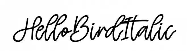
A dynamic, italic handwritten font with expressive, fluid strokes.
![Hello Bird Italic Frei Schriftart Herunterladen]() Herunterladen 38 Downloads@WebFont
Herunterladen 38 Downloads@WebFont -
( Fonts by Ryan Prasetya - Personal-use only. For commercial use please contact owner. )
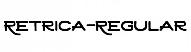
A bold, decorative font with artistic and modern elements.
![Retrica-Regular Frei Schriftart Herunterladen]() Herunterladen 38 Downloads@WebFont
Herunterladen 38 Downloads@WebFont -
( Fonts by zone108.main.jp - Personal-use only. For commercial use please contact owner. )
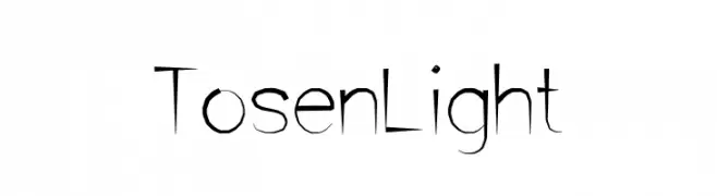
A modern, artistic font with slender, elongated characters and a sophisticated style.
![Tosen Light Frei Schriftart Herunterladen]() Herunterladen 38 Downloads@WebFont
Herunterladen 38 Downloads@WebFont -
( Fonts by Teenage Foundry )
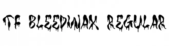
A bold, dripping display font ideal for horror or Halloween themes.
![TF Bleedwax Regular Frei Schriftart Herunterladen]() Herunterladen 38 Downloads@WebFont
Herunterladen 38 Downloads@WebFont -
( Fonts by Balpirick - Personal-use only. For commercial use please contact owner. )
A bold, playful script font with interconnected, flowing strokes and a handwritten feel.
![Boldman Frei Schriftart Herunterladen]() Herunterladen 38 Downloads@WebFont
Herunterladen 38 Downloads@WebFont -
( Fonts by Perspectype Studio - Personal-use only. For commercial use please contact owner. )
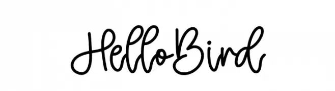
A playful, handwritten font with fluid strokes and a casual style.
![Hello Bird Frei Schriftart Herunterladen]() Herunterladen 38 Downloads@WebFont
Herunterladen 38 Downloads@WebFont -
( Fonts by Iconian Fonts - Daniel Zadorozny - Personal-use only. For commercial use please contact owner. )
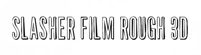
A bold, rough, 3D font with a hand-drawn, edgy style.
![Slasher Film Rough 3D Frei Schriftart Herunterladen]() Herunterladen 38 Downloads@WebFont
Herunterladen 38 Downloads@WebFont -
( Fonts by Edric Studio - Personal-use only. For commercial use please contact owner. )
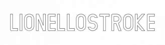
A modern, geometric outline font with clean lines and a bold presence.
![LIONELLO Stroke Frei Schriftart Herunterladen]() Herunterladen 38 Downloads@WebFont
Herunterladen 38 Downloads@WebFont -
( Fonts by Typodermic Fonts - Raymond Larabie - Personal-use only. For commercial use please contact owner. )
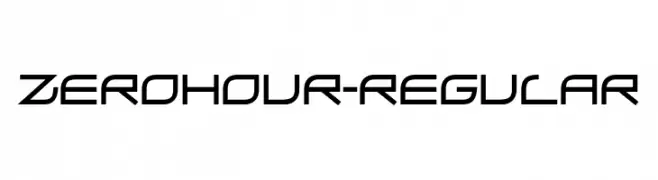
A futuristic, geometric font with sharp, angular letterforms.
![ZeroHour-Regular Frei Schriftart Herunterladen]() Herunterladen 38 Downloads@WebFont
Herunterladen 38 Downloads@WebFont -
( Fonts by Edric Studio - Personal-use only. For commercial use please contact owner. )
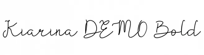
A charming and elegant handwritten script font with flowing, cursive letters.
![Kiarina DEMO Bold Frei Schriftart Herunterladen]() Herunterladen 38 Downloads@WebFont
Herunterladen 38 Downloads@WebFont -
( Fonts by Bearytype - Dian Hadi - Personal-use only. For commercial use please contact owner. )
A playful, handwritten script font with a modern and decorative style.
![myloves Frei Schriftart Herunterladen]() Herunterladen 38 Downloads@WebFont
Herunterladen 38 Downloads@WebFont -
( Fonts by One Design - Personal-use only. For commercial use please contact owner. )
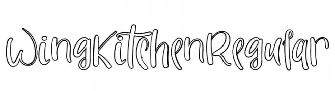
A playful, handwritten font with rounded, flowing lines and a whimsical style.
![WingKitchenRegular Frei Schriftart Herunterladen]() Herunterladen 38 Downloads@WebFont
Herunterladen 38 Downloads@WebFont -
( Fonts by Rantautype - Yudi Pratama Chandra - Personal-use only. For commercial use please contact owner. )
A whimsical, artistic script font with flowing, interconnected letters.
![Surreally Frei Schriftart Herunterladen]() Herunterladen 38 Downloads@WebFont
Herunterladen 38 Downloads@WebFont -
( Fonts by Royaltype - Darwinoo - Personal-use only. For commercial use please contact owner. )
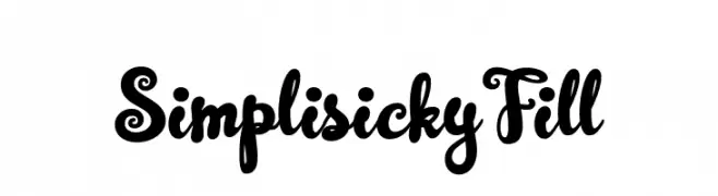
A playful and whimsical font with bold, curvy letterforms and decorative swirls.
![SimplisickyFill Frei Schriftart Herunterladen]() Herunterladen 38 Downloads@WebFont
Herunterladen 38 Downloads@WebFont -
( Fonts by StringLabs - stringlabscreative.com - Personal-use only. For commercial use please contact owner. )
A bold, cursive font with dynamic strokes and a lively, handwritten style.
![Russeline Frei Schriftart Herunterladen]() Herunterladen 38 Downloads@WebFont
Herunterladen 38 Downloads@WebFont -
( Fonts by Vladimir Nikolic - www.creativefabrica.com/designer/vladimirnikolic/ - Personal-use only. For commercial use please contact owner. )
A bold, industrial font with a 3D effect and geometric structure.
![Gaseous Power Book Regular Frei Schriftart Herunterladen]() Herunterladen 38 Downloads@WebFont
Herunterladen 38 Downloads@WebFont -
( Fonts by Konsepta Studio - Personal-use only. For commercial use please contact owner. )
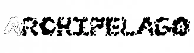
A bold, organic font with island-like contours and high contrast.
![Archipelago Frei Schriftart Herunterladen]() Herunterladen 38 Downloads@WebFont
Herunterladen 38 Downloads@WebFont -
( Fonts by Woodcutter Manero - www.woodcutter.es - Personal-use only. For commercial use please contact owner. )
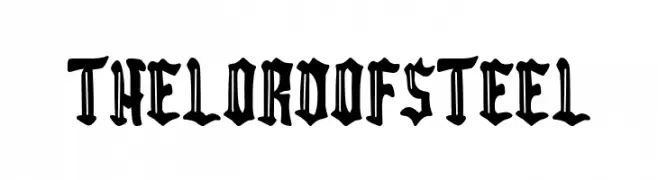
A bold, gothic blackletter font with sharp, dramatic strokes.
![The Lord of Steel Frei Schriftart Herunterladen]() Herunterladen 38 Downloads@WebFont
Herunterladen 38 Downloads@WebFont -
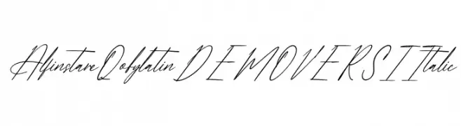
( Fonts by Letterena Studios )
![Alfinstare Qobylatin DEMO VERSI Italic Frei Schriftart Herunterladen]() Herunterladen 38 Downloads@WebFont
Herunterladen 38 Downloads@WebFont -
( Fonts by DumadiStyle - Toni Dzulham - Personal-use only. For commercial use please contact owner. )
A playful, bold handwritten font with a casual and friendly style.
![Rofland Frei Schriftart Herunterladen]() Herunterladen 38 Downloads@WebFont
Herunterladen 38 Downloads@WebFont -
( Fonts by LetterStock - Guguh Gumantoro - Personal-use only. For commercial use please contact owner. )
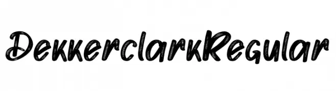
A bold, handwritten font with a playful and energetic style.
![Dekker clark Regular Frei Schriftart Herunterladen]() Herunterladen 38 Downloads@WebFont
Herunterladen 38 Downloads@WebFont -
( Fonts by ONG Type )
![Wednesday Adventure Frei Schriftart Herunterladen]() Herunterladen 38 Downloads@WebFont
Herunterladen 38 Downloads@WebFont -
( Fonts by Kong Font - Personal-use only. For commercial use please contact owner. )
A playful and elegant handwritten font with fluid, cursive strokes.
![HonneyBaby Frei Schriftart Herunterladen]() Herunterladen 38 Downloads@WebFont
Herunterladen 38 Downloads@WebFont -
( Fonts by Seneka Grafika - Personal-use only. For commercial use please contact owner. )
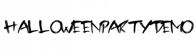
A bold, expressive handwritten font with dynamic, irregular strokes.
![Halloween party demo Frei Schriftart Herunterladen]() Herunterladen 38 Downloads@WebFont
Herunterladen 38 Downloads@WebFont


Welche Schriften sind gerade am populärsten?
Poppins, Roboto, Montserrat, Open Sans und Lato sind wegen ihrer klaren Formen und breiten Einsetzbarkeit sehr gefragt – von Markenauftritt über Landingpages bis hin zu Postern.
Welche Fonts eignen sich für Logos?
Geometrische Sans‑Serifs (z. B. Poppins, Familien im Gotham‑Stil) sind ein häufiger Griff für sauberes, skalierbares Branding. Für eine persönlichere Note bleiben Scripts und Handschrift‑Stile beliebt. Kombinieren Sie einen prägnanten Headline‑Font mit einer neutralen Brotschrift für Wiedererkennung und Harmonie.
Wie oft wird die Top‑Liste aktualisiert?
Regelmäßig – basierend auf realen Downloads und Interaktionen. Schauen Sie öfter vorbei, um aufstrebende Favoriten früh zu entdecken.
💡 Tipp: Seite bookmarken – Trends wechseln schnell, und heutige Top‑Schriften inspirieren morgen vielleicht das Rebranding.