Willkommen bei den Top‑Schriften – hier treffen Beliebtheit und Qualität aufeinander. Das sind die in diesem Jahr am häufigsten heruntergeladenen und genutzten Fonts. Wenn Sie sichere Optionen für Logo, Web oder Social suchen, starten Sie hier.
Jeder Top‑Font überzeugt durch Balance, Lesbarkeit und Vielseitigkeit. Sie finden moderne Sans‑Serifs, elegante Scripts, Vintage‑Serifs und minimalistische Displays.
-
( Fonts by Vladimir Nikolic - www.creativefabrica.com/designer/vladimirnikolic/ - Personal-use only. For commercial use please contact owner. )
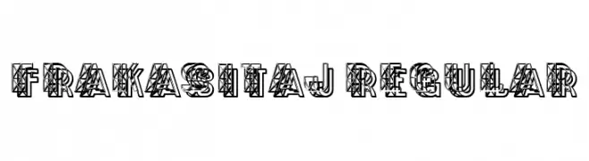
A bold, geometric font with intricate line patterns and a three-dimensional appearance.
 Herunterladen 41 Downloads@WebFont
 -
( Fonts by Allouse Studio - Personal-use only. For commercial use please contact owner. )
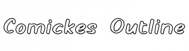
A playful, comic-style outline font with rounded, hand-drawn characters.
![Comickes Outline Frei Schriftart Herunterladen]() Herunterladen 41 Downloads@WebFont
Herunterladen 41 Downloads@WebFont -
( Fonts by Letterena Studios - letterena.com - Personal-use only. For commercial use please contact owner. )
A dynamic handwritten font with fluid strokes and a natural flow.
![Fadetta Frei Schriftart Herunterladen]() Herunterladen 41 Downloads@WebFont
Herunterladen 41 Downloads@WebFont -
( Fonts by Edric Studio - Personal-use only. For commercial use please contact owner. )
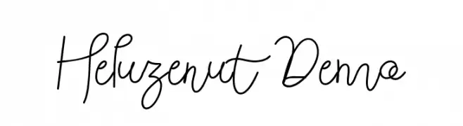
A flowing, cursive font with elegant, connected letters and a delicate appearance.
![Heluzenut Demo Frei Schriftart Herunterladen]() Herunterladen 41 Downloads@WebFont
Herunterladen 41 Downloads@WebFont -
( Fonts by Avery Brown - Personal-use only. For commercial use please contact owner. )
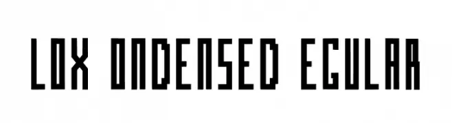
A bold, geometric, and condensed font with a modern, block-like appearance.
![Blox Condensed Regular Frei Schriftart Herunterladen]() Herunterladen 41 Downloads@WebFont
Herunterladen 41 Downloads@WebFont -
( Fonts by Rangkai Aksara - Personal-use only. For commercial use please contact owner. )
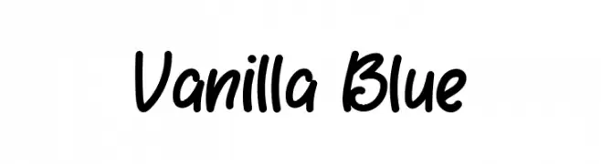
A playful, handwritten font with bold, rounded characters and a casual slant.
![Vanilla Blue Frei Schriftart Herunterladen]() Herunterladen 41 Downloads@WebFont
Herunterladen 41 Downloads@WebFont -
( Fonts by Reka Safriani - Personal-use only. For commercial use please contact owner. )
An elegant script font with flowing, interconnected characters and refined flourishes.
![bohela Frei Schriftart Herunterladen]() Herunterladen 41 Downloads@WebFont
Herunterladen 41 Downloads@WebFont -
( Fonts by TypeType Foundry )
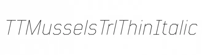
A thin, angular, and italic font with a geometric and modern design.
![TT Mussels Trl Thin Italic Frei Schriftart Herunterladen]() Herunterladen 41 Downloads@WebFont
Herunterladen 41 Downloads@WebFont -
( Fonts by Enxyclo Studio )
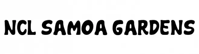
Bold, playful, hand-drawn display font with rounded shapes.
![NCL Samoa Gardens Frei Schriftart Herunterladen]() Herunterladen 41 Downloads@WebFont
Herunterladen 41 Downloads@WebFont -
( Fonts by The Fontune - Personal-use only. For commercial use please contact owner. )
A flowing, elegant script font with a sophisticated handwritten style.
![I'm yours Frei Schriftart Herunterladen]() Herunterladen 41 Downloads@WebFont
Herunterladen 41 Downloads@WebFont -
( Fonts by Mr Letters - Personal-use only. For commercial use please contact owner. )
A bold, cursive font with a flowing, handwritten style.
![natasha-Bold Frei Schriftart Herunterladen]() Herunterladen 41 Downloads@WebFont
Herunterladen 41 Downloads@WebFont -
( Fonts by Mans Greback - www.mansgreback.com - Personal-use only. For commercial use please contact owner. )
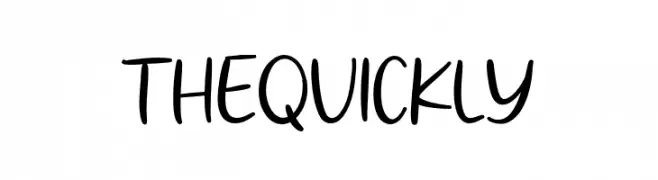
A playful, casual handwritten font with smooth, flowing lines and a personal touch.
![The Quickly Frei Schriftart Herunterladen]() Herunterladen 41 Downloads@WebFont
Herunterladen 41 Downloads@WebFont -
( Fonts by AminMario - Amin Mario - Personal-use only. For commercial use please contact owner. )
An elegant script font with flowing, connected strokes and a sophisticated appearance.
![Lovely Rainy Frei Schriftart Herunterladen]() Herunterladen 41 Downloads@WebFont
Herunterladen 41 Downloads@WebFont -
( Fonts by Perspectype Studio - Personal-use only. For commercial use please contact owner. )
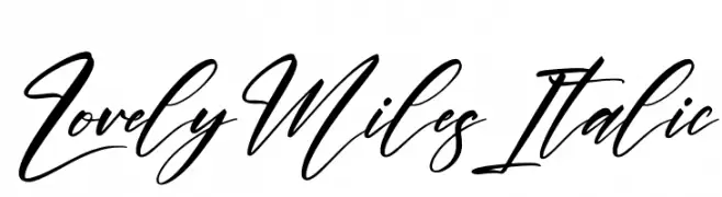
An elegant, flowing cursive font with a sophisticated italic style.
![Lovely Miles Italic Frei Schriftart Herunterladen]() Herunterladen 41 Downloads@WebFont
Herunterladen 41 Downloads@WebFont -
( Fonts by Rangkai Aksara - Personal-use only. For commercial use please contact owner. )
A playful, handwritten font with smooth, rounded strokes and a casual feel.
![Homesick Frei Schriftart Herunterladen]() Herunterladen 41 Downloads@WebFont
Herunterladen 41 Downloads@WebFont -
( Fonts by Robin Ward - Personal-use only. For commercial use please contact owner. )
A decorative and abstract typeface with bold strokes and unique shapes.
![Dragomooriya Medium Frei Schriftart Herunterladen]() Herunterladen 41 Downloads@WebFont
Herunterladen 41 Downloads@WebFont -
( Fonts by Khurasan - Syaf Rizal - Personal-use only. For commercial use please contact owner. )
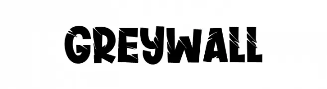
A bold, distressed font with a rugged, edgy appearance.
![Greywall Frei Schriftart Herunterladen]() Herunterladen 41 Downloads@WebFont
Herunterladen 41 Downloads@WebFont -
( Fonts by Vladimir Nikolic )
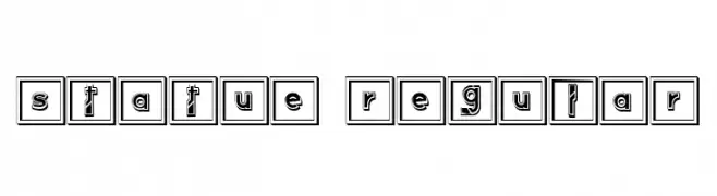
A bold, geometric font with decorative elements enclosed in square frames.
![Statue Regular Frei Schriftart Herunterladen]() Herunterladen 41 Downloads@WebFont
Herunterladen 41 Downloads@WebFont -
( Fonts by Glyphstyle - Dimas Ardhi - Personal-use only. For commercial use please contact owner. )
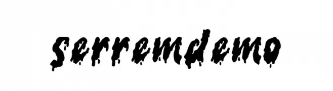
A bold, dripping font with an eerie, fluid appearance.
![serrem demo Frei Schriftart Herunterladen]() Herunterladen 41 Downloads@WebFont
Herunterladen 41 Downloads@WebFont -
( Fonts by Amarlettering - Takiy - Amarlettering - Takiy - Personal-use only. For commercial use please contact owner. )
An elegant, flowing script font with modern and sophisticated curves.
![litesha Frei Schriftart Herunterladen]() Herunterladen 41 Downloads@WebFont
Herunterladen 41 Downloads@WebFont -
( Fonts by Mr Letters - Personal-use only. For commercial use please contact owner. )
A lively and elegant script font with fluid, cursive strokes.
![madison-Regular Frei Schriftart Herunterladen]() Herunterladen 41 Downloads@WebFont
Herunterladen 41 Downloads@WebFont -
( Fonts by Storytype Studio )
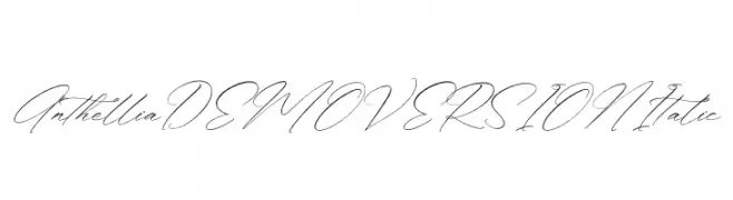
An elegant, cursive script font with flowing lines and ornate flourishes.
![Anthellia DEMO VERSION Italic Frei Schriftart Herunterladen]() Herunterladen 41 Downloads@WebFont
Herunterladen 41 Downloads@WebFont -
( Fonts by Staircase Studio )
Elegant, handwritten cursive script with connected strokes.
![BryanCoyne Frei Schriftart Herunterladen]() Herunterladen 41 Downloads@WebFont
Herunterladen 41 Downloads@WebFont -
( Fonts by Craft Supply Co - Personal-use only. For commercial use please contact owner. )
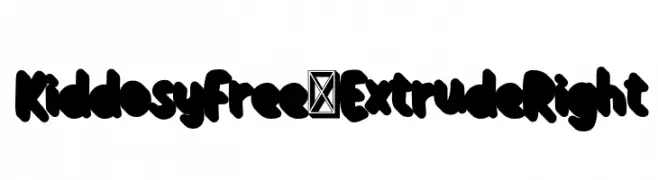
A bold, playful font with rounded characters and an extruded effect.
![KiddosyFree-ExtrudeRight Frei Schriftart Herunterladen]() Herunterladen 41 Downloads@WebFont
Herunterladen 41 Downloads@WebFont -
( Fonts by HansCo - Burhan Afif - Personal-use only. For commercial use please contact owner. )
A playful, handwritten font with fluid, connected letterforms and a casual style.
![Hello Cinta Frei Schriftart Herunterladen]() Herunterladen 41 Downloads@WebFont
Herunterladen 41 Downloads@WebFont -
( Fonts by Joseph Dawson - Personal-use only. For commercial use please contact owner. )
A bold, italicized font with a playful, handwritten style.
![Super Marker Italic Frei Schriftart Herunterladen]() Herunterladen 41 Downloads@WebFont
Herunterladen 41 Downloads@WebFont -
( Fonts by weknow - Wino S Kadir - Personal-use only. For commercial use please contact owner. )
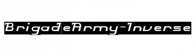
A bold, dynamic font with a futuristic and energetic style.
![Brigade Army-Inverse Frei Schriftart Herunterladen]() Herunterladen 41 Downloads@WebFont
Herunterladen 41 Downloads@WebFont -
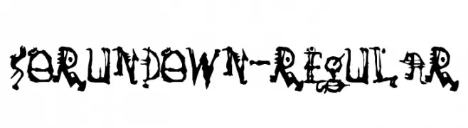
( Fonts by Typodermic Fonts - Raymond Larabie - Personal-use only. For commercial use please contact owner. )
A decorative font with gothic and organic influences, featuring intricate, twisted designs.
![SoRunDown-Regular Frei Schriftart Herunterladen]() Herunterladen 41 Downloads@WebFont
Herunterladen 41 Downloads@WebFont -
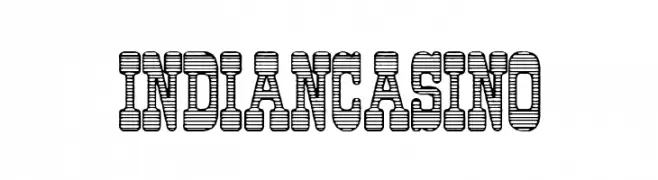
( Fonts by Woodcutter Manero - www.woodcutter.es - Personal-use only. For commercial use please contact owner. )
Bold, striped display font with spiked accents.
![Indian Casino Frei Schriftart Herunterladen]() Herunterladen 41 Downloads@WebFont
Herunterladen 41 Downloads@WebFont -
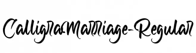
( Fonts by Debut Studio - Ari Fadli - Personal-use only. For commercial use please contact owner. )
A flowing, calligraphic font with elegant curves and decorative flourishes.
![CalligraMarriage-Regular Frei Schriftart Herunterladen]() Herunterladen 41 Downloads@WebFont
Herunterladen 41 Downloads@WebFont -
( Fonts by PutraCetol Studio - www.putracetol.com - Personal-use only. For commercial use please contact owner. )
A whimsical, decorative font with curly accents and a playful style.
![Happy New Year Party Frei Schriftart Herunterladen]() Herunterladen 41 Downloads@WebFont
Herunterladen 41 Downloads@WebFont -
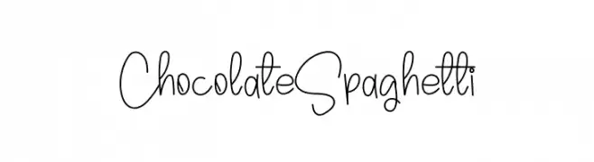
( Fonts by Inermedia Studio - Personal-use only. For commercial use please contact owner. )
A playful, handwritten font with tall, slender characters and a whimsical style.
![Chocolate Spaghetti Frei Schriftart Herunterladen]() Herunterladen 41 Downloads@WebFont
Herunterladen 41 Downloads@WebFont -
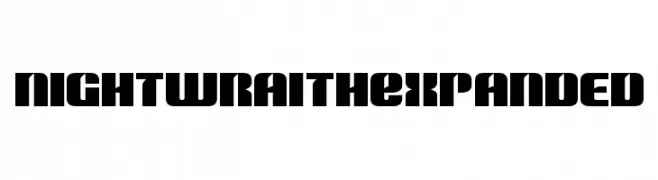
( Fonts by Iconian Fonts - Daniel Zadorozny - Personal-use only. For commercial use please contact owner. )
A bold, geometric font with wide, blocky characters and a modern style.
![Nightwraith Expanded Frei Schriftart Herunterladen]() Herunterladen 41 Downloads@WebFont
Herunterladen 41 Downloads@WebFont -
( Fonts by Kong Font - Personal-use only. For commercial use please contact owner. )
A playful, whimsical script font with a handwritten style.
![Samandriel Frei Schriftart Herunterladen]() Herunterladen 41 Downloads@WebFont
Herunterladen 41 Downloads@WebFont -
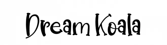
( Fonts by Letterena Studios - letterena.com - Personal-use only. For commercial use please contact owner. )
A playful, handwritten font with whimsical embellishments and medium contrast.
![Dream Koala Frei Schriftart Herunterladen]() Herunterladen 41 Downloads@WebFont
Herunterladen 41 Downloads@WebFont


Welche Schriften sind gerade am populärsten?
Poppins, Roboto, Montserrat, Open Sans und Lato sind wegen ihrer klaren Formen und breiten Einsetzbarkeit sehr gefragt – von Markenauftritt über Landingpages bis hin zu Postern.
Welche Fonts eignen sich für Logos?
Geometrische Sans‑Serifs (z. B. Poppins, Familien im Gotham‑Stil) sind ein häufiger Griff für sauberes, skalierbares Branding. Für eine persönlichere Note bleiben Scripts und Handschrift‑Stile beliebt. Kombinieren Sie einen prägnanten Headline‑Font mit einer neutralen Brotschrift für Wiedererkennung und Harmonie.
Wie oft wird die Top‑Liste aktualisiert?
Regelmäßig – basierend auf realen Downloads und Interaktionen. Schauen Sie öfter vorbei, um aufstrebende Favoriten früh zu entdecken.
💡 Tipp: Seite bookmarken – Trends wechseln schnell, und heutige Top‑Schriften inspirieren morgen vielleicht das Rebranding.