Willkommen bei den Top‑Schriften – hier treffen Beliebtheit und Qualität aufeinander. Das sind die in diesem Jahr am häufigsten heruntergeladenen und genutzten Fonts. Wenn Sie sichere Optionen für Logo, Web oder Social suchen, starten Sie hier.
Jeder Top‑Font überzeugt durch Balance, Lesbarkeit und Vielseitigkeit. Sie finden moderne Sans‑Serifs, elegante Scripts, Vintage‑Serifs und minimalistische Displays.
-
( Fonts by Nicole Blue - Personal-use only. For commercial use please contact owner. )
A bold, playful font with rounded, bubbly characters and a retro vibe.
 Herunterladen 38 Downloads@WebFont
 -
( Fonts by Kong Font - fontkong.com - Personal-use only. For commercial use please contact owner. )
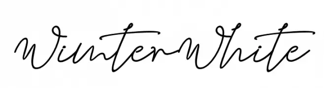
An elegant, flowing script font with a handwritten style.
![Wimter White Frei Schriftart Herunterladen]() Herunterladen 38 Downloads@WebFont
Herunterladen 38 Downloads@WebFont -
( Fonts by weknow - Wino S Kadir - Personal-use only. For commercial use please contact owner. )
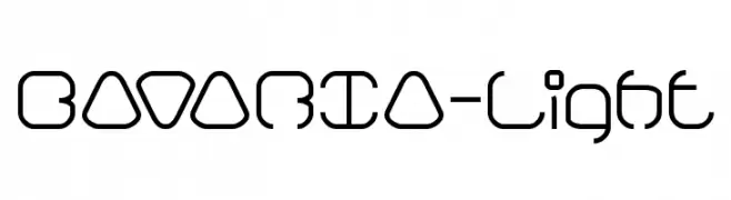
A modern, geometric font with rounded edges and consistent stroke width.
![BAVARIA-Light Frei Schriftart Herunterladen]() Herunterladen 38 Downloads@WebFont
Herunterladen 38 Downloads@WebFont -
( Fonts by LetterFreshStudio - Rizki Andika - Personal-use only. For commercial use please contact owner. )
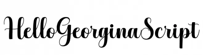
A graceful and elegant script font with flowing, cursive letters.
![HelloGeorginaScript Frei Schriftart Herunterladen]() Herunterladen 38 Downloads@WebFont
Herunterladen 38 Downloads@WebFont -
( Fonts by GGBot - www.ggbot.net - Personal-use only. For commercial use please contact owner. )
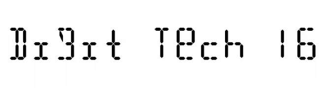
A segmented, digital-style font inspired by classic digital displays.
![Digit Tech 16 Frei Schriftart Herunterladen]() Herunterladen 38 Downloads@WebFont
Herunterladen 38 Downloads@WebFont -
( Fonts by TypeType Foundry )
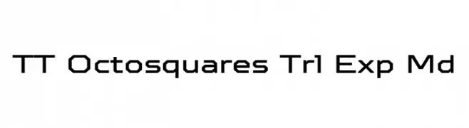
A geometric, modern font with square-like characters and clean lines.
![TT Octosquares Trl Exp Md Frei Schriftart Herunterladen]() Herunterladen 38 Downloads@WebFont
Herunterladen 38 Downloads@WebFont -
( Fonts by Iconian Fonts - Daniel Zadorozny - Personal-use only. For commercial use please contact owner. )
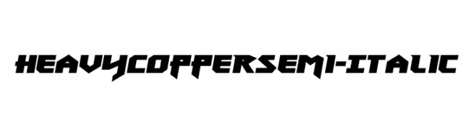
A bold, angular, semi-italic font with a dynamic and aggressive style.
![Heavy Copper Semi-Italic Frei Schriftart Herunterladen]() Herunterladen 38 Downloads@WebFont
Herunterladen 38 Downloads@WebFont -
( Fonts by Perspectype Studio - Personal-use only. For commercial use please contact owner. )
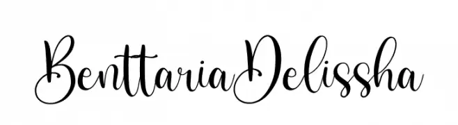
An elegant script font with decorative swirls and flowing lines.
![Benttaria Delissha Frei Schriftart Herunterladen]() Herunterladen 38 Downloads@WebFont
Herunterladen 38 Downloads@WebFont -
( Fonts by Vz Type - Personal-use only. For commercial use please contact owner. )
A lively, expressive handwritten font with fluid, dynamic strokes.
![helloJellita Frei Schriftart Herunterladen]() Herunterladen 38 Downloads@WebFont
Herunterladen 38 Downloads@WebFont -
( Fonts by zone108.main.jp - Personal-use only. For commercial use please contact owner. )
A bold, futuristic font with geometric and block-like design.
![Kaiho Regular Frei Schriftart Herunterladen]() Herunterladen 38 Downloads@WebFont
Herunterladen 38 Downloads@WebFont -
( Fonts by Hadjar Creative - Personal-use only. For commercial use please contact owner. )
A casual, elegant handwritten font with fluid, connected letters.
![Imaginate Link Frei Schriftart Herunterladen]() Herunterladen 38 Downloads@WebFont
Herunterladen 38 Downloads@WebFont -
( Fonts by Md Shohail Bhuian - Personal-use only. For commercial use please contact owner. )
A playful, casual handwritten font with smooth curves and a friendly appearance.
![Sebqor Frei Schriftart Herunterladen]() Herunterladen 38 Downloads@WebFont
Herunterladen 38 Downloads@WebFont -
( Fonts by Iconian Fonts - Daniel Zadorozny - Personal-use only. For commercial use please contact owner. )
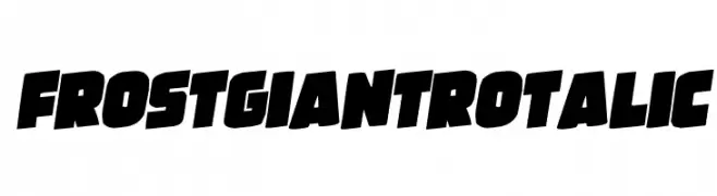
A bold, italicized font with thick, angular strokes and high contrast.
![Frost Giant Rotalic Frei Schriftart Herunterladen]() Herunterladen 38 Downloads@WebFont
Herunterladen 38 Downloads@WebFont -
( Fonts by Vladimir Nikolic - www.creativefabrica.com/designer/vladimirnikolic/ - Personal-use only. For commercial use please contact owner. )
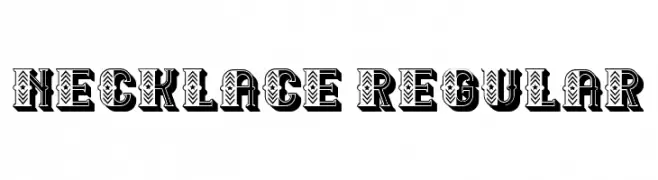
A bold, decorative font with intricate internal patterns and a three-dimensional shadow effect.
![Necklace Regular Frei Schriftart Herunterladen]() Herunterladen 38 Downloads@WebFont
Herunterladen 38 Downloads@WebFont -
( Fonts by Perspectype Studio - Personal-use only. For commercial use please contact owner. )
A whimsical script font with decorative swirls and loops, perfect for creative projects.
![Monday Holiday Frei Schriftart Herunterladen]() Herunterladen 38 Downloads@WebFont
Herunterladen 38 Downloads@WebFont -
( Fonts by Khurasan - Syaf Rizal - Personal-use only. For commercial use please contact owner. )
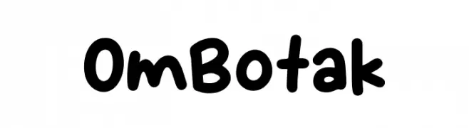
A playful, rounded font with a casual, handwritten style.
![Om Botak Frei Schriftart Herunterladen]() Herunterladen 38 Downloads@WebFont
Herunterladen 38 Downloads@WebFont -
( Personal-use only. For commercial use please contact owner. )
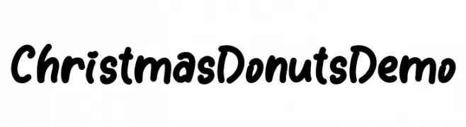
Playful, rounded handwritten font with bold, smooth strokes.
![Christmas Donuts Demo Frei Schriftart Herunterladen]() Herunterladen 38 Downloads@WebFont
Herunterladen 38 Downloads@WebFont -
( Fonts by Vultype - Candra Hamdani - Personal-use only. For commercial use please contact owner. )
A bold, brush-style font with dynamic, cursive-like strokes.
![Brushter Frei Schriftart Herunterladen]() Herunterladen 38 Downloads@WebFont
Herunterladen 38 Downloads@WebFont -
( Fonts by Vunira Design - Personal-use only. For commercial use please contact owner. )
An elegant script font with smooth, connected letters and decorative flourishes.
![Enofive Frei Schriftart Herunterladen]() Herunterladen 38 Downloads@WebFont
Herunterladen 38 Downloads@WebFont -
( Fonts by weknow - Wino S Kadir - Personal-use only. For commercial use please contact owner. )
A modern, hollow outline font with a futuristic aesthetic.
![lanitta-Hollow Frei Schriftart Herunterladen]() Herunterladen 38 Downloads@WebFont
Herunterladen 38 Downloads@WebFont -
( Fonts by Iconian Fonts - Daniel Zadorozny - Personal-use only. For commercial use please contact owner. )
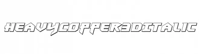
A bold, angular 3D italic font with a futuristic style.
![Heavy Copper 3D Italic Frei Schriftart Herunterladen]() Herunterladen 38 Downloads@WebFont
Herunterladen 38 Downloads@WebFont -
( Fonts by Digi Temply - Personal-use only. For commercial use please contact owner. )
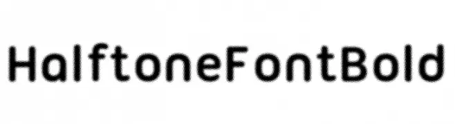
A bold, rounded font with a halftone texture, offering a retro and distinctive look.
![Halftone Font Bold Frei Schriftart Herunterladen]() Herunterladen 38 Downloads@WebFont
Herunterladen 38 Downloads@WebFont -
( Fonts by fontsandfashion - Personal-use only. For commercial use please contact owner. )
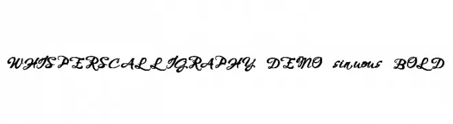
An elegant, bold calligraphic font with flowing, ornate curves.
![WHISPERS CALLIGRAPHY_DEMO_sinuous_BOLD Frei Schriftart Herunterladen]() Herunterladen 38 Downloads@WebFont
Herunterladen 38 Downloads@WebFont -
( Fonts by Woodcutter Manero - www.woodcutter.es - Personal-use only. For commercial use please contact owner. )
Bold, distressed display font with jagged, organic edges.
![Jesus Franco Frei Schriftart Herunterladen]() Herunterladen 38 Downloads@WebFont
Herunterladen 38 Downloads@WebFont -
( Fonts by Arterfak Project - Ahmad Ramzi Fahruddin - Personal-use only. For commercial use please contact owner. )
A bold, decorative font with modern flair and dynamic strokes.
![Rompies-Regular Frei Schriftart Herunterladen]() Herunterladen 38 Downloads@WebFont
Herunterladen 38 Downloads@WebFont -
( Fonts by Iconian Fonts - Daniel Zadorozny - Personal-use only. For commercial use please contact owner. )
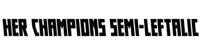
A bold, angular font with a dynamic slant and geometric influence.
![Her Champions Semi-Leftalic Frei Schriftart Herunterladen]() Herunterladen 38 Downloads@WebFont
Herunterladen 38 Downloads@WebFont -
( Fonts by aurisbunni - Personal-use only. For commercial use please contact owner. )
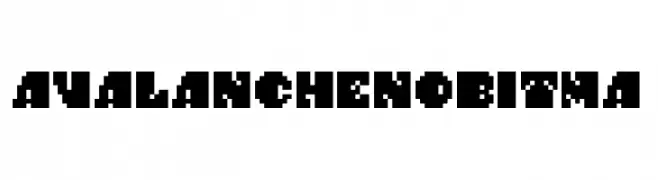
A bold, pixelated font with a retro digital aesthetic.
![AvalanchenoBitma Frei Schriftart Herunterladen]() Herunterladen 38 Downloads@WebFont
Herunterladen 38 Downloads@WebFont -
( Fonts by weknow - Wino S Kadir - Personal-use only. For commercial use please contact owner. )
A bold, italic font with a modern and dynamic style.
![Maruciel Bold Italic Frei Schriftart Herunterladen]() Herunterladen 38 Downloads@WebFont
Herunterladen 38 Downloads@WebFont -
( Fonts by weknow - Wino S Kadir - Personal-use only. For commercial use please contact owner. )
A modern, hollow, inverse font with geometric shapes and smooth curves.
![lanitta-Hollow-Inverse Frei Schriftart Herunterladen]() Herunterladen 38 Downloads@WebFont
Herunterladen 38 Downloads@WebFont -
( Fonts by Iconian Fonts - Daniel Zadorozny - Personal-use only. For commercial use please contact owner. )
A bold, angular font with a futuristic and industrial design.
![Heavy Copper Expanded Frei Schriftart Herunterladen]() Herunterladen 38 Downloads@WebFont
Herunterladen 38 Downloads@WebFont -
( Fonts by Woodcutter Manero - www.woodcutter.es - Personal-use only. For commercial use please contact owner. )
Bold, stencil-style display font with high contrast block backgrounds.
![President Nixon Frei Schriftart Herunterladen]() Herunterladen 38 Downloads@WebFont
Herunterladen 38 Downloads@WebFont -
( Fonts by Letterena Studios - letterena.com - Personal-use only. For commercial use please contact owner. )
A bold, brush-style font with dynamic, slanted strokes and a handwritten feel.
![BLACK BRUSH Italic Frei Schriftart Herunterladen]() Herunterladen 38 Downloads@WebFont
Herunterladen 38 Downloads@WebFont -
( Fonts by Edric Studio - Personal-use only. For commercial use please contact owner. )
An elegant and flowing script font with interconnected letterforms.
![Meiriona Demo Frei Schriftart Herunterladen]() Herunterladen 38 Downloads@WebFont
Herunterladen 38 Downloads@WebFont -
( Fonts by Aqeela Studio - Muhammad Nasir - Personal-use only. For commercial use please contact owner. )
An elegant script font with flowing, ornate cursive letters and intricate swashes.
![Rostina-Regular Frei Schriftart Herunterladen]() Herunterladen 38 Downloads@WebFont
Herunterladen 38 Downloads@WebFont -
( Fonts by Iconian Fonts - Daniel Zadorozny - Personal-use only. For commercial use please contact owner. )
A bold, 3D outlined font with a futuristic and angular design.
![Dark Dominion 3D Frei Schriftart Herunterladen]() Herunterladen 38 Downloads@WebFont
Herunterladen 38 Downloads@WebFont


Welche Schriften sind gerade am populärsten?
Poppins, Roboto, Montserrat, Open Sans und Lato sind wegen ihrer klaren Formen und breiten Einsetzbarkeit sehr gefragt – von Markenauftritt über Landingpages bis hin zu Postern.
Welche Fonts eignen sich für Logos?
Geometrische Sans‑Serifs (z. B. Poppins, Familien im Gotham‑Stil) sind ein häufiger Griff für sauberes, skalierbares Branding. Für eine persönlichere Note bleiben Scripts und Handschrift‑Stile beliebt. Kombinieren Sie einen prägnanten Headline‑Font mit einer neutralen Brotschrift für Wiedererkennung und Harmonie.
Wie oft wird die Top‑Liste aktualisiert?
Regelmäßig – basierend auf realen Downloads und Interaktionen. Schauen Sie öfter vorbei, um aufstrebende Favoriten früh zu entdecken.
💡 Tipp: Seite bookmarken – Trends wechseln schnell, und heutige Top‑Schriften inspirieren morgen vielleicht das Rebranding.