Willkommen bei den Top‑Schriften – hier treffen Beliebtheit und Qualität aufeinander. Das sind die in diesem Jahr am häufigsten heruntergeladenen und genutzten Fonts. Wenn Sie sichere Optionen für Logo, Web oder Social suchen, starten Sie hier.
Jeder Top‑Font überzeugt durch Balance, Lesbarkeit und Vielseitigkeit. Sie finden moderne Sans‑Serifs, elegante Scripts, Vintage‑Serifs und minimalistische Displays.
-
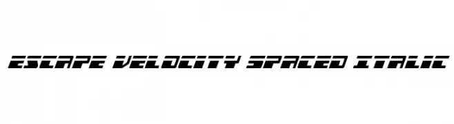
( Fonts by Iconian Fonts - Daniel Zadorozny - Personal-use only. For commercial use please contact owner. )
A bold, futuristic italic font with geometric and angular design.
 Herunterladen 39 Downloads@WebFont
 -
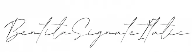
( Fonts by Letterena Studios - letterena.com - Personal-use only. For commercial use please contact owner. )
A cursive, handwritten-style font with elegant, flowing lines.
![Bentila Signate Italic Frei Schriftart Herunterladen]() Herunterladen 39 Downloads@WebFont
Herunterladen 39 Downloads@WebFont -
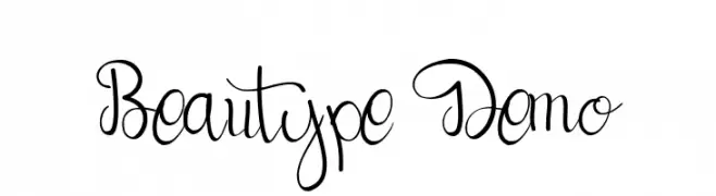
( Fonts by Omotu Studio - Ibnu Utomo - Personal-use only. For commercial use please contact owner. )
A flowing, cursive font with elegant loops and swashes, offering a handwritten appearance.
![Beautype Demo Frei Schriftart Herunterladen]() Herunterladen 39 Downloads@WebFont
Herunterladen 39 Downloads@WebFont -
( Fonts by Rometheme Studio - Yahdi Kumala - Personal-use only. For commercial use please contact owner. )
A bold, geometric font with a futuristic, cyberpunk aesthetic.
![Kogapunk Frei Schriftart Herunterladen]() Herunterladen 39 Downloads@WebFont
Herunterladen 39 Downloads@WebFont -
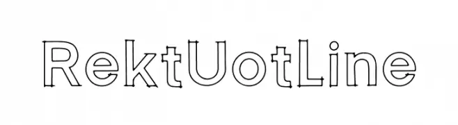
( Fonts by Choirul Masruroh - Personal-use only. For commercial use please contact owner. )
A modern outline font with bold, well-defined characters.
![Rekt Uotline Frei Schriftart Herunterladen]() Herunterladen 39 Downloads@WebFont
Herunterladen 39 Downloads@WebFont -
( Fonts by Denny Subagja - Personal-use only. For commercial use please contact owner. )
A playful, casual handwritten font with flowing, cursive-like strokes.
![Begittera Frei Schriftart Herunterladen]() Herunterladen 39 Downloads@WebFont
Herunterladen 39 Downloads@WebFont -
( Fonts by Vunira Design - Personal-use only. For commercial use please contact owner. )
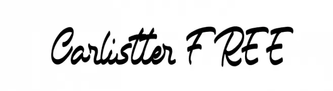
A dynamic, cursive script font with smooth, flowing letterforms.
![Carlistter FREE Frei Schriftart Herunterladen]() Herunterladen 39 Downloads@WebFont
Herunterladen 39 Downloads@WebFont -
( Fonts by weknow - Wino S Kadir - Personal-use only. For commercial use please contact owner. )
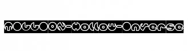
A futuristic, hollow font with bold outlines and geometric shapes.
![MILLION-Hollow-Inverse Frei Schriftart Herunterladen]() Herunterladen 39 Downloads@WebFont
Herunterladen 39 Downloads@WebFont -
( Fonts by Almarkhatype - Abdul Malik Wisnu - Personal-use only. For commercial use please contact owner. )
A dynamic and expressive script font with fluid, flowing letterforms and medium contrast.
![Orchide Frei Schriftart Herunterladen]() Herunterladen 39 Downloads@WebFont
Herunterladen 39 Downloads@WebFont -
( Fonts by Riki - Personal-use only. For commercial use please contact owner. )
A lively and expressive handwritten font with fluid, dynamic strokes.
![Gatshlie Frei Schriftart Herunterladen]() Herunterladen 39 Downloads@WebFont
Herunterladen 39 Downloads@WebFont -
( Fonts by Iconian Fonts - Daniel Zadorozny - Personal-use only. For commercial use please contact owner. )
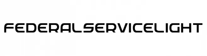
A modern, geometric font with consistent stroke widths and a clean, streamlined appearance.
![Federal Service Light Frei Schriftart Herunterladen]() Herunterladen 39 Downloads@WebFont
Herunterladen 39 Downloads@WebFont -
( Fonts by Pizzadude - Jakob Fischer - Personal-use only. For commercial use please contact owner. )
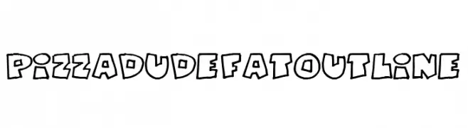
A bold, outlined font with a playful, cartoonish style.
![PizzaDudeFatOutline Frei Schriftart Herunterladen]() Herunterladen 39 Downloads@WebFont
Herunterladen 39 Downloads@WebFont -
( Fonts by Edric Studio - Personal-use only. For commercial use please contact owner. )
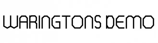
A geometric, angular font with a modern, futuristic style.
![WARINGTONS DEMO Frei Schriftart Herunterladen]() Herunterladen 39 Downloads@WebFont
Herunterladen 39 Downloads@WebFont -
( Fonts by DYSA Studio - Yusup Saputra - Personal-use only. For commercial use please contact owner. )
A classic cursive font with elegant, flowing lines and decorative flourishes.
![Mounlee Frei Schriftart Herunterladen]() Herunterladen 39 Downloads@WebFont
Herunterladen 39 Downloads@WebFont -
( Fonts by Iconian Fonts - Daniel Zadorozny - Personal-use only. For commercial use please contact owner. )
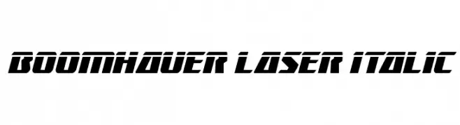
A bold, italicized font with a futuristic and dynamic style.
![Boomhauer Laser Italic Frei Schriftart Herunterladen]() Herunterladen 39 Downloads@WebFont
Herunterladen 39 Downloads@WebFont -
( Fonts by Hugefonts - Personal-use only. For commercial use please contact owner. )
A flowing, elegant handwritten script font with a personal touch.
![Kendrick Frei Schriftart Herunterladen]() Herunterladen 39 Downloads@WebFont
Herunterladen 39 Downloads@WebFont -
( Fonts by ingoFonts - Ingo Zimmermann - Personal-use only. For commercial use please contact owner. )
A bold, pixelated font with a retro digital aesthetic.
![DePixel BreitFett Frei Schriftart Herunterladen]() Herunterladen 39 Downloads@WebFont
Herunterladen 39 Downloads@WebFont -
( Fonts by Woodcutter Manero - www.woodcutter.es - Personal-use only. For commercial use please contact owner. )
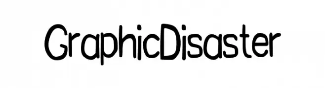
Hand-drawn, rounded sans-serif with playful character.
![Graphic Disaster Frei Schriftart Herunterladen]() Herunterladen 39 Downloads@WebFont
Herunterladen 39 Downloads@WebFont -
( Fonts by Letterhend Studio - Hendry Juanda - Personal-use only. For commercial use please contact owner. )
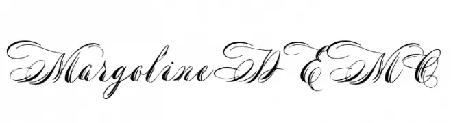
An elegant script font with flowing, cursive style and intricate swashes.
![MargolineDEMO Frei Schriftart Herunterladen]() Herunterladen 39 Downloads@WebFont
Herunterladen 39 Downloads@WebFont -
( Fonts by Rvandtype - Randi Irvan - Personal-use only. For commercial use please contact owner. )
A cursive, handwritten font with elegant, flowing curves.
![Khageats Frei Schriftart Herunterladen]() Herunterladen 39 Downloads@WebFont
Herunterladen 39 Downloads@WebFont -
( Fonts by Hugefonts - Personal-use only. For commercial use please contact owner. )
A modern, handwritten font with a casual and dynamic style.
![Sillverside Frei Schriftart Herunterladen]() Herunterladen 39 Downloads@WebFont
Herunterladen 39 Downloads@WebFont -
( Fonts by DumadiStyle - Toni Dzulham - Personal-use only. For commercial use please contact owner. )
A delicate and flowing script font with elegant, fluid letterforms.
![Shatomi Frei Schriftart Herunterladen]() Herunterladen 39 Downloads@WebFont
Herunterladen 39 Downloads@WebFont -
( Fonts by Edric Studio - Personal-use only. For commercial use please contact owner. )
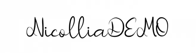
A graceful script font with flowing, connected strokes and elegant curves.
![Nicollia DEMO Frei Schriftart Herunterladen]() Herunterladen 39 Downloads@WebFont
Herunterladen 39 Downloads@WebFont -
( Fonts by Noah Type - noahtype.com - Personal-use only. For commercial use please contact owner. )
An edgy, jagged outline font with a bold and dynamic appearance.
![Vaulcate Demo Outline Frei Schriftart Herunterladen]() Herunterladen 39 Downloads@WebFont
Herunterladen 39 Downloads@WebFont -
( Fonts by Pinisiart )
A bold, playful font with a hand-cut, whimsical style.
![Cutting Board Frei Schriftart Herunterladen]() Herunterladen 39 Downloads@WebFont
Herunterladen 39 Downloads@WebFont -
( Fonts by Arfi Ardian )
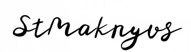
A cursive, handwritten script font.
![St Maknyus Frei Schriftart Herunterladen]() Herunterladen 39 Downloads@WebFont
Herunterladen 39 Downloads@WebFont -
( Fonts by PutraCetol Studio )
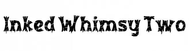
Bold, whimsical display font with jagged, playful edges.
![Inked Whimsy Two Frei Schriftart Herunterladen]() Herunterladen 39 Downloads@WebFont
Herunterladen 39 Downloads@WebFont -
( Fonts by AVType - Personal-use only. For commercial use please contact owner. )
A modern, elegant script font with a flowing, handwritten style.
![Mianty Frei Schriftart Herunterladen]() Herunterladen 39 Downloads@WebFont
Herunterladen 39 Downloads@WebFont -
( Fonts by weknow - Wino S Kadir - Personal-use only. For commercial use please contact owner. )
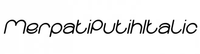
A modern, italicized font with smooth, rounded edges and consistent stroke width.
![Merpati Putih Italic Frei Schriftart Herunterladen]() Herunterladen 39 Downloads@WebFont
Herunterladen 39 Downloads@WebFont -
( Fonts by Halymunt Studio halymuntstudio.com - Personal-use only. For commercial use please contact owner. )
A cursive, handwritten font with elegant, flowing letters.
![Redjeansky Frei Schriftart Herunterladen]() Herunterladen 39 Downloads@WebFont
Herunterladen 39 Downloads@WebFont -
( Fonts by Perspectype Studio - Personal-use only. For commercial use please contact owner. )
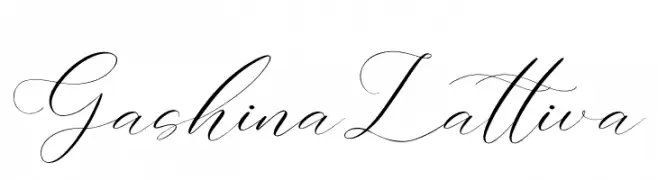
An elegant script font with flowing, cursive letterforms and high contrast strokes.
![Gashina Lattiva Frei Schriftart Herunterladen]() Herunterladen 39 Downloads@WebFont
Herunterladen 39 Downloads@WebFont -
( Fonts by Vladimir Nikolic - Personal-use only. For commercial use please contact owner. )
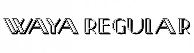
A bold, geometric font with a three-dimensional effect and sharp angles.
![Waya Regular Frei Schriftart Herunterladen]() Herunterladen 39 Downloads@WebFont
Herunterladen 39 Downloads@WebFont -
( Fonts by Zetafonts - Personal-use only. For commercial use please contact owner. )
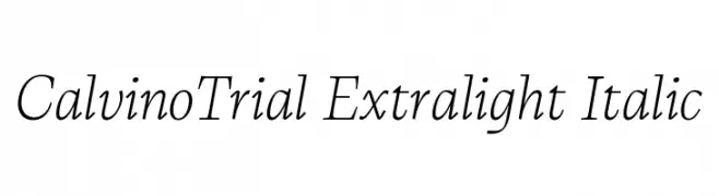
An elegant, extra-light italic serif font with refined curves and classic charm.
![CalvinoTrial Extralight Italic Frei Schriftart Herunterladen]() Herunterladen 39 Downloads@WebFont
Herunterladen 39 Downloads@WebFont -
( Fonts by dancubs - Demsey Satya Nagara - Personal-use only. For commercial use please contact owner. )
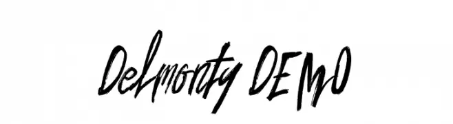
A bold, expressive handwritten font with a brush-like texture.
![Delmonty DEMO Frei Schriftart Herunterladen]() Herunterladen 39 Downloads@WebFont
Herunterladen 39 Downloads@WebFont -
( Fonts by Edric Studio - Personal-use only. For commercial use please contact owner. )
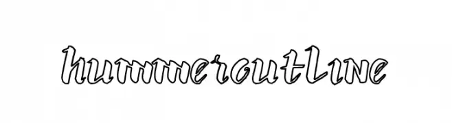
A bold, outlined font with a playful and dynamic style.
![hummer outline Frei Schriftart Herunterladen]() Herunterladen 39 Downloads@WebFont
Herunterladen 39 Downloads@WebFont


Welche Schriften sind gerade am populärsten?
Poppins, Roboto, Montserrat, Open Sans und Lato sind wegen ihrer klaren Formen und breiten Einsetzbarkeit sehr gefragt – von Markenauftritt über Landingpages bis hin zu Postern.
Welche Fonts eignen sich für Logos?
Geometrische Sans‑Serifs (z. B. Poppins, Familien im Gotham‑Stil) sind ein häufiger Griff für sauberes, skalierbares Branding. Für eine persönlichere Note bleiben Scripts und Handschrift‑Stile beliebt. Kombinieren Sie einen prägnanten Headline‑Font mit einer neutralen Brotschrift für Wiedererkennung und Harmonie.
Wie oft wird die Top‑Liste aktualisiert?
Regelmäßig – basierend auf realen Downloads und Interaktionen. Schauen Sie öfter vorbei, um aufstrebende Favoriten früh zu entdecken.
💡 Tipp: Seite bookmarken – Trends wechseln schnell, und heutige Top‑Schriften inspirieren morgen vielleicht das Rebranding.