Willkommen bei den Top‑Schriften – hier treffen Beliebtheit und Qualität aufeinander. Das sind die in diesem Jahr am häufigsten heruntergeladenen und genutzten Fonts. Wenn Sie sichere Optionen für Logo, Web oder Social suchen, starten Sie hier.
Jeder Top‑Font überzeugt durch Balance, Lesbarkeit und Vielseitigkeit. Sie finden moderne Sans‑Serifs, elegante Scripts, Vintage‑Serifs und minimalistische Displays.
-
( Personal-use only. For commercial use please contact owner. )
Expressive, festive script with tall uppercase and bold, rounded lowercase.
 Herunterladen 39 Downloads@WebFont
 -
( Fonts by Alpaprana - Personal-use only. For commercial use please contact owner. )
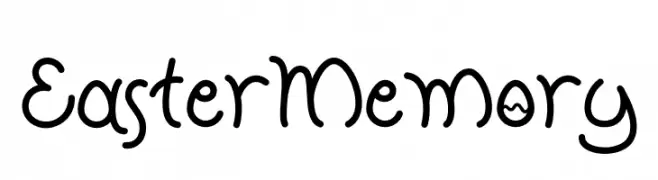
A playful, handwritten font with rounded, flowing characters.
![Easter Memory Frei Schriftart Herunterladen]() Herunterladen 39 Downloads@WebFont
Herunterladen 39 Downloads@WebFont -
( Fonts by Balpirick - Personal-use only. For commercial use please contact owner. )
A bold, handwritten font with a playful and energetic style.
![Romalian Frei Schriftart Herunterladen]() Herunterladen 39 Downloads@WebFont
Herunterladen 39 Downloads@WebFont -
( Fonts by Hurufraktur - Fadly Pratama - Personal-use only. For commercial use please contact owner. )
A bold, brushstroke font with a dynamic and textured appearance.
![Konizuka Frei Schriftart Herunterladen]() Herunterladen 39 Downloads@WebFont
Herunterladen 39 Downloads@WebFont -
( Fonts by S.P.M.H - Slyzi Hadi - Personal-use only. For commercial use please contact owner. )
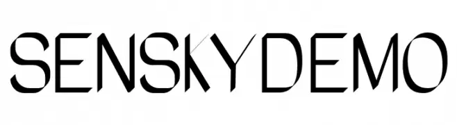
A modern, geometric font with clean lines and sharp angles.
![SeNSKYDEMO Frei Schriftart Herunterladen]() Herunterladen 39 Downloads@WebFont
Herunterladen 39 Downloads@WebFont -
( Fonts by Iconian Fonts - Daniel Zadorozny - Personal-use only. For commercial use please contact owner. )
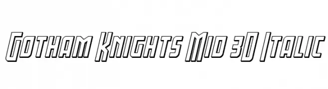
A bold, 3D italic font with geometric, outlined characters.
![Gotham Knights Mid 3D Italic Frei Schriftart Herunterladen]() Herunterladen 39 Downloads@WebFont
Herunterladen 39 Downloads@WebFont -
( Fonts by Perspectype Studio - Personal-use only. For commercial use please contact owner. )
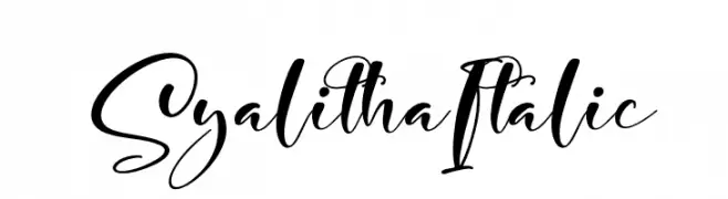
An elegant, flowing script font with smooth cursive strokes and graceful curves.
![Syalitha Italic Frei Schriftart Herunterladen]() Herunterladen 39 Downloads@WebFont
Herunterladen 39 Downloads@WebFont -
( Fonts by Wellscript Studio - Personal-use only. For commercial use please contact owner. )
A playful, hand-drawn font with bold, rounded strokes and a whimsical style.
![Scratch Ink Frei Schriftart Herunterladen]() Herunterladen 39 Downloads@WebFont
Herunterladen 39 Downloads@WebFont -
( Fonts by Angelo Aman - Personal-use only. For commercial use please contact owner. )
A bold, expressive handwritten font with thick, textured strokes.
![Dragos Frei Schriftart Herunterladen]() Herunterladen 39 Downloads@WebFont
Herunterladen 39 Downloads@WebFont -
( Fonts by Perspectype Studio - Personal-use only. For commercial use please contact owner. )
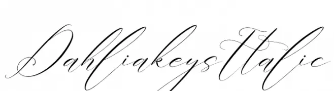
An elegant, flowing script font with intricate, cursive strokes and high contrast.
![Dahliakeys Italic Frei Schriftart Herunterladen]() Herunterladen 39 Downloads@WebFont
Herunterladen 39 Downloads@WebFont -
( Fonts by Iconian Fonts - Daniel Zadorozny - Personal-use only. For commercial use please contact owner. )
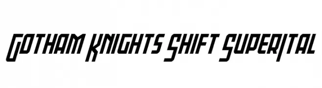
A bold, angular, and futuristic font with a strong slant and geometric style.
![Gotham Knights Shift SuperItal Frei Schriftart Herunterladen]() Herunterladen 39 Downloads@WebFont
Herunterladen 39 Downloads@WebFont -
( Fonts by Typotopia Studio - Personal-use only. For commercial use please contact owner. )
A bold, gothic blackletter font with sharp, angular strokes.
![Osgiliath Frei Schriftart Herunterladen]() Herunterladen 39 Downloads@WebFont
Herunterladen 39 Downloads@WebFont -
( Fonts by Almarkhatype - Abdul Malik Wisnu - Personal-use only. For commercial use please contact owner. )
A bold, high-contrast script font with elegant, flowing letterforms.
![chadelova Frei Schriftart Herunterladen]() Herunterladen 39 Downloads@WebFont
Herunterladen 39 Downloads@WebFont -
( Fonts by Mans Greback - www.mansgreback.com - Personal-use only. For commercial use please contact owner. )
A playful, handwritten font with rounded, consistent strokes.
![Bigantha Frei Schriftart Herunterladen]() Herunterladen 39 Downloads@WebFont
Herunterladen 39 Downloads@WebFont -
( Fonts by Digital Typeface Studio - Eva Barabasne Olasz - Personal-use only. For commercial use please contact owner. )
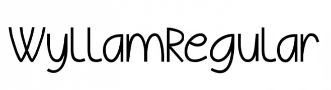
A playful, rounded font with consistent stroke width and elegant curls.
![Wyllam Regular Frei Schriftart Herunterladen]() Herunterladen 39 Downloads@WebFont
Herunterladen 39 Downloads@WebFont -
( Fonts by Graphicfresh - Personal-use only. For commercial use please contact owner. )
A playful, handwritten font with rounded edges and a casual style.
![Kerape Frei Schriftart Herunterladen]() Herunterladen 39 Downloads@WebFont
Herunterladen 39 Downloads@WebFont -
( Fonts by Heinzel Std - Personal-use only. For commercial use please contact owner. )
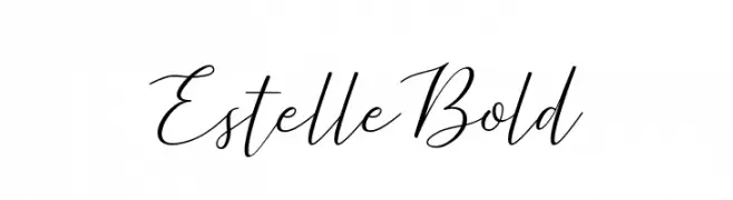
A graceful script font with elegant, flowing cursive strokes.
![Estelle Bold Frei Schriftart Herunterladen]() Herunterladen 39 Downloads@WebFont
Herunterladen 39 Downloads@WebFont -
( Fonts by StringLabs - stringlabscreative.com - Personal-use only. For commercial use please contact owner. )
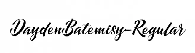
A dynamic and elegant script font with flowing cursive letterforms.
![DaydenBatemisy-Regular Frei Schriftart Herunterladen]() Herunterladen 39 Downloads@WebFont
Herunterladen 39 Downloads@WebFont -
( Fonts by weknow - Wino S Kadir - Personal-use only. For commercial use please contact owner. )
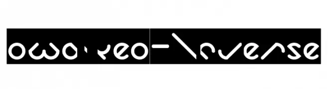
A modern, slanted font with smooth, rounded strokes and a futuristic style.
![owaikeo-Inverse Frei Schriftart Herunterladen]() Herunterladen 39 Downloads@WebFont
Herunterladen 39 Downloads@WebFont -
( Fonts by Letterena Studios - letterena.com - Personal-use only. For commercial use please contact owner. )
A bold, cursive font with interconnected letters and elegant swashes.
![Esyla Frei Schriftart Herunterladen]() Herunterladen 39 Downloads@WebFont
Herunterladen 39 Downloads@WebFont -
( Fonts by Nur Solikh - Personal-use only. For commercial use please contact owner. )
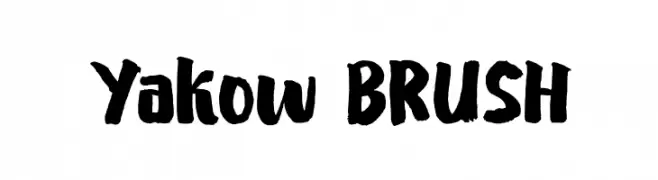
A bold, brush-style font with a hand-painted, artistic appearance.
![Yakow BRUSH Frei Schriftart Herunterladen]() Herunterladen 39 Downloads@WebFont
Herunterladen 39 Downloads@WebFont -
( Fonts by Angin Studio - David Novrian - Personal-use only. For commercial use please contact owner. )
An elegant, high-contrast serif font with elongated characters.
![Rosseta Frei Schriftart Herunterladen]() Herunterladen 39 Downloads@WebFont
Herunterladen 39 Downloads@WebFont -
( Fonts by EyeCone - Personal-use only. For commercial use please contact owner. )
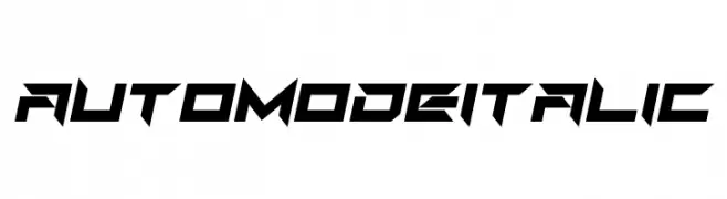
A bold, angular, and italicized font with a futuristic and dynamic style.
![Auto Mode Italic Frei Schriftart Herunterladen]() Herunterladen 39 Downloads@WebFont
Herunterladen 39 Downloads@WebFont -
( Fonts by Raxx Studios - Personal-use only. For commercial use please contact owner. )
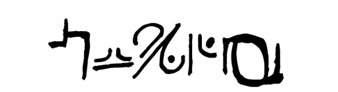
Abstract, hand-drawn script with irregular, ancient-like forms.
![Haury Frei Schriftart Herunterladen]() Herunterladen 39 Downloads@WebFont
Herunterladen 39 Downloads@WebFont -
( Fonts by Skinny Type - Muhajir - Personal-use only. For commercial use please contact owner. )
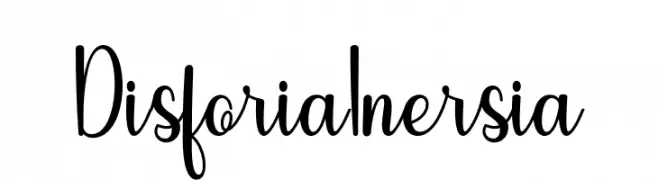
A playful, handwritten font with a smooth, flowing style.
![Disforia Inersia Frei Schriftart Herunterladen]() Herunterladen 39 Downloads@WebFont
Herunterladen 39 Downloads@WebFont -
( Fonts by Letterday Studio )
![Signature present Frei Schriftart Herunterladen]() Herunterladen 39 Downloads@WebFont
Herunterladen 39 Downloads@WebFont -
( Fonts by Vunira Design - Personal-use only. For commercial use please contact owner. )
A bold, decorative font with a distressed, vintage style.
![SalmonFREE Frei Schriftart Herunterladen]() Herunterladen 39 Downloads@WebFont
Herunterladen 39 Downloads@WebFont -
( Fonts by weknow - Wino S Kadir - Personal-use only. For commercial use please contact owner. )
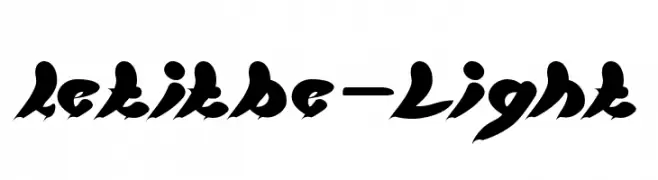
A bold, flowing script font with dynamic brush stroke aesthetics.
![let it be-Light Frei Schriftart Herunterladen]() Herunterladen 39 Downloads@WebFont
Herunterladen 39 Downloads@WebFont -
( Personal-use only. For commercial use please contact owner. )
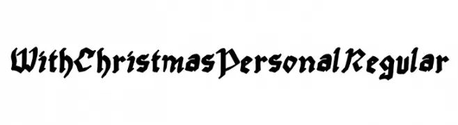
Bold, decorative blackletter font with sharp, angular strokes.
![With Christmas Personal Regular Frei Schriftart Herunterladen]() Herunterladen 39 Downloads@WebFont
Herunterladen 39 Downloads@WebFont -
( Fonts by Mans Greback - www.mansgreback.com - Personal-use only. For commercial use please contact owner. )
A bold, brush-style font with dynamic, hand-painted characteristics.
![Inkbrush Frei Schriftart Herunterladen]() Herunterladen 39 Downloads@WebFont
Herunterladen 39 Downloads@WebFont -
( Fonts by Baihaki - Personal-use only. For commercial use please contact owner. )
A lively, expressive handwritten font with dynamic strokes and playful loops.
![Better flash Frei Schriftart Herunterladen]() Herunterladen 39 Downloads@WebFont
Herunterladen 39 Downloads@WebFont -
( Fonts by Darrell Flood - Personal-use only. For commercial use please contact owner. )
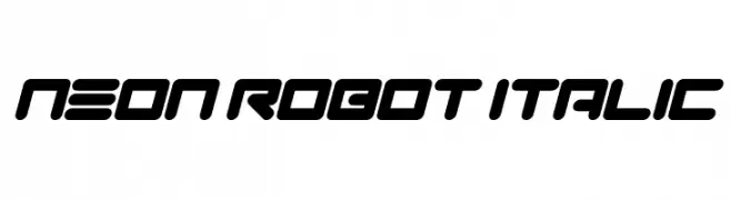
A bold, italicized font with a futuristic and robotic design.
![Neon Robot Italic Frei Schriftart Herunterladen]() Herunterladen 39 Downloads@WebFont
Herunterladen 39 Downloads@WebFont -
( Fonts by Lafontype - Anugrah Pasau - Personal-use only. For commercial use please contact owner. )
A graceful, handwritten script font with elegant, flowing characters.
![Celliad Frei Schriftart Herunterladen]() Herunterladen 39 Downloads@WebFont
Herunterladen 39 Downloads@WebFont -
( Fonts by zone108.main.jp - Personal-use only. For commercial use please contact owner. )
A bold, decorative font with geometric and star-like motifs.
![Kohsonsho Bold Frei Schriftart Herunterladen]() Herunterladen 39 Downloads@WebFont
Herunterladen 39 Downloads@WebFont -
( Fonts by Abo Daniel Studio - Panggah Laksono - Personal-use only. For commercial use please contact owner. )
A fluid, cursive font with a natural handwriting style.
![my status Frei Schriftart Herunterladen]() Herunterladen 39 Downloads@WebFont
Herunterladen 39 Downloads@WebFont


Welche Schriften sind gerade am populärsten?
Poppins, Roboto, Montserrat, Open Sans und Lato sind wegen ihrer klaren Formen und breiten Einsetzbarkeit sehr gefragt – von Markenauftritt über Landingpages bis hin zu Postern.
Welche Fonts eignen sich für Logos?
Geometrische Sans‑Serifs (z. B. Poppins, Familien im Gotham‑Stil) sind ein häufiger Griff für sauberes, skalierbares Branding. Für eine persönlichere Note bleiben Scripts und Handschrift‑Stile beliebt. Kombinieren Sie einen prägnanten Headline‑Font mit einer neutralen Brotschrift für Wiedererkennung und Harmonie.
Wie oft wird die Top‑Liste aktualisiert?
Regelmäßig – basierend auf realen Downloads und Interaktionen. Schauen Sie öfter vorbei, um aufstrebende Favoriten früh zu entdecken.
💡 Tipp: Seite bookmarken – Trends wechseln schnell, und heutige Top‑Schriften inspirieren morgen vielleicht das Rebranding.