Willkommen bei den Top‑Schriften – hier treffen Beliebtheit und Qualität aufeinander. Das sind die in diesem Jahr am häufigsten heruntergeladenen und genutzten Fonts. Wenn Sie sichere Optionen für Logo, Web oder Social suchen, starten Sie hier.
Jeder Top‑Font überzeugt durch Balance, Lesbarkeit und Vielseitigkeit. Sie finden moderne Sans‑Serifs, elegante Scripts, Vintage‑Serifs und minimalistische Displays.
-
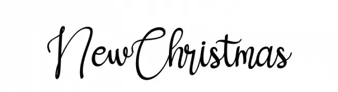
( Fonts by Bearytype - Dian Hadi - Personal-use only. For commercial use please contact owner. )
A playful, festive script font with elegant, flowing cursive letters.
 Herunterladen 37 Downloads@WebFont
 -
( Fonts by Manuel Ramos - Personal-use only. For commercial use please contact owner. )
A sleek, modern font with elongated, thin strokes and a minimalist aesthetic.
![Estilistica Frei Schriftart Herunterladen]() Herunterladen 37 Downloads@WebFont
Herunterladen 37 Downloads@WebFont -
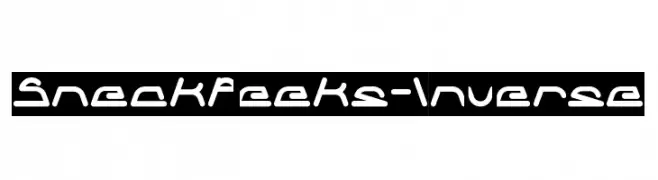
( Fonts by weknow - Wino S Kadir - Personal-use only. For commercial use please contact owner. )
A futuristic, geometric font with consistent stroke width and bold presence.
![Sneak Peeks-Inverse Frei Schriftart Herunterladen]() Herunterladen 37 Downloads@WebFont
Herunterladen 37 Downloads@WebFont -
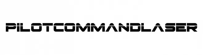
( Fonts by Iconian Fonts - Daniel Zadorozny - Personal-use only. For commercial use please contact owner. )
A bold, futuristic font with geometric precision and sci-fi appeal.
![Pilot Command Laser Frei Schriftart Herunterladen]() Herunterladen 37 Downloads@WebFont
Herunterladen 37 Downloads@WebFont -
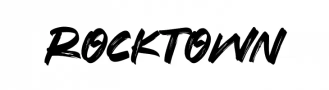
( Fonts by Syaf Rizal - Khurasan - Personal-use only. For commercial use please contact owner. )
A bold, brush-style font with dynamic, hand-painted strokes.
![Rocktown Frei Schriftart Herunterladen]() Herunterladen 37 Downloads@WebFont
Herunterladen 37 Downloads@WebFont -
( Fonts by Iconian Fonts - Daniel Zadorozny - Personal-use only. For commercial use please contact owner. )
A bold, angular font with a futuristic and dynamic style.
![Flight Corps Semi-Italic Frei Schriftart Herunterladen]() Herunterladen 37 Downloads@WebFont
Herunterladen 37 Downloads@WebFont -
( Fonts by Riki - Personal-use only. For commercial use please contact owner. )
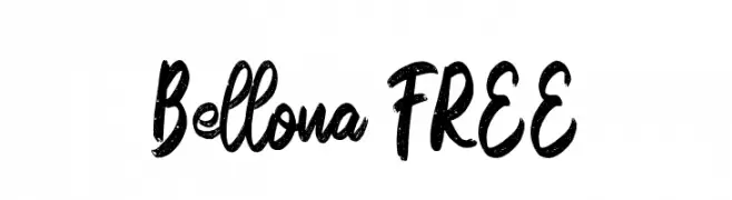
A bold, textured brush-style font with a dynamic and expressive script.
![Bellona FREE Frei Schriftart Herunterladen]() Herunterladen 37 Downloads@WebFont
Herunterladen 37 Downloads@WebFont -
( Fonts by Wahyu Studio - Wahyu Setiyawan - Personal-use only. For commercial use please contact owner. )
A playful, handwritten script font with bold strokes and a dynamic style.
![Deswita Frei Schriftart Herunterladen]() Herunterladen 37 Downloads@WebFont
Herunterladen 37 Downloads@WebFont -
( Fonts by Syaf Rizal - Khurasan - Personal-use only. For commercial use please contact owner. )
A bold, brush-style font with dynamic, expressive strokes.
![Crudex Frei Schriftart Herunterladen]() Herunterladen 37 Downloads@WebFont
Herunterladen 37 Downloads@WebFont -
( Fonts by Riki - Personal-use only. For commercial use please contact owner. )
A bold, cursive font with dynamic strokes and a modern, artistic flair.
![Entade Frei Schriftart Herunterladen]() Herunterladen 37 Downloads@WebFont
Herunterladen 37 Downloads@WebFont -
( Fonts by Hugefonts - Personal-use only. For commercial use please contact owner. )
A bold, angular font with a hand-drawn, dynamic style.
![Vamfired Frei Schriftart Herunterladen]() Herunterladen 37 Downloads@WebFont
Herunterladen 37 Downloads@WebFont -
( Fonts by Kong Font - fontkong.com - Personal-use only. For commercial use please contact owner. )
A dynamic, cursive script font with fluid, connected strokes.
![Shayne Frei Schriftart Herunterladen]() Herunterladen 37 Downloads@WebFont
Herunterladen 37 Downloads@WebFont -
( Fonts by Mans Greback - www.mansgreback.com - Personal-use only. For commercial use please contact owner. )
A playful, casual handwritten font with smooth, flowing curves.
![Ceremony Frei Schriftart Herunterladen]() Herunterladen 37 Downloads@WebFont
Herunterladen 37 Downloads@WebFont -
( Fonts by Azis Maulana Ihsan - Personal-use only. For commercial use please contact owner. )
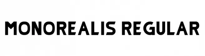
A bold, geometric font with uniform stroke width and modern style.
![Monorealis Regular Frei Schriftart Herunterladen]() Herunterladen 37 Downloads@WebFont
Herunterladen 37 Downloads@WebFont -
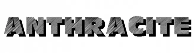
![Anthracite Frei Schriftart Herunterladen]() Herunterladen 37 Downloads
Herunterladen 37 Downloads -
( Fonts by _n3o_ - Laurent Mouy - Personal-use only. For commercial use please contact owner. )
A whimsical, hand-drawn font with elongated, narrow characters and playful irregularity.
![Dream Builder Frei Schriftart Herunterladen]() Herunterladen 37 Downloads@WebFont
Herunterladen 37 Downloads@WebFont -
( Fonts by Royaltype - Darwinoo - Personal-use only. For commercial use please contact owner. )
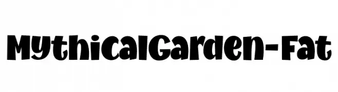
A bold, playful font with rounded shapes and a whimsical style.
![MythicalGarden-Fat Frei Schriftart Herunterladen]() Herunterladen 37 Downloads@WebFont
Herunterladen 37 Downloads@WebFont -
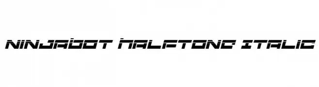
( Fonts by Iconian Fonts )
A bold, futuristic italic font with a halftone effect, ideal for modern and tech-themed designs.
![Ninjabot Halftone Italic Frei Schriftart Herunterladen]() Herunterladen 37 Downloads@WebFont
Herunterladen 37 Downloads@WebFont -
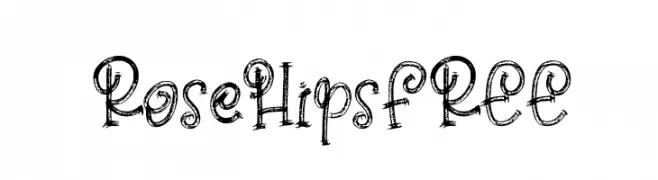
( Fonts by Vunira Design - Personal-use only. For commercial use please contact owner. )
A whimsical, hand-drawn font with intricate, sketch-like details.
![Rose Hips FREE Frei Schriftart Herunterladen]() Herunterladen 37 Downloads@WebFont
Herunterladen 37 Downloads@WebFont -
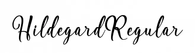
( Fonts by Debut Studio - Ari Fadli - Personal-use only. For commercial use please contact owner. )
A flowing, elegant script font with classic and modern elements.
![Hildegard Regular Frei Schriftart Herunterladen]() Herunterladen 37 Downloads@WebFont
Herunterladen 37 Downloads@WebFont -
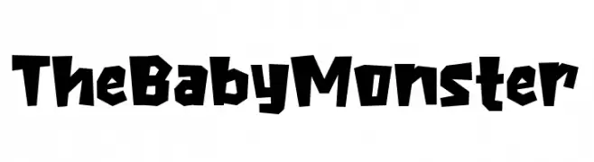
( Fonts by Khurasan - Syaf Rizal - Personal-use only. For commercial use please contact owner. )
A bold, playful font with jagged, irregular shapes and a dynamic style.
![The Baby Monster Frei Schriftart Herunterladen]() Herunterladen 37 Downloads@WebFont
Herunterladen 37 Downloads@WebFont -
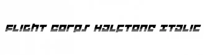
( Fonts by Iconian Fonts - Daniel Zadorozny - Personal-use only. For commercial use please contact owner. )
A bold, italicized font with a futuristic halftone effect and geometric design.
![Flight Corps Halftone Italic Frei Schriftart Herunterladen]() Herunterladen 37 Downloads@WebFont
Herunterladen 37 Downloads@WebFont -
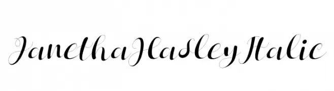
( Fonts by Letterena Studios - letterena.com - Personal-use only. For commercial use please contact owner. )
An elegant and sophisticated cursive font with ornate swashes and flourishes.
![Janetha Hasley Italic Frei Schriftart Herunterladen]() Herunterladen 37 Downloads@WebFont
Herunterladen 37 Downloads@WebFont -
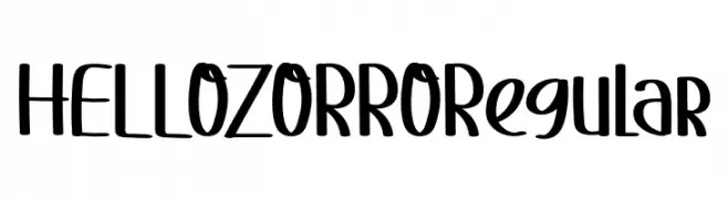
( Fonts by One Design - Personal-use only. For commercial use please contact owner. )
A playful, hand-drawn font with a whimsical and casual style.
![HELLOZORRORegular Frei Schriftart Herunterladen]() Herunterladen 37 Downloads@WebFont
Herunterladen 37 Downloads@WebFont -
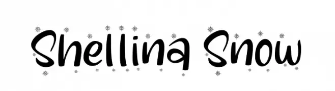
( Fonts by Kong Font - Personal-use only. For commercial use please contact owner. )
A playful handwritten font with snowflake accents, perfect for festive designs.
![Shellina Snow Frei Schriftart Herunterladen]() Herunterladen 37 Downloads@WebFont
Herunterladen 37 Downloads@WebFont -
( Fonts by Jangan Lupa Studio - Personal-use only. For commercial use please contact owner. )
A cursive, handwritten-style font with fluid, connected characters.
![Vanella Frei Schriftart Herunterladen]() Herunterladen 37 Downloads@WebFont
Herunterladen 37 Downloads@WebFont -
( Fonts by pOPdOG fONTS - Dimitris Kolyris - popdog_fonts.tripod.com Sponsoren Schriftart )
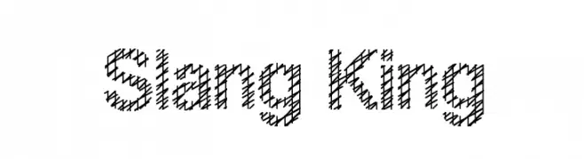
A hand-drawn, crosshatched font with a playful and artistic style.
![Slang King Frei Schriftart Herunterladen]() Herunterladen 37 Downloads
Herunterladen 37 Downloads -
( Fonts by setyaisiam _type - Personal-use only. For commercial use please contact owner. )
A playful, hand-drawn font with tall, narrow letters and consistent stroke width.
![Delfigray Frei Schriftart Herunterladen]() Herunterladen 37 Downloads@WebFont
Herunterladen 37 Downloads@WebFont -
( Fonts by Wahyu Studio - Wahyu Setiyawan - Personal-use only. For commercial use please contact owner. )
A bold, playful script font with a modern, handwritten style.
![Eldyta Frei Schriftart Herunterladen]() Herunterladen 37 Downloads@WebFont
Herunterladen 37 Downloads@WebFont -
( Fonts by Iconian Fonts )
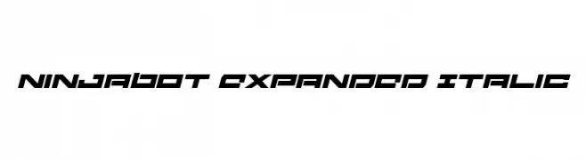
A bold, expanded, and italicized font with a futuristic and dynamic style.
![Ninjabot Expanded Italic Frei Schriftart Herunterladen]() Herunterladen 37 Downloads@WebFont
Herunterladen 37 Downloads@WebFont -
( Fonts by Riki - Personal-use only. For commercial use please contact owner. )
A dynamic handwritten font with fluid, expressive strokes and a playful tilt.
![Callides Frei Schriftart Herunterladen]() Herunterladen 37 Downloads@WebFont
Herunterladen 37 Downloads@WebFont -
( Fonts by Kong Font - Personal-use only. For commercial use please contact owner. )
An elegant, high-contrast script font with flowing, cursive strokes.
![CharlotteBella Frei Schriftart Herunterladen]() Herunterladen 37 Downloads@WebFont
Herunterladen 37 Downloads@WebFont -
( Fonts by Royaltype - Darwinoo - Personal-use only. For commercial use please contact owner. )
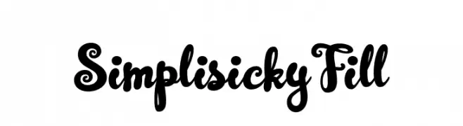
A playful and whimsical font with bold, curvy letterforms and decorative swirls.
![SimplisickyFill Frei Schriftart Herunterladen]() Herunterladen 37 Downloads@WebFont
Herunterladen 37 Downloads@WebFont -
( Fonts by StringLabs - stringlabscreative.com - Personal-use only. For commercial use please contact owner. )
A delicate, flowing script font with elegant, elongated letterforms.
![Carmelia Frei Schriftart Herunterladen]() Herunterladen 37 Downloads@WebFont
Herunterladen 37 Downloads@WebFont -
( Fonts by Ellinor Rapp - www.yourownfont.com Sponsoren Schriftart )
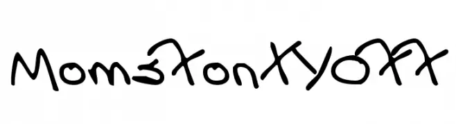
A playful, casual handwritten font with smooth, flowing lines.
![MomsFontYOFF Frei Schriftart Herunterladen]() Herunterladen 37 Downloads
Herunterladen 37 Downloads


Welche Schriften sind gerade am populärsten?
Poppins, Roboto, Montserrat, Open Sans und Lato sind wegen ihrer klaren Formen und breiten Einsetzbarkeit sehr gefragt – von Markenauftritt über Landingpages bis hin zu Postern.
Welche Fonts eignen sich für Logos?
Geometrische Sans‑Serifs (z. B. Poppins, Familien im Gotham‑Stil) sind ein häufiger Griff für sauberes, skalierbares Branding. Für eine persönlichere Note bleiben Scripts und Handschrift‑Stile beliebt. Kombinieren Sie einen prägnanten Headline‑Font mit einer neutralen Brotschrift für Wiedererkennung und Harmonie.
Wie oft wird die Top‑Liste aktualisiert?
Regelmäßig – basierend auf realen Downloads und Interaktionen. Schauen Sie öfter vorbei, um aufstrebende Favoriten früh zu entdecken.
💡 Tipp: Seite bookmarken – Trends wechseln schnell, und heutige Top‑Schriften inspirieren morgen vielleicht das Rebranding.