Willkommen bei den Top‑Schriften – hier treffen Beliebtheit und Qualität aufeinander. Das sind die in diesem Jahr am häufigsten heruntergeladenen und genutzten Fonts. Wenn Sie sichere Optionen für Logo, Web oder Social suchen, starten Sie hier.
Jeder Top‑Font überzeugt durch Balance, Lesbarkeit und Vielseitigkeit. Sie finden moderne Sans‑Serifs, elegante Scripts, Vintage‑Serifs und minimalistische Displays.
-
( Fonts by Balpirick - Personal-use only. For commercial use please contact owner. )
A lively, cursive script font with elegant, flowing strokes.
 Herunterladen 39 Downloads@WebFont
 -
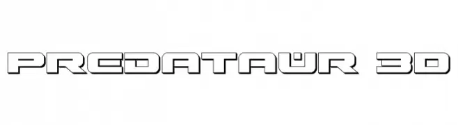
( Fonts by Iconian Fonts - Daniel Zadorozny - Personal-use only. For commercial use please contact owner. )
A bold, 3D geometric font with a futuristic and digital aesthetic.
![Predataur 3D Frei Schriftart Herunterladen]() Herunterladen 39 Downloads@WebFont
Herunterladen 39 Downloads@WebFont -
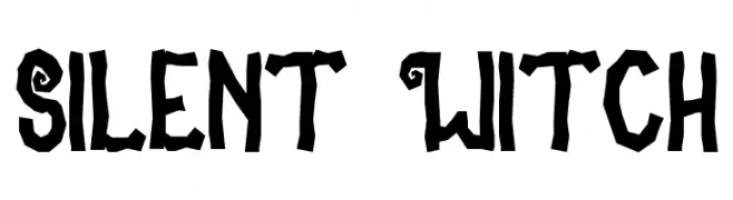
( Fonts by Cikareotype Studio )
Playful, hand-drawn display font with whimsical, magical details.
![Silent Witch Frei Schriftart Herunterladen]() Herunterladen 39 Downloads@WebFont
Herunterladen 39 Downloads@WebFont -
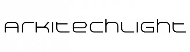
( Fonts by Neogrey Creative - Ivan Filipov - Personal-use only. For commercial use please contact owner. )
A modern, geometric font with clean lines and rounded edges.
![Arkitech Light Frei Schriftart Herunterladen]() Herunterladen 39 Downloads@WebFont
Herunterladen 39 Downloads@WebFont -
( Personal-use only. For commercial use please contact owner. )
![Thaber Blads Trial Regular Frei Schriftart Herunterladen]() Herunterladen 39 Downloads@WebFont
Herunterladen 39 Downloads@WebFont -
( Fonts by Beautypes - Bhakti Al Akbar Pasaribu - Personal-use only. For commercial use please contact owner. )
A lively and elegant script font with flowing, cursive letterforms.
![Basston Script Frei Schriftart Herunterladen]() Herunterladen 39 Downloads@WebFont
Herunterladen 39 Downloads@WebFont -
( Fonts by Vunira Design - Personal-use only. For commercial use please contact owner. )
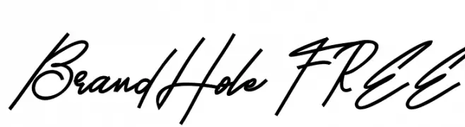
A dynamic, cursive script font with a handwritten appearance.
![BrandHole FREE Frei Schriftart Herunterladen]() Herunterladen 39 Downloads@WebFont
Herunterladen 39 Downloads@WebFont -
( Fonts by GGBot - www.ggbot.net - Personal-use only. For commercial use please contact owner. )
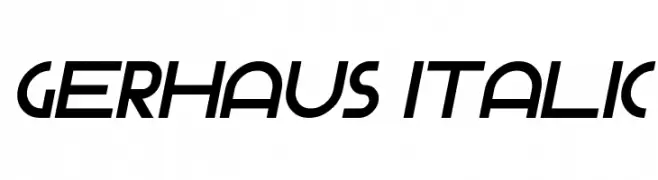
A modern, italic font with a sleek and dynamic style.
![Gerhaus Italic Frei Schriftart Herunterladen]() Herunterladen 39 Downloads@WebFont
Herunterladen 39 Downloads@WebFont -
( Personal-use only. For commercial use please contact owner. )
![Sport Scholars Regular Frei Schriftart Herunterladen]() Herunterladen 39 Downloads@WebFont
Herunterladen 39 Downloads@WebFont -
( Fonts by Alpaprana - Personal-use only. For commercial use please contact owner. )
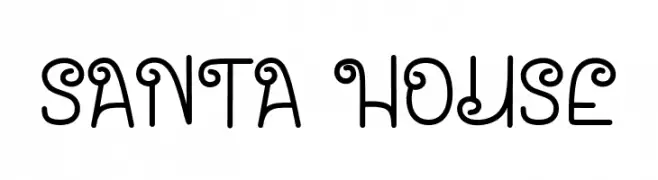
A whimsical and playful font with decorative curls and loops.
![Santa House Frei Schriftart Herunterladen]() Herunterladen 39 Downloads@WebFont
Herunterladen 39 Downloads@WebFont -
( Fonts by Eddy Goodboy - Personal-use only. For commercial use please contact owner. )
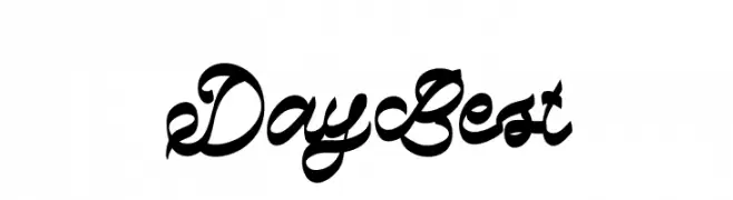
A dynamic and elegant script font with flowing, cursive letterforms.
![Day Best Frei Schriftart Herunterladen]() Herunterladen 39 Downloads@WebFont
Herunterladen 39 Downloads@WebFont -
( Fonts by Variatype - Mukhlis Muhammad - Personal-use only. For commercial use please contact owner. )
A bold, brush-style script font with dynamic, hand-painted strokes.
![Rushwell Frei Schriftart Herunterladen]() Herunterladen 39 Downloads@WebFont
Herunterladen 39 Downloads@WebFont -
( Fonts by weknow - Wino S Kadir - Personal-use only. For commercial use please contact owner. )
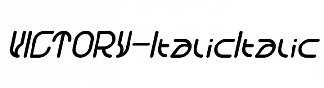
A sleek, modern italic font with rounded, smooth characters.
![VICTORY-Italic Italic Frei Schriftart Herunterladen]() Herunterladen 39 Downloads@WebFont
Herunterladen 39 Downloads@WebFont -
( Fonts by Iconian Fonts - Daniel Zadorozny - Personal-use only. For commercial use please contact owner. )
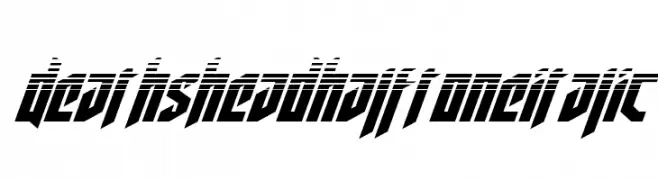
A bold, angular, italic font with a halftone effect for a futuristic look.
![Deathshead Halftone Italic Frei Schriftart Herunterladen]() Herunterladen 39 Downloads@WebFont
Herunterladen 39 Downloads@WebFont -
( Fonts by Bonjour Type - Rachma - Personal-use only. For commercial use please contact owner. )
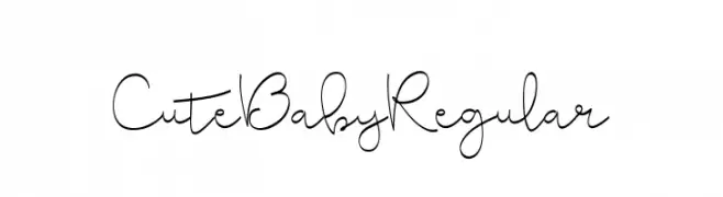
A playful, handwritten font with a whimsical and friendly style.
![CuteBabyRegular Frei Schriftart Herunterladen]() Herunterladen 39 Downloads@WebFont
Herunterladen 39 Downloads@WebFont -
( Fonts by Woodcutter Manero - www.woodcutter.es - Personal-use only. For commercial use please contact owner. )
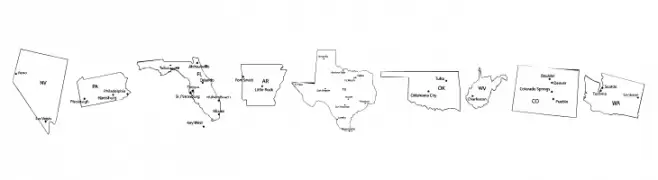
Font with U.S. state outlines as characters, labeled with cities or abbreviations.
![Maps of USA Frei Schriftart Herunterladen]() Herunterladen 39 Downloads@WebFont
Herunterladen 39 Downloads@WebFont -
( Fonts by Mans Greback - www.mansgreback.com - Personal-use only. For commercial use please contact owner. )
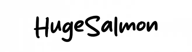
A playful, handwritten font with a casual and friendly appearance.
![Huge Salmon Frei Schriftart Herunterladen]() Herunterladen 39 Downloads@WebFont
Herunterladen 39 Downloads@WebFont -
( Fonts by Almarkhatype - Abdul Malik Wisnu - Personal-use only. For commercial use please contact owner. )
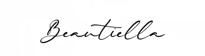
A graceful and fluid handwritten script font with elegant, flowing lines.
![Beautiella Frei Schriftart Herunterladen]() Herunterladen 39 Downloads@WebFont
Herunterladen 39 Downloads@WebFont -
( Fonts by Woodcutter Manero - www.woodcutter.es - Personal-use only. For commercial use please contact owner. )
Distressed slab serif with bold, vintage, and rugged style.
![Cristo Rey Frei Schriftart Herunterladen]() Herunterladen 39 Downloads@WebFont
Herunterladen 39 Downloads@WebFont -
( Fonts by Creatype Studio - Rian Rahardi - Personal-use only. For commercial use please contact owner. )
A lively, handwritten font with fluid strokes and a dynamic slant.
![Monttrela Frei Schriftart Herunterladen]() Herunterladen 39 Downloads@WebFont
Herunterladen 39 Downloads@WebFont -
( Fonts by Javatype Studio - Tio Yulianto - Personal-use only. For commercial use please contact owner. )
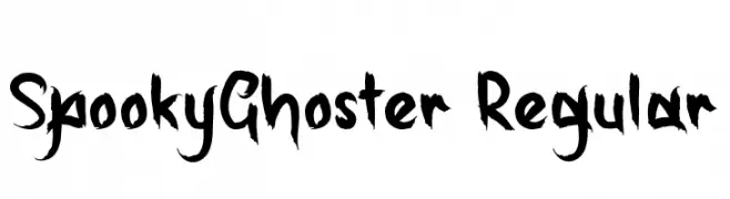
A bold, brush-style font with a spooky, hand-drawn appearance.
![SpookyGhoster-Regular Frei Schriftart Herunterladen]() Herunterladen 39 Downloads@WebFont
Herunterladen 39 Downloads@WebFont -
( Fonts by Zetafonts - Personal-use only. For commercial use please contact owner. )
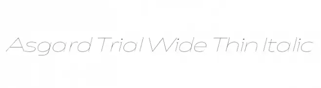
A modern, thin, italic font with wide spacing and elegant design.
![Asgard Trial Wide Thin Italic Frei Schriftart Herunterladen]() Herunterladen 39 Downloads@WebFont
Herunterladen 39 Downloads@WebFont -
( Fonts by Iconian Fonts - Daniel Zadorozny - Personal-use only. For commercial use please contact owner. )
A bold, semi-italic font with a futuristic and dynamic style.
![Starduster Semi-Italic Frei Schriftart Herunterladen]() Herunterladen 39 Downloads@WebFont
Herunterladen 39 Downloads@WebFont -
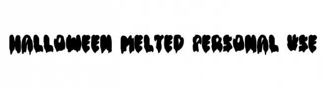
( Fonts by DM Letter Studio )
Bold, melted display font with a spooky, drippy style.
![Halloween Melted Personal Use Frei Schriftart Herunterladen]() Herunterladen 39 Downloads@WebFont
Herunterladen 39 Downloads@WebFont -
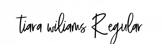
( Fonts by Lemon Studio Type - Herpin Maulana - Personal-use only. For commercial use please contact owner. )
A playful and dynamic handwritten font with fluid strokes.
![tiara wiliams Regular Frei Schriftart Herunterladen]() Herunterladen 39 Downloads@WebFont
Herunterladen 39 Downloads@WebFont -
( Fonts by Anomali Creative - Krisna Teja - Personal-use only. For commercial use please contact owner. )
A bold, retro-inspired cursive font with ornate, flowing characters.
![Retrovert Frei Schriftart Herunterladen]() Herunterladen 39 Downloads@WebFont
Herunterladen 39 Downloads@WebFont -
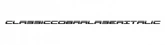
( Fonts by Iconian Fonts - Daniel Zadorozny - Personal-use only. For commercial use please contact owner. )
A bold, italicized font with a futuristic and angular design.
![Classic Cobra Laser Italic Frei Schriftart Herunterladen]() Herunterladen 39 Downloads@WebFont
Herunterladen 39 Downloads@WebFont -
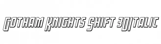
( Fonts by Iconian Fonts - Daniel Zadorozny - Personal-use only. For commercial use please contact owner. )
A bold, 3D italic font with a futuristic and dynamic style.
![Gotham Knights Shift 3DItalic Frei Schriftart Herunterladen]() Herunterladen 39 Downloads@WebFont
Herunterladen 39 Downloads@WebFont -
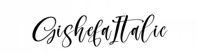
( Fonts by Perspectype Studio - Personal-use only. For commercial use please contact owner. )
A dynamic, flowing script font with elegant cursive letterforms.
![Gishefa Italic Frei Schriftart Herunterladen]() Herunterladen 39 Downloads@WebFont
Herunterladen 39 Downloads@WebFont -
( Fonts by Royaltype - Darwinoo - Personal-use only. For commercial use please contact owner. )
A decorative script font with elegant swirls and high contrast strokes.
![SweeterthanCandy Frei Schriftart Herunterladen]() Herunterladen 39 Downloads@WebFont
Herunterladen 39 Downloads@WebFont -
( Fonts by Almarkhatype - Abdul Malik Wisnu - Personal-use only. For commercial use please contact owner. )
A modern, cursive font with interconnected, flowing letters.
![Bellachia Frei Schriftart Herunterladen]() Herunterladen 39 Downloads@WebFont
Herunterladen 39 Downloads@WebFont -
( Fonts by Khurasan - Syaf Rizal - Personal-use only. For commercial use please contact owner. )
A playful, bold font with rounded, hand-drawn characters.
![Xomai Frei Schriftart Herunterladen]() Herunterladen 39 Downloads@WebFont
Herunterladen 39 Downloads@WebFont -
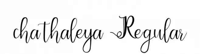
( Fonts by Lemon Studio Type - Herpin Maulana - Personal-use only. For commercial use please contact owner. )
An elegant script font with decorative swirls and a handwritten aesthetic.
![chathaleya Regular Frei Schriftart Herunterladen]() Herunterladen 39 Downloads@WebFont
Herunterladen 39 Downloads@WebFont -
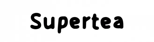
( Fonts by Mans Greback - www.mansgreback.com - Personal-use only. For commercial use please contact owner. )
A playful, bold font with rounded, thick strokes and a whimsical touch.
![Supertea Frei Schriftart Herunterladen]() Herunterladen 39 Downloads@WebFont
Herunterladen 39 Downloads@WebFont -
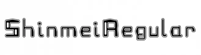
( Fonts by zone108.main.jp - Personal-use only. For commercial use please contact owner. )
A futuristic, outlined font with a bold, geometric style.
![Shinmei Regular Frei Schriftart Herunterladen]() Herunterladen 39 Downloads@WebFont
Herunterladen 39 Downloads@WebFont


Welche Schriften sind gerade am populärsten?
Poppins, Roboto, Montserrat, Open Sans und Lato sind wegen ihrer klaren Formen und breiten Einsetzbarkeit sehr gefragt – von Markenauftritt über Landingpages bis hin zu Postern.
Welche Fonts eignen sich für Logos?
Geometrische Sans‑Serifs (z. B. Poppins, Familien im Gotham‑Stil) sind ein häufiger Griff für sauberes, skalierbares Branding. Für eine persönlichere Note bleiben Scripts und Handschrift‑Stile beliebt. Kombinieren Sie einen prägnanten Headline‑Font mit einer neutralen Brotschrift für Wiedererkennung und Harmonie.
Wie oft wird die Top‑Liste aktualisiert?
Regelmäßig – basierend auf realen Downloads und Interaktionen. Schauen Sie öfter vorbei, um aufstrebende Favoriten früh zu entdecken.
💡 Tipp: Seite bookmarken – Trends wechseln schnell, und heutige Top‑Schriften inspirieren morgen vielleicht das Rebranding.