Willkommen bei den Top‑Schriften – hier treffen Beliebtheit und Qualität aufeinander. Das sind die in diesem Jahr am häufigsten heruntergeladenen und genutzten Fonts. Wenn Sie sichere Optionen für Logo, Web oder Social suchen, starten Sie hier.
Jeder Top‑Font überzeugt durch Balance, Lesbarkeit und Vielseitigkeit. Sie finden moderne Sans‑Serifs, elegante Scripts, Vintage‑Serifs und minimalistische Displays.
-
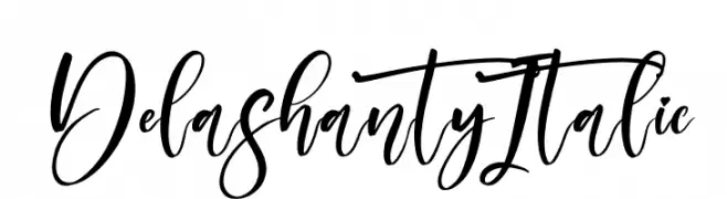
( Fonts by Perspectype Studio - Personal-use only. For commercial use please contact owner. )
A flowing, handwritten script font with dynamic contrast and elegant curves.
 Herunterladen 37 Downloads@WebFont
 -
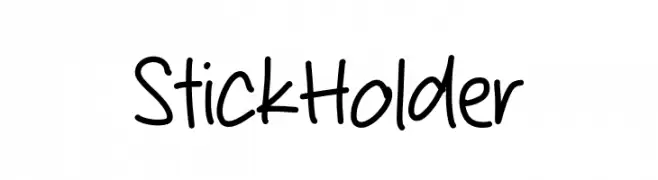
( Fonts by Mans Greback - www.mansgreback.com - Personal-use only. For commercial use please contact owner. )
A playful, casual handwritten font with smooth, rounded edges.
![Stick Holder Frei Schriftart Herunterladen]() Herunterladen 37 Downloads@WebFont
Herunterladen 37 Downloads@WebFont -
( Fonts by Iconian Fonts - Daniel Zadorozny - Personal-use only. For commercial use please contact owner. )
A bold, geometric font with angular, block-like letters.
![Her Champions Bold Semi-Leftal Frei Schriftart Herunterladen]() Herunterladen 37 Downloads@WebFont
Herunterladen 37 Downloads@WebFont -
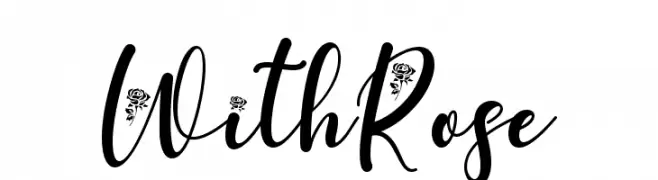
( Fonts by Yoga Letter - Isroni Yoga Prasetya - Personal-use only. For commercial use please contact owner. )
A decorative script font with floral embellishments and elegant, flowing letters.
![With Rose Frei Schriftart Herunterladen]() Herunterladen 37 Downloads@WebFont
Herunterladen 37 Downloads@WebFont -
( Fonts by Bexxtype - Personal-use only. For commercial use please contact owner. )
An elegant script font with flowing, cursive letters and a classic style.
![delthami Frei Schriftart Herunterladen]() Herunterladen 37 Downloads@WebFont
Herunterladen 37 Downloads@WebFont -
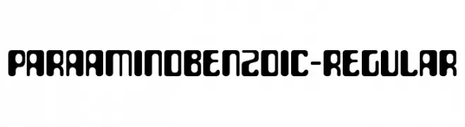
( Fonts by Typodermic Fonts - Raymond Larabie - Personal-use only. For commercial use please contact owner. )
A bold, rounded font with a modern and playful style.
![ParaAminobenzoic-Regular Frei Schriftart Herunterladen]() Herunterladen 37 Downloads@WebFont
Herunterladen 37 Downloads@WebFont -
( Fonts by Dirt2.com - SickCapital - Andrew Hart - Personal-use only. For commercial use please contact owner. )
A bold, geometric font with sharp angles and a modern aesthetic.
![Fireflies Frei Schriftart Herunterladen]() Herunterladen 37 Downloads@WebFont
Herunterladen 37 Downloads@WebFont -
( Fonts by Letterena Studios - letterena.com - Personal-use only. For commercial use please contact owner. )
A lively and flowing script font with elegant curves and smooth transitions.
![Salista Frei Schriftart Herunterladen]() Herunterladen 37 Downloads@WebFont
Herunterladen 37 Downloads@WebFont -
( Fonts by Prioritype Co - Prio Nurokhim Aji - Personal-use only. For commercial use please contact owner. )
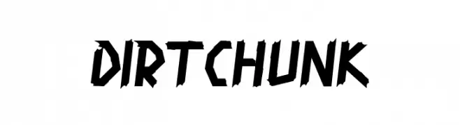
A bold, angular font with a rugged, distressed texture.
![Dirtchunk Frei Schriftart Herunterladen]() Herunterladen 37 Downloads@WebFont
Herunterladen 37 Downloads@WebFont -
( Fonts by weknow - Wino S Kadir - Personal-use only. For commercial use please contact owner. )
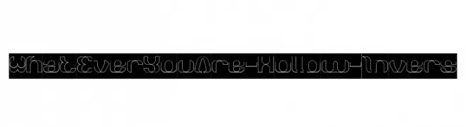
A modern, hollow font with smooth curves and a decorative style.
![What Ever You Are-Hollow-Invers Frei Schriftart Herunterladen]() Herunterladen 37 Downloads@WebFont
Herunterladen 37 Downloads@WebFont -
( Fonts by Vladimir Nikolic - www.creativefabrica.com/designer/vladimirnikolic/ - Personal-use only. For commercial use please contact owner. )
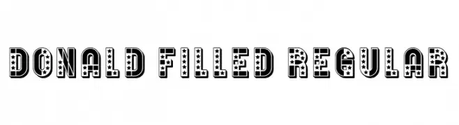
A bold, decorative font with star-filled characters, perfect for eye-catching designs.
![Donald Filled Regular Frei Schriftart Herunterladen]() Herunterladen 37 Downloads@WebFont
Herunterladen 37 Downloads@WebFont -
( Fonts by Digital Typeface Studio - Eva Barabasne Olasz - Personal-use only. For commercial use please contact owner. )
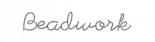
A dotted, script-style font with a playful and elegant appearance.
![Beadwork Frei Schriftart Herunterladen]() Herunterladen 37 Downloads@WebFont
Herunterladen 37 Downloads@WebFont -
( Fonts by Greentype - Akhy Yudi - Personal-use only. For commercial use please contact owner. )
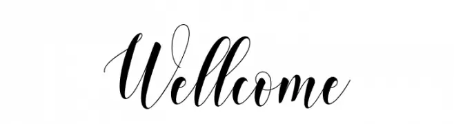
An elegant script font with flowing, cursive letters and high contrast strokes.
![Wellcome Frei Schriftart Herunterladen]() Herunterladen 37 Downloads@WebFont
Herunterladen 37 Downloads@WebFont -
( Fonts by Typodermic Fonts - Raymond Larabie - Personal-use only. For commercial use please contact owner. )
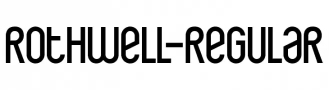
A modern, geometric font with clean lines and a condensed style.
![Rothwell-Regular Frei Schriftart Herunterladen]() Herunterladen 37 Downloads@WebFont
Herunterladen 37 Downloads@WebFont -
( Fonts by Wondoo - Personal-use only. For commercial use please contact owner. )
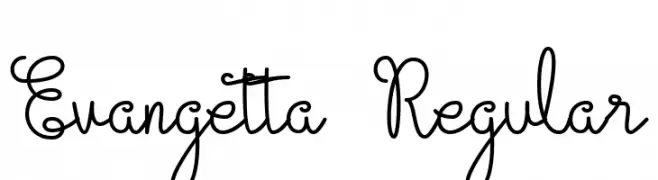
A playful, handwritten font with looping, interconnected strokes.
![Evangetta Regular Frei Schriftart Herunterladen]() Herunterladen 37 Downloads@WebFont
Herunterladen 37 Downloads@WebFont -
( Fonts by MJB Letters - Muhammad Mujibulloh - Personal-use only. For commercial use please contact owner. )
An elegant cursive script font with smooth, flowing strokes.
![Noorlita Frei Schriftart Herunterladen]() Herunterladen 37 Downloads@WebFont
Herunterladen 37 Downloads@WebFont -
( Personal-use only. For commercial use please contact owner. )
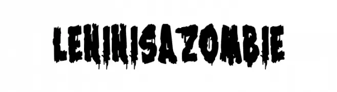
Bold, horror-themed display font with dripping, distressed letterforms.
![Lenin is a Zombie Frei Schriftart Herunterladen]() Herunterladen 37 Downloads@WebFont
Herunterladen 37 Downloads@WebFont -
( Personal-use only. For commercial use please contact owner. )
Bold, bubbly handwritten font with playful, rounded strokes.
![BubbleRush Frei Schriftart Herunterladen]() Herunterladen 37 Downloads@WebFont
Herunterladen 37 Downloads@WebFont -
( Fonts by Perspectype Studio - Personal-use only. For commercial use please contact owner. )
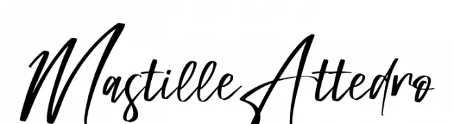
A dynamic, handwritten font with fluid strokes and artistic flair.
![Mastille Attedro Frei Schriftart Herunterladen]() Herunterladen 37 Downloads@WebFont
Herunterladen 37 Downloads@WebFont -
( Fonts by Rahagita Studio - - Personal-use only. For commercial use please contact owner. )
A playful, handwritten font with flowing, connected letterforms.
![Sallome Frei Schriftart Herunterladen]() Herunterladen 37 Downloads@WebFont
Herunterladen 37 Downloads@WebFont -
( Fonts by Rex Revol ( - Rex Revol - Personal-use only. For commercial use please contact owner. )
A bold, geometric font with a futuristic and angular design.
![Rex Revol Frei Schriftart Herunterladen]() Herunterladen 37 Downloads@WebFont
Herunterladen 37 Downloads@WebFont -
( Fonts by UI Creative - Personal-use only. For commercial use please contact owner. )
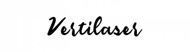
A bold, expressive script font with a dynamic, handwritten style.
![Vertilaser Frei Schriftart Herunterladen]() Herunterladen 37 Downloads@WebFont
Herunterladen 37 Downloads@WebFont -
( Fonts by Wondoo - Personal-use only. For commercial use please contact owner. )
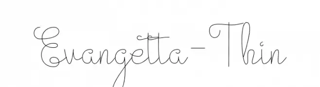
A delicate, thin script font with elegant, flowing lines and whimsical loops.
![Evangetta-Thin Frei Schriftart Herunterladen]() Herunterladen 37 Downloads@WebFont
Herunterladen 37 Downloads@WebFont -
( Fonts by Typodermic Fonts - Raymond Larabie - Personal-use only. For commercial use please contact owner. )
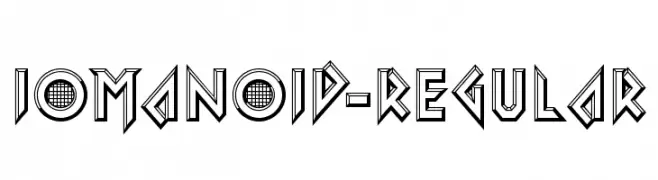
A bold, futuristic font with a three-dimensional, geometric design.
![Iomanoid-Regular Frei Schriftart Herunterladen]() Herunterladen 37 Downloads@WebFont
Herunterladen 37 Downloads@WebFont -
( Fonts by Typegoals Labs - Personal-use only. For commercial use please contact owner. )
A flowing, cursive script font with a casual, handwritten style.
![Rosyitha Frei Schriftart Herunterladen]() Herunterladen 37 Downloads@WebFont
Herunterladen 37 Downloads@WebFont -
( Fonts by Iconian Fonts - Daniel Zadorozny - Personal-use only. For commercial use please contact owner. )
A futuristic, geometric font with sharp angles and clean lines.
![Alexis Expanded Frei Schriftart Herunterladen]() Herunterladen 37 Downloads@WebFont
Herunterladen 37 Downloads@WebFont -
( Fonts by Morning Time Studio - Personal-use only. For commercial use please contact owner. )
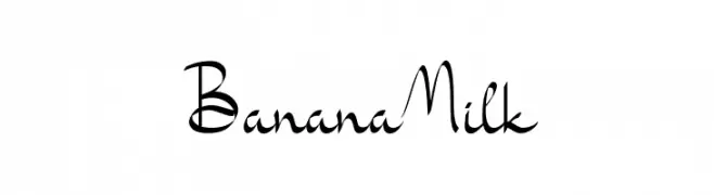
A playful, handwritten script font with a whimsical style.
![Banana Milk Frei Schriftart Herunterladen]() Herunterladen 37 Downloads@WebFont
Herunterladen 37 Downloads@WebFont -
( Fonts by Edric Studio - Personal-use only. For commercial use please contact owner. )
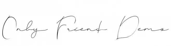
An elegant, flowing script font with delicate, thin strokes and cursive letterforms.
![Only Friend Demo Frei Schriftart Herunterladen]() Herunterladen 37 Downloads@WebFont
Herunterladen 37 Downloads@WebFont -
( Fonts by Kong Font - Personal-use only. For commercial use please contact owner. )
A bold, angular font with a dynamic oblique slant and geometric influence.
![Miles Hunt Clean Oblique Frei Schriftart Herunterladen]() Herunterladen 37 Downloads@WebFont
Herunterladen 37 Downloads@WebFont -
( Fonts by Kong Font - Personal-use only. For commercial use please contact owner. )
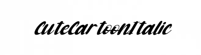
A bold, italicized script font with a playful, cartoonish style.
![Cute Cartoon Italic Frei Schriftart Herunterladen]() Herunterladen 37 Downloads@WebFont
Herunterladen 37 Downloads@WebFont -
( Fonts by Mans Greback - www.mansgreback.com - Personal-use only. For commercial use please contact owner. )
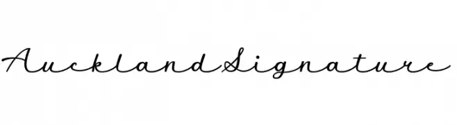
An elegant script font with smooth, flowing lines and a handwritten style.
![Auckland Signature Frei Schriftart Herunterladen]() Herunterladen 37 Downloads@WebFont
Herunterladen 37 Downloads@WebFont -
( Fonts by K_IN Studio - Personal-use only. For commercial use please contact owner. )
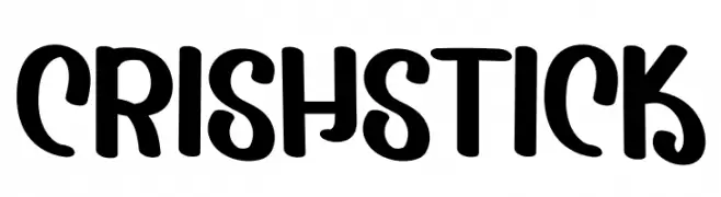
A bold, playful font with a hand-drawn, whimsical style.
![Crish Stick Frei Schriftart Herunterladen]() Herunterladen 37 Downloads@WebFont
Herunterladen 37 Downloads@WebFont -
( Fonts by Typegoals Labs - Personal-use only. For commercial use please contact owner. )
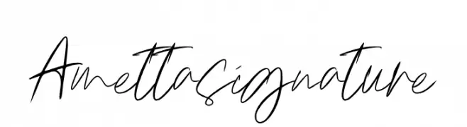
A modern, elegant handwritten font with fluid, cursive strokes.
![Amettasignature Frei Schriftart Herunterladen]() Herunterladen 37 Downloads@WebFont
Herunterladen 37 Downloads@WebFont -
( Fonts by Patria Ari Typestudio - Patria Ari - Personal-use only. For commercial use please contact owner. )
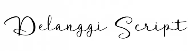
An elegant script font with flowing, handwritten characters.
![Delanggi Script Frei Schriftart Herunterladen]() Herunterladen 37 Downloads@WebFont
Herunterladen 37 Downloads@WebFont -
( Fonts by Vunira Design - Personal-use only. For commercial use please contact owner. )
An elegant, flowing script font with intricate, decorative letterforms.
![Daytone FREE Frei Schriftart Herunterladen]() Herunterladen 37 Downloads@WebFont
Herunterladen 37 Downloads@WebFont


Welche Schriften sind gerade am populärsten?
Poppins, Roboto, Montserrat, Open Sans und Lato sind wegen ihrer klaren Formen und breiten Einsetzbarkeit sehr gefragt – von Markenauftritt über Landingpages bis hin zu Postern.
Welche Fonts eignen sich für Logos?
Geometrische Sans‑Serifs (z. B. Poppins, Familien im Gotham‑Stil) sind ein häufiger Griff für sauberes, skalierbares Branding. Für eine persönlichere Note bleiben Scripts und Handschrift‑Stile beliebt. Kombinieren Sie einen prägnanten Headline‑Font mit einer neutralen Brotschrift für Wiedererkennung und Harmonie.
Wie oft wird die Top‑Liste aktualisiert?
Regelmäßig – basierend auf realen Downloads und Interaktionen. Schauen Sie öfter vorbei, um aufstrebende Favoriten früh zu entdecken.
💡 Tipp: Seite bookmarken – Trends wechseln schnell, und heutige Top‑Schriften inspirieren morgen vielleicht das Rebranding.