Willkommen bei den Top‑Schriften – hier treffen Beliebtheit und Qualität aufeinander. Das sind die in diesem Jahr am häufigsten heruntergeladenen und genutzten Fonts. Wenn Sie sichere Optionen für Logo, Web oder Social suchen, starten Sie hier.
Jeder Top‑Font überzeugt durch Balance, Lesbarkeit und Vielseitigkeit. Sie finden moderne Sans‑Serifs, elegante Scripts, Vintage‑Serifs und minimalistische Displays.
-
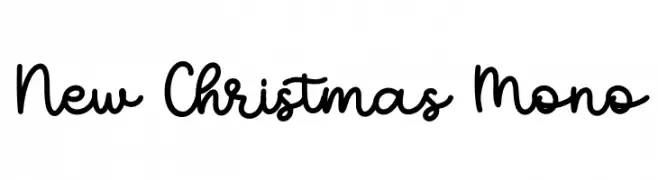
( Personal-use only. For commercial use please contact owner. )
A casual, handwritten monoline script with rounded forms.
 Herunterladen 38 Downloads@WebFont
 -
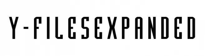
( Fonts by Iconian Fonts - Daniel Zadorozny - Personal-use only. For commercial use please contact owner. )
A bold, expanded font with tall, narrow characters and a modern aesthetic.
![Y-Files Expanded Frei Schriftart Herunterladen]() Herunterladen 38 Downloads@WebFont
Herunterladen 38 Downloads@WebFont -
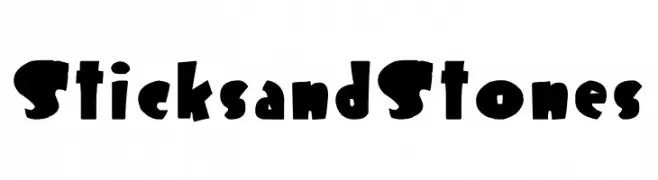
( Fonts by Joseph Dawson - Personal-use only. For commercial use please contact owner. )
A bold, playful font with irregular, chunky letterforms and a hand-crafted appearance.
![Sticks and Stones Frei Schriftart Herunterladen]() Herunterladen 38 Downloads@WebFont
Herunterladen 38 Downloads@WebFont -
( Fonts by StringLabs - stringlabscreative.com - Personal-use only. For commercial use please contact owner. )
A bold, cursive font with a dynamic and handwritten style.
![Haredang Frei Schriftart Herunterladen]() Herunterladen 38 Downloads@WebFont
Herunterladen 38 Downloads@WebFont -
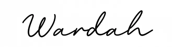
( Fonts by Omotu Studio )
Handwritten script font with smooth, connected strokes.
![Wardah Frei Schriftart Herunterladen]() Herunterladen 38 Downloads@WebFont
Herunterladen 38 Downloads@WebFont -
( Fonts by PutraCetol Studio - www.putracetol.com - Personal-use only. For commercial use please contact owner. )
A cursive, flowing font with elegant, sweeping lines and artistic flair.
![Anitya Frei Schriftart Herunterladen]() Herunterladen 38 Downloads@WebFont
Herunterladen 38 Downloads@WebFont -
( Fonts by Sifak Muf - Personal-use only. For commercial use please contact owner. )
A playful, bold handwritten font with a casual and friendly style.
![Blankide Frei Schriftart Herunterladen]() Herunterladen 38 Downloads@WebFont
Herunterladen 38 Downloads@WebFont -
( Fonts by bringtypestudio.co - Bringtype Studio - Personal-use only. For commercial use please contact owner. )
A dynamic and flowing script font with elegant curves and smooth strokes.
![sancaka Frei Schriftart Herunterladen]() Herunterladen 38 Downloads@WebFont
Herunterladen 38 Downloads@WebFont -
( Fonts by Harmonais Visual - Personal-use only. For commercial use please contact owner. )
A high-contrast serif font with elegant, sharp serifs and a modern flair.
![HV Weist Havanah Trial Regular Frei Schriftart Herunterladen]() Herunterladen 38 Downloads@WebFont
Herunterladen 38 Downloads@WebFont -
( Personal-use only. For commercial use please contact owner. )
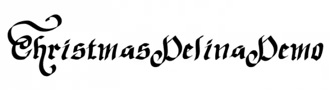
Ornate blackletter style with dramatic swashes and high contrast.
![Christmas Delina Demo Frei Schriftart Herunterladen]() Herunterladen 38 Downloads@WebFont
Herunterladen 38 Downloads@WebFont -
( Fonts by Gassstype - Anang Fibriyanto - www.gassstype.com - Personal-use only. For commercial use please contact owner. )
A bold, energetic brush-style font with a hand-drawn feel.
![Fast Lane Frei Schriftart Herunterladen]() Herunterladen 38 Downloads@WebFont
Herunterladen 38 Downloads@WebFont -
( Fonts by DumadiStyle - Toni Dzulham - Personal-use only. For commercial use please contact owner. )
A bold, hand-drawn style font with energetic and playful characteristics.
![Remover Frei Schriftart Herunterladen]() Herunterladen 38 Downloads@WebFont
Herunterladen 38 Downloads@WebFont -
( Fonts by Vz Type - Personal-use only. For commercial use please contact owner. )
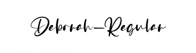
A flowing, cursive font with elegant, sweeping strokes and a handwritten appearance.
![Deborah-Regular Frei Schriftart Herunterladen]() Herunterladen 38 Downloads@WebFont
Herunterladen 38 Downloads@WebFont -
( Fonts by Mans Greback - www.mansgreback.com - Personal-use only. For commercial use please contact owner. )
A playful, handwritten font with bold, rounded strokes and a casual style.
![Sunbright Frei Schriftart Herunterladen]() Herunterladen 38 Downloads@WebFont
Herunterladen 38 Downloads@WebFont -
( Personal-use only. For commercial use please contact owner. )
Festive, star-accented script font with holiday-themed embellishments.
![ChristmasTimeStarPersonalUse-Re Frei Schriftart Herunterladen]() Herunterladen 38 Downloads@WebFont
Herunterladen 38 Downloads@WebFont -
( Fonts by Edric Studio - Personal-use only. For commercial use please contact owner. )
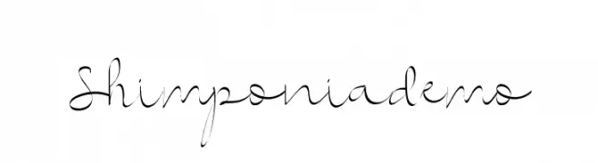
An elegant and decorative script font with flowing, cursive letterforms.
![Shimponiademo Frei Schriftart Herunterladen]() Herunterladen 38 Downloads@WebFont
Herunterladen 38 Downloads@WebFont -
( Fonts by Letterfand.Studio - Yusuf Afandi - Personal-use only. For commercial use please contact owner. )
An elegant, flowing script font with interconnected letters and a sophisticated style.
![Baybe Evaline Frei Schriftart Herunterladen]() Herunterladen 38 Downloads@WebFont
Herunterladen 38 Downloads@WebFont -
( Fonts by Pen Culture - Revo Farisky - Personal-use only. For commercial use please contact owner. )
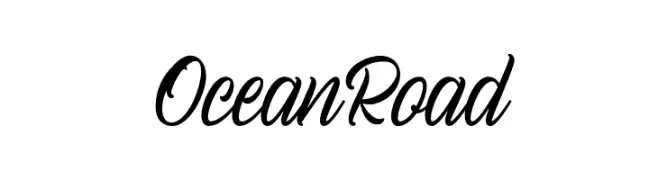
A dynamic cursive script font with elegant, flowing strokes.
![Ocean Road Frei Schriftart Herunterladen]() Herunterladen 38 Downloads@WebFont
Herunterladen 38 Downloads@WebFont -
( Fonts by The Ocean Studio - Laire Banyu Sandi Pawenang - Personal-use only. For commercial use please contact owner. )
A whimsical, artistic handwritten font with flowing, interconnected letterforms.
![Holy Type Frei Schriftart Herunterladen]() Herunterladen 38 Downloads@WebFont
Herunterladen 38 Downloads@WebFont -
( Fonts by Vunira Design - Personal-use only. For commercial use please contact owner. )
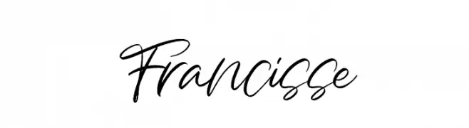
A dynamic, fluid handwritten font with elegant cursive strokes.
![Francisse Frei Schriftart Herunterladen]() Herunterladen 38 Downloads@WebFont
Herunterladen 38 Downloads@WebFont -
( Fonts by Noah Type - noahtype.com - Personal-use only. For commercial use please contact owner. )
A bold, impactful font with thick strokes and slightly rounded edges.
![Sweetzy Demo Bold Frei Schriftart Herunterladen]() Herunterladen 38 Downloads@WebFont
Herunterladen 38 Downloads@WebFont -
( Fonts by Vunira Design - Personal-use only. For commercial use please contact owner. )
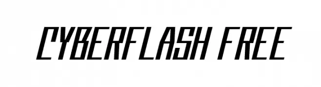
A bold, futuristic font with angular lines and a dynamic slant.
![Cyberflash FREE Frei Schriftart Herunterladen]() Herunterladen 38 Downloads@WebFont
Herunterladen 38 Downloads@WebFont -
( Fonts by Khurasan - Syaf Rizal - Personal-use only. For commercial use please contact owner. )
A playful, bold font with a hand-drawn, whimsical style.
![Cheese Toast Frei Schriftart Herunterladen]() Herunterladen 38 Downloads@WebFont
Herunterladen 38 Downloads@WebFont -
( Fonts by Mans Greback - www.mansgreback.com - Personal-use only. For commercial use please contact owner. )
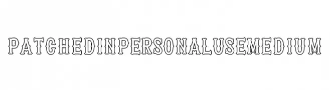
A bold, decorative font with a unique outline style, ideal for vintage-themed projects.
![Patched In PERSONAL USE Medium Frei Schriftart Herunterladen]() Herunterladen 38 Downloads@WebFont
Herunterladen 38 Downloads@WebFont -
( Personal-use only. For commercial use please contact owner. )
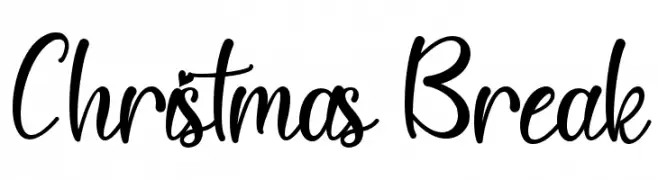
Casual, handwritten script with tall, flowing letters and playful energy.
![Christmas Break Frei Schriftart Herunterladen]() Herunterladen 38 Downloads@WebFont
Herunterladen 38 Downloads@WebFont -
( Fonts by Letterafa Studio )
Expressive, angular script with a bold, hand-drawn look.
![Gemfity Frei Schriftart Herunterladen]() Herunterladen 38 Downloads@WebFont
Herunterladen 38 Downloads@WebFont -
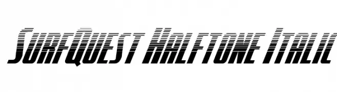
( Fonts by Iconian Fonts - Daniel Zadorozny - Personal-use only. For commercial use please contact owner. )
A bold, italicized font with a halftone effect, perfect for modern and dynamic designs.
![SurfQuest Halftone Italic Frei Schriftart Herunterladen]() Herunterladen 38 Downloads@WebFont
Herunterladen 38 Downloads@WebFont -
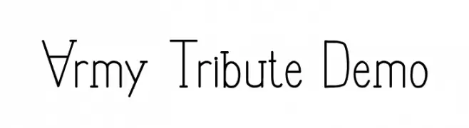
( Fonts by Edric Studio - Personal-use only. For commercial use please contact owner. )
A geometric, military-inspired font with clean lines and structured forms.
![Army Tribute Demo Frei Schriftart Herunterladen]() Herunterladen 38 Downloads@WebFont
Herunterladen 38 Downloads@WebFont -
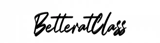
( Fonts by Gassstype - Anang Fibriyanto - www.gassstype.com - Personal-use only. For commercial use please contact owner. )
A bold, dynamic handwritten font with expressive strokes and fluid motion.
![Better at Class Frei Schriftart Herunterladen]() Herunterladen 38 Downloads@WebFont
Herunterladen 38 Downloads@WebFont -
![KWALITEIT Frei Schriftart Herunterladen]() Herunterladen 38 Downloads
Herunterladen 38 Downloads -
( Fonts by weknow - Wino S Kadir - Personal-use only. For commercial use please contact owner. )
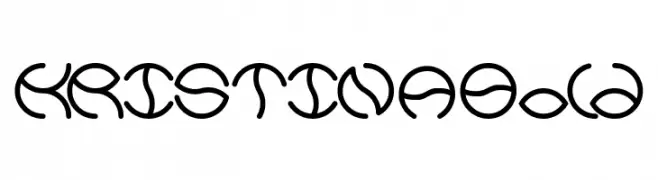
A bold, artistic font with circular and looping strokes, offering a modern twist.
![KRISTINA Bold Frei Schriftart Herunterladen]() Herunterladen 38 Downloads@WebFont
Herunterladen 38 Downloads@WebFont -
( Fonts by Edric Studio - Personal-use only. For commercial use please contact owner. )
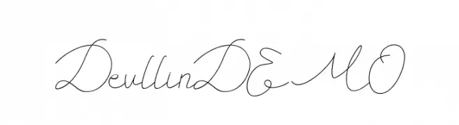
An elegant, flowing script font with a modern calligraphic style.
![Devllin DEMO Frei Schriftart Herunterladen]() Herunterladen 38 Downloads@WebFont
Herunterladen 38 Downloads@WebFont -
( Fonts by Fitrah Type )
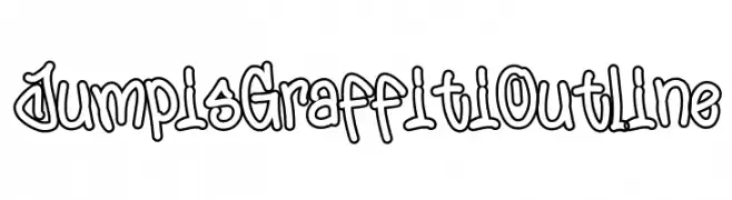
Graffiti-style outlined font with energetic, hand-drawn shapes.
![Jumpis Graffiti Outline Frei Schriftart Herunterladen]() Herunterladen 38 Downloads@WebFont
Herunterladen 38 Downloads@WebFont -
( Fonts by Iconian Fonts - Daniel Zadorozny - Personal-use only. For commercial use please contact owner. )
A bold, angular font with a futuristic and geometric design.
![Crossbow Head Expanded Leftal Frei Schriftart Herunterladen]() Herunterladen 38 Downloads@WebFont
Herunterladen 38 Downloads@WebFont -
( Fonts by 177Studio )
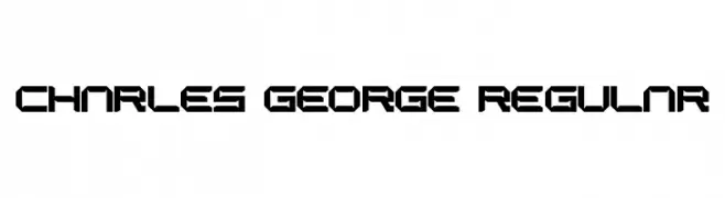
A bold, geometric font with angular, futuristic characters.
![CHARLES GEORGE Regular Frei Schriftart Herunterladen]() Herunterladen 38 Downloads@WebFont
Herunterladen 38 Downloads@WebFont


Welche Schriften sind gerade am populärsten?
Poppins, Roboto, Montserrat, Open Sans und Lato sind wegen ihrer klaren Formen und breiten Einsetzbarkeit sehr gefragt – von Markenauftritt über Landingpages bis hin zu Postern.
Welche Fonts eignen sich für Logos?
Geometrische Sans‑Serifs (z. B. Poppins, Familien im Gotham‑Stil) sind ein häufiger Griff für sauberes, skalierbares Branding. Für eine persönlichere Note bleiben Scripts und Handschrift‑Stile beliebt. Kombinieren Sie einen prägnanten Headline‑Font mit einer neutralen Brotschrift für Wiedererkennung und Harmonie.
Wie oft wird die Top‑Liste aktualisiert?
Regelmäßig – basierend auf realen Downloads und Interaktionen. Schauen Sie öfter vorbei, um aufstrebende Favoriten früh zu entdecken.
💡 Tipp: Seite bookmarken – Trends wechseln schnell, und heutige Top‑Schriften inspirieren morgen vielleicht das Rebranding.