Willkommen bei den Top‑Schriften – hier treffen Beliebtheit und Qualität aufeinander. Das sind die in diesem Jahr am häufigsten heruntergeladenen und genutzten Fonts. Wenn Sie sichere Optionen für Logo, Web oder Social suchen, starten Sie hier.
Jeder Top‑Font überzeugt durch Balance, Lesbarkeit und Vielseitigkeit. Sie finden moderne Sans‑Serifs, elegante Scripts, Vintage‑Serifs und minimalistische Displays.
-
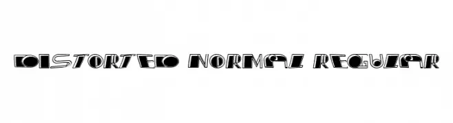
( Fonts by Vladimir Nikolic - www.creativefabrica.com/designer/vladimirnikolic/ - Personal-use only. For commercial use please contact owner. )
A modern, distorted font with dynamic, eye-catching elements.
 Herunterladen 38 Downloads@WebFont
 -
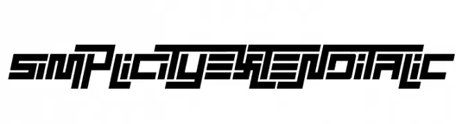
( Fonts by EyeCone - Personal-use only. For commercial use please contact owner. )
A bold, geometric, and italic font with a futuristic and angular design.
![Simplicity Extend Italic Frei Schriftart Herunterladen]() Herunterladen 38 Downloads@WebFont
Herunterladen 38 Downloads@WebFont -
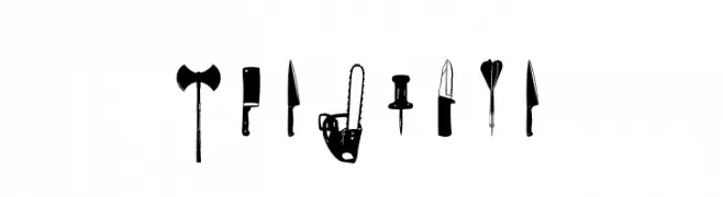
( Fonts by Pallor Publishing - Frank Lawrence - Personal-use only. For commercial use please contact owner. )
A display font made from weapon and tool silhouettes.
![Cut Point Frei Schriftart Herunterladen]() Herunterladen 38 Downloads@WebFont
Herunterladen 38 Downloads@WebFont -
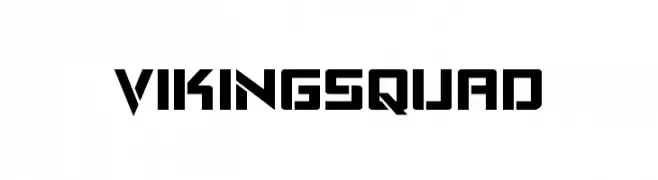
( Fonts by Iconian Fonts - Daniel Zadorozny - Personal-use only. For commercial use please contact owner. )
A bold, geometric font with sharp angles and a futuristic style.
![Viking Squad Frei Schriftart Herunterladen]() Herunterladen 38 Downloads@WebFont
Herunterladen 38 Downloads@WebFont -
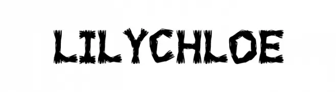
( Fonts by Gilang Ternadho )
Bold, jagged display font with a wild, energetic style.
![LILY CHLOE Frei Schriftart Herunterladen]() Herunterladen 38 Downloads@WebFont
Herunterladen 38 Downloads@WebFont -
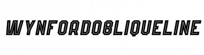
( Fonts by Kong Font - Personal-use only. For commercial use please contact owner. )
A bold, geometric oblique font with outlined characters and a modern, dynamic style.
![Wynford Oblique Line Frei Schriftart Herunterladen]() Herunterladen 38 Downloads@WebFont
Herunterladen 38 Downloads@WebFont -
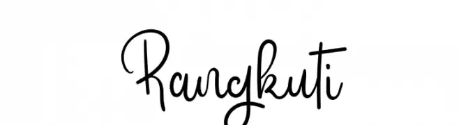
( Fonts by TypeScrib Studio - Personal-use only. For commercial use please contact owner. )
A playful and whimsical script font with fluid, interconnected letterforms.
![Rangkuti Frei Schriftart Herunterladen]() Herunterladen 38 Downloads@WebFont
Herunterladen 38 Downloads@WebFont -
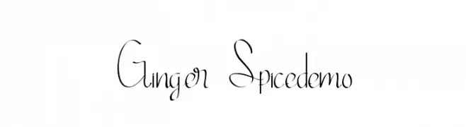
( Fonts by Edric Studio - Personal-use only. For commercial use please contact owner. )
A delicate, modern script font with an elegant, handwritten style.
![Ginger Spicedemo Frei Schriftart Herunterladen]() Herunterladen 38 Downloads@WebFont
Herunterladen 38 Downloads@WebFont -
( Fonts by Shanaya Studio - Personal-use only. For commercial use please contact owner. )
A bold, flowing script font with high contrast and elegant curves.
![Redlineryh Frei Schriftart Herunterladen]() Herunterladen 38 Downloads@WebFont
Herunterladen 38 Downloads@WebFont -
( Fonts by Ali Hamidi - Personal-use only. For commercial use please contact owner. )
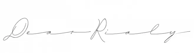
A delicate and elegant script font with flowing, cursive strokes.
![Dear Rialy Frei Schriftart Herunterladen]() Herunterladen 38 Downloads@WebFont
Herunterladen 38 Downloads@WebFont -
( Fonts by Bexxtype - Personal-use only. For commercial use please contact owner. )
A dynamic and elegant script font with flowing, cursive letterforms.
![Elistabeta Frei Schriftart Herunterladen]() Herunterladen 38 Downloads@WebFont
Herunterladen 38 Downloads@WebFont -
( Fonts by Abo Daniel Studio - Panggah Laksono - Personal-use only. For commercial use please contact owner. )
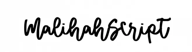
A bold, flowing script font with interconnected letters and a lively, handwritten style.
![Malihah Script Frei Schriftart Herunterladen]() Herunterladen 38 Downloads@WebFont
Herunterladen 38 Downloads@WebFont -
( Fonts by Randy Ford - Personal-use only. For commercial use please contact owner. )
A decorative font with letters designed to resemble lizards, featuring elaborate and whimsical details.
![Lizzard Frei Schriftart Herunterladen]() Herunterladen 38 Downloads@WebFont
Herunterladen 38 Downloads@WebFont -
( Fonts by Runsell Studio - Personal-use only. For commercial use please contact owner. )
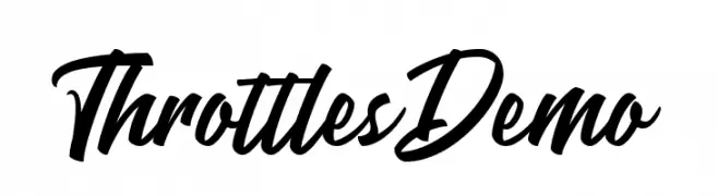
A bold, modern script font with a dynamic, handwritten style.
![ThrottlesDemo Frei Schriftart Herunterladen]() Herunterladen 38 Downloads@WebFont
Herunterladen 38 Downloads@WebFont -
( Personal-use only. For commercial use please contact owner. )
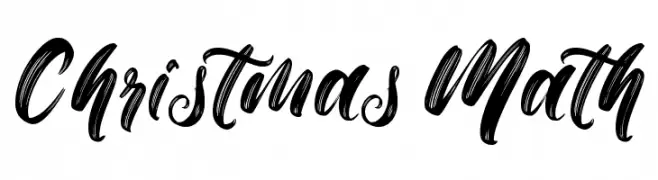
Bold, brush-style script font with energetic, festive strokes.
![Christmas Math Frei Schriftart Herunterladen]() Herunterladen 38 Downloads@WebFont
Herunterladen 38 Downloads@WebFont -
( Fonts by Perspectype Studio - Personal-use only. For commercial use please contact owner. )
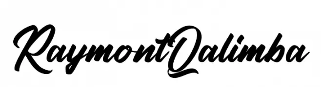
A bold, expressive script font with flowing cursive letterforms.
![Raymont Qalimba Frei Schriftart Herunterladen]() Herunterladen 38 Downloads@WebFont
Herunterladen 38 Downloads@WebFont -
( Fonts by Antipixel - Julia MartÃnez Diana - Personal-use only. For commercial use please contact owner. )
A light, elegant italic font with thin, elongated characters and generous spacing.
![Aracne Light Italic Frei Schriftart Herunterladen]() Herunterladen 38 Downloads@WebFont
Herunterladen 38 Downloads@WebFont -
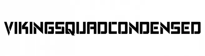
( Fonts by Iconian Fonts - Daniel Zadorozny - Personal-use only. For commercial use please contact owner. )
A bold, geometric, and condensed font with a modern, futuristic style.
![Viking Squad Condensed Frei Schriftart Herunterladen]() Herunterladen 38 Downloads@WebFont
Herunterladen 38 Downloads@WebFont -
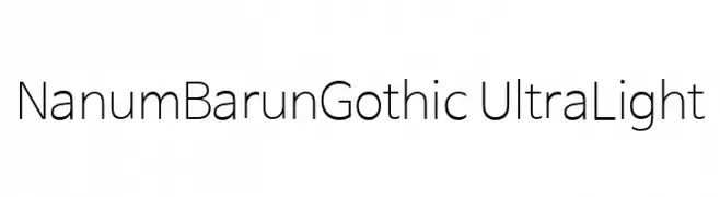
( Collection of Korean web fonts - Personal-use only. For commercial use please contact owner. )
A modern, ultra-light sans-serif font with clean lines and balanced proportions.
![NanumBarunGothic UltraLight Frei Schriftart Herunterladen]() Herunterladen 38 Downloads@WebFont
Herunterladen 38 Downloads@WebFont -
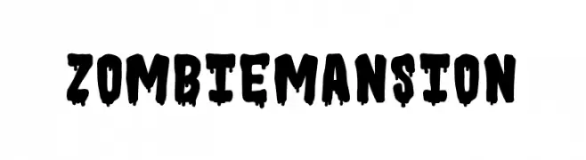
( Fonts by Mozatype )
Bold, dripping display font with a horror theme.
![ZOMBIE MANSION Frei Schriftart Herunterladen]() Herunterladen 38 Downloads@WebFont
Herunterladen 38 Downloads@WebFont -
( Fonts by Vultype - Candra Hamdani - Personal-use only. For commercial use please contact owner. )
A lively and elegant script font with flowing, cursive letterforms.
![Bugetta Frei Schriftart Herunterladen]() Herunterladen 38 Downloads@WebFont
Herunterladen 38 Downloads@WebFont -
( Fonts by Albertako - Albert Akho - Personal-use only. For commercial use please contact owner. )
A sleek, modern font with geometric and minimalist design.
![Keyla Frei Schriftart Herunterladen]() Herunterladen 38 Downloads@WebFont
Herunterladen 38 Downloads@WebFont -
( Fonts by Antipixel - Julia MartÃnez Diana - Personal-use only. For commercial use please contact owner. )
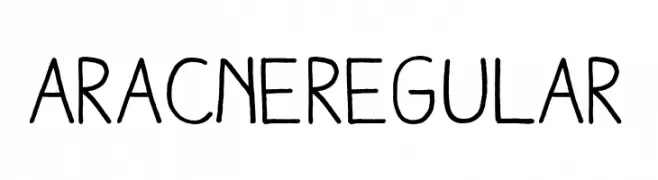
A playful, handwritten font with a casual and organic feel.
![AracneRegular Frei Schriftart Herunterladen]() Herunterladen 38 Downloads@WebFont
Herunterladen 38 Downloads@WebFont -
( Fonts by Runsell Studio - Personal-use only. For commercial use please contact owner. )
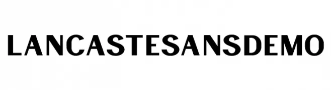
A bold, modern sans-serif font with clean lines and excellent readability.
![LancasteSansDemo Frei Schriftart Herunterladen]() Herunterladen 38 Downloads@WebFont
Herunterladen 38 Downloads@WebFont -
( Fonts by Mans Greback - www.mansgreback.com - Personal-use only. For commercial use please contact owner. )
A playful, casual handwritten font with smooth, flowing strokes.
![Darwin Smith Frei Schriftart Herunterladen]() Herunterladen 38 Downloads@WebFont
Herunterladen 38 Downloads@WebFont -
( Fonts by StringLabs - stringlabscreative.com - Personal-use only. For commercial use please contact owner. )
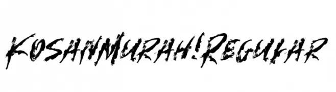
A bold, brush-stroke font with a raw, expressive style.
![Kosan Murah! Regular Frei Schriftart Herunterladen]() Herunterladen 38 Downloads@WebFont
Herunterladen 38 Downloads@WebFont -
( Fonts by TypeScrib Studio - Personal-use only. For commercial use please contact owner. )
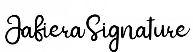
A playful, modern handwritten font with smooth, flowing curves.
![Jafiera Signature Frei Schriftart Herunterladen]() Herunterladen 38 Downloads@WebFont
Herunterladen 38 Downloads@WebFont -
( Fonts by Antipixel - Julia MartÃnez Diana - Personal-use only. For commercial use please contact owner. )
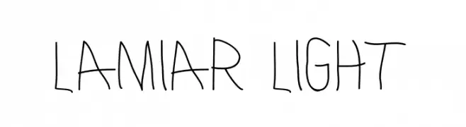
A playful, handwritten font with thin, irregular strokes and a casual style.
![Lamiar Light Frei Schriftart Herunterladen]() Herunterladen 38 Downloads@WebFont
Herunterladen 38 Downloads@WebFont -
( Fonts by Dilbadil - Abdillah Abdi - Personal-use only. For commercial use please contact owner. )
A playful and expressive script font with flowing, cursive letters.
![Raquen Frei Schriftart Herunterladen]() Herunterladen 38 Downloads@WebFont
Herunterladen 38 Downloads@WebFont -
( Fonts by Alpaprana - Personal-use only. For commercial use please contact owner. )
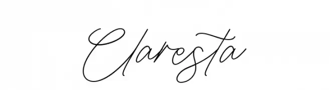
A fluid and elegant script font with connected cursive strokes.
![Claresta Frei Schriftart Herunterladen]() Herunterladen 38 Downloads@WebFont
Herunterladen 38 Downloads@WebFont -
( Personal-use only. For commercial use please contact owner. )
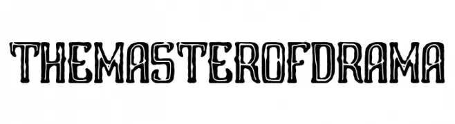
A dramatic, hand-drawn display font with bold, irregular outlines.
![The Master of Drama Frei Schriftart Herunterladen]() Herunterladen 38 Downloads@WebFont
Herunterladen 38 Downloads@WebFont -
( Fonts by Helotype )
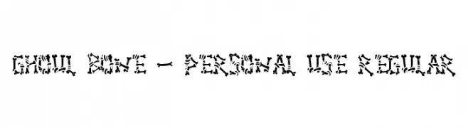
A bold, bone-themed decorative font with a spooky, playful style.
![Ghoul Bone - Personal Use Regular Frei Schriftart Herunterladen]() Herunterladen 38 Downloads@WebFont
Herunterladen 38 Downloads@WebFont -
( Fonts by Vladimir Nikolic - www.creativefabrica.com/designer/vladimirnikolic/ - Personal-use only. For commercial use please contact owner. )
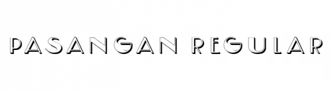
A modern, geometric font with a blend of solid and outlined elements.
![Pasangan Regular Frei Schriftart Herunterladen]() Herunterladen 38 Downloads@WebFont
Herunterladen 38 Downloads@WebFont -
( Fonts by Edric Studio - Personal-use only. For commercial use please contact owner. )
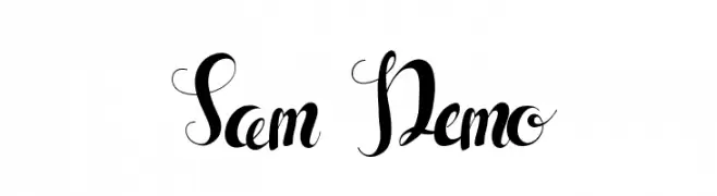
An elegant script font with decorative swashes and flowing curves.
![Sam Demo Frei Schriftart Herunterladen]() Herunterladen 38 Downloads@WebFont
Herunterladen 38 Downloads@WebFont -
( Fonts by Iconian Fonts - Daniel Zadorozny - Personal-use only. For commercial use please contact owner. )
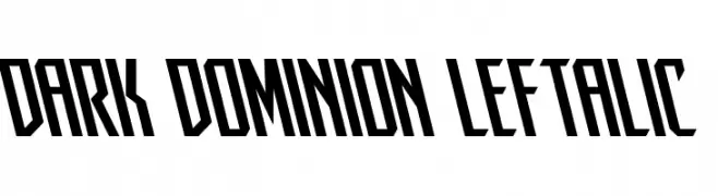
A bold, angular font with a leftward slant and high contrast.
![Dark Dominion Leftalic Frei Schriftart Herunterladen]() Herunterladen 38 Downloads@WebFont
Herunterladen 38 Downloads@WebFont


Welche Schriften sind gerade am populärsten?
Poppins, Roboto, Montserrat, Open Sans und Lato sind wegen ihrer klaren Formen und breiten Einsetzbarkeit sehr gefragt – von Markenauftritt über Landingpages bis hin zu Postern.
Welche Fonts eignen sich für Logos?
Geometrische Sans‑Serifs (z. B. Poppins, Familien im Gotham‑Stil) sind ein häufiger Griff für sauberes, skalierbares Branding. Für eine persönlichere Note bleiben Scripts und Handschrift‑Stile beliebt. Kombinieren Sie einen prägnanten Headline‑Font mit einer neutralen Brotschrift für Wiedererkennung und Harmonie.
Wie oft wird die Top‑Liste aktualisiert?
Regelmäßig – basierend auf realen Downloads und Interaktionen. Schauen Sie öfter vorbei, um aufstrebende Favoriten früh zu entdecken.
💡 Tipp: Seite bookmarken – Trends wechseln schnell, und heutige Top‑Schriften inspirieren morgen vielleicht das Rebranding.