Willkommen bei den Top‑Schriften – hier treffen Beliebtheit und Qualität aufeinander. Das sind die in diesem Jahr am häufigsten heruntergeladenen und genutzten Fonts. Wenn Sie sichere Optionen für Logo, Web oder Social suchen, starten Sie hier.
Jeder Top‑Font überzeugt durch Balance, Lesbarkeit und Vielseitigkeit. Sie finden moderne Sans‑Serifs, elegante Scripts, Vintage‑Serifs und minimalistische Displays.
-
( Fonts by Alexander Tiunov - Personal-use only. For commercial use please contact owner. )
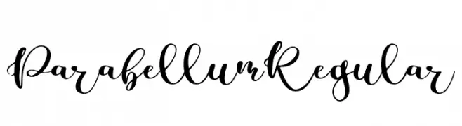
An elegant, flowing script font with ornate uppercase and fluid lowercase letters.
 Herunterladen 36 Downloads@WebFont
 -
( Fonts by Typodermic Fonts - Raymond Larabie - Personal-use only. For commercial use please contact owner. )
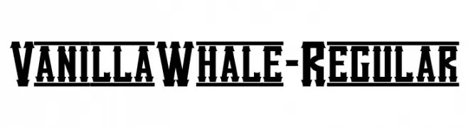
A bold, angular font with a vintage, decorative style.
![VanillaWhale-Regular Frei Schriftart Herunterladen]() Herunterladen 36 Downloads@WebFont
Herunterladen 36 Downloads@WebFont -
( Personal-use only. For commercial use please contact owner. )
Bold, rounded handwritten font with a playful and casual style.
![Christmas Planner Frei Schriftart Herunterladen]() Herunterladen 36 Downloads@WebFont
Herunterladen 36 Downloads@WebFont -
( Fonts by Sabrcreative - Personal-use only. For commercial use please contact owner. )
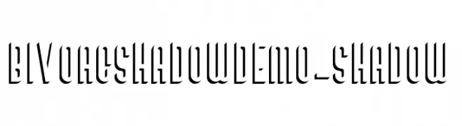
A bold, shadowed font with a three-dimensional effect for striking visual impact.
![BivoacShadowDemo-Shadow Frei Schriftart Herunterladen]() Herunterladen 36 Downloads@WebFont
Herunterladen 36 Downloads@WebFont -
( Fonts by Nirmana Visual - Sigit Dwipa - Personal-use only. For commercial use please contact owner. )
An elegant, flowing script font with a handwritten appearance.
![Shettricka Frei Schriftart Herunterladen]() Herunterladen 36 Downloads@WebFont
Herunterladen 36 Downloads@WebFont -
( Fonts by Mans Greback - www.mansgreback.com - Personal-use only. For commercial use please contact owner. )
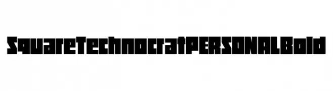
A bold, geometric font with a strong, square structure and modern aesthetic.
![Square Technocrat PERSONAL Bold Frei Schriftart Herunterladen]() Herunterladen 36 Downloads@WebFont
Herunterladen 36 Downloads@WebFont -
( Fonts by weknow - Wino S Kadir - Personal-use only. For commercial use please contact owner. )
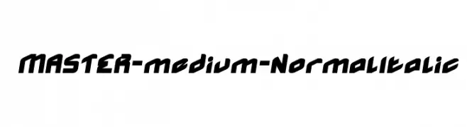
A bold, italicized font with a modern and dynamic style.
![MASTER-medium-Normal Italic Frei Schriftart Herunterladen]() Herunterladen 36 Downloads@WebFont
Herunterladen 36 Downloads@WebFont -
( Fonts by Iconian Fonts - Daniel Zadorozny - Personal-use only. For commercial use please contact owner. )
A bold, expanded, and italicized modern font with a futuristic design.
![Predataur Expanded Italic Frei Schriftart Herunterladen]() Herunterladen 36 Downloads@WebFont
Herunterladen 36 Downloads@WebFont -
( Fonts by Edric Studio - Personal-use only. For commercial use please contact owner. )
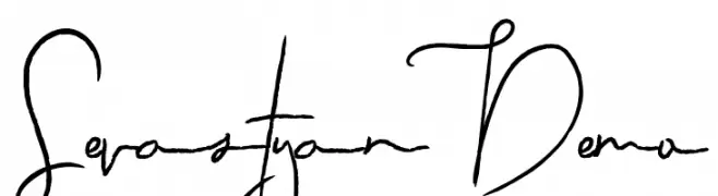
An elegant, flowing script font with intricate, continuous strokes.
![Sevastyan Demo Frei Schriftart Herunterladen]() Herunterladen 36 Downloads@WebFont
Herunterladen 36 Downloads@WebFont -
( Fonts by Adam Jagosz - Personal-use only. For commercial use please contact owner. )
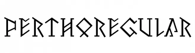
A bold, angular font inspired by ancient runic alphabets.
![Pertho Regular Frei Schriftart Herunterladen]() Herunterladen 36 Downloads@WebFont
Herunterladen 36 Downloads@WebFont -
( Fonts by Jetsmax Studio - Khairil Anwar - Personal-use only. For commercial use please contact owner. )
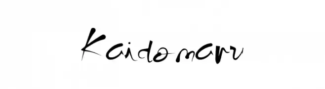
A dynamic, handwritten-style font with expressive and fluid strokes.
![Kaidomaru Frei Schriftart Herunterladen]() Herunterladen 36 Downloads@WebFont
Herunterladen 36 Downloads@WebFont -
( Fonts by Syaf Rizal - Khurasan - Personal-use only. For commercial use please contact owner. )
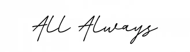
A casual and elegant handwritten script font with fluid strokes.
![All Always Frei Schriftart Herunterladen]() Herunterladen 36 Downloads@WebFont
Herunterladen 36 Downloads@WebFont -
( Fonts by Mans Greback - www.mansgreback.com - Personal-use only. For commercial use please contact owner. )
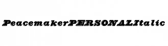
A bold, italic font with a dynamic and energetic style.
![Peacemaker PERSONAL Italic Frei Schriftart Herunterladen]() Herunterladen 36 Downloads@WebFont
Herunterladen 36 Downloads@WebFont -
( Fonts by Letter Art Studio )
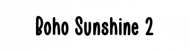
Playful, rounded sans-serif with a hand-drawn feel.
![Boho Sunshine 2 Frei Schriftart Herunterladen]() Herunterladen 36 Downloads@WebFont
Herunterladen 36 Downloads@WebFont -
( Fonts by Creatype Studio - Rian Rahardi - Personal-use only. For commercial use please contact owner. )
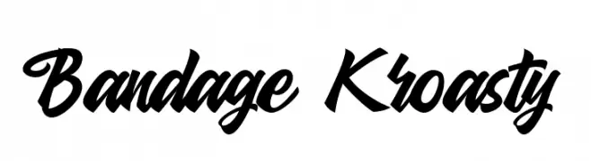
A bold, energetic script font with fluid, connected letters.
![Bandage Kroasty Frei Schriftart Herunterladen]() Herunterladen 36 Downloads@WebFont
Herunterladen 36 Downloads@WebFont -
( Fonts by AukimVisuel - Audry Kitoko Makelele - Personal-use only. For commercial use please contact owner. )
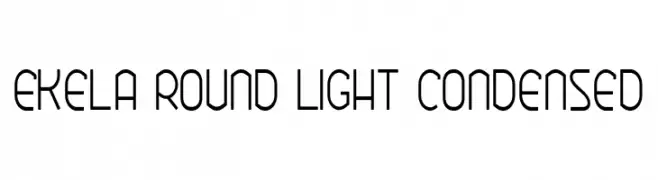
A modern, rounded, and light font with a condensed width and clean style.
![Ekela Round Light Condensed Frei Schriftart Herunterladen]() Herunterladen 36 Downloads@WebFont
Herunterladen 36 Downloads@WebFont -
( Fonts by Iconian Fonts - Daniel Zadorozny - Personal-use only. For commercial use please contact owner. )
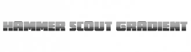
A bold, futuristic font with a gradient effect created by horizontal lines.
![Hammer Scout Gradient Frei Schriftart Herunterladen]() Herunterladen 36 Downloads@WebFont
Herunterladen 36 Downloads@WebFont -
( Fonts by Iconian Fonts - Daniel Zadorozny - Personal-use only. For commercial use please contact owner. )
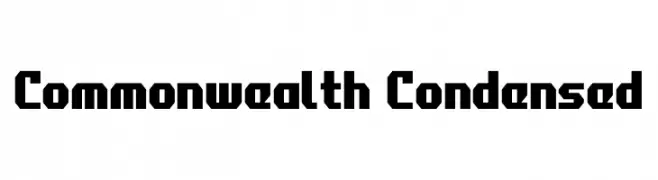
A bold, geometric, and condensed font with a modern industrial style.
![Commonwealth Condensed Frei Schriftart Herunterladen]() Herunterladen 36 Downloads@WebFont
Herunterladen 36 Downloads@WebFont -
( Fonts by bringtypestudio.co )
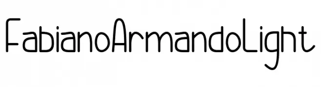
A light, rounded geometric sans-serif with tall, narrow proportions.
![Fabiano Armando Light Frei Schriftart Herunterladen]() Herunterladen 36 Downloads@WebFont
Herunterladen 36 Downloads@WebFont -
( Fonts by Linecreative - ARI JUANDA - Personal-use only. For commercial use please contact owner. )
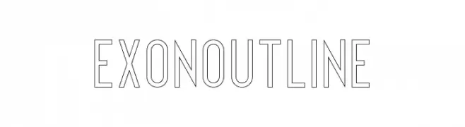
A modern, geometric outline font with uniform line thickness and balanced proportions.
![Exon outline Frei Schriftart Herunterladen]() Herunterladen 36 Downloads@WebFont
Herunterladen 36 Downloads@WebFont -
( Fonts by NanaNissa - Personal-use only. For commercial use please contact owner. )
A sophisticated script font with elegant, flowing letters and decorative flourishes.
![Delandia Frei Schriftart Herunterladen]() Herunterladen 36 Downloads@WebFont
Herunterladen 36 Downloads@WebFont -
( Fonts by Sharvanna Kenny - Personal-use only. For commercial use please contact owner. )
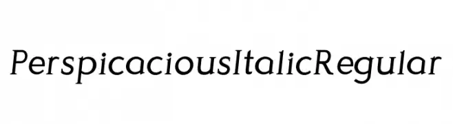
An elegant serif font with an italic slant and moderate stroke contrast.
![Perspicacious Italic Regular Frei Schriftart Herunterladen]() Herunterladen 36 Downloads@WebFont
Herunterladen 36 Downloads@WebFont -
( Fonts by weknow - Wino S Kadir - Personal-use only. For commercial use please contact owner. )
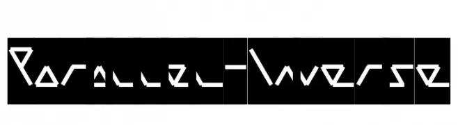
A geometric, angular font with a futuristic and dynamic design.
![Parallel-Inverse Frei Schriftart Herunterladen]() Herunterladen 36 Downloads@WebFont
Herunterladen 36 Downloads@WebFont -
( Fonts by Rémi Godefroid - Personal-use only. For commercial use please contact owner. )
A modern, flowing font with artistic and fluid character design.
![Tibet Frei Schriftart Herunterladen]() Herunterladen 36 Downloads@WebFont
Herunterladen 36 Downloads@WebFont -
( Fonts by StringLabs - stringlabscreative.com - Personal-use only. For commercial use please contact owner. )
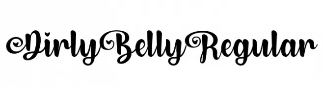
A bold, whimsical script font with elegant swirls and loops.
![Dirly Belly Regular Frei Schriftart Herunterladen]() Herunterladen 36 Downloads@WebFont
Herunterladen 36 Downloads@WebFont -
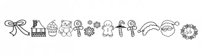
( Fonts by Edy Wiyono - Personal-use only. For commercial use please contact owner. )
Hand-drawn Christmas doodle icon set.
![Christmas Box Frei Schriftart Herunterladen]() Herunterladen 36 Downloads@WebFont
Herunterladen 36 Downloads@WebFont -
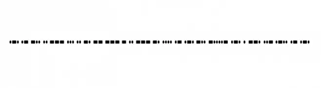
( Fonts by Typodermic Fonts - Raymond Larabie - Personal-use only. For commercial use please contact owner. )
A decorative Morse code-inspired font with dots and dashes.
![RadiosinMotionHard-Regular Frei Schriftart Herunterladen]() Herunterladen 36 Downloads@WebFont
Herunterladen 36 Downloads@WebFont -
( Fonts by Alpaprana Studio - Personal-use only. For commercial use please contact owner. )
A refined and elegant script font with flowing cursive letterforms.
![Giordan Frei Schriftart Herunterladen]() Herunterladen 36 Downloads@WebFont
Herunterladen 36 Downloads@WebFont -
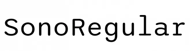
( Fonts by Tyler Finck )
A modern, geometric sans-serif font with rounded edges and excellent readability.
![Sono Regular Frei Schriftart Herunterladen]() Herunterladen 36 Downloads@WebFont
Herunterladen 36 Downloads@WebFont -
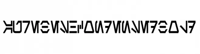
( Fonts by Pixel Sagas - Neale and Shayna Davidson - Personal-use only. For commercial use please contact owner. )
A bold, condensed font with a futuristic, angular design.
![Aurebesh Condensed Bold Frei Schriftart Herunterladen]() Herunterladen 36 Downloads@WebFont
Herunterladen 36 Downloads@WebFont -
( Fonts by Perspectype Studio - Personal-use only. For commercial use please contact owner. )
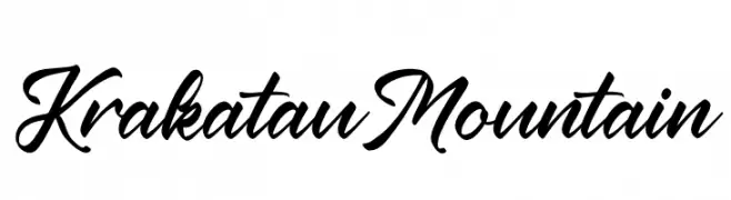
A bold, cursive script font with a dynamic and fluid style.
![Krakatau Mountain Frei Schriftart Herunterladen]() Herunterladen 36 Downloads@WebFont
Herunterladen 36 Downloads@WebFont -
( Fonts by dcoxy - Greg Medina - Personal-use only. For commercial use please contact owner. )
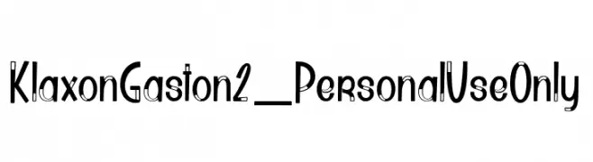
A playful, modern font with geometric influences and decorative elements.
![Klaxon Gaston2_PersonalUseOnly Frei Schriftart Herunterladen]() Herunterladen 36 Downloads@WebFont
Herunterladen 36 Downloads@WebFont -
( Fonts by Alif Quentin - Personal-use only. For commercial use please contact owner. )
A dynamic, expressive handwritten font with fluid, flowing letterforms.
![BasyarJalai Frei Schriftart Herunterladen]() Herunterladen 36 Downloads@WebFont
Herunterladen 36 Downloads@WebFont -
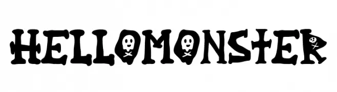
( Fonts by Alpaprana Studio - Personal-use only. For commercial use please contact owner. )
A playful, spooky font with skull and bone elements, perfect for Halloween themes.
![Hello Monster Frei Schriftart Herunterladen]() Herunterladen 36 Downloads@WebFont
Herunterladen 36 Downloads@WebFont -
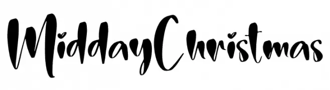
( Personal-use only. For commercial use please contact owner. )
Expressive, bold handwritten script with brush-like strokes.
![Midday Christmas Frei Schriftart Herunterladen]() Herunterladen 36 Downloads@WebFont
Herunterladen 36 Downloads@WebFont


Welche Schriften sind gerade am populärsten?
Poppins, Roboto, Montserrat, Open Sans und Lato sind wegen ihrer klaren Formen und breiten Einsetzbarkeit sehr gefragt – von Markenauftritt über Landingpages bis hin zu Postern.
Welche Fonts eignen sich für Logos?
Geometrische Sans‑Serifs (z. B. Poppins, Familien im Gotham‑Stil) sind ein häufiger Griff für sauberes, skalierbares Branding. Für eine persönlichere Note bleiben Scripts und Handschrift‑Stile beliebt. Kombinieren Sie einen prägnanten Headline‑Font mit einer neutralen Brotschrift für Wiedererkennung und Harmonie.
Wie oft wird die Top‑Liste aktualisiert?
Regelmäßig – basierend auf realen Downloads und Interaktionen. Schauen Sie öfter vorbei, um aufstrebende Favoriten früh zu entdecken.
💡 Tipp: Seite bookmarken – Trends wechseln schnell, und heutige Top‑Schriften inspirieren morgen vielleicht das Rebranding.