Willkommen bei den Top‑Schriften – hier treffen Beliebtheit und Qualität aufeinander. Das sind die in diesem Jahr am häufigsten heruntergeladenen und genutzten Fonts. Wenn Sie sichere Optionen für Logo, Web oder Social suchen, starten Sie hier.
Jeder Top‑Font überzeugt durch Balance, Lesbarkeit und Vielseitigkeit. Sie finden moderne Sans‑Serifs, elegante Scripts, Vintage‑Serifs und minimalistische Displays.
-
( Fonts by James Kilfiger - Personal-use only. For commercial use please contact owner. )
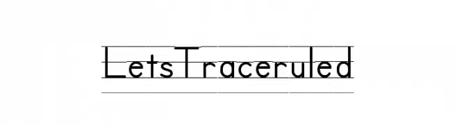
A clean, structured font ideal for educational and handwriting practice.
 Herunterladen 1246 Downloads@WebFont
 -
( Runsell Studio - creativemarket.com/RunsellStudio )
A clean, modern sans-serif font with uniform stroke width and excellent legibility.
![RobustaSansDemo Frei Schriftart Herunterladen]() Herunterladen 1246 Downloads@WebFont
Herunterladen 1246 Downloads@WebFont -
![NATURAL SUGARS Frei Schriftart Herunterladen]() Herunterladen 1246 Downloads@WebFont
Herunterladen 1246 Downloads@WebFont -
( Copyright (c) 2014 by TipTopTyp )
A dynamic, slanted font with smooth curves and consistent stroke width.
![Ranga Regular Frei Schriftart Herunterladen]() Herunterladen 1246 Downloads@WebFont
Herunterladen 1246 Downloads@WebFont -
( Fonts by www.peter-wiegel.de. Personal-use only. For commercial use please contact owner. )
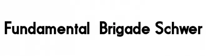
A bold, modern sans-serif font with geometric lines and strong presence.
![Fundamental Brigade Schwer Frei Schriftart Herunterladen]() Herunterladen 1246 Downloads@WebFont
Herunterladen 1246 Downloads@WebFont -
( Fonts by www.junkohanhero.com )
A bold, distressed font with a vintage, industrial feel.
![Payday Frei Schriftart Herunterladen]() Herunterladen 1246 Downloads@WebFont
Herunterladen 1246 Downloads@WebFont -
( Fonts by Jurgen Geiger - www.geigerartwork.de )
A bold, impactful font with thick strokes and a strong visual presence.
![Bloc Bold Frei Schriftart Herunterladen]() Herunterladen 1246 Downloads@WebFont
Herunterladen 1246 Downloads@WebFont -
( Fonts by Ward Zwart - wardzwart.blogspot.com - free for personal use only! )
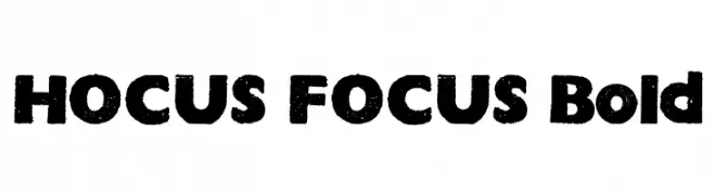
A bold, distressed font with a rugged, textured appearance.
![HOCUS FOCUS Bold Frei Schriftart Herunterladen]() Herunterladen 1246 Downloads@WebFont
Herunterladen 1246 Downloads@WebFont -
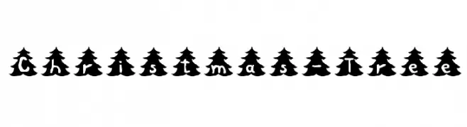
![Christmas-Tree Frei Schriftart Herunterladen]() Herunterladen 1246 Downloads@WebFont
Herunterladen 1246 Downloads@WebFont -
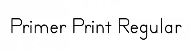
![Primer Print Regular Frei Schriftart Herunterladen]() Herunterladen 1246 Downloads@WebFont
Herunterladen 1246 Downloads@WebFont -
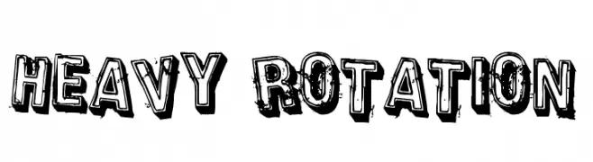
( Fonts by Rob Dobi - Toxic Type - www.dobi.nu )
A bold, distressed font with a grunge effect, ideal for impactful designs.
![Heavy Rotation Frei Schriftart Herunterladen]() Herunterladen 1246 Downloads@WebFont
Herunterladen 1246 Downloads@WebFont -
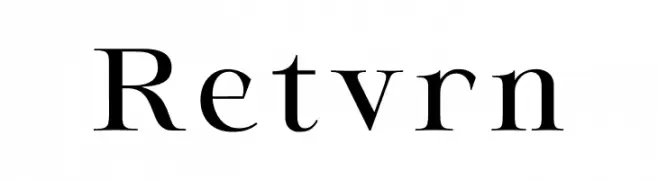
( Fonts by Ismael Dayag - Personal-use only. For commercial use please contact owner. )
A classic serif font with elegant strokes and pronounced serifs.
![Retvrn Frei Schriftart Herunterladen]() Herunterladen 1245 Downloads@WebFont
Herunterladen 1245 Downloads@WebFont -
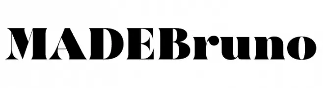
( Fonts by MadeType - Personal-use only. For commercial use please contact owner. )
A bold, high-contrast font with a modern and dramatic style.
![MADEBruno Frei Schriftart Herunterladen]() Herunterladen 1245 Downloads@WebFont
Herunterladen 1245 Downloads@WebFont -
( Fonts by www.chequered.ink - Chequered Ink - Personal-use only. For commercial use please contact owner. )
A futuristic geometric font with clean lines and a modern aesthetic.
![Seldom Scene Frei Schriftart Herunterladen]() Herunterladen 1245 Downloads@WebFont
Herunterladen 1245 Downloads@WebFont -
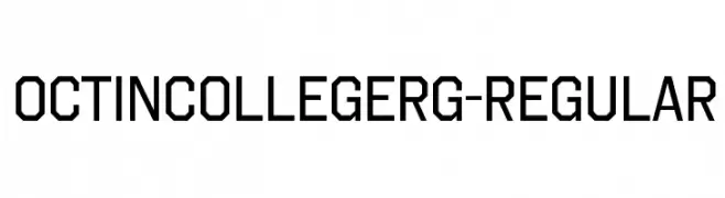
( Typodermic Fonts - Ray Larabie - www.typodermicfonts.com/ )
A bold, geometric font with a collegiate and modern aesthetic.
![OctinCollegeRg-Regular Frei Schriftart Herunterladen]() Herunterladen 1245 Downloads@WebFont
Herunterladen 1245 Downloads@WebFont -
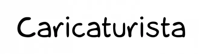
( twitter.com/omogollon )
A playful, hand-drawn font with rounded, casual characters.
![Caricaturista Frei Schriftart Herunterladen]() Herunterladen 1245 Downloads@WebFont
Herunterladen 1245 Downloads@WebFont -
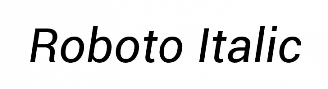
( Fonts by developer.android.com )
A modern, italicized sans-serif font with clean lines and balanced proportions.
![Roboto Italic Frei Schriftart Herunterladen]() Herunterladen 1245 Downloads@WebFont
Herunterladen 1245 Downloads@WebFont -
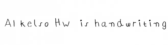
![AI kelso HW is handwriting Frei Schriftart Herunterladen]() Herunterladen 1245 Downloads@WebFont
Herunterladen 1245 Downloads@WebFont -
( Fonts by Kevin Christopher - www.kcfonts.com )
A bold, distressed font with a rugged, textured appearance.
![Transit Display Frei Schriftart Herunterladen]() Herunterladen 1245 Downloads@WebFont
Herunterladen 1245 Downloads@WebFont -
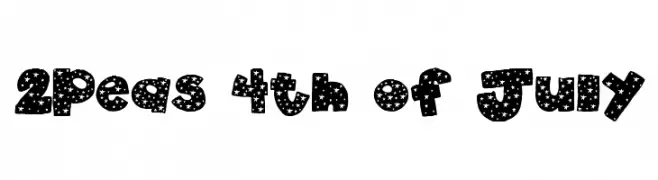
( Fonts by www.twopeasinabucket.com )
A bold, star-patterned decorative font ideal for festive designs.
![2Peas 4th of July Frei Schriftart Herunterladen]() Herunterladen 1245 Downloads@WebFont
Herunterladen 1245 Downloads@WebFont -
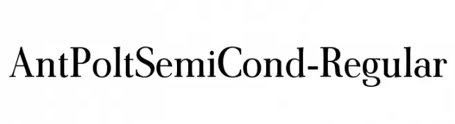
![AntPoltSemiCond-Regular Frei Schriftart Herunterladen]() Herunterladen 1245 Downloads@WebFont
Herunterladen 1245 Downloads@WebFont -
( Fonts by Dieter Steffmann )
A bold, high-contrast font with a modern twist on traditional serif elements.
![Louisianne Black Frei Schriftart Herunterladen]() Herunterladen 1245 Downloads@WebFont
Herunterladen 1245 Downloads@WebFont -
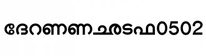
![Shree-Mal-0502 Frei Schriftart Herunterladen]() Herunterladen 1245 Downloads@WebFont
Herunterladen 1245 Downloads@WebFont -
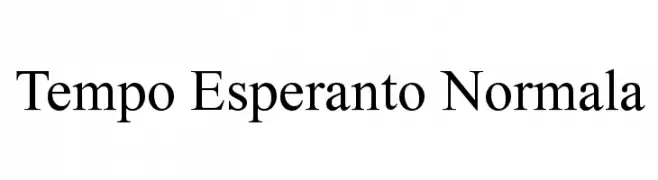
![Tempo Esperanto Normala Frei Schriftart Herunterladen]() Herunterladen 1245 Downloads
Herunterladen 1245 Downloads -
![G.B.BOOT Frei Schriftart Herunterladen]() Herunterladen 1245 Downloads@WebFont
Herunterladen 1245 Downloads@WebFont -
( Fonts by blueroom - Personal-use only. For commercial use please contact owner. )
A bold, geometric font with strong, blocky letterforms.
![Fyodor Bold Frei Schriftart Herunterladen]() Herunterladen 1244 Downloads@WebFont
Herunterladen 1244 Downloads@WebFont -
( Michael D. Adams - www.triskele.com/roadgeek-fonts/ )
A bold, modern font with strong, clear letterforms ideal for signage.
![Roadgeek Transport Heavy Frei Schriftart Herunterladen]() Herunterladen 1244 Downloads@WebFont
Herunterladen 1244 Downloads@WebFont -
( Fonts by Alif Devan R. )
A bold, cursive font with dynamic strokes and a handwritten feel.
![Venetian Frei Schriftart Herunterladen]() Herunterladen 1244 Downloads@WebFont
Herunterladen 1244 Downloads@WebFont -
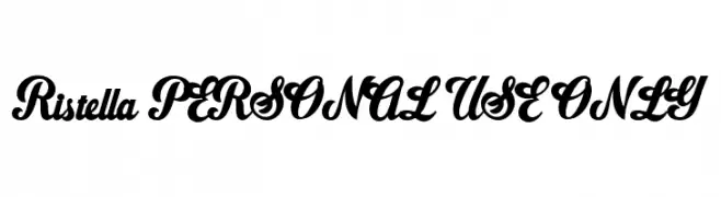
( Fonts by Måns Grebäck )
A modern, elegant script font with decorative swashes and smooth curves.
![Ristella PERSONAL USE ONLY Frei Schriftart Herunterladen]() Herunterladen 1244 Downloads@WebFont
Herunterladen 1244 Downloads@WebFont -
( Fonts by Mikrojihad Inc - www.behance.net/mikrojihad - Personal-use only. For commercial use please contact owner. )
A bold, playful script font with rounded, connected characters.
![BlackFat Frei Schriftart Herunterladen]() Herunterladen 1244 Downloads@WebFont
Herunterladen 1244 Downloads@WebFont -
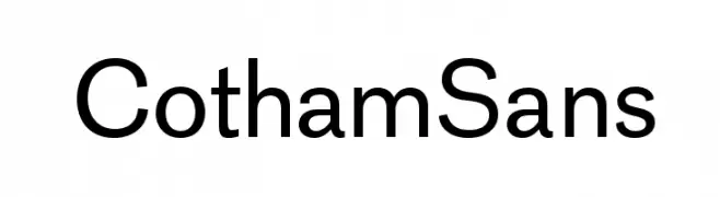
( Fonts by www.love-letters.be. Personal-use only. For commercial use please contact owner. )
A modern, clean sans-serif font with balanced stroke width and excellent readability.
![CothamSans Frei Schriftart Herunterladen]() Herunterladen 1244 Downloads@WebFont
Herunterladen 1244 Downloads@WebFont -
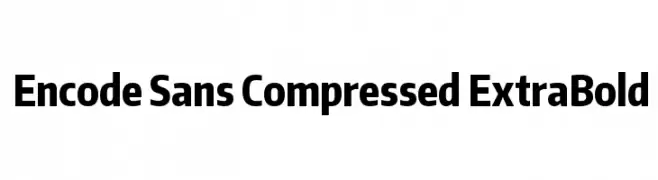
( Copyright (c) 2012, Impallari Type (www.impallari.com), with Reserved Font Name Encode Sans. )
A modern, compressed sans-serif font with an extra bold weight.
![Encode Sans Compressed ExtraBold Frei Schriftart Herunterladen]() Herunterladen 1244 Downloads@WebFont
Herunterladen 1244 Downloads@WebFont -
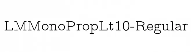
( Fonts by www.gust.org.pl )
A modern, monospaced font with low contrast and uniform spacing.
![LMMonoPropLt10-Regular Frei Schriftart Herunterladen]() Herunterladen 1244 Downloads@WebFont
Herunterladen 1244 Downloads@WebFont -
( Fonts by Colorful Typhoon - http://orange.s56.xrea.com/blog/ )
A playful, handwritten font with bold strokes and an informal style.
![homework normal Frei Schriftart Herunterladen]() Herunterladen 1244 Downloads@WebFont
Herunterladen 1244 Downloads@WebFont -
![Bluefish Black Demo Italic Frei Schriftart Herunterladen]() Herunterladen 1243 Downloads@WebFont
Herunterladen 1243 Downloads@WebFont


Welche Schriften sind gerade am populärsten?
Poppins, Roboto, Montserrat, Open Sans und Lato sind wegen ihrer klaren Formen und breiten Einsetzbarkeit sehr gefragt – von Markenauftritt über Landingpages bis hin zu Postern.
Welche Fonts eignen sich für Logos?
Geometrische Sans‑Serifs (z. B. Poppins, Familien im Gotham‑Stil) sind ein häufiger Griff für sauberes, skalierbares Branding. Für eine persönlichere Note bleiben Scripts und Handschrift‑Stile beliebt. Kombinieren Sie einen prägnanten Headline‑Font mit einer neutralen Brotschrift für Wiedererkennung und Harmonie.
Wie oft wird die Top‑Liste aktualisiert?
Regelmäßig – basierend auf realen Downloads und Interaktionen. Schauen Sie öfter vorbei, um aufstrebende Favoriten früh zu entdecken.
💡 Tipp: Seite bookmarken – Trends wechseln schnell, und heutige Top‑Schriften inspirieren morgen vielleicht das Rebranding.