Willkommen bei den Top‑Schriften – hier treffen Beliebtheit und Qualität aufeinander. Das sind die in diesem Jahr am häufigsten heruntergeladenen und genutzten Fonts. Wenn Sie sichere Optionen für Logo, Web oder Social suchen, starten Sie hier.
Jeder Top‑Font überzeugt durch Balance, Lesbarkeit und Vielseitigkeit. Sie finden moderne Sans‑Serifs, elegante Scripts, Vintage‑Serifs und minimalistische Displays.
-
( Fonts by weknow - Wino S Kadir - Personal-use only. For commercial use please contact owner. )
A modern, hollow font with a continuous line design, perfect for creative projects.
 Herunterladen 36 Downloads@WebFont
 -
( Fonts by Angin Studio - David Novrian - Personal-use only. For commercial use please contact owner. )
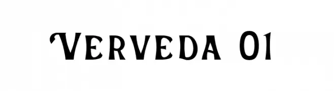
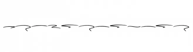
A bold, decorative font with artistic curves and edges.
![Verveda 01 Frei Schriftart Herunterladen]() Herunterladen 36 Downloads@WebFont
Herunterladen 36 Downloads@WebFont -
( Fonts by Jetsmax.com - Personal-use only. For commercial use please contact owner. )
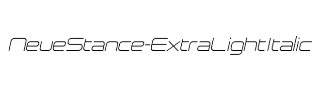
A sleek, modern, and italicized font with an extra light weight and geometric design.
![NeueStance-ExtraLightItalic Frei Schriftart Herunterladen]() Herunterladen 36 Downloads@WebFont
Herunterladen 36 Downloads@WebFont -
( Fonts by PutraCetol Studio )
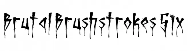
A chaotic, brushstroke display font with elongated, jagged forms and ink splatters.
![Brutal Brushstrokes Six Frei Schriftart Herunterladen]() Herunterladen 36 Downloads@WebFont
Herunterladen 36 Downloads@WebFont -
( Fonts by LJ Design Studios - Luis Jaramillo - Personal-use only. For commercial use please contact owner. )
A bold, modern sans-serif typeface with geometric shapes and clean lines.
![Ge Body Frei Schriftart Herunterladen]() Herunterladen 36 Downloads@WebFont
Herunterladen 36 Downloads@WebFont -
( Fonts by Qkila - Quentin Aquila - Personal-use only. For commercial use please contact owner. )
A playful, handwritten font with a whimsical and artistic style.
![Slam Frei Schriftart Herunterladen]() Herunterladen 36 Downloads@WebFont
Herunterladen 36 Downloads@WebFont -
( Fonts by Bonjour Type - Rachma - Personal-use only. For commercial use please contact owner. )
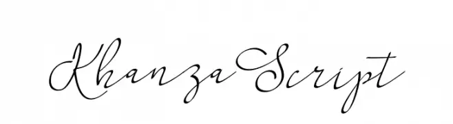
An elegant, flowing script font with a sophisticated style.
![KhanzaScript Frei Schriftart Herunterladen]() Herunterladen 36 Downloads@WebFont
Herunterladen 36 Downloads@WebFont -
( Fonts by Beautypes - Bhakti Al Akbar Pasaribu - Personal-use only. For commercial use please contact owner. )
A playful, decorative font with bold numbers and elegant swashes.
![Kudofun Swash Frei Schriftart Herunterladen]() Herunterladen 36 Downloads@WebFont
Herunterladen 36 Downloads@WebFont -
( Fonts by Ndiscovered - Natanael Gama - Personal-use only. For commercial use please contact owner. )
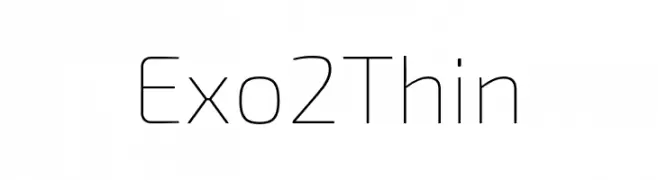
A sleek, modern font with thin, clean lines and a minimalist aesthetic.
![Exo 2 Thin Frei Schriftart Herunterladen]() Herunterladen 36 Downloads@WebFont
Herunterladen 36 Downloads@WebFont -
( Fonts by Sesa Grafika - Personal-use only. For commercial use please contact owner. )
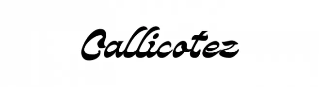
A bold, elegant script font with flowing, interconnected characters.
![Callicotez Frei Schriftart Herunterladen]() Herunterladen 36 Downloads@WebFont
Herunterladen 36 Downloads@WebFont -
( Fonts by Graphix Line Studio - Personal-use only. For commercial use please contact owner. )
A cursive, handwritten-style font with elegant, flowing strokes.
![Snowflake Frei Schriftart Herunterladen]() Herunterladen 36 Downloads@WebFont
Herunterladen 36 Downloads@WebFont -
( Fonts by Skinny Type - Muhajir - Personal-use only. For commercial use please contact owner. )
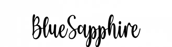
A playful and whimsical script font with a hand-drawn quality.
![Blue Sapphire Frei Schriftart Herunterladen]() Herunterladen 36 Downloads@WebFont
Herunterladen 36 Downloads@WebFont -
( Fonts by Khurasan - Syaf Rizal - Personal-use only. For commercial use please contact owner. )
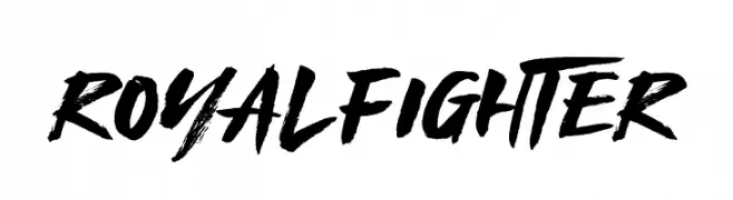
A bold, brushstroke font with a dynamic and textured appearance.
![Royal Fighter Frei Schriftart Herunterladen]() Herunterladen 36 Downloads@WebFont
Herunterladen 36 Downloads@WebFont -
( Fonts by junkohanhero )
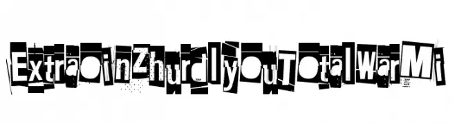
A bold, eclectic font with a ransom note style, featuring unique, cut-out characters.
![Extraoin Zhurdlyou Total War Mi Frei Schriftart Herunterladen]() Herunterladen 36 Downloads@WebFont
Herunterladen 36 Downloads@WebFont -
( Fonts by zone108.main.jp - Personal-use only. For commercial use please contact owner. )
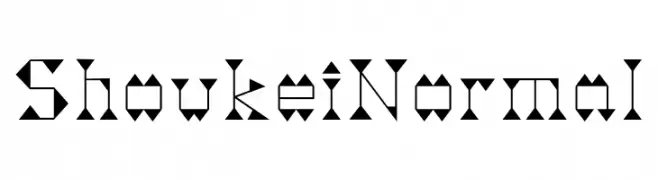
A geometric, angular font with a futuristic and artistic style.
![Shoukei Normal Frei Schriftart Herunterladen]() Herunterladen 36 Downloads@WebFont
Herunterladen 36 Downloads@WebFont -
( Fonts by Graphics Bam - Benjamin Melville - Personal-use only. For commercial use please contact owner. )
A bold, distressed font with a grungy, urban aesthetic.
![DirtyBoy Frei Schriftart Herunterladen]() Herunterladen 36 Downloads@WebFont
Herunterladen 36 Downloads@WebFont -
( Fonts by Variatype - Mukhlis Muhammad - Personal-use only. For commercial use please contact owner. )
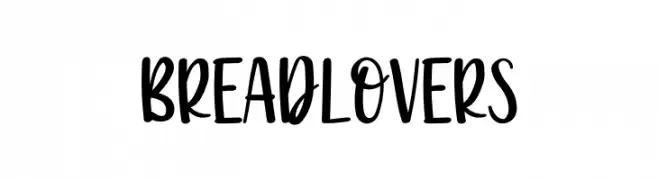
A bold, playful handwritten font with a lively and informal style.
![Breadlovers Frei Schriftart Herunterladen]() Herunterladen 36 Downloads@WebFont
Herunterladen 36 Downloads@WebFont -
( Fonts by Naman Arora )
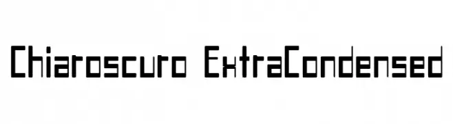
A geometric, extra-condensed font with a modern and technical design.
![Chiaroscuro-ExtraCondensed Frei Schriftart Herunterladen]() Herunterladen 36 Downloads@WebFont
Herunterladen 36 Downloads@WebFont -
( Fonts by Letterena Studios - letterena.com - Personal-use only. For commercial use please contact owner. )
A fluid and elegant script font with a handwritten appearance.
![Amstera Balika Frei Schriftart Herunterladen]() Herunterladen 36 Downloads@WebFont
Herunterladen 36 Downloads@WebFont -
( Fonts by Creatype Studio - Rian Rahardi - Personal-use only. For commercial use please contact owner. )
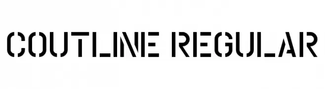
A bold, geometric stencil font with a modern industrial style.
![Coutline Regular Frei Schriftart Herunterladen]() Herunterladen 36 Downloads@WebFont
Herunterladen 36 Downloads@WebFont -
( Fonts by Risa Andarwati Wazirotun - Personal-use only. For commercial use please contact owner. )
A bold, geometric outline font with sharp angles and a modern style.
![Bodax Outline Frei Schriftart Herunterladen]() Herunterladen 36 Downloads@WebFont
Herunterladen 36 Downloads@WebFont -
( Fonts by Syaf Rizal - Khurasan - Personal-use only. For commercial use please contact owner. )
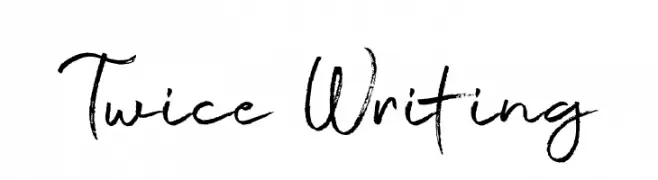
A dynamic, expressive handwritten font with fluid, spontaneous strokes.
![Twice Writing Frei Schriftart Herunterladen]() Herunterladen 36 Downloads@WebFont
Herunterladen 36 Downloads@WebFont -
![PuchiMono Frei Schriftart Herunterladen]() Herunterladen 36 Downloads@WebFont
Herunterladen 36 Downloads@WebFont -
( Fonts by Subectype & Orenari - Rangga Subekti & Ari - Personal-use only. For commercial use please contact owner. )
A playful, handwritten font with bold, rounded strokes and a dynamic slant.
![CuteGorilla Frei Schriftart Herunterladen]() Herunterladen 36 Downloads@WebFont
Herunterladen 36 Downloads@WebFont -
( Fonts by Creative Lab - Creative LAB - Personal-use only. For commercial use please contact owner. )
A playful and whimsical script font with a hand-drawn appearance.
![Handley Frei Schriftart Herunterladen]() Herunterladen 36 Downloads@WebFont
Herunterladen 36 Downloads@WebFont -
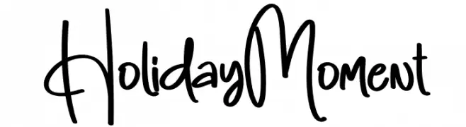
( Personal-use only. For commercial use please contact owner. )
Casual, handwritten script with playful energy and varied stroke thickness.
![Holiday Moment Frei Schriftart Herunterladen]() Herunterladen 36 Downloads@WebFont
Herunterladen 36 Downloads@WebFont -
( Fonts by Eknoji Studio - Personal-use only. For commercial use please contact owner. )
A bold, playful handwritten font with a casual and friendly vibe.
![Hikata Frei Schriftart Herunterladen]() Herunterladen 36 Downloads@WebFont
Herunterladen 36 Downloads@WebFont -
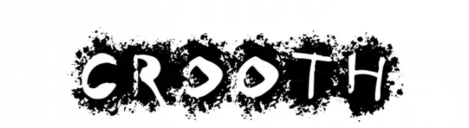
( Fonts by Primitype - Personal-use only. For commercial use please contact owner. )
A bold, grunge-style font with a distressed, artistic texture.
![CROOTH Frei Schriftart Herunterladen]() Herunterladen 36 Downloads@WebFont
Herunterladen 36 Downloads@WebFont -
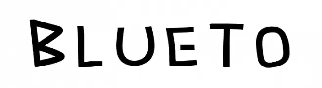
( Fonts by Khurasan - Syaf Rizal - Personal-use only. For commercial use please contact owner. )
A playful, hand-drawn font with bold, rounded strokes and an informal style.
![Blueto Frei Schriftart Herunterladen]() Herunterladen 36 Downloads@WebFont
Herunterladen 36 Downloads@WebFont -
( Personal-use only. For commercial use please contact owner. )
![NEXERA Frei Schriftart Herunterladen]() Herunterladen 36 Downloads@WebFont
Herunterladen 36 Downloads@WebFont -
( Fonts by Jason Pagura - Personal-use only. For commercial use please contact owner. )
A playful, bold font with rounded, thick letterforms and a friendly appearance.
![Gohan Frei Schriftart Herunterladen]() Herunterladen 36 Downloads@WebFont
Herunterladen 36 Downloads@WebFont -
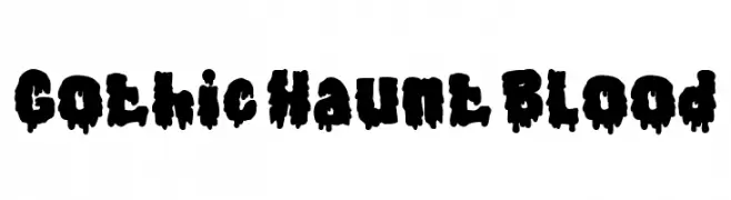
( Fonts by PutraCetol Studio )
A bold, dripping display font ideal for horror themes.
![Gothic Haunt Blood Frei Schriftart Herunterladen]() Herunterladen 36 Downloads@WebFont
Herunterladen 36 Downloads@WebFont -
( Personal-use only. For commercial use please contact owner. )
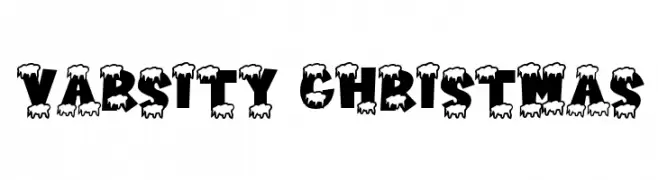
Bold, festive display font with snow-covered letters.
![Varsity Christmas Frei Schriftart Herunterladen]() Herunterladen 36 Downloads@WebFont
Herunterladen 36 Downloads@WebFont -
( Fonts by Vz Type - Personal-use only. For commercial use please contact owner. )
A fluid and elegant handwritten font with dynamic strokes.
![AtkinsonSignature Frei Schriftart Herunterladen]() Herunterladen 36 Downloads@WebFont
Herunterladen 36 Downloads@WebFont -
( Fonts by Khurasan - Syaf Rizal - Personal-use only. For commercial use please contact owner. )
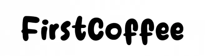
A playful, bold, and rounded font with a hand-drawn feel.
![First Coffee Frei Schriftart Herunterladen]() Herunterladen 36 Downloads@WebFont
Herunterladen 36 Downloads@WebFont


Welche Schriften sind gerade am populärsten?
Poppins, Roboto, Montserrat, Open Sans und Lato sind wegen ihrer klaren Formen und breiten Einsetzbarkeit sehr gefragt – von Markenauftritt über Landingpages bis hin zu Postern.
Welche Fonts eignen sich für Logos?
Geometrische Sans‑Serifs (z. B. Poppins, Familien im Gotham‑Stil) sind ein häufiger Griff für sauberes, skalierbares Branding. Für eine persönlichere Note bleiben Scripts und Handschrift‑Stile beliebt. Kombinieren Sie einen prägnanten Headline‑Font mit einer neutralen Brotschrift für Wiedererkennung und Harmonie.
Wie oft wird die Top‑Liste aktualisiert?
Regelmäßig – basierend auf realen Downloads und Interaktionen. Schauen Sie öfter vorbei, um aufstrebende Favoriten früh zu entdecken.
💡 Tipp: Seite bookmarken – Trends wechseln schnell, und heutige Top‑Schriften inspirieren morgen vielleicht das Rebranding.