Willkommen bei den Top‑Schriften – hier treffen Beliebtheit und Qualität aufeinander. Das sind die in diesem Jahr am häufigsten heruntergeladenen und genutzten Fonts. Wenn Sie sichere Optionen für Logo, Web oder Social suchen, starten Sie hier.
Jeder Top‑Font überzeugt durch Balance, Lesbarkeit und Vielseitigkeit. Sie finden moderne Sans‑Serifs, elegante Scripts, Vintage‑Serifs und minimalistische Displays.
-
( Fonts by Almarkhatype - Abdul Malik Wisnu - Personal-use only. For commercial use please contact owner. )
A bold, condensed font with a modern and impactful style.
 Herunterladen 322 Downloads@WebFont
 -
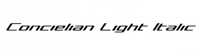
( Fonts by Daniel Zadorozny - www.iconian.com - Free for personal use )
A sleek, modern italic font with a geometric and futuristic design.
![Concielian Light Italic Frei Schriftart Herunterladen]() Herunterladen 322 Downloads@WebFont
Herunterladen 322 Downloads@WebFont -
( Fonts by Castcraft Software - opti.netii.net - check the website before use )
A bold, dramatic font with sharp serifs and high contrast.
![OPTIEdwards Frei Schriftart Herunterladen]() Herunterladen 322 Downloads@WebFont
Herunterladen 322 Downloads@WebFont -
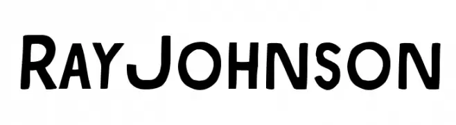
( Download for Personal Use. For Commercial: http://www.k-type.com )
A bold, modern font with a vintage touch, featuring slightly condensed uppercase letters.
![RayJohnson Frei Schriftart Herunterladen]() Herunterladen 322 Downloads@WebFont
Herunterladen 322 Downloads@WebFont -
![The Dance Signature Frei Schriftart Herunterladen]() Herunterladen 322 Downloads@WebFont
Herunterladen 322 Downloads@WebFont -
-
![Smokedamage_demo Regular Frei Schriftart Herunterladen]() Herunterladen 322 Downloads@WebFont
Herunterladen 322 Downloads@WebFont -
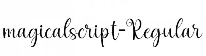
( Fonts by zulkhairilettering - Zulkhairi M Saleh - Personal-use only. For commercial use please contact owner. )
A whimsical, cursive font with elegant loops and flowing connections.
![magicalscript-Regular Frei Schriftart Herunterladen]() Herunterladen 322 Downloads@WebFont
Herunterladen 322 Downloads@WebFont -
( Fonts by www.fenotype.com )
A bold, distressed font with a gritty, urban aesthetic.
![3 theHard way RMX-Regular DEMO Frei Schriftart Herunterladen]() Herunterladen 322 Downloads@WebFont
Herunterladen 322 Downloads@WebFont -
( Fonts by Daniel Zadorozny - www.iconian.com )
A bold, gothic-inspired font with sharp, angular lines and dramatic serifs.
![Xiphos Frei Schriftart Herunterladen]() Herunterladen 322 Downloads@WebFont
Herunterladen 322 Downloads@WebFont -
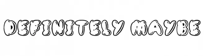
( Font by Jonathan Harris - www.tattoowoo.com )
A playful, bubble-like outlined font with bold, rounded characters.
![Definitely Maybe Frei Schriftart Herunterladen]() Herunterladen 322 Downloads@WebFont
Herunterladen 322 Downloads@WebFont


Welche Schriften sind gerade am populärsten?
Poppins, Roboto, Montserrat, Open Sans und Lato sind wegen ihrer klaren Formen und breiten Einsetzbarkeit sehr gefragt – von Markenauftritt über Landingpages bis hin zu Postern.
Welche Fonts eignen sich für Logos?
Geometrische Sans‑Serifs (z. B. Poppins, Familien im Gotham‑Stil) sind ein häufiger Griff für sauberes, skalierbares Branding. Für eine persönlichere Note bleiben Scripts und Handschrift‑Stile beliebt. Kombinieren Sie einen prägnanten Headline‑Font mit einer neutralen Brotschrift für Wiedererkennung und Harmonie.
Wie oft wird die Top‑Liste aktualisiert?
Regelmäßig – basierend auf realen Downloads und Interaktionen. Schauen Sie öfter vorbei, um aufstrebende Favoriten früh zu entdecken.
💡 Tipp: Seite bookmarken – Trends wechseln schnell, und heutige Top‑Schriften inspirieren morgen vielleicht das Rebranding.