Willkommen bei den Top‑Schriften – hier treffen Beliebtheit und Qualität aufeinander. Das sind die in diesem Jahr am häufigsten heruntergeladenen und genutzten Fonts. Wenn Sie sichere Optionen für Logo, Web oder Social suchen, starten Sie hier.
Jeder Top‑Font überzeugt durch Balance, Lesbarkeit und Vielseitigkeit. Sie finden moderne Sans‑Serifs, elegante Scripts, Vintage‑Serifs und minimalistische Displays.
-
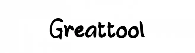
( Fonts by Studio Hello Good )
A bold, playful handwritten font with dynamic, irregular strokes.
 Herunterladen 321 Downloads@WebFont
 -
![GlyphBasic4 Frei Schriftart Herunterladen]() Herunterladen 321 Downloads@WebFont
Herunterladen 321 Downloads@WebFont -
( Fonts by MuraKnockout Media + Design - muraknockout.com. Personal-use only. For commercial use please contact owner. )
A modern, geometric font with clean lines and a minimalist aesthetic.
![Ciudad Nueva CAPS Frei Schriftart Herunterladen]() Herunterladen 321 Downloads@WebFont
Herunterladen 321 Downloads@WebFont -
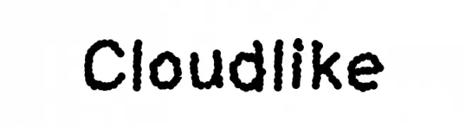
( charmingcharlie.co.nr/ )
A playful, cloud-textured font with a whimsical and approachable style.
![Cloudlike Frei Schriftart Herunterladen]() Herunterladen 321 Downloads@WebFont
Herunterladen 321 Downloads@WebFont -
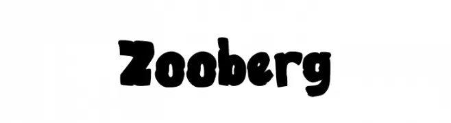
( Fonts by Muhammad Yafinuha )
A bold, playful font with a hand-drawn, graffiti-like style.
![Zooberg Frei Schriftart Herunterladen]() Herunterladen 321 Downloads@WebFont
Herunterladen 321 Downloads@WebFont -
-
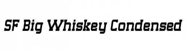
( Fonts by ShyFonts )
A bold, condensed font with angular, slanted characters for a dynamic look.
![SF Big Whiskey Condensed Frei Schriftart Herunterladen]() Herunterladen 321 Downloads@WebFont
Herunterladen 321 Downloads@WebFont -
![Flying Without Wings Frei Schriftart Herunterladen]() Herunterladen 321 Downloads@WebFont
Herunterladen 321 Downloads@WebFont -
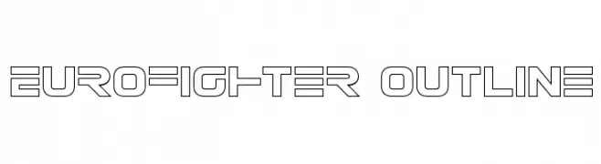
( Fonts by Daniel Zadorozny - www.iconian.com )
A bold, geometric outline font with a futuristic and technical look.
![Eurofighter Outline Frei Schriftart Herunterladen]() Herunterladen 321 Downloads@WebFont
Herunterladen 321 Downloads@WebFont -
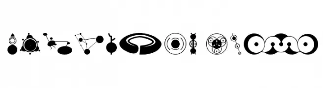
( Fonts by Astigmatic One Eye Typographic Institute - Brian J. Bonislawsky - astigmatic.com )
Abstract, crop circle-inspired dingbat font with bold geometric symbols.
![CropBats AOE Frei Schriftart Herunterladen]() Herunterladen 321 Downloads@WebFont
Herunterladen 321 Downloads@WebFont -
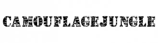
( Anthony Robinson - www.redbubble.com/people/anfa/portfolio )
A bold, rugged font with a jungle camouflage pattern and distressed texture.
![Camouflage Jungle Frei Schriftart Herunterladen]() Herunterladen 321 Downloads@WebFont
Herunterladen 321 Downloads@WebFont


Welche Schriften sind gerade am populärsten?
Poppins, Roboto, Montserrat, Open Sans und Lato sind wegen ihrer klaren Formen und breiten Einsetzbarkeit sehr gefragt – von Markenauftritt über Landingpages bis hin zu Postern.
Welche Fonts eignen sich für Logos?
Geometrische Sans‑Serifs (z. B. Poppins, Familien im Gotham‑Stil) sind ein häufiger Griff für sauberes, skalierbares Branding. Für eine persönlichere Note bleiben Scripts und Handschrift‑Stile beliebt. Kombinieren Sie einen prägnanten Headline‑Font mit einer neutralen Brotschrift für Wiedererkennung und Harmonie.
Wie oft wird die Top‑Liste aktualisiert?
Regelmäßig – basierend auf realen Downloads und Interaktionen. Schauen Sie öfter vorbei, um aufstrebende Favoriten früh zu entdecken.
💡 Tipp: Seite bookmarken – Trends wechseln schnell, und heutige Top‑Schriften inspirieren morgen vielleicht das Rebranding.