Willkommen bei den Top‑Schriften – hier treffen Beliebtheit und Qualität aufeinander. Das sind die in diesem Jahr am häufigsten heruntergeladenen und genutzten Fonts. Wenn Sie sichere Optionen für Logo, Web oder Social suchen, starten Sie hier.
Jeder Top‑Font überzeugt durch Balance, Lesbarkeit und Vielseitigkeit. Sie finden moderne Sans‑Serifs, elegante Scripts, Vintage‑Serifs und minimalistische Displays.
-
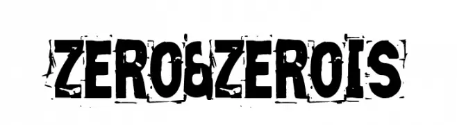
( Fonts by Vic Fieger )
A bold, distressed font with a grunge aesthetic.
 Herunterladen 320 Downloads@WebFont
 -
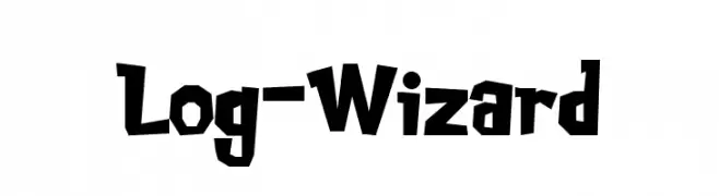
( Fonts by Pinisiart )
A bold, playful font with a hand-carved, rustic appearance.
![Log-Wizard Frei Schriftart Herunterladen]() Herunterladen 320 Downloads@WebFont
Herunterladen 320 Downloads@WebFont -
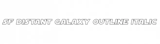
( Fonts by ShyFonts )
A futuristic, italicized outline font with bold, angular letterforms.
![SF Distant Galaxy Outline Italic Frei Schriftart Herunterladen]() Herunterladen 320 Downloads@WebFont
Herunterladen 320 Downloads@WebFont -
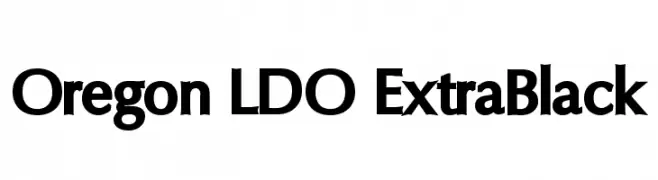
( Fonts by Luke Owens - Personal-use only. For commercial use please contact owner. )
A bold, geometric font with strong strokes and modern appeal.
![Oregon LDO ExtraBlack Frei Schriftart Herunterladen]() Herunterladen 320 Downloads@WebFont
Herunterladen 320 Downloads@WebFont -
( Fonts by Burhan Afif - hanscostudio.com - Personal-use only. For commercial use please contact owner. )
A bold, high-contrast font with elegant curves and sharp angles.
![Notted Frei Schriftart Herunterladen]() Herunterladen 320 Downloads@WebFont
Herunterladen 320 Downloads@WebFont -
-
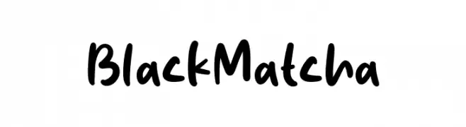
( Fonts by Origin Type )
Bold, playful handwritten font.
![Black Matcha Frei Schriftart Herunterladen]() Herunterladen 320 Downloads@WebFont
Herunterladen 320 Downloads@WebFont -
( Here Be Monsters - monsterswithin.com )
A modern, narrow sans-serif font with a sleek, vertical emphasis.
![HBM Serenity Sans Title Frei Schriftart Herunterladen]() Herunterladen 320 Downloads@WebFont
Herunterladen 320 Downloads@WebFont -
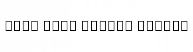
( Noto is a trademark of Google Inc. Noto fonts are open source. All Noto fonts are published under the SIL Open Font License, Version 1.1 )
A clean, modern font with uniform stroke width and balanced spacing.
![Noto Sans Arabic Medium Frei Schriftart Herunterladen]() Herunterladen 320 Downloads@WebFont
Herunterladen 320 Downloads@WebFont -
![612KosheyLine-Bold Frei Schriftart Herunterladen]() Herunterladen 320 Downloads@WebFont
Herunterladen 320 Downloads@WebFont -
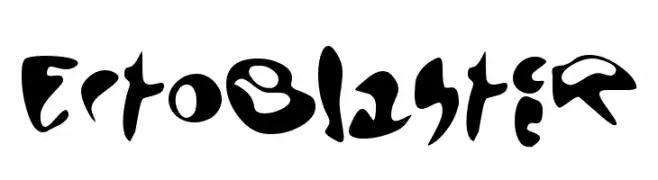
( Font by http://home.luna.nl/~xino/ )
A bold, abstract font with fluid, imaginative shapes and a futuristic feel.
![EctoBlaster Frei Schriftart Herunterladen]() Herunterladen 320 Downloads@WebFont
Herunterladen 320 Downloads@WebFont


Welche Schriften sind gerade am populärsten?
Poppins, Roboto, Montserrat, Open Sans und Lato sind wegen ihrer klaren Formen und breiten Einsetzbarkeit sehr gefragt – von Markenauftritt über Landingpages bis hin zu Postern.
Welche Fonts eignen sich für Logos?
Geometrische Sans‑Serifs (z. B. Poppins, Familien im Gotham‑Stil) sind ein häufiger Griff für sauberes, skalierbares Branding. Für eine persönlichere Note bleiben Scripts und Handschrift‑Stile beliebt. Kombinieren Sie einen prägnanten Headline‑Font mit einer neutralen Brotschrift für Wiedererkennung und Harmonie.
Wie oft wird die Top‑Liste aktualisiert?
Regelmäßig – basierend auf realen Downloads und Interaktionen. Schauen Sie öfter vorbei, um aufstrebende Favoriten früh zu entdecken.
💡 Tipp: Seite bookmarken – Trends wechseln schnell, und heutige Top‑Schriften inspirieren morgen vielleicht das Rebranding.