Willkommen bei den Top‑Schriften – hier treffen Beliebtheit und Qualität aufeinander. Das sind die in diesem Jahr am häufigsten heruntergeladenen und genutzten Fonts. Wenn Sie sichere Optionen für Logo, Web oder Social suchen, starten Sie hier.
Jeder Top‑Font überzeugt durch Balance, Lesbarkeit und Vielseitigkeit. Sie finden moderne Sans‑Serifs, elegante Scripts, Vintage‑Serifs und minimalistische Displays.
-
( Fonts by Brittney Murphy Design - Brittney Murphy - Personal-use only. For commercial use please contact owner. )
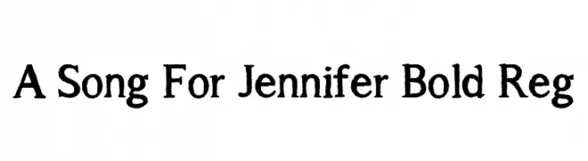
A bold, slightly distressed serif font with a hand-crafted feel.
 Herunterladen 7 Downloads@WebFont
 -
( Fonts by Brittney Murphy Design - Brittney Murphy - Personal-use only. For commercial use please contact owner. )
Bold, inline, all caps, italicized font with a modern style.
![Market Fresh Inline Bold All Caps Italic Frei Schriftart Herunterladen]() Herunterladen 7 Downloads@WebFont
Herunterladen 7 Downloads@WebFont -
( Fonts by Brittney Murphy Design - Brittney Murphy - Personal-use only. For commercial use please contact owner. )
A modern, italic uppercase font with a clean and dynamic style.
![Market Fresh All Caps Italic Rg Frei Schriftart Herunterladen]() Herunterladen 7 Downloads@WebFont
Herunterladen 7 Downloads@WebFont -
( Fonts by Brittney Murphy Design - Brittney Murphy - Personal-use only. For commercial use please contact owner. )
A bold, italicized font with a modern and dynamic style.
![Market Fresh Bold All Caps Italic Frei Schriftart Herunterladen]() Herunterladen 7 Downloads@WebFont
Herunterladen 7 Downloads@WebFont -
( Fonts by Brittney Murphy Design - Brittney Murphy - Personal-use only. For commercial use please contact owner. )
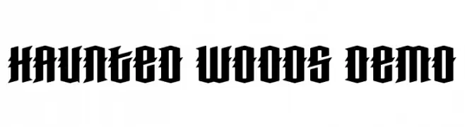
A bold, gothic-style font with sharp, angular edges and a dramatic presence.
![Haunted Woods Demo Frei Schriftart Herunterladen]() Herunterladen 7 Downloads@WebFont
Herunterladen 7 Downloads@WebFont -
( Fonts by Brittney Murphy Design - Brittney Murphy - Personal-use only. For commercial use please contact owner. )
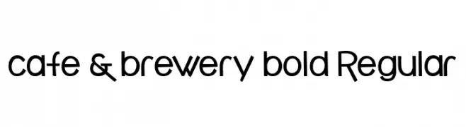
A playful, modern font with geometric and organic elements.
![cafe & brewery bold Regular Frei Schriftart Herunterladen]() Herunterladen 7 Downloads@WebFont
Herunterladen 7 Downloads@WebFont -
( Fonts by Brittney Murphy Design - Brittney Murphy - Personal-use only. For commercial use please contact owner. )
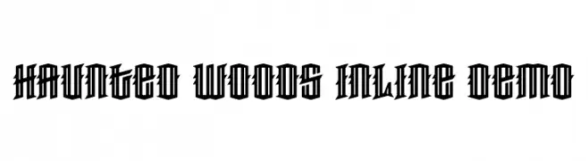
A bold, gothic-style font with sharp, angular lines and an inline design.
![Haunted Woods Inline Demo Frei Schriftart Herunterladen]() Herunterladen 7 Downloads@WebFont
Herunterladen 7 Downloads@WebFont -
( Fonts by Brittney Murphy Design - Brittney Murphy - Personal-use only. For commercial use please contact owner. )
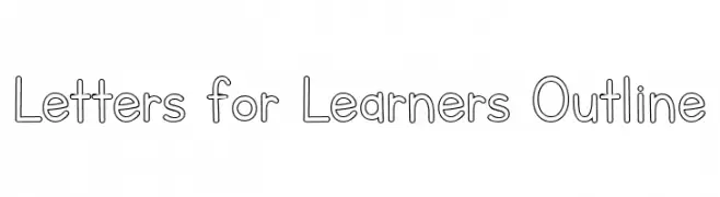
A playful outline font with rounded edges, perfect for educational and creative projects.
![Letters for Learners Outline Frei Schriftart Herunterladen]() Herunterladen 7 Downloads@WebFont
Herunterladen 7 Downloads@WebFont -
![Ol Chiki Bivash Shadow Frei Schriftart Herunterladen]() Herunterladen 6 Downloads
Herunterladen 6 Downloads -
( Fonts by Brittney Murphy Design - Brittney Murphy - Personal-use only. For commercial use please contact owner. )
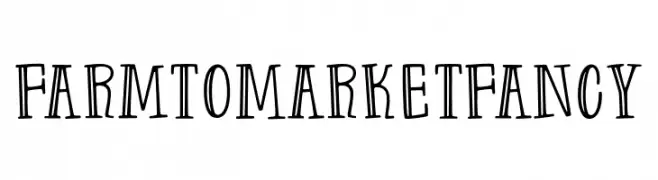
A playful, hand-drawn font with tall, narrow characters and a whimsical style.
![Farm to Market Fancy Frei Schriftart Herunterladen]() Herunterladen 6 Downloads@WebFont
Herunterladen 6 Downloads@WebFont -
( Fonts by Brittney Murphy Design - Brittney Murphy - Personal-use only. For commercial use please contact owner. )
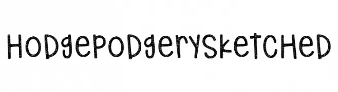
A playful, hand-drawn font with a sketched, textured style.
![Hodgepodgery Sketched Frei Schriftart Herunterladen]() Herunterladen 6 Downloads@WebFont
Herunterladen 6 Downloads@WebFont -
( Fonts by Brittney Murphy Design - Brittney Murphy - Personal-use only. For commercial use please contact owner. )
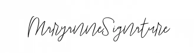
A fluid and elegant handwritten font with artistic loops and curves.
![Maryanne Signature Frei Schriftart Herunterladen]() Herunterladen 6 Downloads@WebFont
Herunterladen 6 Downloads@WebFont -
( Fonts by Brittney Murphy Design - Brittney Murphy - Personal-use only. For commercial use please contact owner. )
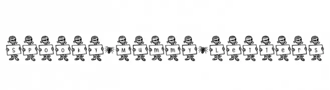
A whimsical, mummy-themed decorative font perfect for Halloween projects.
![Spooky*Mummy*Letters Frei Schriftart Herunterladen]() Herunterladen 6 Downloads@WebFont
Herunterladen 6 Downloads@WebFont -
( Faridul Haque Sponsoren Schriftart )
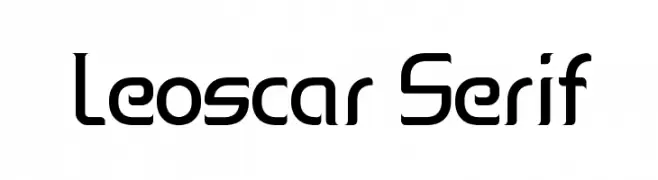
A modern, geometric font with a futuristic and structured design.
![Leoscar Serif Frei Schriftart Herunterladen]() Herunterladen 5 Downloads
Herunterladen 5 Downloads -
( Fonts by Brittney Murphy Design - Brittney Murphy - Personal-use only. For commercial use please contact owner. )
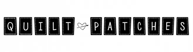
A playful, patchwork-style font with a hand-stitched appearance.
![Quilt*Patches Frei Schriftart Herunterladen]() Herunterladen 5 Downloads@WebFont
Herunterladen 5 Downloads@WebFont -
( Fonts by Brittney Murphy Design - Brittney Murphy - Personal-use only. For commercial use please contact owner. )
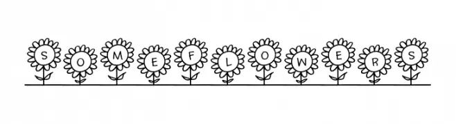
A playful font with characters inside sunflower designs, offering a whimsical and cheerful look.
![SoMeFlOwErS Frei Schriftart Herunterladen]() Herunterladen 5 Downloads@WebFont
Herunterladen 5 Downloads@WebFont -
( Fonts by Brittney Murphy Design - Brittney Murphy - Personal-use only. For commercial use please contact owner. )
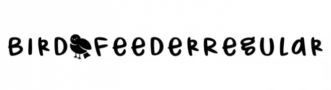
A playful, handwritten font with rounded, bold characters.
![Bird_Feeder Regular Frei Schriftart Herunterladen]() Herunterladen 5 Downloads@WebFont
Herunterladen 5 Downloads@WebFont -
( Fonts by Brittney Murphy Design - Brittney Murphy - Personal-use only. For commercial use please contact owner. )
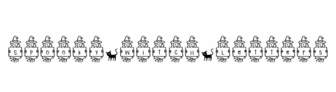
A whimsical font with letters held by cartoon witches, perfect for magical themes.
![Spooky*Witch*Letters Frei Schriftart Herunterladen]() Herunterladen 5 Downloads@WebFont
Herunterladen 5 Downloads@WebFont -
( Fonts by Brittney Murphy Design - Brittney Murphy - Personal-use only. For commercial use please contact owner. )
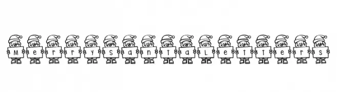
A festive font with letters held by cartoon Santa figures, perfect for holiday themes.
![Merry Santa Letters Frei Schriftart Herunterladen]() Herunterladen 5 Downloads@WebFont
Herunterladen 5 Downloads@WebFont -
( Parker Creative - Alan Parker - fontbundles.net/parker-creative Sponsoren Schriftart )
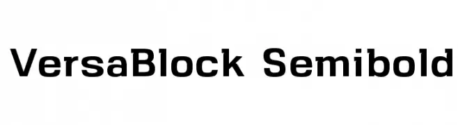
A bold, geometric font with clean lines and a modern style.
![VersaBlock Semibold Frei Schriftart Herunterladen]() Herunterladen 4 Downloads
Herunterladen 4 Downloads -
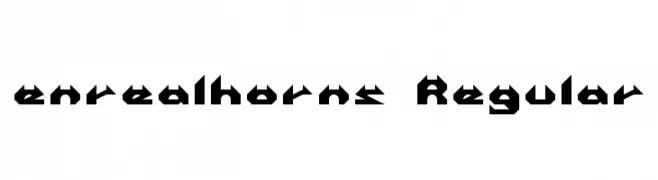
![enrealhorns Regular Frei Schriftart Herunterladen]() Herunterladen 4 Downloads
Herunterladen 4 Downloads -
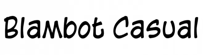
( Fonts by blambot.com Sponsoren Schriftart )
A playful, handwritten-style font with bold, rounded strokes.
![Blambot Casual Frei Schriftart Herunterladen]() Herunterladen 4 Downloads
Herunterladen 4 Downloads -
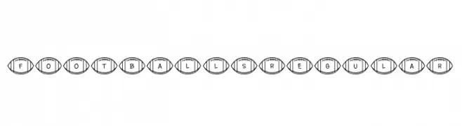
( Fonts by Brittney Murphy Design - Brittney Murphy - Personal-use only. For commercial use please contact owner. )
A decorative font with characters inside football shapes, perfect for sports themes.
![Footballs Regular Frei Schriftart Herunterladen]() Herunterladen 3 Downloads@WebFont
Herunterladen 3 Downloads@WebFont -
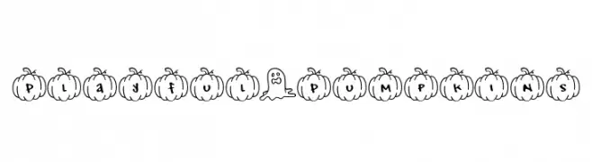
( Fonts by Brittney Murphy Design - Brittney Murphy - Personal-use only. For commercial use please contact owner. )
A playful, pumpkin-themed font with a hand-drawn, festive style.
![Playful*Pumpkins Frei Schriftart Herunterladen]() Herunterladen 3 Downloads@WebFont
Herunterladen 3 Downloads@WebFont -
( AND - andesign.hu Sponsoren Schriftart )
A dynamic, flame-like font with sharp serifs and flowing curves.
![barka Frei Schriftart Herunterladen]() Herunterladen 3 Downloads
Herunterladen 3 Downloads -
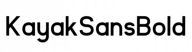
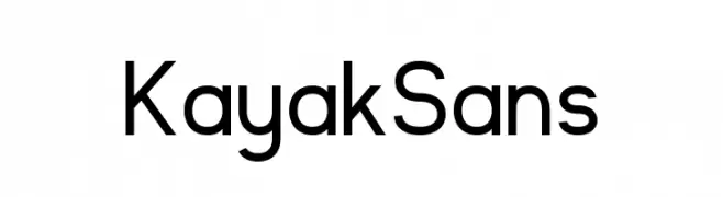
( Fonts by Jack Harvatt - HARVATT.HOUSE/STORE - Personal-use only. For commercial use please contact owner. Sponsoren Schriftart )
A bold, modern sans-serif font with clean lines and uniform strokes.
![Kayak Sans Bold Frei Schriftart Herunterladen]() Herunterladen 2 Downloads
Herunterladen 2 Downloads -
( Fonts by Jack Harvatt - HARVATT.HOUSE/STORE - Personal-use only. For commercial use please contact owner. Sponsoren Schriftart )
A modern, geometric sans-serif typeface with clean lines and uniform strokes.
![Kayak Sans Frei Schriftart Herunterladen]() Herunterladen 2 Downloads
Herunterladen 2 Downloads -
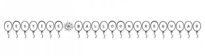
( Fonts by Brittney Murphy Design - Brittney Murphy - Personal-use only. For commercial use please contact owner. )
A playful font with characters inside balloons, perfect for festive occasions.
![Festive*Balloons Regular Frei Schriftart Herunterladen]() Herunterladen 2 Downloads@WebFont
Herunterladen 2 Downloads@WebFont -
![always * forever Frei Schriftart Herunterladen]() Herunterladen 1 Downloads@WebFont
Herunterladen 1 Downloads@WebFont -
![divlit Frei Schriftart Herunterladen]() Herunterladen 1 Downloads
Herunterladen 1 Downloads -
![Candara Frei Schriftart Herunterladen]() Herunterladen 0 Downloads
Herunterladen 0 Downloads -
![Oz Handicraft BT Frei Schriftart Herunterladen]() Herunterladen 0 Downloads
Herunterladen 0 Downloads -
( https://www.epicdelusion.com Sponsoren Schriftart )
A bold, distressed font with a weathered, vintage look.
![Venue_on_the_Beach Frei Schriftart Herunterladen]() Herunterladen 0 Downloads
Herunterladen 0 Downloads -
![Candara Bold Italic Frei Schriftart Herunterladen]() Herunterladen 0 Downloads
Herunterladen 0 Downloads -
( Fonts by Maniackers Design - www.mksd.jp Sponsoren Schriftart )
A futuristic, geometric font with continuous line characters and a modern aesthetic.
![Coil Ktl Frei Schriftart Herunterladen]() Herunterladen 0 Downloads
Herunterladen 0 Downloads


Welche Schriften sind gerade am populärsten?
Poppins, Roboto, Montserrat, Open Sans und Lato sind wegen ihrer klaren Formen und breiten Einsetzbarkeit sehr gefragt – von Markenauftritt über Landingpages bis hin zu Postern.
Welche Fonts eignen sich für Logos?
Geometrische Sans‑Serifs (z. B. Poppins, Familien im Gotham‑Stil) sind ein häufiger Griff für sauberes, skalierbares Branding. Für eine persönlichere Note bleiben Scripts und Handschrift‑Stile beliebt. Kombinieren Sie einen prägnanten Headline‑Font mit einer neutralen Brotschrift für Wiedererkennung und Harmonie.
Wie oft wird die Top‑Liste aktualisiert?
Regelmäßig – basierend auf realen Downloads und Interaktionen. Schauen Sie öfter vorbei, um aufstrebende Favoriten früh zu entdecken.
💡 Tipp: Seite bookmarken – Trends wechseln schnell, und heutige Top‑Schriften inspirieren morgen vielleicht das Rebranding.