Willkommen bei den Top‑Schriften – hier treffen Beliebtheit und Qualität aufeinander. Das sind die in diesem Jahr am häufigsten heruntergeladenen und genutzten Fonts. Wenn Sie sichere Optionen für Logo, Web oder Social suchen, starten Sie hier.
Jeder Top‑Font überzeugt durch Balance, Lesbarkeit und Vielseitigkeit. Sie finden moderne Sans‑Serifs, elegante Scripts, Vintage‑Serifs und minimalistische Displays.
-
( Fonts by Maniackers Design - www.mksd.jp Sponsoren Schriftart )
A bold, pixelated font with a digital, retro aesthetic.
 Herunterladen 0 Downloads
 -
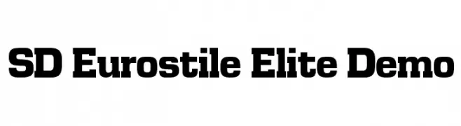
![SD Eurostile Elite Demo Frei Schriftart Herunterladen]() Herunterladen 0 Downloads
Herunterladen 0 Downloads -
![Holiday Pi BT Frei Schriftart Herunterladen]() Herunterladen 0 Downloads
Herunterladen 0 Downloads -
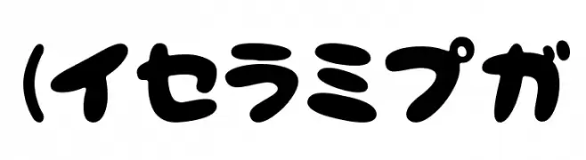
( Fonts by Maniackers Design - www.mksd.jp Sponsoren Schriftart )
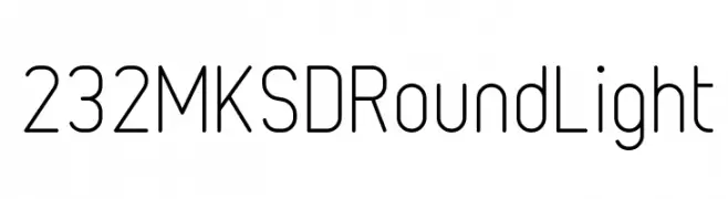
A modern sans-serif font with rounded edges and a clean, approachable style.
![232MKSDRoundLight Frei Schriftart Herunterladen]() Herunterladen 0 Downloads
Herunterladen 0 Downloads -
( Fonts by Maniackers Design - www.mksd.jp Sponsoren Schriftart )
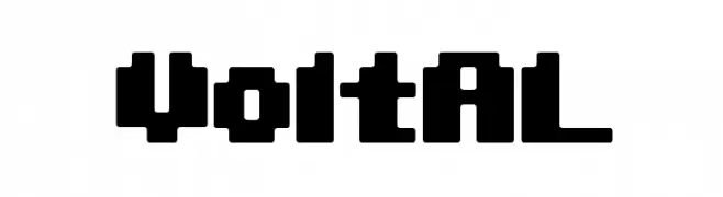
A bold, geometric font with a modern, industrial feel.
![VoltKT Frei Schriftart Herunterladen]() Herunterladen 0 Downloads
Herunterladen 0 Downloads -
( Fonts by Maniackers Design - www.mksd.jp Sponsoren Schriftart )
A modern, ultra-light font with geometric shapes and rounded edges.
![232MKSDRoundSuperUltraLight Frei Schriftart Herunterladen]() Herunterladen 0 Downloads
Herunterladen 0 Downloads -
( Fonts by Maniackers Design - www.mksd.jp Sponsoren Schriftart )
A modern, ultra-light, rounded font with a minimalist design.
![232MKSDRoundUltraLight Frei Schriftart Herunterladen]() Herunterladen 0 Downloads
Herunterladen 0 Downloads -
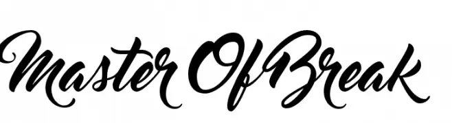
( Fonts by a Clement Nicolle - www.stereo-type.fr . Personal-use only. For commercial use please contact owner. Sponsoren Schriftart )
A dynamic, cursive script font with elegant, flowing letters and ornate details.
![MasterOfBreak Frei Schriftart Herunterladen]() Herunterladen 0 Downloads
Herunterladen 0 Downloads -
( Fonts by Maniackers Design - www.mksd.jp Sponsoren Schriftart )
A modern, rounded font with a clean and friendly appearance.
![232MKSDRoundMedium Frei Schriftart Herunterladen]() Herunterladen 0 Downloads
Herunterladen 0 Downloads -
( Fonts by a Clement Nicolle - www.stereo-type.fr . Personal-use only. For commercial use please contact owner. Sponsoren Schriftart )
A bold, cursive script font with elegant loops and swirls.
![Master Of Break Frei Schriftart Herunterladen]() Herunterladen 0 Downloads
Herunterladen 0 Downloads -
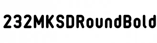
( Fonts by Maniackers Design - www.mksd.jp Sponsoren Schriftart )
A bold, rounded font with smooth, consistent strokes and a friendly appearance.
![232MKSDRoundBold Frei Schriftart Herunterladen]() Herunterladen 0 Downloads
Herunterladen 0 Downloads -
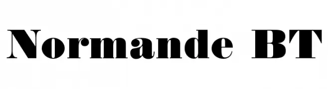
![Normande BT Frei Schriftart Herunterladen]() Herunterladen 0 Downloads
Herunterladen 0 Downloads -
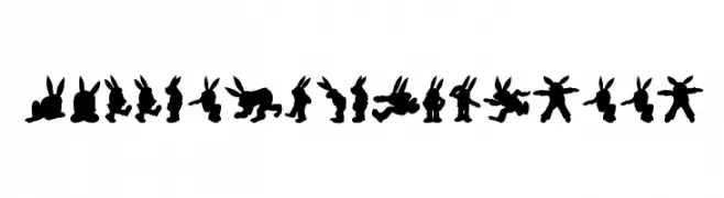
( Fonts by Maniackers Design - www.mksd.jp Sponsoren Schriftart )
A decorative font using rabbit silhouettes for each character.
![Rabbit35Silhouette Frei Schriftart Herunterladen]() Herunterladen 0 Downloads
Herunterladen 0 Downloads -
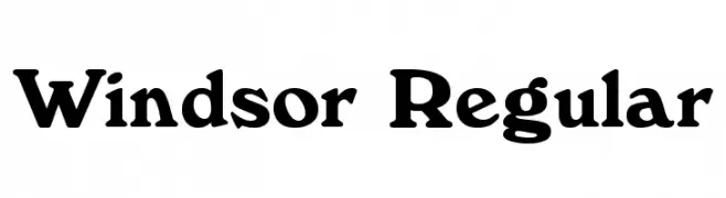
![Windsor Regular Frei Schriftart Herunterladen]() Herunterladen 0 Downloads
Herunterladen 0 Downloads -
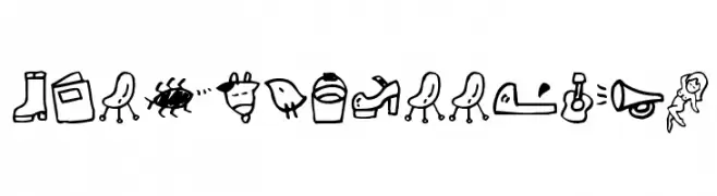
( Fonts by Maniackers Design - www.mksd.jp Sponsoren Schriftart )
Hand-drawn doodle font with holiday and summer-themed icons.
![HolidayIllustA Frei Schriftart Herunterladen]() Herunterladen 0 Downloads
Herunterladen 0 Downloads -
( Fonts by Maniackers Design - www.mksd.jp Sponsoren Schriftart )
A playful, bold font with rounded, bubbly characters and tight spacing.
![NeponHR Frei Schriftart Herunterladen]() Herunterladen 0 Downloads
Herunterladen 0 Downloads -
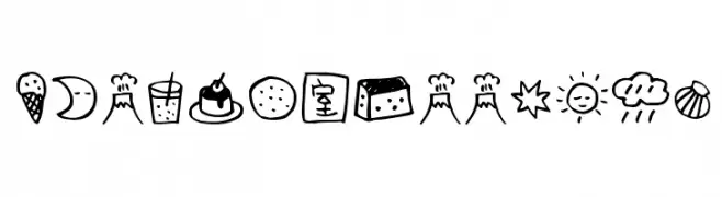
( Fonts by Maniackers Design - www.mksd.jp Sponsoren Schriftart )
Hand-drawn doodle font with playful food and object icons.
![HolidayIllustB Frei Schriftart Herunterladen]() Herunterladen 0 Downloads
Herunterladen 0 Downloads -
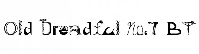
![Old Dreadful No.7 BT Frei Schriftart Herunterladen]() Herunterladen 0 Downloads
Herunterladen 0 Downloads -
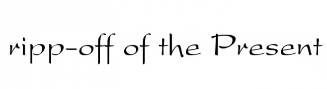
![ripp-off of the Present Frei Schriftart Herunterladen]() Herunterladen 0 Downloads
Herunterladen 0 Downloads -
( Fonts by Maniackers Design - www.mksd.jp Sponsoren Schriftart )
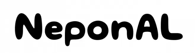
A playful, rounded font with a bold and bubbly appearance.
![NeponAL Frei Schriftart Herunterladen]() Herunterladen 0 Downloads
Herunterladen 0 Downloads -
( Fonts by Maniackers Design - www.mksd.jp Sponsoren Schriftart )
A modern, geometric font with clean lines and a minimalist style.
![243Ground AL Frei Schriftart Herunterladen]() Herunterladen 0 Downloads
Herunterladen 0 Downloads -
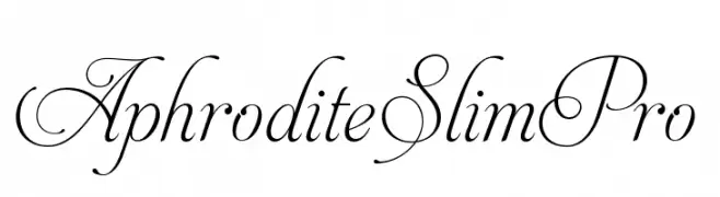
![AphroditeSlimPro Frei Schriftart Herunterladen]() Herunterladen 0 Downloads
Herunterladen 0 Downloads -
( Fonts by Maniackers Design - www.mksd.jp Sponsoren Schriftart )
A playful, bold font with rounded edges and a cartoonish style.
![NeponKT Frei Schriftart Herunterladen]() Herunterladen 0 Downloads
Herunterladen 0 Downloads -
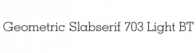
![Geometric Slabserif 703 Light BT Frei Schriftart Herunterladen]() Herunterladen 0 Downloads
Herunterladen 0 Downloads -
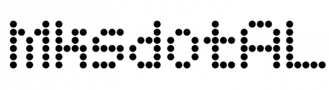
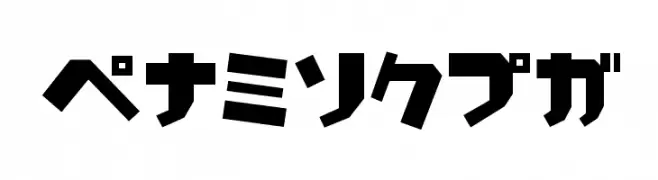
( Fonts by Maniackers Design - www.mksd.jp Sponsoren Schriftart )
A dot matrix font with a digital, retro aesthetic.
![MksdotAL Frei Schriftart Herunterladen]() Herunterladen 0 Downloads
Herunterladen 0 Downloads -
( Fonts by Maniackers Design - www.mksd.jp Sponsoren Schriftart )
Bold, geometric font with strong, uniform strokes and a modern, industrial feel.
![SardinenHR Frei Schriftart Herunterladen]() Herunterladen 0 Downloads
Herunterladen 0 Downloads -
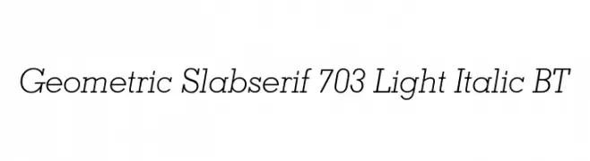
![Geometric Slabserif 703 Light Italic BT Frei Schriftart Herunterladen]() Herunterladen 0 Downloads
Herunterladen 0 Downloads -
( Fonts by Maniackers Design - www.mksd.jp Sponsoren Schriftart )
A bold, rounded, and modern font with a futuristic appeal.
![PocoUltraAl Frei Schriftart Herunterladen]() Herunterladen 0 Downloads
Herunterladen 0 Downloads -
( Fonts by Maniackers Design - www.mksd.jp Sponsoren Schriftart )
Bold, geometric font with blocky, angular characters for a modern, assertive look.
![SardinenKT Frei Schriftart Herunterladen]() Herunterladen 0 Downloads
Herunterladen 0 Downloads -
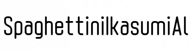
( Fonts by Maniackers Design - www.mksd.jp Sponsoren Schriftart )
A modern, rounded font with a clean, condensed style and uniform stroke width.
![SpaghettiniIkasumiAl Frei Schriftart Herunterladen]() Herunterladen 0 Downloads
Herunterladen 0 Downloads -
( Fonts by www.nr2154.com Sponsoren Schriftart )
A sophisticated font with high contrast and elegant, slender strokes.
![Luce Frei Schriftart Herunterladen]() Herunterladen 0 Downloads
Herunterladen 0 Downloads -
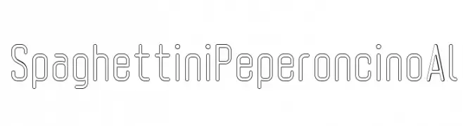
( Fonts by Maniackers Design - www.mksd.jp Sponsoren Schriftart )
A modern, geometric font with outlined characters and a minimalist style.
![SpaghettiniPeperoncinoAl Frei Schriftart Herunterladen]() Herunterladen 0 Downloads
Herunterladen 0 Downloads -
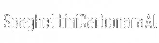
( Fonts by Maniackers Design - www.mksd.jp Sponsoren Schriftart )
A modern, geometric font with a hollow, outlined design and consistent stroke widths.
![SpaghettiniCarbonaraAl Frei Schriftart Herunterladen]() Herunterladen 0 Downloads
Herunterladen 0 Downloads -
( Fonts by Maniackers Design - www.mksd.jp Sponsoren Schriftart )
A bold, geometric font with high contrast and tight spacing, ideal for modern designs.
![LunchKT Frei Schriftart Herunterladen]() Herunterladen 0 Downloads
Herunterladen 0 Downloads -
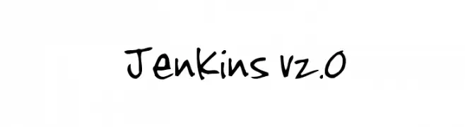
( Fonts by www.fontalicious.com Sponsoren Schriftart )
A lively, handwritten font with playful and dynamic letterforms.
![Jenkins v2.0 Frei Schriftart Herunterladen]() Herunterladen 0 Downloads
Herunterladen 0 Downloads


Welche Schriften sind gerade am populärsten?
Poppins, Roboto, Montserrat, Open Sans und Lato sind wegen ihrer klaren Formen und breiten Einsetzbarkeit sehr gefragt – von Markenauftritt über Landingpages bis hin zu Postern.
Welche Fonts eignen sich für Logos?
Geometrische Sans‑Serifs (z. B. Poppins, Familien im Gotham‑Stil) sind ein häufiger Griff für sauberes, skalierbares Branding. Für eine persönlichere Note bleiben Scripts und Handschrift‑Stile beliebt. Kombinieren Sie einen prägnanten Headline‑Font mit einer neutralen Brotschrift für Wiedererkennung und Harmonie.
Wie oft wird die Top‑Liste aktualisiert?
Regelmäßig – basierend auf realen Downloads und Interaktionen. Schauen Sie öfter vorbei, um aufstrebende Favoriten früh zu entdecken.
💡 Tipp: Seite bookmarken – Trends wechseln schnell, und heutige Top‑Schriften inspirieren morgen vielleicht das Rebranding.