Willkommen bei den Top‑Schriften – hier treffen Beliebtheit und Qualität aufeinander. Das sind die in diesem Jahr am häufigsten heruntergeladenen und genutzten Fonts. Wenn Sie sichere Optionen für Logo, Web oder Social suchen, starten Sie hier.
Jeder Top‑Font überzeugt durch Balance, Lesbarkeit und Vielseitigkeit. Sie finden moderne Sans‑Serifs, elegante Scripts, Vintage‑Serifs und minimalistische Displays.
-
( Fonts by Maniackers Design - www.mksd.jp Sponsoren Schriftart )
A bold, geometric font with rounded edges and consistent stroke widths.
 Herunterladen 0 Downloads
 -
( Fonts by Maniackers Design - www.mksd.jp Sponsoren Schriftart )
A playful, bold font with rounded, dynamic letterforms.
![SnailKT Frei Schriftart Herunterladen]() Herunterladen 0 Downloads
Herunterladen 0 Downloads -
( Fonts by creativetacos.com.Personal-use only. For commercial use please contact owner. Sponsoren Schriftart )
A hand-drawn, narrow font with a whimsical and artistic style.
![Ibrat Frei Schriftart Herunterladen]() Herunterladen 0 Downloads
Herunterladen 0 Downloads -
( Fonts by Maniackers Design - www.mksd.jp Sponsoren Schriftart )
A playful, bold font with rounded, bubbly characters and a whimsical style.
![MeltLvOneAl Frei Schriftart Herunterladen]() Herunterladen 0 Downloads
Herunterladen 0 Downloads -
( Fonts by Maniackers Design - www.mksd.jp Sponsoren Schriftart )
A bold, decorative font with dynamic curves and sharp edges.
![Airplane2AL Frei Schriftart Herunterladen]() Herunterladen 0 Downloads
Herunterladen 0 Downloads -
( Fonts by Maniackers Design - www.mksd.jp Sponsoren Schriftart )
A playful, bold font with quirky, rounded characters and a whimsical style.
![SnailAL Frei Schriftart Herunterladen]() Herunterladen 0 Downloads
Herunterladen 0 Downloads -
( Fonts by creativetacos.com.Personal-use only. For commercial use please contact owner. Sponsoren Schriftart )
A tall, narrow font with a geometric and modern style.
![Jassmine Demo Frei Schriftart Herunterladen]() Herunterladen 0 Downloads
Herunterladen 0 Downloads -
( Fonts by Maniackers Design - www.mksd.jp Sponsoren Schriftart )
A playful, bold font with organic, melting shapes.
![MeltThreeLvAl Frei Schriftart Herunterladen]() Herunterladen 0 Downloads
Herunterladen 0 Downloads -
( Fonts by Maniackers Design - www.mksd.jp Sponsoren Schriftart )
A bold, futuristic font with sharp, angular edges and a dynamic style.
![Airplane2KT Frei Schriftart Herunterladen]() Herunterladen 0 Downloads
Herunterladen 0 Downloads -
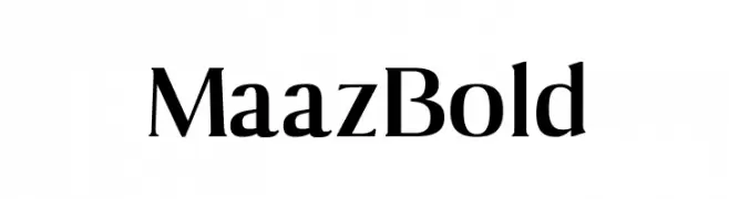
( Fonts by creativetacos.com.Personal-use only. For commercial use please contact owner. Sponsoren Schriftart )
A bold, high-contrast serif font with elegant and dramatic strokes.
![Maaz Bold Frei Schriftart Herunterladen]() Herunterladen 0 Downloads
Herunterladen 0 Downloads -
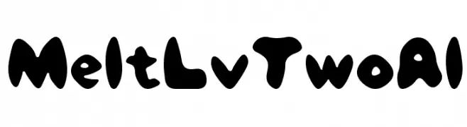
( Fonts by Maniackers Design - www.mksd.jp Sponsoren Schriftart )
A playful, bold font with rounded, blob-like characters and a whimsical style.
![MeltLvTwoAl Frei Schriftart Herunterladen]() Herunterladen 0 Downloads
Herunterladen 0 Downloads -
( Ryan Brotherston - fontstruct.com/fontstructors/rilencavy/public Sponsoren Schriftart )
A bold, modern font with a playful, stencil-like design.
![Twitch RC Regular Frei Schriftart Herunterladen]() Herunterladen 0 Downloads
Herunterladen 0 Downloads -
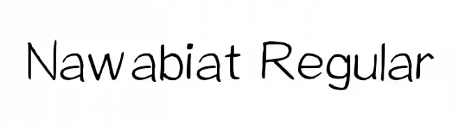
( Fonts by creativetacos.com.Personal-use only. For commercial use please contact owner. Sponsoren Schriftart )
A playful, handwritten font with a casual and friendly style.
![Nawabiat Regular Frei Schriftart Herunterladen]() Herunterladen 0 Downloads
Herunterladen 0 Downloads -
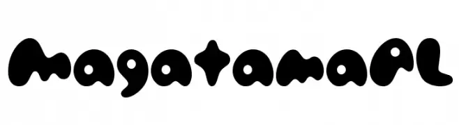
( Fonts by Maniackers Design - www.mksd.jp Sponsoren Schriftart )
A playful, bold font with rounded, blob-like characters.
![MagatamaAL Frei Schriftart Herunterladen]() Herunterladen 0 Downloads
Herunterladen 0 Downloads -
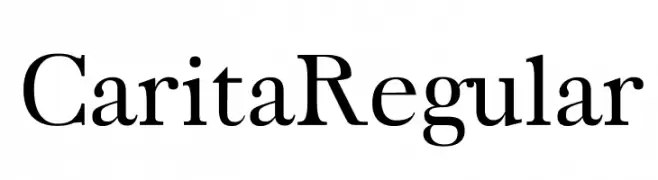
( Fonts by creativetacos.com.Personal-use only. For commercial use please contact owner. Sponsoren Schriftart )
A classic serif typeface with elegant curves and refined structure.
![Carita Regular Frei Schriftart Herunterladen]() Herunterladen 0 Downloads
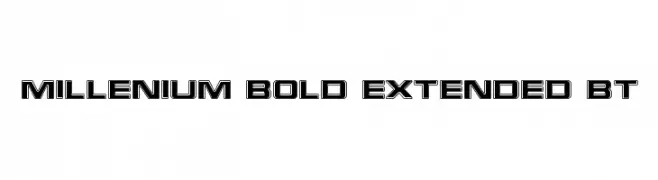
Herunterladen 0 Downloads -
![Millenium Bold Extended BT Frei Schriftart Herunterladen]() Herunterladen 0 Downloads
Herunterladen 0 Downloads -
( Fonts by Maniackers Design - www.mksd.jp Sponsoren Schriftart )
A geometric, three-line stroke font with a modern and structured appearance.
![PinponpanTwohr Frei Schriftart Herunterladen]() Herunterladen 0 Downloads
Herunterladen 0 Downloads -
( Fonts by creativetacos.com.Personal-use only. For commercial use please contact owner. Sponsoren Schriftart )
A playful, handcrafted font with a whimsical, paper-cut style.
![Papercutting Frei Schriftart Herunterladen]() Herunterladen 0 Downloads
Herunterladen 0 Downloads -
( Fonts by Maniackers Design - www.mksd.jp Sponsoren Schriftart )
Bold, geometric sans-serif Japanese font with strong, clean lines.
![240mksdKt Frei Schriftart Herunterladen]() Herunterladen 0 Downloads
Herunterladen 0 Downloads -
( Fonts by Maniackers Design - www.mksd.jp Sponsoren Schriftart )
A decorative, geometric font with outlined, hollow characters.
![PinponpanThreeHR Frei Schriftart Herunterladen]() Herunterladen 0 Downloads
Herunterladen 0 Downloads -
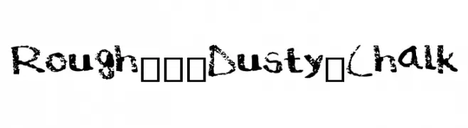
( Fonts by creativetacos.com.Personal-use only. For commercial use please contact owner. Sponsoren Schriftart )
A rugged, textured font with a chalk-like, distressed appearance.
![Rough___Dusty_Chalk Frei Schriftart Herunterladen]() Herunterladen 0 Downloads
Herunterladen 0 Downloads -
( Fonts by Maniackers Design - www.mksd.jp Sponsoren Schriftart )
A bold slab serif font with a strong, authoritative appearance.
![240mksdAlA Frei Schriftart Herunterladen]() Herunterladen 0 Downloads
Herunterladen 0 Downloads -
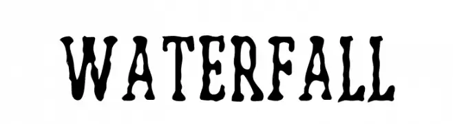
![WATERFALL Frei Schriftart Herunterladen]() Herunterladen 0 Downloads
Herunterladen 0 Downloads -
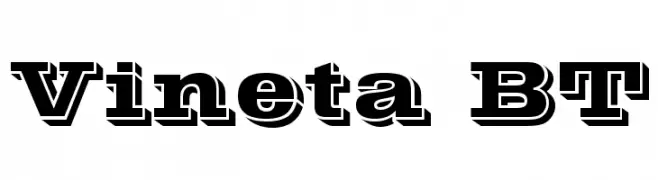
![Vineta BT Frei Schriftart Herunterladen]() Herunterladen 0 Downloads
Herunterladen 0 Downloads -
( Fonts by Maniackers Design - www.mksd.jp Sponsoren Schriftart )
A bold, geometric font with a modern, digital aesthetic.
![PinponpanFourHr Frei Schriftart Herunterladen]() Herunterladen 0 Downloads
Herunterladen 0 Downloads -
( Fonts by creativetacos.com.Personal-use only. For commercial use please contact owner. Sponsoren Schriftart )
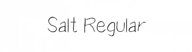
A playful, handwritten font with thin, irregular strokes.
![Salt Regular Frei Schriftart Herunterladen]() Herunterladen 0 Downloads
Herunterladen 0 Downloads -
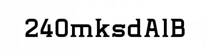
( Fonts by Maniackers Design - www.mksd.jp Sponsoren Schriftart )
A bold slab serif font with strong, block-like serifs and a robust design.
![240mksdAlB Frei Schriftart Herunterladen]() Herunterladen 0 Downloads
Herunterladen 0 Downloads -
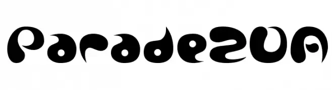
( Fonts by Maniackers Design - www.mksd.jp Sponsoren Schriftart )
A bold, playful font with organic curves and a retro-modern vibe.
![Parade20A Frei Schriftart Herunterladen]() Herunterladen 0 Downloads
Herunterladen 0 Downloads -
( Fonts by Maniackers Design - www.mksd.jp Sponsoren Schriftart )
A pixelated, retro-style font with a blocky, digital appearance.
![HachipochiEightKt Frei Schriftart Herunterladen]() Herunterladen 0 Downloads
Herunterladen 0 Downloads -
( Fonts by creativetacos.com.Personal-use only. For commercial use please contact owner. Sponsoren Schriftart )
An elegant script font with flowing, interconnected letters and a calligraphic style.
![Shimla La Frei Schriftart Herunterladen]() Herunterladen 0 Downloads
Herunterladen 0 Downloads -
( Fonts by Maniackers Design - www.mksd.jp Sponsoren Schriftart )
A bold, geometric font with a blocky, uniform design.
![CollageHardRmxAl Frei Schriftart Herunterladen]() Herunterladen 0 Downloads
Herunterladen 0 Downloads -
![Delicate Bold Frei Schriftart Herunterladen]() Herunterladen 0 Downloads
Herunterladen 0 Downloads -
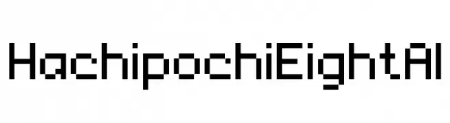
( Fonts by Maniackers Design - www.mksd.jp Sponsoren Schriftart )
A pixelated, blocky font inspired by retro digital displays.
![HachipochiEightAl Frei Schriftart Herunterladen]() Herunterladen 0 Downloads
Herunterladen 0 Downloads -
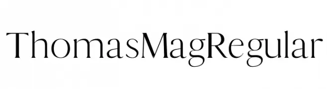
( Fonts by creativetacos.com.Personal-use only. For commercial use please contact owner. Sponsoren Schriftart )
A refined serif font with elegant, thin strokes and a timeless aesthetic.
![Thomas Mag Regular Frei Schriftart Herunterladen]() Herunterladen 0 Downloads
Herunterladen 0 Downloads -
( Fonts by Maniackers Design - www.mksd.jp Sponsoren Schriftart )
A bold, geometric font with a modern, futuristic style.
![CollageRmxAl Frei Schriftart Herunterladen]() Herunterladen 0 Downloads
Herunterladen 0 Downloads


Welche Schriften sind gerade am populärsten?
Poppins, Roboto, Montserrat, Open Sans und Lato sind wegen ihrer klaren Formen und breiten Einsetzbarkeit sehr gefragt – von Markenauftritt über Landingpages bis hin zu Postern.
Welche Fonts eignen sich für Logos?
Geometrische Sans‑Serifs (z. B. Poppins, Familien im Gotham‑Stil) sind ein häufiger Griff für sauberes, skalierbares Branding. Für eine persönlichere Note bleiben Scripts und Handschrift‑Stile beliebt. Kombinieren Sie einen prägnanten Headline‑Font mit einer neutralen Brotschrift für Wiedererkennung und Harmonie.
Wie oft wird die Top‑Liste aktualisiert?
Regelmäßig – basierend auf realen Downloads und Interaktionen. Schauen Sie öfter vorbei, um aufstrebende Favoriten früh zu entdecken.
💡 Tipp: Seite bookmarken – Trends wechseln schnell, und heutige Top‑Schriften inspirieren morgen vielleicht das Rebranding.