Willkommen bei den Top‑Schriften – hier treffen Beliebtheit und Qualität aufeinander. Das sind die in diesem Jahr am häufigsten heruntergeladenen und genutzten Fonts. Wenn Sie sichere Optionen für Logo, Web oder Social suchen, starten Sie hier.
Jeder Top‑Font überzeugt durch Balance, Lesbarkeit und Vielseitigkeit. Sie finden moderne Sans‑Serifs, elegante Scripts, Vintage‑Serifs und minimalistische Displays.
-
( Fonts by Maniackers Design - www.mksd.jp Sponsoren Schriftart )
A playful, informal handwritten font with thin, irregular strokes.
 Herunterladen 0 Downloads
 -
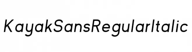
( Fonts by Jack Harvatt - HARVATT.HOUSE/STORE - Personal-use only. For commercial use please contact owner. Sponsoren Schriftart )
A modern sans-serif font with an italic slant, offering clarity and elegance.
![Kayak Sans Regular Italic Frei Schriftart Herunterladen]() Herunterladen 0 Downloads
Herunterladen 0 Downloads -
( Fonts by Maniackers Design - www.mksd.jp Sponsoren Schriftart )
A bold, geometric font with a futuristic and digital aesthetic.
![Astro3AL Frei Schriftart Herunterladen]() Herunterladen 0 Downloads
Herunterladen 0 Downloads -
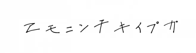
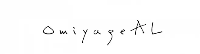
( Fonts by Maniackers Design - www.mksd.jp Sponsoren Schriftart )
A casual, handwritten font with a playful and informal style.
![OmiyageAL Frei Schriftart Herunterladen]() Herunterladen 0 Downloads
Herunterladen 0 Downloads -
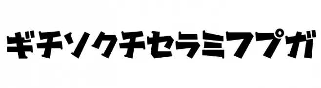
( Fonts by Maniackers Design - www.mksd.jp Sponsoren Schriftart )
A bold, angular font with a playful and dynamic style.
![Gachapon2KT Frei Schriftart Herunterladen]() Herunterladen 0 Downloads
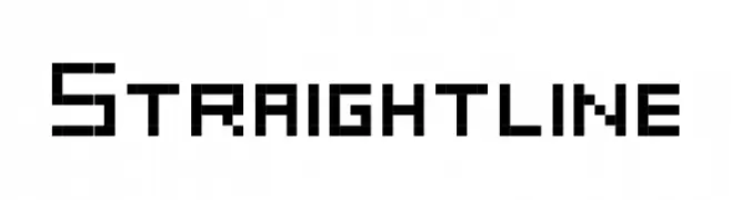
Herunterladen 0 Downloads -
![Straightline Frei Schriftart Herunterladen]() Herunterladen 0 Downloads
Herunterladen 0 Downloads -
( Fonts by Maniackers Design - www.mksd.jp Sponsoren Schriftart )
A casual, handwritten font with a playful and informal style.
![OmiyageHR Frei Schriftart Herunterladen]() Herunterladen 0 Downloads
Herunterladen 0 Downloads -
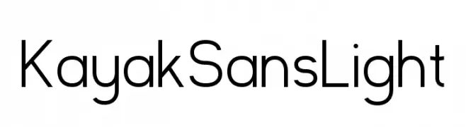
( Fonts by Jack Harvatt - HARVATT.HOUSE/STORE - Personal-use only. For commercial use please contact owner. Sponsoren Schriftart )
A modern, light sans-serif font with clean lines and balanced proportions.
![Kayak Sans Light Frei Schriftart Herunterladen]() Herunterladen 0 Downloads
Herunterladen 0 Downloads -
( Fonts by Maniackers Design - www.mksd.jp Sponsoren Schriftart )
A futuristic and abstract font with bold, geometric shapes and rounded edges.
![DorisorangeKT Frei Schriftart Herunterladen]() Herunterladen 0 Downloads
Herunterladen 0 Downloads -
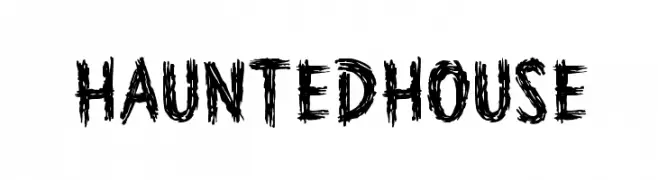
( Font by www.houseind.com Sponsoren Schriftart )
A spooky, jagged font with a haunted, eerie appearance.
![HauntedHouse Frei Schriftart Herunterladen]() Herunterladen 0 Downloads
Herunterladen 0 Downloads -
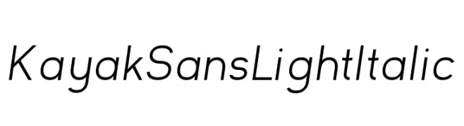
( Fonts by Jack Harvatt - HARVATT.HOUSE/STORE - Personal-use only. For commercial use please contact owner. Sponsoren Schriftart )
A modern, light, and italic sans-serif font with clean lines and a sleek design.
![Kayak Sans Light Italic Frei Schriftart Herunterladen]() Herunterladen 0 Downloads
Herunterladen 0 Downloads -
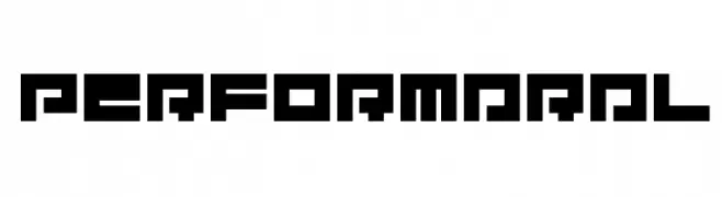
( Fonts by Maniackers Design - www.mksd.jp Sponsoren Schriftart )
A bold, geometric font with a futuristic, digital aesthetic.
![PerformarAL Frei Schriftart Herunterladen]() Herunterladen 0 Downloads
Herunterladen 0 Downloads -
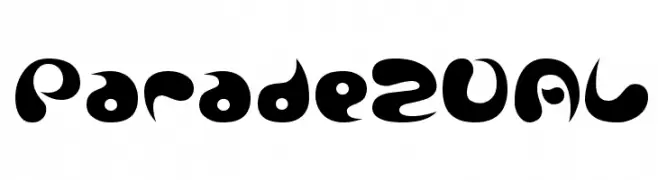
( Fonts by Maniackers Design - www.mksd.jp Sponsoren Schriftart )
A bold, playful font with organic, fluid shapes and high contrast.
![Parade20AL Frei Schriftart Herunterladen]() Herunterladen 0 Downloads
Herunterladen 0 Downloads -
( Fonts by Maniackers Design - www.mksd.jp Sponsoren Schriftart )
A bold, rounded font with a playful and modern aesthetic.
![MerumoKt Frei Schriftart Herunterladen]() Herunterladen 0 Downloads
Herunterladen 0 Downloads -
![Wedding Text BT Frei Schriftart Herunterladen]() Herunterladen 0 Downloads
Herunterladen 0 Downloads -
( Fonts by Maniackers Design - www.mksd.jp Sponsoren Schriftart )
A bold, playful font with a bubbly, cartoonish style and high contrast strokes.
![Parade20KT Frei Schriftart Herunterladen]() Herunterladen 0 Downloads
Herunterladen 0 Downloads -
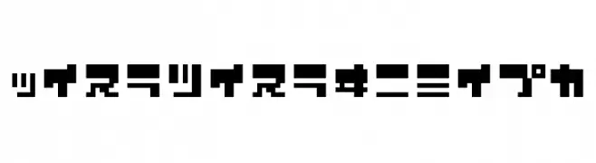
( Fonts by Maniackers Design - www.mksd.jp Sponsoren Schriftart )
A bold, pixelated font with a retro digital aesthetic.
![ZerozeroNineHr Frei Schriftart Herunterladen]() Herunterladen 0 Downloads
Herunterladen 0 Downloads -
( Fonts by creativetacos.com.Personal-use only. For commercial use please contact owner. Sponsoren Schriftart )
A wavy, hand-drawn font with a whimsical, energetic style.
![Aaric Frei Schriftart Herunterladen]() Herunterladen 0 Downloads
Herunterladen 0 Downloads -
( Fonts by Maniackers Design - www.mksd.jp Sponsoren Schriftart )
A bold, rounded font with a playful and modern style.
![MerumoAl Frei Schriftart Herunterladen]() Herunterladen 0 Downloads
Herunterladen 0 Downloads -
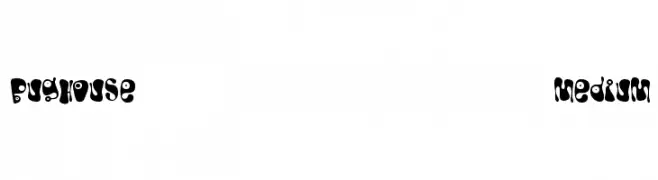
( Font by www.houseind.com Sponsoren Schriftart )
A playful, bold font with organic shapes and quirky details.
![Bughouse Medium Frei Schriftart Herunterladen]() Herunterladen 0 Downloads
Herunterladen 0 Downloads -
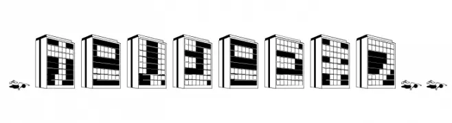
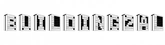
( Fonts by Maniackers Design - www.mksd.jp Sponsoren Schriftart )
A font where each character is designed as a building, featuring architectural elements.
![Building2KT Frei Schriftart Herunterladen]() Herunterladen 0 Downloads
Herunterladen 0 Downloads -
( Fonts by Maniackers Design - www.mksd.jp Sponsoren Schriftart )
A bold, pixelated font with a retro digital aesthetic.
![ZerozeroNineKt Frei Schriftart Herunterladen]() Herunterladen 0 Downloads
Herunterladen 0 Downloads -
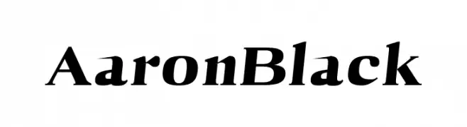
( Fonts by creativetacos.com.Personal-use only. For commercial use please contact owner. Sponsoren Schriftart )
A bold, italic serif font with dynamic strokes and elegant curves.
![Aaron Black Frei Schriftart Herunterladen]() Herunterladen 0 Downloads
Herunterladen 0 Downloads -
( Fonts by Maniackers Design - www.mksd.jp Sponsoren Schriftart )
A bold, geometric font with a modern and structured appearance.
![071MKSDKTBold Frei Schriftart Herunterladen]() Herunterladen 0 Downloads
Herunterladen 0 Downloads -
( Fonts by Maniackers Design - www.mksd.jp Sponsoren Schriftart )
A display font styled as architectural buildings with a modern, urban feel.
![Building2AL Frei Schriftart Herunterladen]() Herunterladen 0 Downloads
Herunterladen 0 Downloads -
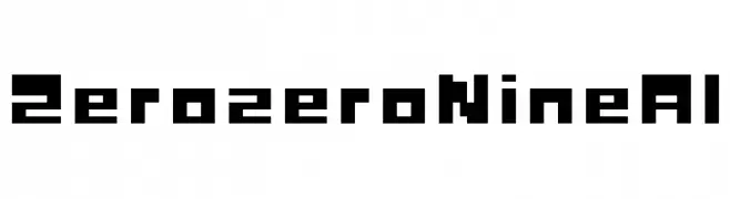
( Fonts by Maniackers Design - www.mksd.jp Sponsoren Schriftart )
A bold, pixelated font with a retro digital aesthetic.
![ZerozeroNineAl Frei Schriftart Herunterladen]() Herunterladen 0 Downloads
Herunterladen 0 Downloads -
( Fonts by creativetacos.com.Personal-use only. For commercial use please contact owner. Sponsoren Schriftart )
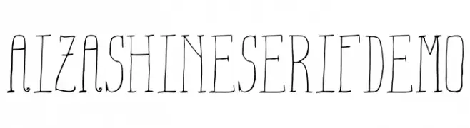
A whimsical, hand-drawn font with tall, narrow characters and playful details.
![Aiza Shine Serif Demo Frei Schriftart Herunterladen]() Herunterladen 0 Downloads
Herunterladen 0 Downloads -
( Fonts by Maniackers Design - www.mksd.jp Sponsoren Schriftart )
A bold, geometric font with a strong, modern presence.
![071MKSDBoldA Frei Schriftart Herunterladen]() Herunterladen 0 Downloads
Herunterladen 0 Downloads -
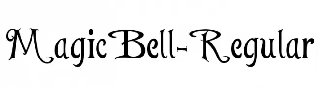
![MagicBell-Regular Frei Schriftart Herunterladen]() Herunterladen 0 Downloads
Herunterladen 0 Downloads -
( Fonts by creativetacos.com.Personal-use only. For commercial use please contact owner. Sponsoren Schriftart )
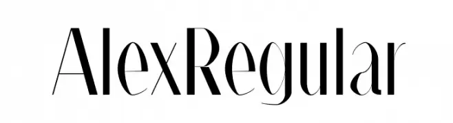
A modern, elegant font with high contrast and slender letterforms.
![Alex Regular Frei Schriftart Herunterladen]() Herunterladen 0 Downloads
Herunterladen 0 Downloads -
( Fonts by Maniackers Design - www.mksd.jp Sponsoren Schriftart )
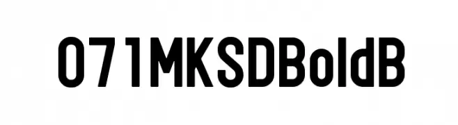
A bold, modern font with a geometric structure and uniform thickness.
![071MKSDBoldB Frei Schriftart Herunterladen]() Herunterladen 0 Downloads
Herunterladen 0 Downloads -
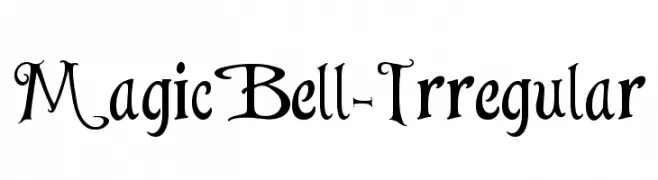
![MagicBell-Irregular Frei Schriftart Herunterladen]() Herunterladen 0 Downloads
Herunterladen 0 Downloads -
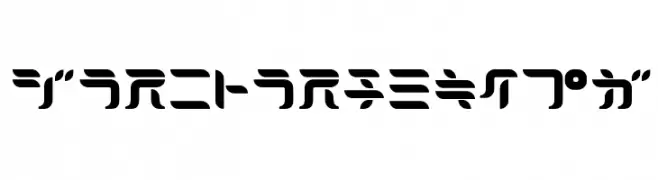
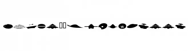
( Fonts by Maniackers Design - www.mksd.jp Sponsoren Schriftart )
A bold, UFO-themed silhouette font with imaginative spacecraft designs.
![UFOnt51Silhouette Frei Schriftart Herunterladen]() Herunterladen 0 Downloads
Herunterladen 0 Downloads -
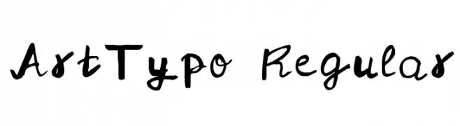
( Fonts by creativetacos.com.Personal-use only. For commercial use please contact owner. Sponsoren Schriftart )
A playful, artistic handwritten font with dynamic strokes.
![ArtTypo Regular Frei Schriftart Herunterladen]() Herunterladen 0 Downloads
Herunterladen 0 Downloads -
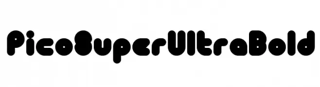
( Fonts by Maniackers Design - www.mksd.jp Sponsoren Schriftart )
A bold, playful font with rounded, bubble-like characters.
![PicoSuperUltraBold Frei Schriftart Herunterladen]() Herunterladen 0 Downloads
Herunterladen 0 Downloads


Welche Schriften sind gerade am populärsten?
Poppins, Roboto, Montserrat, Open Sans und Lato sind wegen ihrer klaren Formen und breiten Einsetzbarkeit sehr gefragt – von Markenauftritt über Landingpages bis hin zu Postern.
Welche Fonts eignen sich für Logos?
Geometrische Sans‑Serifs (z. B. Poppins, Familien im Gotham‑Stil) sind ein häufiger Griff für sauberes, skalierbares Branding. Für eine persönlichere Note bleiben Scripts und Handschrift‑Stile beliebt. Kombinieren Sie einen prägnanten Headline‑Font mit einer neutralen Brotschrift für Wiedererkennung und Harmonie.
Wie oft wird die Top‑Liste aktualisiert?
Regelmäßig – basierend auf realen Downloads und Interaktionen. Schauen Sie öfter vorbei, um aufstrebende Favoriten früh zu entdecken.
💡 Tipp: Seite bookmarken – Trends wechseln schnell, und heutige Top‑Schriften inspirieren morgen vielleicht das Rebranding.