Willkommen bei den Top‑Schriften – hier treffen Beliebtheit und Qualität aufeinander. Das sind die in diesem Jahr am häufigsten heruntergeladenen und genutzten Fonts. Wenn Sie sichere Optionen für Logo, Web oder Social suchen, starten Sie hier.
Jeder Top‑Font überzeugt durch Balance, Lesbarkeit und Vielseitigkeit. Sie finden moderne Sans‑Serifs, elegante Scripts, Vintage‑Serifs und minimalistische Displays.
-
( Fonts by www.junkohanhero.com - Personal-use only. For commercial use please contact owner. )
A playful, hand-drawn font with a textured, informal style.
 Herunterladen 314 Downloads@WebFont
 -
![VN-TienGiang*H Bold Frei Schriftart Herunterladen]() Herunterladen 314 Downloads@WebFont
Herunterladen 314 Downloads@WebFont -
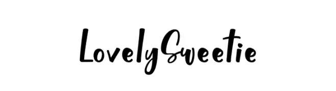
( Fonts by Almarkhatype - Abdul Malik Wisnu - Personal-use only. For commercial use please contact owner. )
A playful and expressive handwritten font with fluid strokes.
![Lovely Sweetie Frei Schriftart Herunterladen]() Herunterladen 314 Downloads@WebFont
Herunterladen 314 Downloads@WebFont -
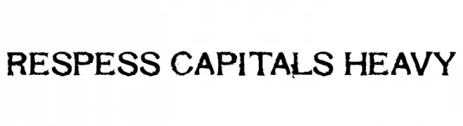
( Fonts by www.abecedarienne.com )
A bold, distressed font with a rugged, vintage style.
![Respess Capitals Heavy Frei Schriftart Herunterladen]() Herunterladen 314 Downloads@WebFont
Herunterladen 314 Downloads@WebFont -
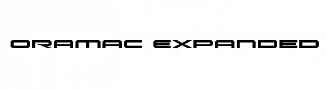
( Iconian Fonts - Daniel Zadorozny - www.iconian.com )
A futuristic, geometric font with expanded letterforms and a tech-inspired design.
![Oramac Expanded Frei Schriftart Herunterladen]() Herunterladen 314 Downloads@WebFont
Herunterladen 314 Downloads@WebFont -
-
( Fonts by Bangkit Tri Setiadi )
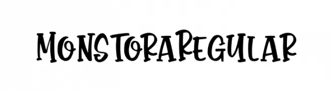
A playful, bold font with a hand-drawn, whimsical style.
![Monstora Regular Frei Schriftart Herunterladen]() Herunterladen 314 Downloads@WebFont
Herunterladen 314 Downloads@WebFont -
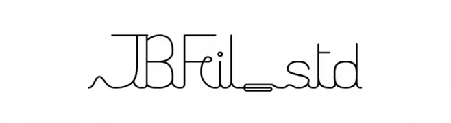
![JBFil_std Frei Schriftart Herunterladen]() Herunterladen 314 Downloads@WebFont
Herunterladen 314 Downloads@WebFont -
( Fonts by a Emily Spadoni - http://creativemarket.com/emilyspadoni/. Personal-use only. For commercial use please contact owner. )
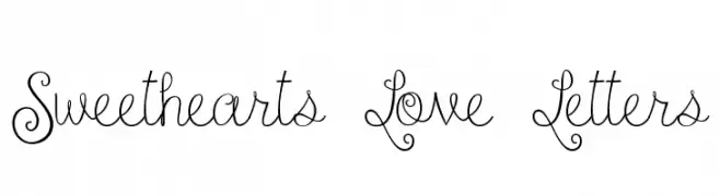
A whimsical, curly font with a playful and decorative style.
![Sweethearts Love Letters Frei Schriftart Herunterladen]() Herunterladen 314 Downloads@WebFont
Herunterladen 314 Downloads@WebFont -
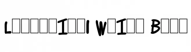
![Lettering1 Weird Bold Frei Schriftart Herunterladen]() Herunterladen 314 Downloads@WebFont
Herunterladen 314 Downloads@WebFont -
( Fonts by Dan P. Lyons - Personal-use only. For commercial use please contact owner. )
A bold, modern font with rounded edges and geometric structure.
![Dressedless Pro Regular Frei Schriftart Herunterladen]() Herunterladen 314 Downloads@WebFont
Herunterladen 314 Downloads@WebFont

Welche Schriften sind gerade am populärsten?
Poppins, Roboto, Montserrat, Open Sans und Lato sind wegen ihrer klaren Formen und breiten Einsetzbarkeit sehr gefragt – von Markenauftritt über Landingpages bis hin zu Postern.
Welche Fonts eignen sich für Logos?
Geometrische Sans‑Serifs (z. B. Poppins, Familien im Gotham‑Stil) sind ein häufiger Griff für sauberes, skalierbares Branding. Für eine persönlichere Note bleiben Scripts und Handschrift‑Stile beliebt. Kombinieren Sie einen prägnanten Headline‑Font mit einer neutralen Brotschrift für Wiedererkennung und Harmonie.
Wie oft wird die Top‑Liste aktualisiert?
Regelmäßig – basierend auf realen Downloads und Interaktionen. Schauen Sie öfter vorbei, um aufstrebende Favoriten früh zu entdecken.
💡 Tipp: Seite bookmarken – Trends wechseln schnell, und heutige Top‑Schriften inspirieren morgen vielleicht das Rebranding.