Willkommen bei den Top‑Schriften – hier treffen Beliebtheit und Qualität aufeinander. Das sind die in diesem Jahr am häufigsten heruntergeladenen und genutzten Fonts. Wenn Sie sichere Optionen für Logo, Web oder Social suchen, starten Sie hier.
Jeder Top‑Font überzeugt durch Balance, Lesbarkeit und Vielseitigkeit. Sie finden moderne Sans‑Serifs, elegante Scripts, Vintage‑Serifs und minimalistische Displays.
-
( Fonts by Graham Meade - GemFonts )
A rugged, hand-drawn style font with uneven strokes and a rustic charm.
 Herunterladen 313 Downloads@WebFont
 -
( Fonts by Daniel Zadorozny - www.iconian.com - Free for personal use )
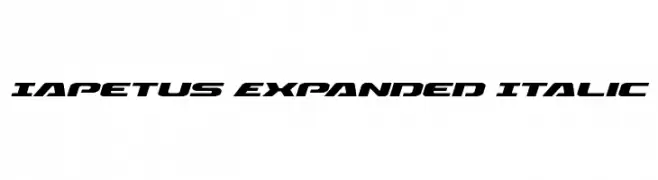
A bold, expanded, and italicized font with a modern, dynamic style.
![Iapetus Expanded Italic Frei Schriftart Herunterladen]() Herunterladen 313 Downloads@WebFont
Herunterladen 313 Downloads@WebFont -
( Fonts by a Jayvee Enaguas - harvettfox96.deviantart.com. Personal-use only. For commercial use please contact owner. )
A pixelated, retro-style font ideal for digital and nostalgic projects.
![Pixel Operator Frei Schriftart Herunterladen]() Herunterladen 313 Downloads@WebFont
Herunterladen 313 Downloads@WebFont -
( Copyright (c) 2000-2010, Ben Weiner (ben@readingtype.org.uk) )
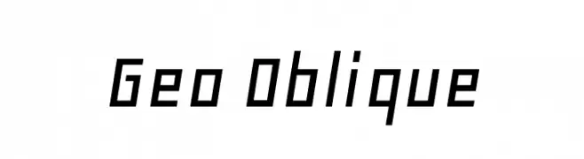
A geometric, angular font with an oblique slant for a dynamic, modern look.
![Geo Oblique Frei Schriftart Herunterladen]() Herunterladen 313 Downloads@WebFont
Herunterladen 313 Downloads@WebFont -
( www.gabrielfam.com.br )
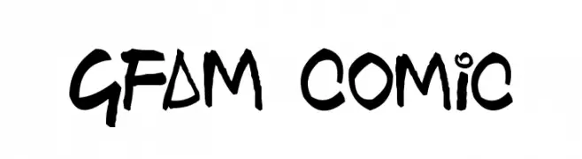
A playful, hand-drawn style font with bold, irregular strokes.
![GFAM Comic Frei Schriftart Herunterladen]() Herunterladen 313 Downloads@WebFont
Herunterladen 313 Downloads@WebFont -
-
( www.junkohanhero.com )
A bold, decorative font with a unique dotted pattern filling each character.
![Air Atlas Frei Schriftart Herunterladen]() Herunterladen 313 Downloads@WebFont
Herunterladen 313 Downloads@WebFont -
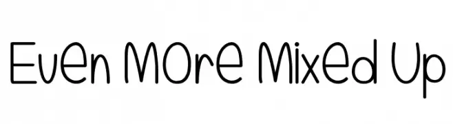
![Even More Mixed Up Frei Schriftart Herunterladen]() Herunterladen 313 Downloads@WebFont
Herunterladen 313 Downloads@WebFont -
( Fonts by Nate Piekos - www.blambot.com )
A bold, hand-drawn font with a playful and artistic style.
![Casket-Breath Frei Schriftart Herunterladen]() Herunterladen 313 Downloads@WebFont
Herunterladen 313 Downloads@WebFont -
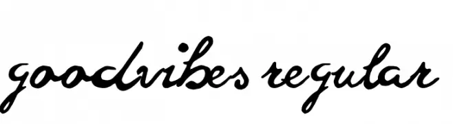
( Fonts by Peter Olexa )
A lively, cursive font with interconnected characters and a whimsical charm.
![goodvibes regular Frei Schriftart Herunterladen]() Herunterladen 313 Downloads@WebFont
Herunterladen 313 Downloads@WebFont -
![inumocca Frei Schriftart Herunterladen]() Herunterladen 313 Downloads@WebFont
Herunterladen 313 Downloads@WebFont


Welche Schriften sind gerade am populärsten?
Poppins, Roboto, Montserrat, Open Sans und Lato sind wegen ihrer klaren Formen und breiten Einsetzbarkeit sehr gefragt – von Markenauftritt über Landingpages bis hin zu Postern.
Welche Fonts eignen sich für Logos?
Geometrische Sans‑Serifs (z. B. Poppins, Familien im Gotham‑Stil) sind ein häufiger Griff für sauberes, skalierbares Branding. Für eine persönlichere Note bleiben Scripts und Handschrift‑Stile beliebt. Kombinieren Sie einen prägnanten Headline‑Font mit einer neutralen Brotschrift für Wiedererkennung und Harmonie.
Wie oft wird die Top‑Liste aktualisiert?
Regelmäßig – basierend auf realen Downloads und Interaktionen. Schauen Sie öfter vorbei, um aufstrebende Favoriten früh zu entdecken.
💡 Tipp: Seite bookmarken – Trends wechseln schnell, und heutige Top‑Schriften inspirieren morgen vielleicht das Rebranding.