Willkommen bei den Top‑Schriften – hier treffen Beliebtheit und Qualität aufeinander. Das sind die in diesem Jahr am häufigsten heruntergeladenen und genutzten Fonts. Wenn Sie sichere Optionen für Logo, Web oder Social suchen, starten Sie hier.
Jeder Top‑Font überzeugt durch Balance, Lesbarkeit und Vielseitigkeit. Sie finden moderne Sans‑Serifs, elegante Scripts, Vintage‑Serifs und minimalistische Displays.
-
 Herunterladen 1198 Downloads@WebFont
 -
( Fonts by Arkandis Digital Foundry )
A modern sans-serif font with medium weight and excellent readability.
![SwitzeraADF-Medium Frei Schriftart Herunterladen]() Herunterladen 1198 Downloads@WebFont
Herunterladen 1198 Downloads@WebFont -
![MLB Nationals Reverse Bevel Frei Schriftart Herunterladen]() Herunterladen 1198 Downloads@WebFont
Herunterladen 1198 Downloads@WebFont -
![Greek Old Face C Frei Schriftart Herunterladen]() Herunterladen 1198 Downloads@WebFont
Herunterladen 1198 Downloads@WebFont -
( Fonts by David Rakowski )
An ornate, decorative font with a vintage, theatrical style.
![Showboat Regular Frei Schriftart Herunterladen]() Herunterladen 1198 Downloads@WebFont
Herunterladen 1198 Downloads@WebFont -
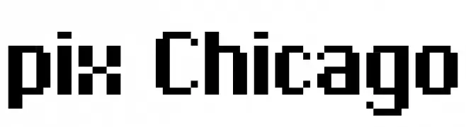
![pix Chicago Frei Schriftart Herunterladen]() Herunterladen 1198 Downloads
Herunterladen 1198 Downloads -
![AIFragment Frei Schriftart Herunterladen]() Herunterladen 1198 Downloads@WebFont
Herunterladen 1198 Downloads@WebFont -
![Powder Frei Schriftart Herunterladen]() Herunterladen 1197 Downloads@WebFont
Herunterladen 1197 Downloads@WebFont -
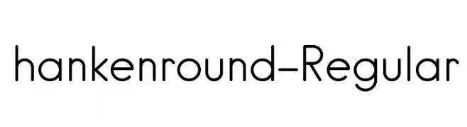
( Fonts by Hanken Design Co. - Personal-use only. For commercial use please contact owner. )
A modern, rounded font with a clean and approachable design.
![hankenround-Regular Frei Schriftart Herunterladen]() Herunterladen 1197 Downloads@WebFont
Herunterladen 1197 Downloads@WebFont -
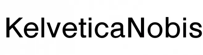
( Erion Dyrmishi - cool-fonts-for-logos.blogspot.com )
A modern, clean sans-serif font with uniform stroke widths and excellent readability.
![Kelvetica Nobis Frei Schriftart Herunterladen]() Herunterladen 1197 Downloads@WebFont
Herunterladen 1197 Downloads@WebFont -
( Typhoon Type - Suthi Srisopha - www.typhoontype.net )
A playful, modern script font with a handwritten feel and elegant curves.
![Sweet Hipster Frei Schriftart Herunterladen]() Herunterladen 1197 Downloads@WebFont
Herunterladen 1197 Downloads@WebFont -
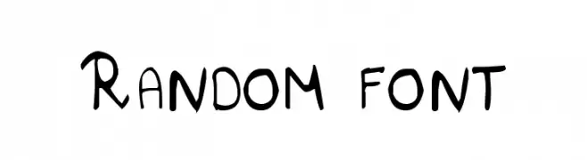
( Bhavesh Shaha )
A playful, handwritten-style font with a casual and dynamic appearance.
![Random font Frei Schriftart Herunterladen]() Herunterladen 1197 Downloads@WebFont
Herunterladen 1197 Downloads@WebFont -
( www.duncanlong.com/ )
A bold, dramatic font with exaggerated curves and a vintage-modern aesthetic.
![Doctor Fibes DEL Frei Schriftart Herunterladen]() Herunterladen 1197 Downloads@WebFont
Herunterladen 1197 Downloads@WebFont -
( Fonts by joorgemoron )
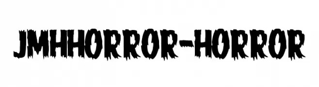
A bold, jagged font with a distressed, horror-themed appearance.
![JMHHORROR-HORROR Frei Schriftart Herunterladen]() Herunterladen 1197 Downloads@WebFont
Herunterladen 1197 Downloads@WebFont -
( Fonts by Aspek hndz )
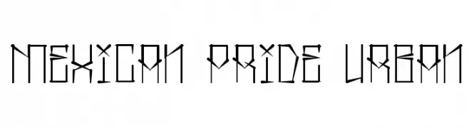
A bold, angular font with an urban, graffiti-inspired style.
![Mexican Pride Urban Frei Schriftart Herunterladen]() Herunterladen 1197 Downloads@WebFont
Herunterladen 1197 Downloads@WebFont -
( Fonts by www.dcoxy.com )
A bold, playful handwritten font with rounded strokes and lively character.
![Rabbit Hole Frei Schriftart Herunterladen]() Herunterladen 1197 Downloads@WebFont
Herunterladen 1197 Downloads@WebFont -
![Primrose Frei Schriftart Herunterladen]() Herunterladen 1197 Downloads@WebFont
Herunterladen 1197 Downloads@WebFont -
( Fonts by Rick Mueller )
An elegant script font with fluid, natural handwriting style.
![Verona Script Frei Schriftart Herunterladen]() Herunterladen 1197 Downloads@WebFont
Herunterladen 1197 Downloads@WebFont -
( Fonts by a Clement Nicolle - www.stereo-type.fr . Personal-use only. For commercial use please contact owner. )
A bold, distressed blackletter-style font with a vintage, grunge aesthetic.
![Frakturika Frei Schriftart Herunterladen]() Herunterladen 1197 Downloads@WebFont
Herunterladen 1197 Downloads@WebFont -
( Fonts by Dieter Steffmann )
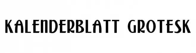
A bold, geometric font with Art Deco influences, featuring tall, narrow characters.
![Kalenderblatt Grotesk Frei Schriftart Herunterladen]() Herunterladen 1197 Downloads@WebFont
Herunterladen 1197 Downloads@WebFont -
( Fonts by ShyFonts )
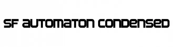
A bold, condensed font with a futuristic, geometric design.
![SF Automaton Condensed Frei Schriftart Herunterladen]() Herunterladen 1197 Downloads@WebFont
Herunterladen 1197 Downloads@WebFont -
( Fonts by Mocha Frappuccino - Personal-use only. For commercial use please contact owner. )
A playful, bubbly font with decorative drips and rounded characters.
![Christmas Vibes Shine Frei Schriftart Herunterladen]() Herunterladen 1196 Downloads@WebFont
Herunterladen 1196 Downloads@WebFont -
( Fonts by Gilangs )
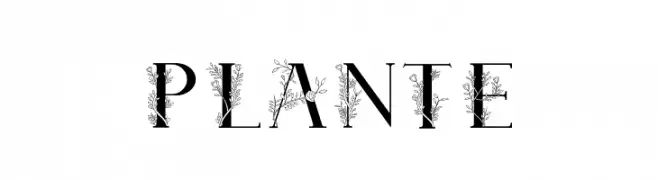
A decorative serif font with intricate floral embellishments.
![Plante Frei Schriftart Herunterladen]() Herunterladen 1196 Downloads@WebFont
Herunterladen 1196 Downloads@WebFont -
( Fonts by Fikry Alif - Fikryal studio - https://www.creativefabrica.com/designer/mfikryalif/ref/222304/ - Personal-use only. For commercial use please contact owner. )
A modern, handwritten font with a casual and flowing style.
![Beatrise Frei Schriftart Herunterladen]() Herunterladen 1196 Downloads@WebFont
Herunterladen 1196 Downloads@WebFont -
( Fonts by Muhammad Miad - By This font full version https://crmrkt.com/P45Ver - Personal-use only. For commercial use please contact owner. )
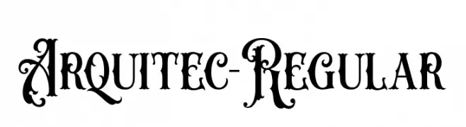
An ornate, decorative font with intricate swirls and high contrast, perfect for artistic projects.
![Arquitec-Regular Frei Schriftart Herunterladen]() Herunterladen 1196 Downloads@WebFont
Herunterladen 1196 Downloads@WebFont -
![Audrey and Reynold Frei Schriftart Herunterladen]() Herunterladen 1196 Downloads@WebFont
Herunterladen 1196 Downloads@WebFont -
( Fonts by Zetafonts - Personal-use only. For commercial use please contact owner. )
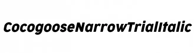
A modern, narrow, and italicized font with bold characters.
![Cocogoose Narrow Trial Italic Frei Schriftart Herunterladen]() Herunterladen 1196 Downloads@WebFont
Herunterladen 1196 Downloads@WebFont -
( Fonts by Castcraft Software - OPTI Fonts Archive - opti.netii.net - Personal-use only. For commercial use please contact owner. )
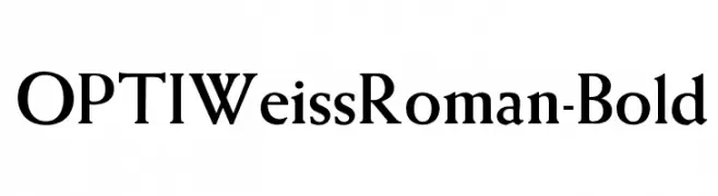
A bold, classic serif font with pronounced serifs and strong presence.
![OPTIWeissRoman-Bold Frei Schriftart Herunterladen]() Herunterladen 1196 Downloads@WebFont
Herunterladen 1196 Downloads@WebFont -
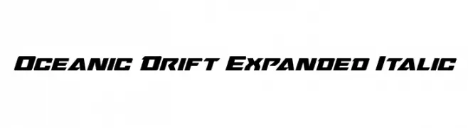
( Fonts by Daniel Zadorozny - www.iconian.com )
A bold, expanded italic font with a modern and dynamic style.
![Oceanic Drift Expanded Italic Frei Schriftart Herunterladen]() Herunterladen 1196 Downloads@WebFont
Herunterladen 1196 Downloads@WebFont -
![London Olympics 2012 Frei Schriftart Herunterladen]() Herunterladen 1196 Downloads@WebFont
Herunterladen 1196 Downloads@WebFont -
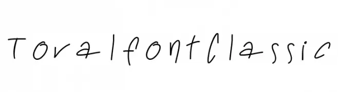
![ToralfontClassic Frei Schriftart Herunterladen]() Herunterladen 1196 Downloads@WebFont
Herunterladen 1196 Downloads@WebFont -
![Ssoft's-Veena-ML Frei Schriftart Herunterladen]() Herunterladen 1196 Downloads@WebFont
Herunterladen 1196 Downloads@WebFont -
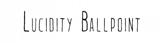
![Lucidity Ballpoint Frei Schriftart Herunterladen]() Herunterladen 1196 Downloads@WebFont
Herunterladen 1196 Downloads@WebFont -
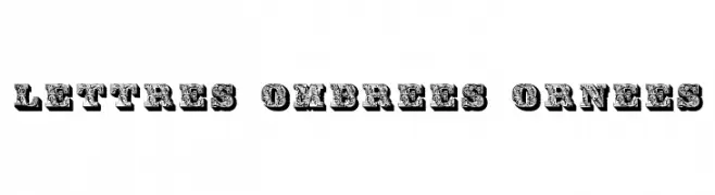
( Fonts by Dieter Steffmann )
Ornate, shadowed font with intricate detailing and a vintage aesthetic.
![Lettres ombrees ornees Frei Schriftart Herunterladen]() Herunterladen 1196 Downloads@WebFont
Herunterladen 1196 Downloads@WebFont -
![Ismini Regular Frei Schriftart Herunterladen]() Herunterladen 1196 Downloads@WebFont
Herunterladen 1196 Downloads@WebFont


Welche Schriften sind gerade am populärsten?
Poppins, Roboto, Montserrat, Open Sans und Lato sind wegen ihrer klaren Formen und breiten Einsetzbarkeit sehr gefragt – von Markenauftritt über Landingpages bis hin zu Postern.
Welche Fonts eignen sich für Logos?
Geometrische Sans‑Serifs (z. B. Poppins, Familien im Gotham‑Stil) sind ein häufiger Griff für sauberes, skalierbares Branding. Für eine persönlichere Note bleiben Scripts und Handschrift‑Stile beliebt. Kombinieren Sie einen prägnanten Headline‑Font mit einer neutralen Brotschrift für Wiedererkennung und Harmonie.
Wie oft wird die Top‑Liste aktualisiert?
Regelmäßig – basierend auf realen Downloads und Interaktionen. Schauen Sie öfter vorbei, um aufstrebende Favoriten früh zu entdecken.
💡 Tipp: Seite bookmarken – Trends wechseln schnell, und heutige Top‑Schriften inspirieren morgen vielleicht das Rebranding.