Willkommen bei den Top‑Schriften – hier treffen Beliebtheit und Qualität aufeinander. Das sind die in diesem Jahr am häufigsten heruntergeladenen und genutzten Fonts. Wenn Sie sichere Optionen für Logo, Web oder Social suchen, starten Sie hier.
Jeder Top‑Font überzeugt durch Balance, Lesbarkeit und Vielseitigkeit. Sie finden moderne Sans‑Serifs, elegante Scripts, Vintage‑Serifs und minimalistische Displays.
-
( Free for personal use )
A bold, playful font with rounded, hand-drawn characters.
 Herunterladen 1189 Downloads@WebFont
 -
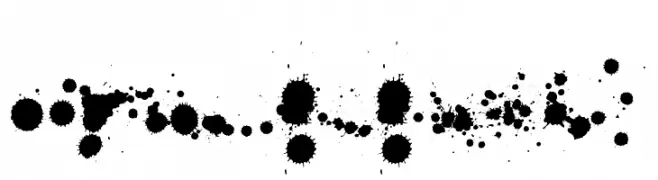
( Fonts by Christophe Feray - www.wcfonts.com )
An artistic font with ink splatter-inspired characters, offering a chaotic and expressive style.
![WCRhesusABta Frei Schriftart Herunterladen]() Herunterladen 1189 Downloads@WebFont
Herunterladen 1189 Downloads@WebFont -
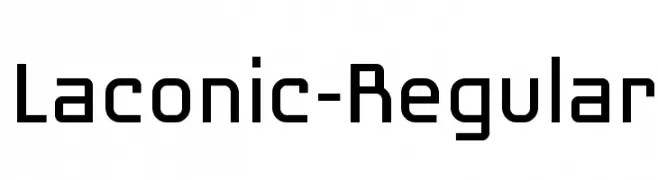
( Fonts by www.woodardworks.com )
A modern, geometric font with a clean and structured design.
![Laconic-Regular Frei Schriftart Herunterladen]() Herunterladen 1189 Downloads@WebFont
Herunterladen 1189 Downloads@WebFont -
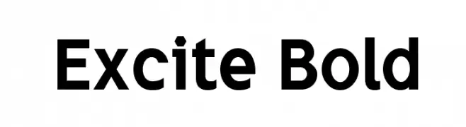
( K-Type Freebies (Free for Personal Use Only) FROM http://www.k-type.com )
A bold, modern font with strong geometric shapes and clear readability.
![Excite Bold Frei Schriftart Herunterladen]() Herunterladen 1189 Downloads@WebFont
Herunterladen 1189 Downloads@WebFont -
![Fleurons Frei Schriftart Herunterladen]() Herunterladen 1189 Downloads
Herunterladen 1189 Downloads -
![Gipsiero Frei Schriftart Herunterladen]() Herunterladen 1189 Downloads@WebFont
Herunterladen 1189 Downloads@WebFont -
( Fonts by or from www.graffitifonts.net )
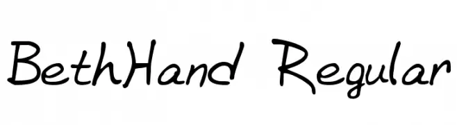
A playful and casual handwritten font with fluid strokes.
![BethHand Regular Frei Schriftart Herunterladen]() Herunterladen 1189 Downloads@WebFont
Herunterladen 1189 Downloads@WebFont -
( Fonts by Khurasan )
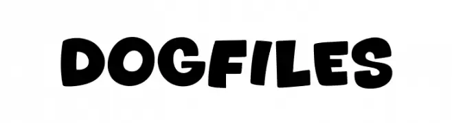
A bold, playful font with rounded, hand-drawn characters.
![Dogfiles Frei Schriftart Herunterladen]() Herunterladen 1188 Downloads@WebFont
Herunterladen 1188 Downloads@WebFont -
( Fonts by Niskala Huruf )
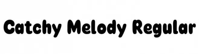
A playful, bold font with rounded, bubbly characters ideal for creative designs.
![Catchy Melody Regular Frei Schriftart Herunterladen]() Herunterladen 1188 Downloads@WebFont
Herunterladen 1188 Downloads@WebFont -
( Fonts by Steve Cloutier - www.cloutierfontes.ca )
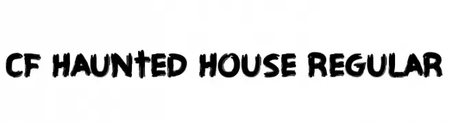
A bold, brush-stroke font with a hand-painted, dynamic appearance.
![CF Haunted House Regular Frei Schriftart Herunterladen]() Herunterladen 1188 Downloads@WebFont
Herunterladen 1188 Downloads@WebFont -
( Fonts by Socialh. Personal-use only. For commercial use please contact owner. )
A bold, distressed font with a textured, vintage appearance.
![Fada Frei Schriftart Herunterladen]() Herunterladen 1188 Downloads@WebFont
Herunterladen 1188 Downloads@WebFont -
( Fonts by a Emily Spadoni - http://creativemarket.com/emilyspadoni/. Personal-use only. For commercial use please contact owner. )
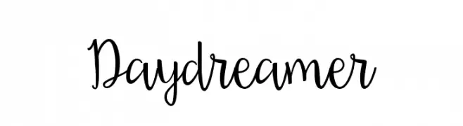
A whimsical, playful script font with elegant, flowing cursive letters.
![Daydreamer Frei Schriftart Herunterladen]() Herunterladen 1188 Downloads@WebFont
Herunterladen 1188 Downloads@WebFont -
( Copyright (c) 2011, Dan Sayers (i@iotic.com) )
A playful, rounded font with consistent stroke width and smooth curves.
![Averia Libre Bold Frei Schriftart Herunterladen]() Herunterladen 1188 Downloads@WebFont
Herunterladen 1188 Downloads@WebFont -
( Fonts by Benoit Sjoholm - www.benoitsjoholm.com - All my fonts are for sale )
A modern, elegant script font with smooth, flowing lines.
![Rachel Frei Schriftart Herunterladen]() Herunterladen 1188 Downloads@WebFont
Herunterladen 1188 Downloads@WebFont -
( Free for a personal use. For a commercial use please visit www.kevinandamanda.com )
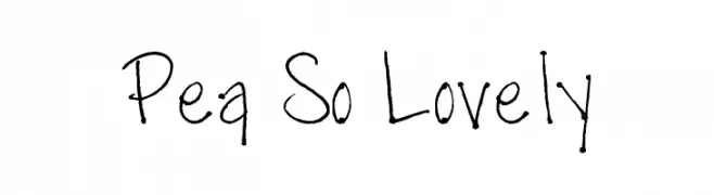
A playful, handwritten font with a whimsical and personal touch.
![Pea So Lovely Frei Schriftart Herunterladen]() Herunterladen 1188 Downloads@WebFont
Herunterladen 1188 Downloads@WebFont -
( Fonts by www.DigitalDreamDesign.net )
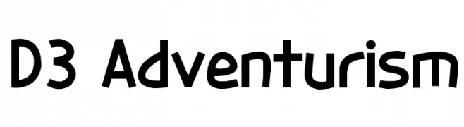
A bold, geometric font with a playful yet structured design.
![D3 Adventurism Frei Schriftart Herunterladen]() Herunterladen 1188 Downloads@WebFont
Herunterladen 1188 Downloads@WebFont -
![DYLOVASTUFF Frei Schriftart Herunterladen]() Herunterladen 1188 Downloads@WebFont
Herunterladen 1188 Downloads@WebFont -
( Fonts by Casady & Greene )
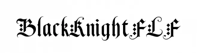
A decorative blackletter font with intricate, angular strokes and medieval flair.
![BlackKnightFLF Frei Schriftart Herunterladen]() Herunterladen 1188 Downloads@WebFont
Herunterladen 1188 Downloads@WebFont -
( Fonts by Manfred Klein - manfred-klein.ina-mar.com )
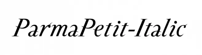
An elegant italic serif font with graceful curves and refined style.
![ParmaPetit-Italic Frei Schriftart Herunterladen]() Herunterladen 1188 Downloads@WebFont
Herunterladen 1188 Downloads@WebFont -
![Zero Hour Frei Schriftart Herunterladen]() Herunterladen 1188 Downloads@WebFont
Herunterladen 1188 Downloads@WebFont -
![Clubland Frei Schriftart Herunterladen]() Herunterladen 1188 Downloads@WebFont
Herunterladen 1188 Downloads@WebFont -
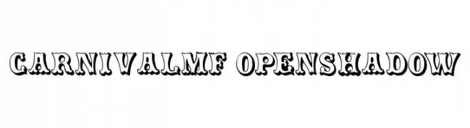
( Fonts by Rick Mueller )
A playful, bold font with an open shadow effect and vintage carnival style.
![CarnivalMF OpenShadow Frei Schriftart Herunterladen]() Herunterladen 1188 Downloads@WebFont
Herunterladen 1188 Downloads@WebFont -
![dinstik Frei Schriftart Herunterladen]() Herunterladen 1188 Downloads@WebFont
Herunterladen 1188 Downloads@WebFont -
![Ice Caps Frei Schriftart Herunterladen]() Herunterladen 1188 Downloads@WebFont
Herunterladen 1188 Downloads@WebFont -
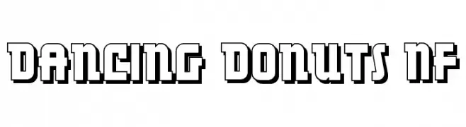
( Fonts by Nick Curtis - www.nicksfonts.com )
A bold, playful font with a three-dimensional, geometric design.
![Dancing Donuts NF Frei Schriftart Herunterladen]() Herunterladen 1188 Downloads@WebFont
Herunterladen 1188 Downloads@WebFont -
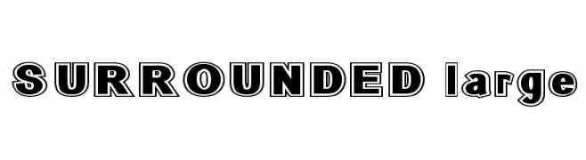
( Fonts by Bree Gorton )
A bold, outlined font with a strong, impactful design.
![SURROUNDED large Frei Schriftart Herunterladen]() Herunterladen 1188 Downloads@WebFont
Herunterladen 1188 Downloads@WebFont -
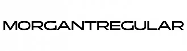
( Fonts by Typologic - Fadiel Muhammad - Personal-use only. For commercial use please contact owner. )
A modern, geometric font with bold, slightly condensed characters.
![Morgant Regular Frei Schriftart Herunterladen]() Herunterladen 1187 Downloads@WebFont
Herunterladen 1187 Downloads@WebFont -
( Fonts by Peter Wiegel - www.peter-wiegel.de - Personal-use only. For commercial use please contact owner. )
A bold, geometric font with a modern, futuristic style.
![GSTAero Frei Schriftart Herunterladen]() Herunterladen 1187 Downloads@WebFont
Herunterladen 1187 Downloads@WebFont -
( Syntetype Studio )
A bold, geometric sans-serif font with a modern and clean design.
![Neozoic Trial Frei Schriftart Herunterladen]() Herunterladen 1187 Downloads@WebFont
Herunterladen 1187 Downloads@WebFont -
( Fonts by omnibus-type.com. Personal-use only. For commercial use please contact owner. )
A playful, hand-drawn font with tall, narrow characters and bold strokes.
![Bahiana Frei Schriftart Herunterladen]() Herunterladen 1187 Downloads@WebFont
Herunterladen 1187 Downloads@WebFont -
![2peas Frei Schriftart Herunterladen]() Herunterladen 1187 Downloads@WebFont
Herunterladen 1187 Downloads@WebFont -
( Fonts by India S )
A bold, playful handwritten font with thick strokes and a casual style.
![India Frei Schriftart Herunterladen]() Herunterladen 1187 Downloads@WebFont
Herunterladen 1187 Downloads@WebFont -
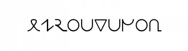
( Fonts by Joel Tashinian. Free to use for non-commercial purposes. Font page www.omniglot.com/writing/europaphon.htm )
A futuristic and geometric font with clean lines and modern design.
![Europaphon Frei Schriftart Herunterladen]() Herunterladen 1187 Downloads@WebFont
Herunterladen 1187 Downloads@WebFont -
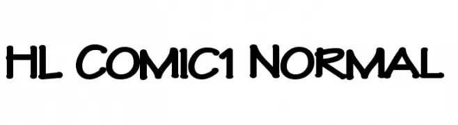
( Fonts by HungLan Design - www.hunglandesign.com )
A bold, playful comic-style font with rounded, handwritten characters.
![HL Comic1 Normal Frei Schriftart Herunterladen]() Herunterladen 1187 Downloads@WebFont
Herunterladen 1187 Downloads@WebFont -
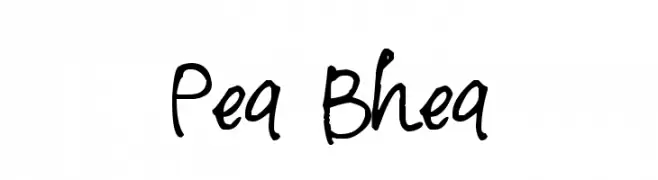
( Free for a personal use. For a commercial use please visit www.kevinandamanda.com )
A playful and dynamic handwritten font with fluid strokes.
![Pea Bhea Frei Schriftart Herunterladen]() Herunterladen 1187 Downloads@WebFont
Herunterladen 1187 Downloads@WebFont


Welche Schriften sind gerade am populärsten?
Poppins, Roboto, Montserrat, Open Sans und Lato sind wegen ihrer klaren Formen und breiten Einsetzbarkeit sehr gefragt – von Markenauftritt über Landingpages bis hin zu Postern.
Welche Fonts eignen sich für Logos?
Geometrische Sans‑Serifs (z. B. Poppins, Familien im Gotham‑Stil) sind ein häufiger Griff für sauberes, skalierbares Branding. Für eine persönlichere Note bleiben Scripts und Handschrift‑Stile beliebt. Kombinieren Sie einen prägnanten Headline‑Font mit einer neutralen Brotschrift für Wiedererkennung und Harmonie.
Wie oft wird die Top‑Liste aktualisiert?
Regelmäßig – basierend auf realen Downloads und Interaktionen. Schauen Sie öfter vorbei, um aufstrebende Favoriten früh zu entdecken.
💡 Tipp: Seite bookmarken – Trends wechseln schnell, und heutige Top‑Schriften inspirieren morgen vielleicht das Rebranding.