Willkommen bei den Top‑Schriften – hier treffen Beliebtheit und Qualität aufeinander. Das sind die in diesem Jahr am häufigsten heruntergeladenen und genutzten Fonts. Wenn Sie sichere Optionen für Logo, Web oder Social suchen, starten Sie hier.
Jeder Top‑Font überzeugt durch Balance, Lesbarkeit und Vielseitigkeit. Sie finden moderne Sans‑Serifs, elegante Scripts, Vintage‑Serifs und minimalistische Displays.
-
( Fonts by Greg Medina - www.dcoxy.com - Personal-use only. For commercial use please contact owner. )
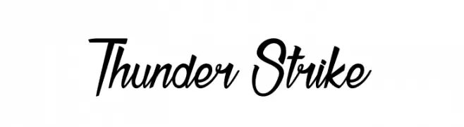
A bold, italicized font with dynamic, angular uppercase and flowing lowercase letters.
 Herunterladen 301 Downloads@WebFont
 -
( Fonts by David Espinosa - http://issuu.com/davidespinosa5/ )
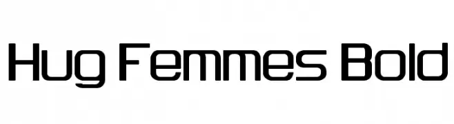
A bold, modern font with geometric shapes and rounded corners.
![Hug Femmes Bold Frei Schriftart Herunterladen]() Herunterladen 301 Downloads@WebFont
Herunterladen 301 Downloads@WebFont -
( Fonts by Typodermic Fonts )
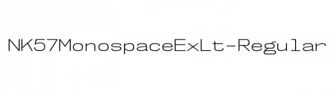
A modern, monospaced font with uniform strokes and a geometric influence.
![NK57MonospaceExLt-Regular Frei Schriftart Herunterladen]() Herunterladen 301 Downloads@WebFont
Herunterladen 301 Downloads@WebFont -
![dreamsoftheatre Frei Schriftart Herunterladen]() Herunterladen 301 Downloads@WebFont
Herunterladen 301 Downloads@WebFont -
( Fonts by Zetafonts - Personal-use only. For commercial use please contact owner. )
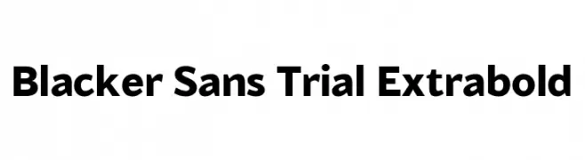
A bold, modern sans-serif font with strong, clean lines and excellent readability.
![Blacker Sans Trial Extrabold Frei Schriftart Herunterladen]() Herunterladen 301 Downloads@WebFont
Herunterladen 301 Downloads@WebFont -
-
( Fonts by Graham Meade - GemFonts )
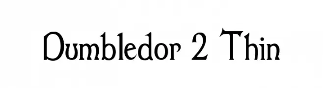
A decorative serif font with a classic yet whimsical style, featuring sharp serifs and elegant curves.
![Dumbledor 2 Thin Frei Schriftart Herunterladen]() Herunterladen 301 Downloads@WebFont
Herunterladen 301 Downloads@WebFont -
( Fonts by Zarma Type Foundry )
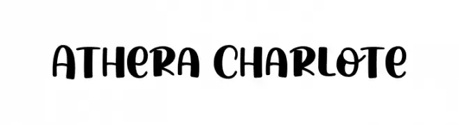
A bold, playful font with rounded edges and a whimsical, handwritten style.
![Athera Charlote Frei Schriftart Herunterladen]() Herunterladen 301 Downloads@WebFont
Herunterladen 301 Downloads@WebFont -
( Fonts by Nirmala Creative )
A bold, playful font with horizontal stripes and rounded edges.
![Clara Strip Frei Schriftart Herunterladen]() Herunterladen 301 Downloads@WebFont
Herunterladen 301 Downloads@WebFont -
( Fonts by a Neale Davidson - www.pixelsagas.com. Personal-use only. For commercial use please contact owner. )
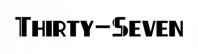
A bold, geometric font with sharp angles and a modern aesthetic.
![Thirty-Seven Frei Schriftart Herunterladen]() Herunterladen 301 Downloads@WebFont
Herunterladen 301 Downloads@WebFont -
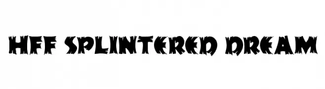
( Fonts by Have Fun with Fonts )
A bold, jagged font with sharp, irregular edges for a dynamic and edgy look.
![HFF Splintered Dream Frei Schriftart Herunterladen]() Herunterladen 301 Downloads@WebFont
Herunterladen 301 Downloads@WebFont

Welche Schriften sind gerade am populärsten?
Poppins, Roboto, Montserrat, Open Sans und Lato sind wegen ihrer klaren Formen und breiten Einsetzbarkeit sehr gefragt – von Markenauftritt über Landingpages bis hin zu Postern.
Welche Fonts eignen sich für Logos?
Geometrische Sans‑Serifs (z. B. Poppins, Familien im Gotham‑Stil) sind ein häufiger Griff für sauberes, skalierbares Branding. Für eine persönlichere Note bleiben Scripts und Handschrift‑Stile beliebt. Kombinieren Sie einen prägnanten Headline‑Font mit einer neutralen Brotschrift für Wiedererkennung und Harmonie.
Wie oft wird die Top‑Liste aktualisiert?
Regelmäßig – basierend auf realen Downloads und Interaktionen. Schauen Sie öfter vorbei, um aufstrebende Favoriten früh zu entdecken.
💡 Tipp: Seite bookmarken – Trends wechseln schnell, und heutige Top‑Schriften inspirieren morgen vielleicht das Rebranding.