Willkommen bei den Top‑Schriften – hier treffen Beliebtheit und Qualität aufeinander. Das sind die in diesem Jahr am häufigsten heruntergeladenen und genutzten Fonts. Wenn Sie sichere Optionen für Logo, Web oder Social suchen, starten Sie hier.
Jeder Top‑Font überzeugt durch Balance, Lesbarkeit und Vielseitigkeit. Sie finden moderne Sans‑Serifs, elegante Scripts, Vintage‑Serifs und minimalistische Displays.
-
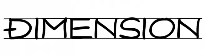
( Fonts by Faqih Fawaji - Personal-use only. For commercial use please contact owner. )
A modern, high-contrast font with sleek, elegant lines.
 Herunterladen 299 Downloads@WebFont
 -
![Dimension Frei Schriftart Herunterladen]() Herunterladen 299 Downloads@WebFont
Herunterladen 299 Downloads@WebFont -
( Fonts by dustBUST - Andreas Nylin )
A playful, hand-drawn font with a whimsical and dynamic style.
![Laban Frei Schriftart Herunterladen]() Herunterladen 299 Downloads@WebFont
Herunterladen 299 Downloads@WebFont -
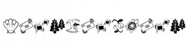
( Fonts by Manfred Klein. Free for private and charity use. Free for commercial with donation to organizations )
A quirky pictogram font with cartoonish, illustrative icons.
![RatsFatzBats Frei Schriftart Herunterladen]() Herunterladen 299 Downloads@WebFont
Herunterladen 299 Downloads@WebFont -
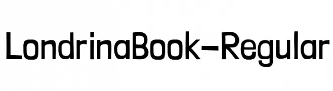
( Fonts by Marcelo Magalhães - Personal-use only. For commercial use please contact owner. )
A playful, hand-drawn style font with bold, rounded characters.
![LondrinaBook-Regular Frei Schriftart Herunterladen]() Herunterladen 299 Downloads@WebFont
Herunterladen 299 Downloads@WebFont -
-
![MakeMagicHappen Frei Schriftart Herunterladen]() Herunterladen 299 Downloads@WebFont
Herunterladen 299 Downloads@WebFont -
![Chiseled Open Frei Schriftart Herunterladen]() Herunterladen 299 Downloads@WebFont
Herunterladen 299 Downloads@WebFont -
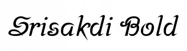
( Copyright 2018 The Srisakdi Project Authors (https://github.com/cadsondemak/Srisakdi) )
A bold, elegant script font with flowing, cursive letterforms and decorative flourishes.
![Srisakdi Bold Frei Schriftart Herunterladen]() Herunterladen 299 Downloads@WebFont
Herunterladen 299 Downloads@WebFont -
( Fonts by Alpaprana Studio )
A playful, hand-drawn font with a whimsical and casual style.
![Amberly Frei Schriftart Herunterladen]() Herunterladen 299 Downloads@WebFont
Herunterladen 299 Downloads@WebFont -
( Fonts by Attype Studio )
A playful, bold font with rounded, bubbly characters.
![Ginger Biscuit - Personal Use Frei Schriftart Herunterladen]() Herunterladen 299 Downloads@WebFont
Herunterladen 299 Downloads@WebFont


Welche Schriften sind gerade am populärsten?
Poppins, Roboto, Montserrat, Open Sans und Lato sind wegen ihrer klaren Formen und breiten Einsetzbarkeit sehr gefragt – von Markenauftritt über Landingpages bis hin zu Postern.
Welche Fonts eignen sich für Logos?
Geometrische Sans‑Serifs (z. B. Poppins, Familien im Gotham‑Stil) sind ein häufiger Griff für sauberes, skalierbares Branding. Für eine persönlichere Note bleiben Scripts und Handschrift‑Stile beliebt. Kombinieren Sie einen prägnanten Headline‑Font mit einer neutralen Brotschrift für Wiedererkennung und Harmonie.
Wie oft wird die Top‑Liste aktualisiert?
Regelmäßig – basierend auf realen Downloads und Interaktionen. Schauen Sie öfter vorbei, um aufstrebende Favoriten früh zu entdecken.
💡 Tipp: Seite bookmarken – Trends wechseln schnell, und heutige Top‑Schriften inspirieren morgen vielleicht das Rebranding.