Willkommen bei den Top‑Schriften – hier treffen Beliebtheit und Qualität aufeinander. Das sind die in diesem Jahr am häufigsten heruntergeladenen und genutzten Fonts. Wenn Sie sichere Optionen für Logo, Web oder Social suchen, starten Sie hier.
Jeder Top‑Font überzeugt durch Balance, Lesbarkeit und Vielseitigkeit. Sie finden moderne Sans‑Serifs, elegante Scripts, Vintage‑Serifs und minimalistische Displays.
-
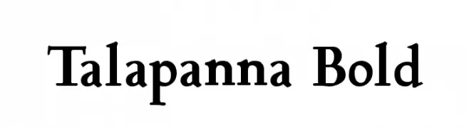
( Fonts by softerviews.org )
A bold, classic serif font with strong strokes and elegant curves.
 Herunterladen 298 Downloads@WebFont
 -
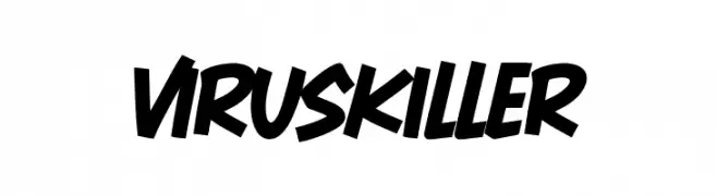
( Fonts by Khurasan )
A bold, energetic font with thick strokes and a dynamic slant.
![Virus Killer Frei Schriftart Herunterladen]() Herunterladen 298 Downloads@WebFont
Herunterladen 298 Downloads@WebFont -
![lakhey2 Frei Schriftart Herunterladen]() Herunterladen 298 Downloads@WebFont
Herunterladen 298 Downloads@WebFont -
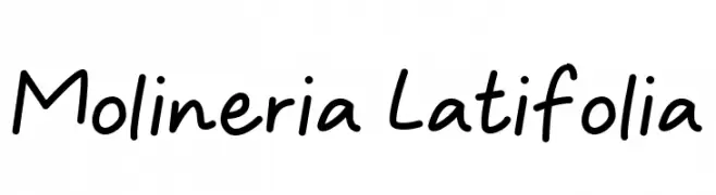
( Fonts by Wildan Type )
A casual, handwritten font with a playful and informal style.
![Molineria Latifolia Frei Schriftart Herunterladen]() Herunterladen 297 Downloads@WebFont
Herunterladen 297 Downloads@WebFont -
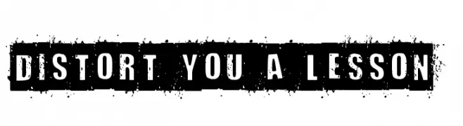
( Fonts by Andrew McCluskey - nalgames.com )
A bold, distressed stencil font with an industrial, grunge aesthetic.
![Distort You A Lesson Frei Schriftart Herunterladen]() Herunterladen 297 Downloads@WebFont
Herunterladen 297 Downloads@WebFont -
-
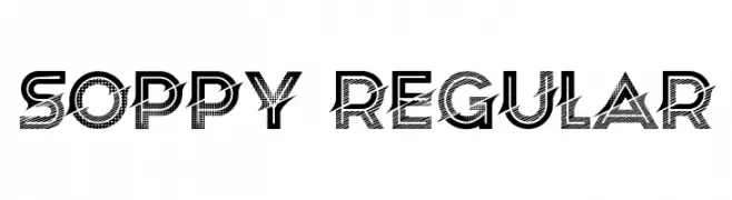
( Fonts by Vladimir Nikolic )
A bold, decorative font with a textured pattern overlay, perfect for impactful display use.
![Soppy Regular Frei Schriftart Herunterladen]() Herunterladen 297 Downloads@WebFont
Herunterladen 297 Downloads@WebFont -
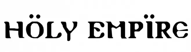
( Fonts by Daniel Zadorozny - www.iconian.com - Free for personal use )
A bold, gothic-inspired font with sharp, angular lines and a historical feel.
![Holy Empire Frei Schriftart Herunterladen]() Herunterladen 297 Downloads@WebFont
Herunterladen 297 Downloads@WebFont -
![Manjiro'sHw21 Frei Schriftart Herunterladen]() Herunterladen 297 Downloads@WebFont
Herunterladen 297 Downloads@WebFont -
( Fonts by Steve Cloutier - www.cloutierfontes.ca - Personal-use only. For commercial use please contact owner. )
A bold, brush-style font with a hand-painted appearance.
![CF Paradise City Regular Frei Schriftart Herunterladen]() Herunterladen 297 Downloads@WebFont
Herunterladen 297 Downloads@WebFont -
![Chronicles of Arkmar Frei Schriftart Herunterladen]() Herunterladen 297 Downloads@WebFont
Herunterladen 297 Downloads@WebFont


Welche Schriften sind gerade am populärsten?
Poppins, Roboto, Montserrat, Open Sans und Lato sind wegen ihrer klaren Formen und breiten Einsetzbarkeit sehr gefragt – von Markenauftritt über Landingpages bis hin zu Postern.
Welche Fonts eignen sich für Logos?
Geometrische Sans‑Serifs (z. B. Poppins, Familien im Gotham‑Stil) sind ein häufiger Griff für sauberes, skalierbares Branding. Für eine persönlichere Note bleiben Scripts und Handschrift‑Stile beliebt. Kombinieren Sie einen prägnanten Headline‑Font mit einer neutralen Brotschrift für Wiedererkennung und Harmonie.
Wie oft wird die Top‑Liste aktualisiert?
Regelmäßig – basierend auf realen Downloads und Interaktionen. Schauen Sie öfter vorbei, um aufstrebende Favoriten früh zu entdecken.
💡 Tipp: Seite bookmarken – Trends wechseln schnell, und heutige Top‑Schriften inspirieren morgen vielleicht das Rebranding.