Willkommen bei den Top‑Schriften – hier treffen Beliebtheit und Qualität aufeinander. Das sind die in diesem Jahr am häufigsten heruntergeladenen und genutzten Fonts. Wenn Sie sichere Optionen für Logo, Web oder Social suchen, starten Sie hier.
Jeder Top‑Font überzeugt durch Balance, Lesbarkeit und Vielseitigkeit. Sie finden moderne Sans‑Serifs, elegante Scripts, Vintage‑Serifs und minimalistische Displays.
-
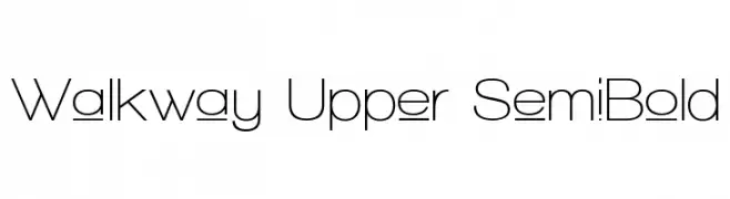
( Fonts by Graham Meade - GemFonts )
A modern, semi-bold sans-serif font with a clean and geometric design.
 Herunterladen 1167 Downloads@WebFont
 -
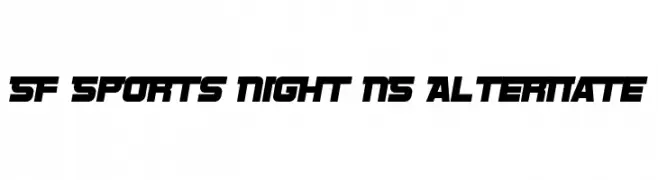
( Fonts by ShyFonts )
A bold, angular font with a futuristic and sporty aesthetic.
![SF Sports Night NS Alternate Frei Schriftart Herunterladen]() Herunterladen 1167 Downloads@WebFont
Herunterladen 1167 Downloads@WebFont -
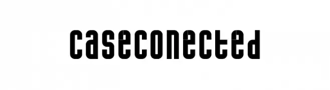
( Fonts by www.phantompower.de )
A bold, geometric font with a modern and uniform design.
![caseconected Frei Schriftart Herunterladen]() Herunterladen 1167 Downloads@WebFont
Herunterladen 1167 Downloads@WebFont -
![Cthulhu Runes Frei Schriftart Herunterladen]() Herunterladen 1167 Downloads@WebFont
Herunterladen 1167 Downloads@WebFont -
![04b_25 Frei Schriftart Herunterladen]() Herunterladen 1167 Downloads@WebFont
Herunterladen 1167 Downloads@WebFont -
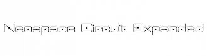
Schriftart von defharo. For commercial use please contact the owner.
( Neospace Circuit is an avant-garde typeface designed for lovers of technology and science fiction. With its elegant extended proportion and geometric minimalism, Neospace redefines typographic aesthetics with a perfect fusion between modern and futuristic )
A futuristic, circuit-inspired font with geometric lines and dot accents.
![Neospace Circuit Expanded Frei Schriftart Herunterladen]() Herunterladen 1166 Downloads@WebFont
Herunterladen 1166 Downloads@WebFont -
( Fonts by Dan P. Lyons - Personal-use only. For commercial use please contact owner. )
A bold, modern sans-serif font with clean lines and strong presence.
![Garde Frei Schriftart Herunterladen]() Herunterladen 1166 Downloads@WebFont
Herunterladen 1166 Downloads@WebFont -
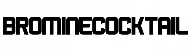
( Fonts by www.chequered.ink - Chequered Ink - Personal-use only. For commercial use please contact owner. )
A bold, geometric font with uniform stroke widths and a modern design.
![Bromine Cocktail Frei Schriftart Herunterladen]() Herunterladen 1166 Downloads@WebFont
Herunterladen 1166 Downloads@WebFont -
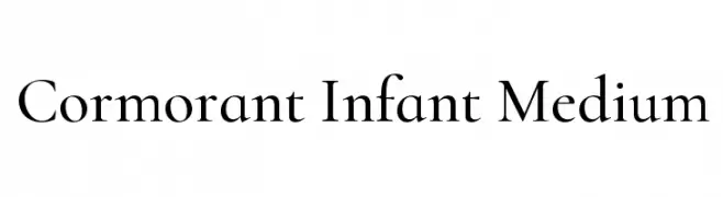
( Copyright (c) 2015, Christian Thalmann and the Cormorant Project Authors (github.com/CatharsisFonts/Cormorant) )
A classic serif font with elegant, refined letterforms and balanced weight.
![Cormorant Infant Medium Frei Schriftart Herunterladen]() Herunterladen 1166 Downloads@WebFont
Herunterladen 1166 Downloads@WebFont -
![Screter Frei Schriftart Herunterladen]() Herunterladen 1166 Downloads@WebFont
Herunterladen 1166 Downloads@WebFont -
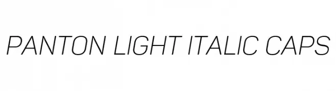
( Fonts by a www.fontfabric.com. Personal-use only. For commercial use please contact owner. )
A modern, light, italic font with clean lines and a dynamic slant.
![Panton Light italic Caps Frei Schriftart Herunterladen]() Herunterladen 1166 Downloads@WebFont
Herunterladen 1166 Downloads@WebFont -
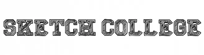
( Fonts by Galdino Otten - galdinootten.com )
A bold, sketch-style font with a hand-drawn, textured appearance.
![Sketch College Frei Schriftart Herunterladen]() Herunterladen 1166 Downloads@WebFont
Herunterladen 1166 Downloads@WebFont -
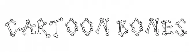
( Fonts by Galdino Otten - galdinootten.com )
A playful, bone-themed font perfect for creative and themed projects.
![Cartoon Bones Frei Schriftart Herunterladen]() Herunterladen 1166 Downloads@WebFont
Herunterladen 1166 Downloads@WebFont -
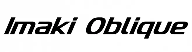
( Fonts by Neale Davidson - www.pixelsagas.com )
A sleek, oblique font with a modern and dynamic style.
![Imaki Oblique Frei Schriftart Herunterladen]() Herunterladen 1166 Downloads@WebFont
Herunterladen 1166 Downloads@WebFont -
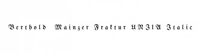
( Fonts by Peter Wiegel - www.peter-wiegel.de )
A traditional blackletter font with ornate, angular letterforms and decorative flourishes.
![Berthold Mainzer Fraktur UNZ1A Italic Frei Schriftart Herunterladen]() Herunterladen 1166 Downloads@WebFont
Herunterladen 1166 Downloads@WebFont -
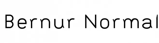
![Bernur Normal Frei Schriftart Herunterladen]() Herunterladen 1166 Downloads@WebFont
Herunterladen 1166 Downloads@WebFont -
( Free for personal and commercial use. Fonts by www.hvdfonts.com )
A bold, distressed font with a vintage, textured appearance.
![HVD Bodedo Frei Schriftart Herunterladen]() Herunterladen 1166 Downloads@WebFont
Herunterladen 1166 Downloads@WebFont -
![Evil Of Frankenstein Frei Schriftart Herunterladen]() Herunterladen 1166 Downloads@WebFont
Herunterladen 1166 Downloads@WebFont -
![Gargoyles Normal Frei Schriftart Herunterladen]() Herunterladen 1166 Downloads@WebFont
Herunterladen 1166 Downloads@WebFont -
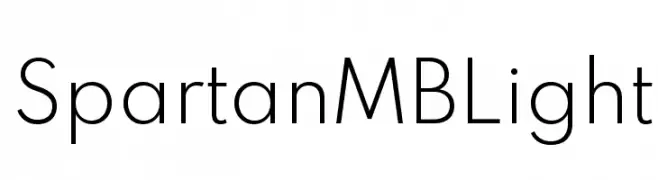
( Fonts by Matt Bailey - Personal-use only. For commercial use please contact owner. )
A clean, modern sans-serif font with a geometric structure and minimalist aesthetic.
![Spartan MB Light Frei Schriftart Herunterladen]() Herunterladen 1165 Downloads@WebFont
Herunterladen 1165 Downloads@WebFont -
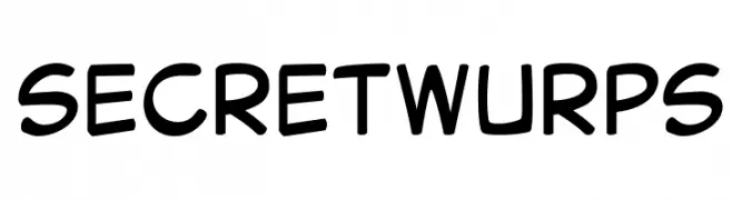
( Joberto )
A playful, rounded font with a casual, hand-drawn style.
![Secret Wurps Frei Schriftart Herunterladen]() Herunterladen 1165 Downloads@WebFont
Herunterladen 1165 Downloads@WebFont -
( Chequered Ink - chequered.ink/ )
A modern, geometric sans-serif font with tall, narrow characters and medium contrast.
![Megan June Frei Schriftart Herunterladen]() Herunterladen 1165 Downloads@WebFont
Herunterladen 1165 Downloads@WebFont -
![SHARKBOY and lavagirl Frei Schriftart Herunterladen]() Herunterladen 1165 Downloads@WebFont
Herunterladen 1165 Downloads@WebFont -
( Fonts by Darrell Flood )
A bold, playful font with a hand-drawn marker style.
![Cartoon Marker Frei Schriftart Herunterladen]() Herunterladen 1165 Downloads@WebFont
Herunterladen 1165 Downloads@WebFont -
( Fonts by a Neale Davidson - www.pixelsagas.com. Personal-use only. For commercial use please contact owner. )
A bold, geometric, and futuristic font with a condensed style.
![Zebulon Condensed Frei Schriftart Herunterladen]() Herunterladen 1165 Downloads@WebFont
Herunterladen 1165 Downloads@WebFont -
![The CheddarCake Factory Frei Schriftart Herunterladen]() Herunterladen 1165 Downloads@WebFont
Herunterladen 1165 Downloads@WebFont -
( https://www.behance.net/katharinehoward )
A bold, playful handwritten font with rounded, dynamic characters.
![Boxing Wizards Frei Schriftart Herunterladen]() Herunterladen 1165 Downloads@WebFont
Herunterladen 1165 Downloads@WebFont -
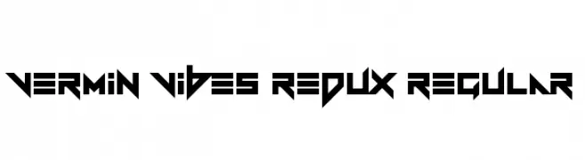
( Fonts by Andrew McCluskey - nalgames.com )
A bold, angular font with a futuristic and edgy design.
![Vermin Vibes Redux Regular Frei Schriftart Herunterladen]() Herunterladen 1165 Downloads@WebFont
Herunterladen 1165 Downloads@WebFont -
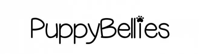
( Fonts by Vanessa Bays - bythebutterfly.com )
A playful, rounded font with whimsical paw print accents.
![PuppyBellies Frei Schriftart Herunterladen]() Herunterladen 1165 Downloads@WebFont
Herunterladen 1165 Downloads@WebFont -
![TuffyScript-Regular Frei Schriftart Herunterladen]() Herunterladen 1165 Downloads@WebFont
Herunterladen 1165 Downloads@WebFont -
![Zachery-Book Frei Schriftart Herunterladen]() Herunterladen 1165 Downloads@WebFont
Herunterladen 1165 Downloads@WebFont -
![DIST Yolks Emoticons Frei Schriftart Herunterladen]() Herunterladen 1165 Downloads@WebFont
Herunterladen 1165 Downloads@WebFont -
![MOO Frei Schriftart Herunterladen]() Herunterladen 1165 Downloads@WebFont
Herunterladen 1165 Downloads@WebFont -
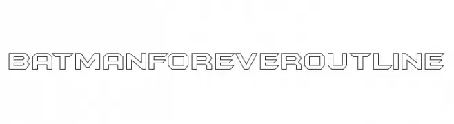
![BatmanForeverOutline Frei Schriftart Herunterladen]() Herunterladen 1165 Downloads@WebFont
Herunterladen 1165 Downloads@WebFont -
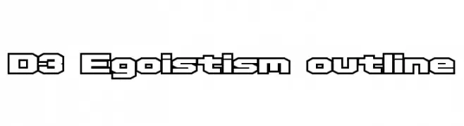
( Fonts by www.DigitalDreamDesign.net )
A bold, geometric outline font with sharp angles and uniform thickness.
![D3 Egoistism outline Frei Schriftart Herunterladen]() Herunterladen 1165 Downloads@WebFont
Herunterladen 1165 Downloads@WebFont


Welche Schriften sind gerade am populärsten?
Poppins, Roboto, Montserrat, Open Sans und Lato sind wegen ihrer klaren Formen und breiten Einsetzbarkeit sehr gefragt – von Markenauftritt über Landingpages bis hin zu Postern.
Welche Fonts eignen sich für Logos?
Geometrische Sans‑Serifs (z. B. Poppins, Familien im Gotham‑Stil) sind ein häufiger Griff für sauberes, skalierbares Branding. Für eine persönlichere Note bleiben Scripts und Handschrift‑Stile beliebt. Kombinieren Sie einen prägnanten Headline‑Font mit einer neutralen Brotschrift für Wiedererkennung und Harmonie.
Wie oft wird die Top‑Liste aktualisiert?
Regelmäßig – basierend auf realen Downloads und Interaktionen. Schauen Sie öfter vorbei, um aufstrebende Favoriten früh zu entdecken.
💡 Tipp: Seite bookmarken – Trends wechseln schnell, und heutige Top‑Schriften inspirieren morgen vielleicht das Rebranding.