Willkommen bei den Top‑Schriften – hier treffen Beliebtheit und Qualität aufeinander. Das sind die in diesem Jahr am häufigsten heruntergeladenen und genutzten Fonts. Wenn Sie sichere Optionen für Logo, Web oder Social suchen, starten Sie hier.
Jeder Top‑Font überzeugt durch Balance, Lesbarkeit und Vielseitigkeit. Sie finden moderne Sans‑Serifs, elegante Scripts, Vintage‑Serifs und minimalistische Displays.
-
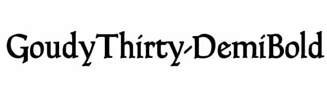
( Fonts by Dieter Steffmann )
A classic and elegant serif font with vintage charm and strong presence.
 Herunterladen 298 Downloads@WebFont
 -
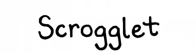
( Fonts by www.kimberlygeswein.com - Kimberly Geswein )
A playful, handwritten font with a casual and friendly style.
![Scrogglet Frei Schriftart Herunterladen]() Herunterladen 298 Downloads@WebFont
Herunterladen 298 Downloads@WebFont -
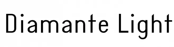
( Fonts by www.monofonts.com. Personal-use only. For commercial use please contact owner. )
A clean, modern sans-serif font with uniform stroke widths and geometric influence.
![Diamante Light Frei Schriftart Herunterladen]() Herunterladen 298 Downloads@WebFont
Herunterladen 298 Downloads@WebFont -
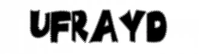
![Ufrayd Frei Schriftart Herunterladen]() Herunterladen 298 Downloads
Herunterladen 298 Downloads -
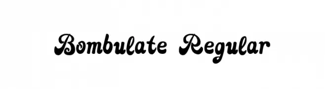
( Fonts by Suamzu Art )
A bold, playful script font with whimsical curves and ornate details.
![Bombulate Regular Frei Schriftart Herunterladen]() Herunterladen 298 Downloads@WebFont
Herunterladen 298 Downloads@WebFont -
-
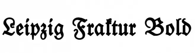
( Fonts by Peter Wiegel - www.peter-wiegel.de - Personal-use only. For commercial use please contact owner. )
A bold, blackletter typeface with intricate, angular strokes and a traditional Fraktur style.
![Leipzig Fraktur Bold Frei Schriftart Herunterladen]() Herunterladen 298 Downloads@WebFont
Herunterladen 298 Downloads@WebFont -
( Fonts by Wahyu Eka Prasetya - wepfont.com - Personal-use only. For commercial use please contact owner. )
A bold, distressed font with a hand-painted, gritty appearance.
![Gasin Frei Schriftart Herunterladen]() Herunterladen 298 Downloads@WebFont
Herunterladen 298 Downloads@WebFont -
( Fonts by Glyphobet Font Foundry - Matt Chisholm - http://glyphobet.net/typography/ )
A distressed, textured font with a vintage, handmade feel.
![Rubbing Font Frei Schriftart Herunterladen]() Herunterladen 298 Downloads@WebFont
Herunterladen 298 Downloads@WebFont -
![lakhey2 Frei Schriftart Herunterladen]() Herunterladen 298 Downloads@WebFont
Herunterladen 298 Downloads@WebFont -
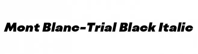
( Fonts by Fontfabric - Svetoslav Simov - Personal-use only. For commercial use please contact owner. )
A bold, italic font with a modern and dynamic style.
![Mont Blanc-Trial Black Italic Frei Schriftart Herunterladen]() Herunterladen 297 Downloads@WebFont
Herunterladen 297 Downloads@WebFont


Welche Schriften sind gerade am populärsten?
Poppins, Roboto, Montserrat, Open Sans und Lato sind wegen ihrer klaren Formen und breiten Einsetzbarkeit sehr gefragt – von Markenauftritt über Landingpages bis hin zu Postern.
Welche Fonts eignen sich für Logos?
Geometrische Sans‑Serifs (z. B. Poppins, Familien im Gotham‑Stil) sind ein häufiger Griff für sauberes, skalierbares Branding. Für eine persönlichere Note bleiben Scripts und Handschrift‑Stile beliebt. Kombinieren Sie einen prägnanten Headline‑Font mit einer neutralen Brotschrift für Wiedererkennung und Harmonie.
Wie oft wird die Top‑Liste aktualisiert?
Regelmäßig – basierend auf realen Downloads und Interaktionen. Schauen Sie öfter vorbei, um aufstrebende Favoriten früh zu entdecken.
💡 Tipp: Seite bookmarken – Trends wechseln schnell, und heutige Top‑Schriften inspirieren morgen vielleicht das Rebranding.