Willkommen bei den Top‑Schriften – hier treffen Beliebtheit und Qualität aufeinander. Das sind die in diesem Jahr am häufigsten heruntergeladenen und genutzten Fonts. Wenn Sie sichere Optionen für Logo, Web oder Social suchen, starten Sie hier.
Jeder Top‑Font überzeugt durch Balance, Lesbarkeit und Vielseitigkeit. Sie finden moderne Sans‑Serifs, elegante Scripts, Vintage‑Serifs und minimalistische Displays.
-
( Chen Yining )
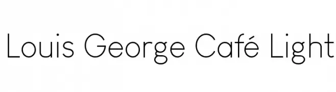
A clean, modern sans-serif font with a light weight and minimalistic design.
 Herunterladen 1144 Downloads@WebFont
 -
![Igbo Regular Frei Schriftart Herunterladen]() Herunterladen 1144 Downloads@WebFont
Herunterladen 1144 Downloads@WebFont -
( Fonts by www.blambot.com )
A bold, distressed font with a rugged, vintage feel and narrow characters.
![CryptCreepBB Frei Schriftart Herunterladen]() Herunterladen 1144 Downloads@WebFont
Herunterladen 1144 Downloads@WebFont -
( Fonts by Steve Cloutier - www.cloutierfontes.ca )
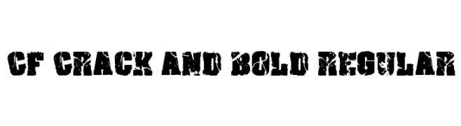
A bold, distressed font with a rugged, cracked appearance.
![CF Crack and Bold Regular Frei Schriftart Herunterladen]() Herunterladen 1144 Downloads@WebFont
Herunterladen 1144 Downloads@WebFont -
( Fonts by Steve Cloutier - www.cloutierfontes.ca )
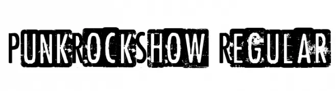
A bold, distressed font with a punk rock aesthetic.
![PunkRockShow Regular Frei Schriftart Herunterladen]() Herunterladen 1144 Downloads@WebFont
Herunterladen 1144 Downloads@WebFont -
( Fonts by Hideki Katayama - com4t-fff.seesaa.net )
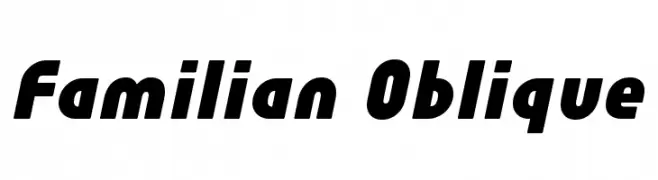
A bold, oblique font with rounded characters and a modern, dynamic style.
![Familian Oblique Frei Schriftart Herunterladen]() Herunterladen 1144 Downloads@WebFont
Herunterladen 1144 Downloads@WebFont -
![FirstGundam Frei Schriftart Herunterladen]() Herunterladen 1144 Downloads@WebFont
Herunterladen 1144 Downloads@WebFont -
![ELEPHANT K Regular Frei Schriftart Herunterladen]() Herunterladen 1144 Downloads@WebFont
Herunterladen 1144 Downloads@WebFont -
![coffee beans Frei Schriftart Herunterladen]() Herunterladen 1144 Downloads@WebFont
Herunterladen 1144 Downloads@WebFont -
( Fonts by Font People - Personal-use only. For commercial use please contact owner. )
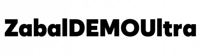
A bold, ultra-heavy geometric sans-serif font with a modern and assertive style.
![Zabal DEMO Ultra Frei Schriftart Herunterladen]() Herunterladen 1143 Downloads@WebFont
Herunterladen 1143 Downloads@WebFont -
( Fonts by Sudtipos )
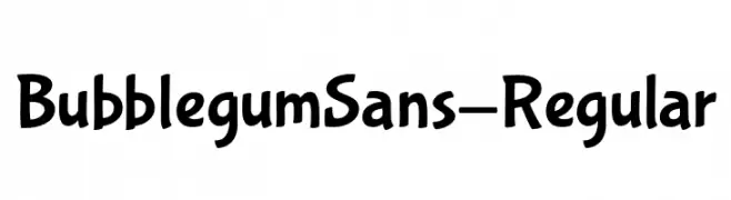
A playful, bubbly font with smooth, rounded characters.
![BubblegumSans-Regular Frei Schriftart Herunterladen]() Herunterladen 1143 Downloads@WebFont
Herunterladen 1143 Downloads@WebFont -
( Fonts by Chris Vile - fontmonger.com - Personal-use only. For commercial use please contact owner. )
A bold, outlined geometric font with a modern and structured appearance.
![GeneseeSt-Regular Frei Schriftart Herunterladen]() Herunterladen 1143 Downloads@WebFont
Herunterladen 1143 Downloads@WebFont -
( Fonts by Press Gang Studios )
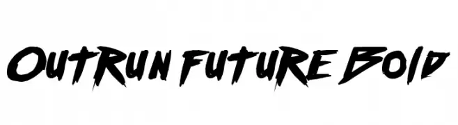
A bold, dynamic font with sharp, angular edges and a brush-like texture.
![Outrun future Bold Frei Schriftart Herunterladen]() Herunterladen 1143 Downloads@WebFont
Herunterladen 1143 Downloads@WebFont -
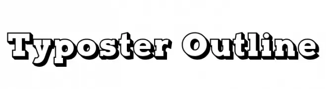
![Typoster Outline Frei Schriftart Herunterladen]() Herunterladen 1143 Downloads@WebFont
Herunterladen 1143 Downloads@WebFont -
( Fonts by a www.fontfabric.com. Personal-use only. For commercial use please contact owner. )
A bold, italic sans-serif font with smooth, rounded edges and a modern look.
![Blogger Sans Bold Italic Frei Schriftart Herunterladen]() Herunterladen 1143 Downloads@WebFont
Herunterladen 1143 Downloads@WebFont -
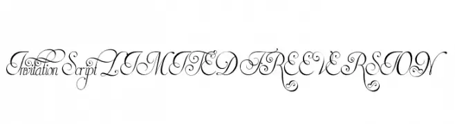
![Invitation Script LIMITED FREE VERSION Frei Schriftart Herunterladen]() Herunterladen 1143 Downloads@WebFont
Herunterladen 1143 Downloads@WebFont -
Schriftart von Qbotype. For commercial use please contact the owner.
( Fonts by www.phuxerdesigns.com.ar - Non-commercial use of any typeface free version, only buying the full version )
A modern, geometric font with rounded edges and a bold, cohesive appearance.
![Zian Frei Schriftart Herunterladen]() Herunterladen 1143 Downloads@WebFont
Herunterladen 1143 Downloads@WebFont -
![Airboy Frei Schriftart Herunterladen]() Herunterladen 1143 Downloads@WebFont
Herunterladen 1143 Downloads@WebFont -
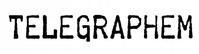
![Telegraphem Frei Schriftart Herunterladen]() Herunterladen 1143 Downloads@WebFont
Herunterladen 1143 Downloads@WebFont -
( Fonts by www.peter-wiegel.de. Personal-use only. For commercial use please contact owner. )
An elegant script font with flowing, handwritten-style strokes.
![Wolgast Script Frei Schriftart Herunterladen]() Herunterladen 1143 Downloads@WebFont
Herunterladen 1143 Downloads@WebFont -
( Fonts by www.peter-wiegel.de. Personal-use only. For commercial use please contact owner. )
A modern, geometric sans-serif font with uniform strokes and clear characters.
![Fibel Sued Frei Schriftart Herunterladen]() Herunterladen 1143 Downloads@WebFont
Herunterladen 1143 Downloads@WebFont -
![Bensch Gothic Frei Schriftart Herunterladen]() Herunterladen 1143 Downloads@WebFont
Herunterladen 1143 Downloads@WebFont -
( Fonts by Daniel Gauthier )
A bold, edgy font with tribal-like cut-out designs and sharp angles.
![CBGBFontSolid Frei Schriftart Herunterladen]() Herunterladen 1143 Downloads@WebFont
Herunterladen 1143 Downloads@WebFont -
![Engebrechtre Expanded Frei Schriftart Herunterladen]() Herunterladen 1143 Downloads@WebFont
Herunterladen 1143 Downloads@WebFont -
( Fonts by NubeFonts - nubefonts.blogspot.com - Personal-use only. For commercial use please contact owner. )
A bold, modern sans-serif font with clean, geometric lines.
![CaptainMarvel Frei Schriftart Herunterladen]() Herunterladen 1142 Downloads@WebFont
Herunterladen 1142 Downloads@WebFont -
( Fonts by Cristiano Sobral - Personal-use only. For commercial use please contact owner. )
A modern, clean sans-serif typeface with consistent stroke width and balanced spacing.
![Cheyenne Sans Medium Frei Schriftart Herunterladen]() Herunterladen 1142 Downloads@WebFont
Herunterladen 1142 Downloads@WebFont -
![Minecraftia 2.0 Frei Schriftart Herunterladen]() Herunterladen 1142 Downloads@WebFont
Herunterladen 1142 Downloads@WebFont -
![DKJalebi Frei Schriftart Herunterladen]() Herunterladen 1142 Downloads@WebFont
Herunterladen 1142 Downloads@WebFont -
( Fonts by Arkandis Digital Foundry )
A bold, heavy serif font with a classic and authoritative style.
![VenturisSansADFHeavy Frei Schriftart Herunterladen]() Herunterladen 1142 Downloads@WebFont
Herunterladen 1142 Downloads@WebFont -
![Simplesnails by Haiku Frei Schriftart Herunterladen]() Herunterladen 1142 Downloads@WebFont
Herunterladen 1142 Downloads@WebFont -
![Hairy Monster Solid Frei Schriftart Herunterladen]() Herunterladen 1142 Downloads@WebFont
Herunterladen 1142 Downloads@WebFont -
![Bird cherry Frei Schriftart Herunterladen]() Herunterladen 1142 Downloads@WebFont
Herunterladen 1142 Downloads@WebFont -
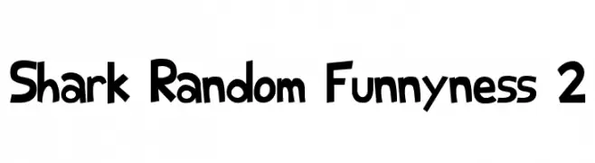
( Fonts by Aryel Filipe )
A playful, cartoon-like font with bold, exaggerated letterforms.
![Shark Random Funnyness 2 Frei Schriftart Herunterladen]() Herunterladen 1142 Downloads@WebFont
Herunterladen 1142 Downloads@WebFont -
( Fonts by www.blambot.com )
A bold, flame-inspired font with dynamic, jagged edges.
![Char BB Frei Schriftart Herunterladen]() Herunterladen 1142 Downloads@WebFont
Herunterladen 1142 Downloads@WebFont -
( Fonts by The Scriptorium - Dave Nalle )
A gothic, medieval-inspired font with sharp serifs and intricate detailing.
![Scurlock Frei Schriftart Herunterladen]() Herunterladen 1142 Downloads@WebFont
Herunterladen 1142 Downloads@WebFont


Welche Schriften sind gerade am populärsten?
Poppins, Roboto, Montserrat, Open Sans und Lato sind wegen ihrer klaren Formen und breiten Einsetzbarkeit sehr gefragt – von Markenauftritt über Landingpages bis hin zu Postern.
Welche Fonts eignen sich für Logos?
Geometrische Sans‑Serifs (z. B. Poppins, Familien im Gotham‑Stil) sind ein häufiger Griff für sauberes, skalierbares Branding. Für eine persönlichere Note bleiben Scripts und Handschrift‑Stile beliebt. Kombinieren Sie einen prägnanten Headline‑Font mit einer neutralen Brotschrift für Wiedererkennung und Harmonie.
Wie oft wird die Top‑Liste aktualisiert?
Regelmäßig – basierend auf realen Downloads und Interaktionen. Schauen Sie öfter vorbei, um aufstrebende Favoriten früh zu entdecken.
💡 Tipp: Seite bookmarken – Trends wechseln schnell, und heutige Top‑Schriften inspirieren morgen vielleicht das Rebranding.