Willkommen bei den Top‑Schriften – hier treffen Beliebtheit und Qualität aufeinander. Das sind die in diesem Jahr am häufigsten heruntergeladenen und genutzten Fonts. Wenn Sie sichere Optionen für Logo, Web oder Social suchen, starten Sie hier.
Jeder Top‑Font überzeugt durch Balance, Lesbarkeit und Vielseitigkeit. Sie finden moderne Sans‑Serifs, elegante Scripts, Vintage‑Serifs und minimalistische Displays.
-
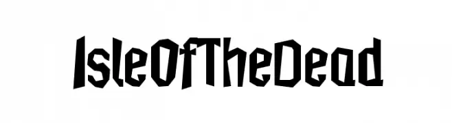
( Iconian Fonts - Daniel Zadorozny - www.iconian.com )
Bold, italicized, and expanded font with a dynamic and modern style.
 Herunterladen 287 Downloads@WebFont
 -
![IsleOfTheDead Frei Schriftart Herunterladen]() Herunterladen 287 Downloads@WebFont
Herunterladen 287 Downloads@WebFont -
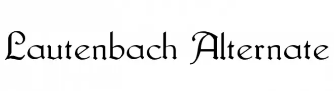
( Fonts by www.fugit-tempus.de )
A classic calligraphic font with modern elegance and ornate details.
![Lautenbach Alternate Frei Schriftart Herunterladen]() Herunterladen 287 Downloads@WebFont
Herunterladen 287 Downloads@WebFont -
( Fonts by a Max Infeld - XEROGRAPHER FONTS - xerographer.blogspot.com . Personal-use only. For commercial use please contact owner. )
A playful, hand-drawn font with a sketch-like, textured appearance.
![SomeLines Frei Schriftart Herunterladen]() Herunterladen 287 Downloads@WebFont
Herunterladen 287 Downloads@WebFont -
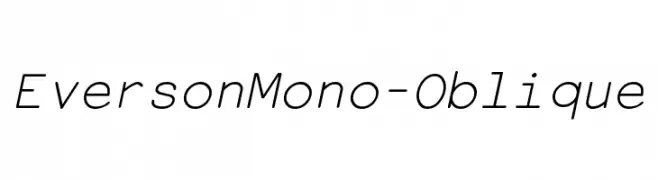
![EversonMono-Oblique Frei Schriftart Herunterladen]() Herunterladen 287 Downloads@WebFont
Herunterladen 287 Downloads@WebFont -
-
( Fonts by Woodcutter )
A playful, bold, and hand-drawn font with exaggerated curves.
![Alberto ha Vuelto! Frei Schriftart Herunterladen]() Herunterladen 287 Downloads@WebFont
Herunterladen 287 Downloads@WebFont -
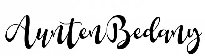
( Fonts by Eknoji Studio - www.eknojistudio.com - Personal-use only. For commercial use please contact owner. )
A graceful and elegant script font with flowing cursive lines.
![Aunten Bedany Frei Schriftart Herunterladen]() Herunterladen 287 Downloads@WebFont
Herunterladen 287 Downloads@WebFont -
( Fonts by MJType )
A playful, casual handwritten font with smooth, rounded strokes.
![Shell Crabs Frei Schriftart Herunterladen]() Herunterladen 287 Downloads@WebFont
Herunterladen 287 Downloads@WebFont -
( Runsell Studio - creativemarket.com/RunsellStudio )
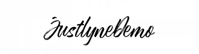
A bold, expressive handwritten font with fluid, cursive strokes.
![JustlyneDemo Frei Schriftart Herunterladen]() Herunterladen 287 Downloads@WebFont
Herunterladen 287 Downloads@WebFont -
( Fonts by Kreative Korporation - www.kreativekorp.com )
A pixelated, monospaced font with a retro, digital aesthetic.
![LisaTerminal Paper Raw Frei Schriftart Herunterladen]() Herunterladen 287 Downloads@WebFont
Herunterladen 287 Downloads@WebFont


Welche Schriften sind gerade am populärsten?
Poppins, Roboto, Montserrat, Open Sans und Lato sind wegen ihrer klaren Formen und breiten Einsetzbarkeit sehr gefragt – von Markenauftritt über Landingpages bis hin zu Postern.
Welche Fonts eignen sich für Logos?
Geometrische Sans‑Serifs (z. B. Poppins, Familien im Gotham‑Stil) sind ein häufiger Griff für sauberes, skalierbares Branding. Für eine persönlichere Note bleiben Scripts und Handschrift‑Stile beliebt. Kombinieren Sie einen prägnanten Headline‑Font mit einer neutralen Brotschrift für Wiedererkennung und Harmonie.
Wie oft wird die Top‑Liste aktualisiert?
Regelmäßig – basierend auf realen Downloads und Interaktionen. Schauen Sie öfter vorbei, um aufstrebende Favoriten früh zu entdecken.
💡 Tipp: Seite bookmarken – Trends wechseln schnell, und heutige Top‑Schriften inspirieren morgen vielleicht das Rebranding.