Willkommen bei den Top‑Schriften – hier treffen Beliebtheit und Qualität aufeinander. Das sind die in diesem Jahr am häufigsten heruntergeladenen und genutzten Fonts. Wenn Sie sichere Optionen für Logo, Web oder Social suchen, starten Sie hier.
Jeder Top‑Font überzeugt durch Balance, Lesbarkeit und Vielseitigkeit. Sie finden moderne Sans‑Serifs, elegante Scripts, Vintage‑Serifs und minimalistische Displays.
-
 Herunterladen 283 Downloads@WebFont
 -
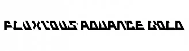
![Fluxious Advance Bold Frei Schriftart Herunterladen]() Herunterladen 283 Downloads@WebFont
Herunterladen 283 Downloads@WebFont -
( Fonts by Rochadi Sudarma [Rochart Studio] - Personal-use only. For commercial use please contact owner. )
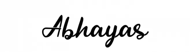
A cursive, handwritten-style font with elegant, flowing strokes.
![Abhayas Frei Schriftart Herunterladen]() Herunterladen 283 Downloads@WebFont
Herunterladen 283 Downloads@WebFont -
( Fonts by Leonard Posavec )
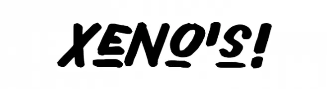
A bold, dynamic font with rounded edges and a playful, energetic style.
![Xeno's! Frei Schriftart Herunterladen]() Herunterladen 283 Downloads@WebFont
Herunterladen 283 Downloads@WebFont -
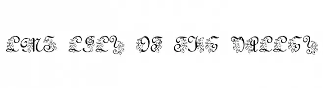
![LMS Lily Of The Valley Frei Schriftart Herunterladen]() Herunterladen 283 Downloads@WebFont
Herunterladen 283 Downloads@WebFont -
-
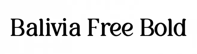
( Fonts by Ardyana Types - Ardyana Putra - Personal-use only. For commercial use please contact owner. )
A bold, classic serif font with strong serifs and a traditional appearance.
![Balivia Free Bold Frei Schriftart Herunterladen]() Herunterladen 283 Downloads@WebFont
Herunterladen 283 Downloads@WebFont -
( Fonts by Jacob Fisher - www.pizzadude.dk )
A bold, playful font with an edgy, graffiti-inspired style.
![Sk8ordye Frei Schriftart Herunterladen]() Herunterladen 283 Downloads@WebFont
Herunterladen 283 Downloads@WebFont -
( Fonts by Peter Wiegel - www.peter-wiegel.de - Personal-use only. For commercial use please contact owner. )
A bold, blackletter font with sharp, angular lines and a historical Gothic style.
![Gotenburg B UNZ_1_L Bold Frei Schriftart Herunterladen]() Herunterladen 283 Downloads@WebFont
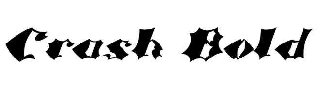
Herunterladen 283 Downloads@WebFont -
![Crash Bold Frei Schriftart Herunterladen]() Herunterladen 283 Downloads@WebFont
Herunterladen 283 Downloads@WebFont -
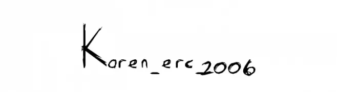
( Font by Eric Wirjanata. All of my font are donation based. You can support by buying something from here. http://society6.com/EricWirjanata )
A hand-drawn, artistic font with irregular strokes and a unique, expressive style.
![Karen_erc_2006 Frei Schriftart Herunterladen]() Herunterladen 283 Downloads@WebFont
Herunterladen 283 Downloads@WebFont


Welche Schriften sind gerade am populärsten?
Poppins, Roboto, Montserrat, Open Sans und Lato sind wegen ihrer klaren Formen und breiten Einsetzbarkeit sehr gefragt – von Markenauftritt über Landingpages bis hin zu Postern.
Welche Fonts eignen sich für Logos?
Geometrische Sans‑Serifs (z. B. Poppins, Familien im Gotham‑Stil) sind ein häufiger Griff für sauberes, skalierbares Branding. Für eine persönlichere Note bleiben Scripts und Handschrift‑Stile beliebt. Kombinieren Sie einen prägnanten Headline‑Font mit einer neutralen Brotschrift für Wiedererkennung und Harmonie.
Wie oft wird die Top‑Liste aktualisiert?
Regelmäßig – basierend auf realen Downloads und Interaktionen. Schauen Sie öfter vorbei, um aufstrebende Favoriten früh zu entdecken.
💡 Tipp: Seite bookmarken – Trends wechseln schnell, und heutige Top‑Schriften inspirieren morgen vielleicht das Rebranding.