Willkommen bei den Top‑Schriften – hier treffen Beliebtheit und Qualität aufeinander. Das sind die in diesem Jahr am häufigsten heruntergeladenen und genutzten Fonts. Wenn Sie sichere Optionen für Logo, Web oder Social suchen, starten Sie hier.
Jeder Top‑Font überzeugt durch Balance, Lesbarkeit und Vielseitigkeit. Sie finden moderne Sans‑Serifs, elegante Scripts, Vintage‑Serifs und minimalistische Displays.
-
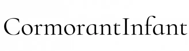
( Fonts by Catharsis - Personal-use only. For commercial use please contact owner. )
A classic serif font with high contrast and elegant letterforms.
 Herunterladen 1093 Downloads@WebFont
 -
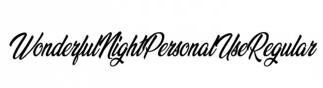
( Fonts by Billy Argel - Personal-use only. For commercial use please contact owner. )
An elegant, flowing script font with ornate uppercase and smooth lowercase letters.
![Wonderful Night Personal Use Regular Frei Schriftart Herunterladen]() Herunterladen 1093 Downloads@WebFont
Herunterladen 1093 Downloads@WebFont -
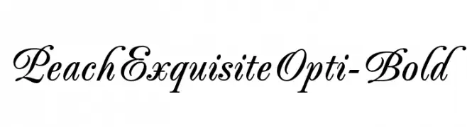
( Fonts by Castcraft Software - OPTI Fonts Archive - opti.netii.net - Personal-use only. For commercial use please contact owner. )
An elegant, cursive script font with ornate swashes and flourishes.
![PeachExquisiteOpti-Bold Frei Schriftart Herunterladen]() Herunterladen 1093 Downloads@WebFont
Herunterladen 1093 Downloads@WebFont -
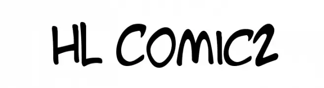
( Fonts by HungLan Design - www.hunglandesign.com )
A playful, handwritten font with a casual and friendly style.
![HL Comic2 Frei Schriftart Herunterladen]() Herunterladen 1093 Downloads@WebFont
Herunterladen 1093 Downloads@WebFont -
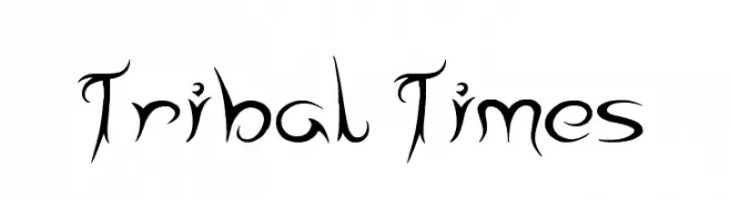
( Font by Jonathan Harris - www.tattoowoo.com )
A tribal-inspired font with sharp, flowing lines and a bold, dynamic style.
![Tribal Times Frei Schriftart Herunterladen]() Herunterladen 1093 Downloads@WebFont
Herunterladen 1093 Downloads@WebFont -
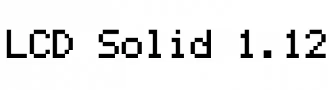
-
![LCD Solid 1.12 Frei Schriftart Herunterladen]() Herunterladen 1093 Downloads@WebFont
Herunterladen 1093 Downloads@WebFont -
( Google Web Fonts )
A sleek, modern, condensed, light italic font with tight spacing.
![Open Sans Condensed Light Italic Frei Schriftart Herunterladen]() Herunterladen 1093 Downloads@WebFont
Herunterladen 1093 Downloads@WebFont -
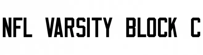
![NFL Varsity Block C Frei Schriftart Herunterladen]() Herunterladen 1093 Downloads@WebFont
Herunterladen 1093 Downloads@WebFont -
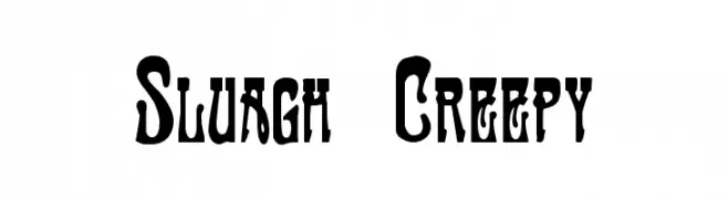
![Sluagh Creepy Frei Schriftart Herunterladen]() Herunterladen 1093 Downloads@WebFont
Herunterladen 1093 Downloads@WebFont -
( Fonts by Apostrophic Lab )
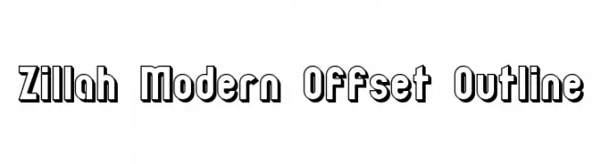
A bold, modern font with an offset outline creating a 3D effect.
![Zillah Modern Offset Outline Frei Schriftart Herunterladen]() Herunterladen 1093 Downloads@WebFont
Herunterladen 1093 Downloads@WebFont -
( Fonts by yusukekamiyamane.com )
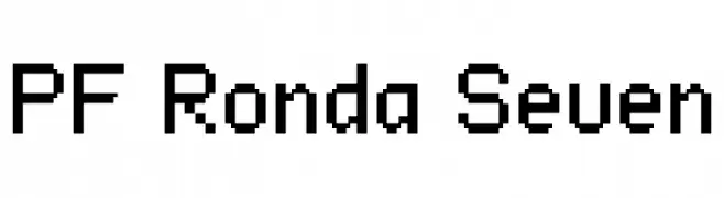
A pixelated, blocky font with a retro digital aesthetic.
![PF Ronda Seven Frei Schriftart Herunterladen]() Herunterladen 1093 Downloads@WebFont
Herunterladen 1093 Downloads@WebFont -
( Fonts by Ben Nathan )
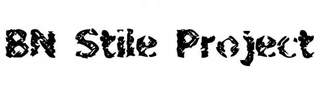
A bold, distressed font with a grungy, textured appearance.
![BN Stile Project Frei Schriftart Herunterladen]() Herunterladen 1093 Downloads@WebFont
Herunterladen 1093 Downloads@WebFont -
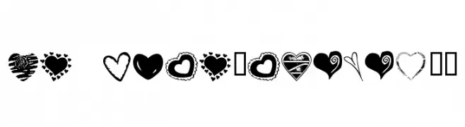
![KR Heartalicious Frei Schriftart Herunterladen]() Herunterladen 1093 Downloads@WebFont
Herunterladen 1093 Downloads@WebFont -
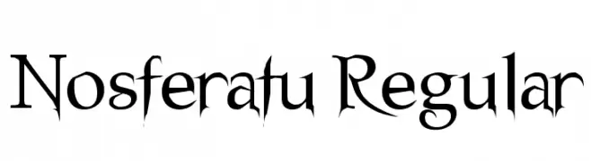
![Nosferatu Regular Frei Schriftart Herunterladen]() Herunterladen 1093 Downloads@WebFont
Herunterladen 1093 Downloads@WebFont -
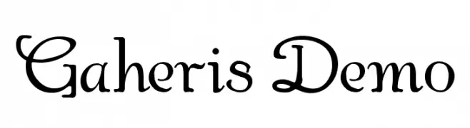
![Gaheris Demo Frei Schriftart Herunterladen]() Herunterladen 1093 Downloads@WebFont
Herunterladen 1093 Downloads@WebFont -
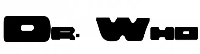
![Dr. Who Frei Schriftart Herunterladen]() Herunterladen 1093 Downloads@WebFont
Herunterladen 1093 Downloads@WebFont -
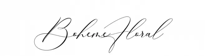
( Fonts by 50Fox Studio - www.50fox.com - Personal-use only. For commercial use please contact owner. )
A sophisticated script font with elegant, flowing strokes and high contrast.
![BohemeFloral Frei Schriftart Herunterladen]() Herunterladen 1092 Downloads@WebFont
Herunterladen 1092 Downloads@WebFont -
( Fonts by HoPoYa Studio - Mahmud Fajar Rosyadi - Personal-use only. For commercial use please contact owner. )
A bold, angular font with a medieval, knightly aesthetic.
![Royal Knights Regular Frei Schriftart Herunterladen]() Herunterladen 1092 Downloads@WebFont
Herunterladen 1092 Downloads@WebFont -
Schriftart von danny91194. For commercial use please contact the owner.
( Created on May 7, 2018 )
A bold, modern font with thick strokes and geometric shapes.
![The Happy Cricket Frei Schriftart Herunterladen]() Herunterladen 1092 Downloads@WebFont
Herunterladen 1092 Downloads@WebFont -
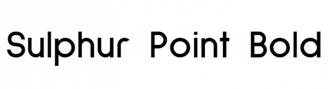
( Copyright 2016 Michal Sahar. All rights reserved. )
A bold, modern sans-serif font with a clean and geometric design.
![Sulphur Point Bold Frei Schriftart Herunterladen]() Herunterladen 1092 Downloads@WebFont
Herunterladen 1092 Downloads@WebFont -
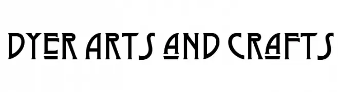
( Fonts by Typo )
A bold, handcrafted font with geometric and organic elements.
![Dyer Arts and Crafts Frei Schriftart Herunterladen]() Herunterladen 1092 Downloads@WebFont
Herunterladen 1092 Downloads@WebFont -
( Fonts by Billy Argel - www.billyargel.com - Personal-use only. For commercial use please contact owner. )
A bold, cursive font with playful, interconnected letters and high contrast.
![Candy Shop Black Personal Use Frei Schriftart Herunterladen]() Herunterladen 1092 Downloads@WebFont
Herunterladen 1092 Downloads@WebFont -
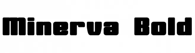
( Fonts by a Neale Davidson - www.pixelsagas.com. Personal-use only. For commercial use please contact owner. )
A bold, geometric font with thick, uniform strokes and a strong visual impact.
![Minerva Bold Frei Schriftart Herunterladen]() Herunterladen 1092 Downloads@WebFont
Herunterladen 1092 Downloads@WebFont -
( Free for personal use )
Bold, angular font with a dynamic, comic book style.
![Action Comcs Black Frei Schriftart Herunterladen]() Herunterladen 1092 Downloads@WebFont
Herunterladen 1092 Downloads@WebFont -
![modern Frei Schriftart Herunterladen]() Herunterladen 1092 Downloads@WebFont
Herunterladen 1092 Downloads@WebFont -
![MB-Graveyard_Designs Frei Schriftart Herunterladen]() Herunterladen 1092 Downloads@WebFont
Herunterladen 1092 Downloads@WebFont -
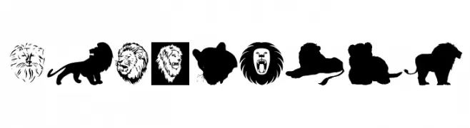
( Fonts by Manfred Klein. Free for private and charity use. Free for commercial with donation to organizations )
A decorative dingbat font with diverse lion illustrations and emblems.
![LionsClub Frei Schriftart Herunterladen]() Herunterladen 1092 Downloads@WebFont
Herunterladen 1092 Downloads@WebFont -
( Fonts by Spork Thug Typography - Josh Wilhelm - www.lifewithouttaffy.com/taffy/blog )
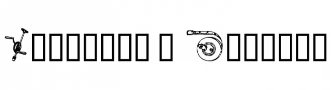
A decorative font featuring hand tools as characters, perfect for DIY-themed projects.
![Handyman's Special Frei Schriftart Herunterladen]() Herunterladen 1092 Downloads@WebFont
Herunterladen 1092 Downloads@WebFont -
( Fonts by Apostrophic Lab )
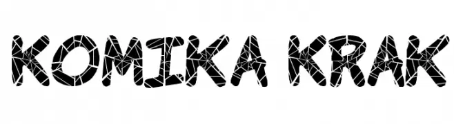
A bold, playful font with a shattered glass effect, perfect for creative projects.
![Komika Krak Frei Schriftart Herunterladen]() Herunterladen 1092 Downloads@WebFont
Herunterladen 1092 Downloads@WebFont -
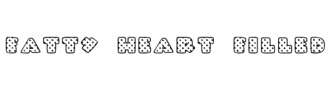
![Fatty Heart Filled Frei Schriftart Herunterladen]() Herunterladen 1092 Downloads@WebFont
Herunterladen 1092 Downloads@WebFont -
![Scratch Frei Schriftart Herunterladen]() Herunterladen 1092 Downloads@WebFont
Herunterladen 1092 Downloads@WebFont -
( Fonts by www.houseoflime.com )
Intricate tribal tattoo designs transform each character into a unique piece of art.
![Tattoo Frei Schriftart Herunterladen]() Herunterladen 1092 Downloads@WebFont
Herunterladen 1092 Downloads@WebFont -
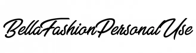
![Bella Fashion Personal Use Frei Schriftart Herunterladen]() Herunterladen 1091 Downloads@WebFont
Herunterladen 1091 Downloads@WebFont -
( Fonts by Andrew McCluskey - nalgames.com. Personal-use only. For commercial use please contact owner. )
A modern, geometric font with circular shapes and consistent stroke thickness.
![Zdyk Pisces Frei Schriftart Herunterladen]() Herunterladen 1091 Downloads@WebFont
Herunterladen 1091 Downloads@WebFont -
![NHL Edge Calgary Frei Schriftart Herunterladen]() Herunterladen 1091 Downloads@WebFont
Herunterladen 1091 Downloads@WebFont


Welche Schriften sind gerade am populärsten?
Poppins, Roboto, Montserrat, Open Sans und Lato sind wegen ihrer klaren Formen und breiten Einsetzbarkeit sehr gefragt – von Markenauftritt über Landingpages bis hin zu Postern.
Welche Fonts eignen sich für Logos?
Geometrische Sans‑Serifs (z. B. Poppins, Familien im Gotham‑Stil) sind ein häufiger Griff für sauberes, skalierbares Branding. Für eine persönlichere Note bleiben Scripts und Handschrift‑Stile beliebt. Kombinieren Sie einen prägnanten Headline‑Font mit einer neutralen Brotschrift für Wiedererkennung und Harmonie.
Wie oft wird die Top‑Liste aktualisiert?
Regelmäßig – basierend auf realen Downloads und Interaktionen. Schauen Sie öfter vorbei, um aufstrebende Favoriten früh zu entdecken.
💡 Tipp: Seite bookmarken – Trends wechseln schnell, und heutige Top‑Schriften inspirieren morgen vielleicht das Rebranding.